Semrush helps you:

  • Do keyword research
  • Audit your local listings
  • Perform competitor analyses
  • Manage social media accounts
  • And much more!

Backlinko readers get:

A 14-day trial for premium features. 55+ tools.
Free access for core features.

Newsletter Sign Up

Backlinko readers get unlimited
access for 14 days. 55+ tools.

Close

Grow your online visibility.
On all key channels.
From just one platform.

✓ Find profitable keywords
✓ Create winning content
✓ Get more organic traffic
Find Keyword Ideas in Seconds

Boost SEO results with powerful keyword research

Free Keyword Research Tool

Landing Pages: The Definitive Guide

This is the most complete guide to landing pages online.

So if you want to:

  • Create landing pages that convert SUPER well
  • See examples of the world’s best landing pages
  • Get access to proven landing page templates

Then you’ll love the detailed strategies in today’s guide.

Let’s dive right in.

Landing Pages: The Definitive Guide

Chapter 1:Landing Pages 101

Landing Pages 101

In this chapter I’m going to walk you through the basics of landing pages.

Including:

What they are.

Why are they important.

And how an effective landing page can increase conversions on your site.

What Is a Landing Page?

A landing page is a page that’s designed to facilitate a single desired action, such as making a purchase, filling out a form, signing up for a free trial or entering an email address.

It’s called a landing page because it’s a page where users “land” after clicking on a link in a Facebook post, Google Ad, email newsletter or any other traffic source.

What Is A Landing Page

How Is a Landing Page Different Than a “Normal” Webpage?

A normal web page tends to have several different desired actions.

For example, take your average homepage.

Homepages Have Multiple CTAs

Most homepages have multiple goals and several different calls to action (CTAs). For example, you might want homepage visitors to fill out a contact form. Or learn more about your features. Or sign up for a free trial.

And it’s the same story for blog posts, about pages… and most other pages on your site. You’ve got lots of competing CTAs going on.

(Which is why you rarely want to send Google Ads traffic to these types of pages).

But with a landing page, there’s usually ONE goal and ONE consistent CTA.

Landing Pages Have A Single CTA

Why Do Landing Pages Convert So Well?

There are two main reasons that landing pages are GREAT for increasing conversions:

  1. They have a focused CTA.
  2. They’re targeted to a specific group.

Like I just mentioned, successful landing pages CRUSH normal pages because they’re 100% focused on a single CTA.

But that’s not the only reason that landing pages convert super well.

They also convert because you can target them for a specific group, type of potential customer, or offer.

In fact, HubSpot found that more landing pages=more total sitewide conversions.

Impact Of Number Of Landing Pages On Lead Generation

Now that we have the basics out of the way, it’s time to dive deeper into the exact types of landing pages that work best.

Chapter 2:Landing Page Templates

Types Of Landing Pages

Now it’s time for me to show you exactly how to create a high-converting landing page.

Specifically, I’m going to hand you 4 landing page templates that you can use:

  • Email signup page template
  • Sales page template
  • Free trial page template
  • Lead gen page template

Let’s check out the templates.

Email Signup Page Template

An email signup page (also known as a “Squeeze Page”) is a page engineered to collect emails in exchange for an ebook, report or a valuable newsletter.

Email Sign Up Page Template

Headline=What They Get

People today are SUPER reluctant to give away their email address. And I can’t blame them.

When you hand over your email to someone you have no clue what’s coming next. They could start sending you a bunch of crap, bombard you with a million messages, sell your email to the highest bidder.

Which means you need to make what someone’s going to get SUPER clear.

For example, if you look at the Exploding Topics newsletter signup page, we used a compelling headline that made “what you get” crystal clear.
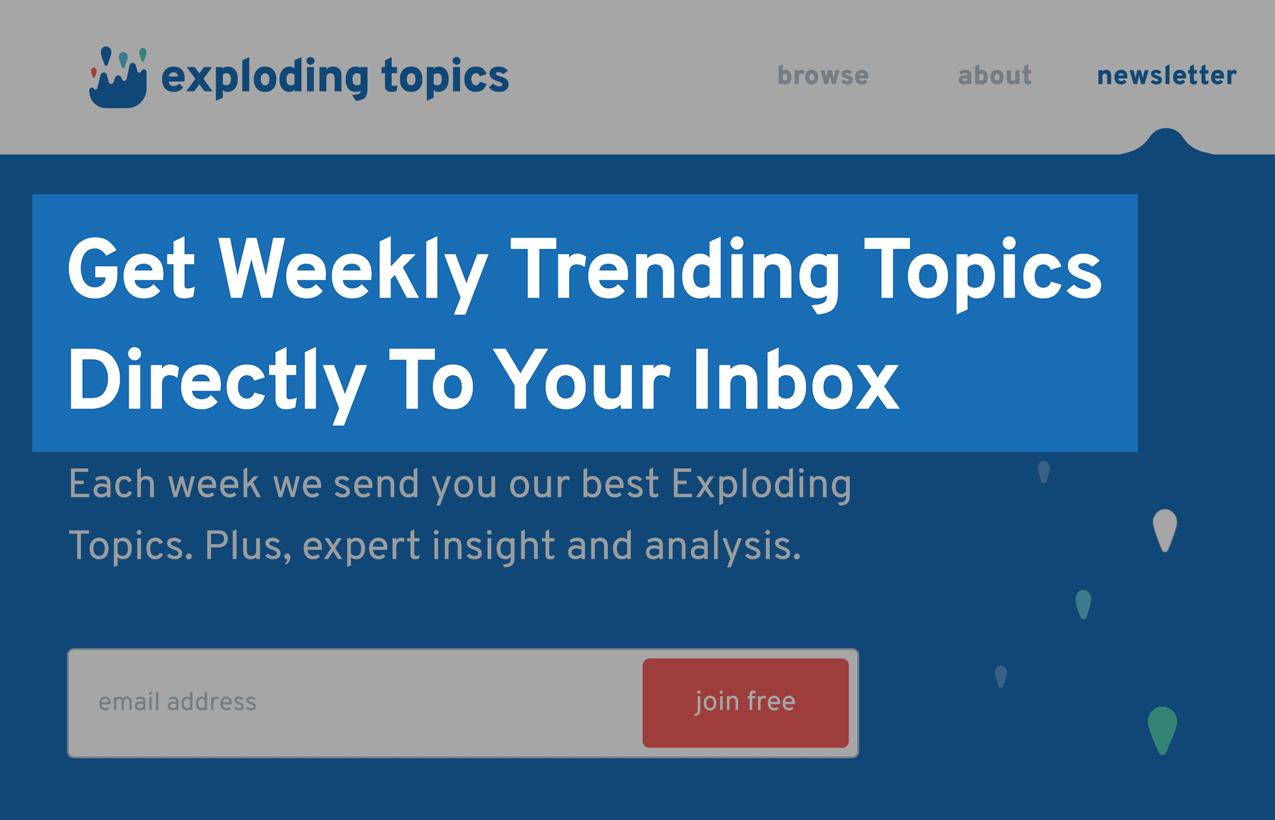
Explodingtopics – Newsletter Signup

Detailed Subheadline

Your subheadline is designed to add more details to your offer, including what it is and why it’s valuable.

Here’s an example:
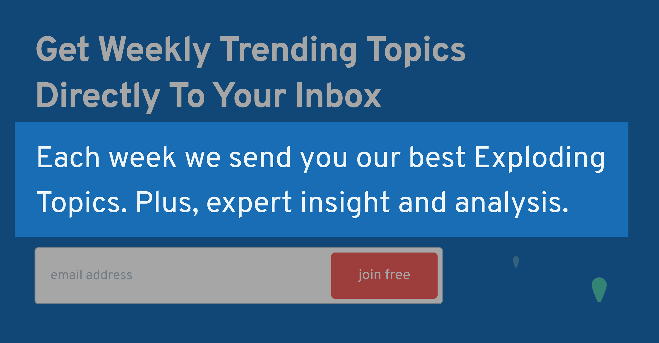
Explodingtopics – Newsletter Signup Subheadline

The headline that we used is a good start. But it’s still not 100% clear what you’ll get when you sign up. Which is where the subheadline comes into play.


Hero Image

Your email signup page should have a “Hero Image” that shows off what they’re going to get.

Remember: an “email course”, “report” or “weekly newsletter” are SUPER hard to picture in your mind.

And your Hero Image makes your offer more tangible and real.
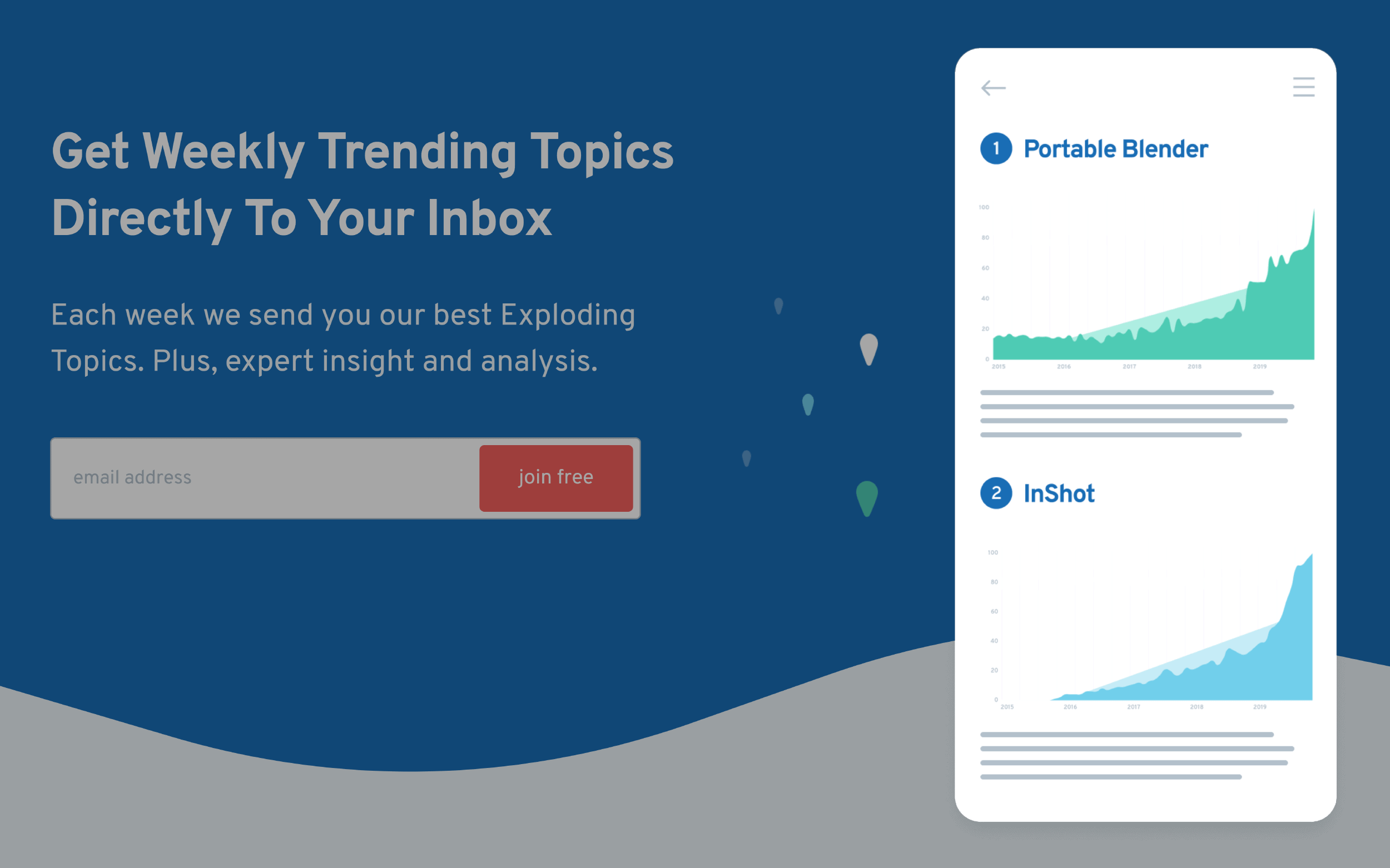
Explodingtopics – Newsletter Signup Hero Image

Above The Fold CTA

I recommend using your first email sign-up form way above the fold, like this:
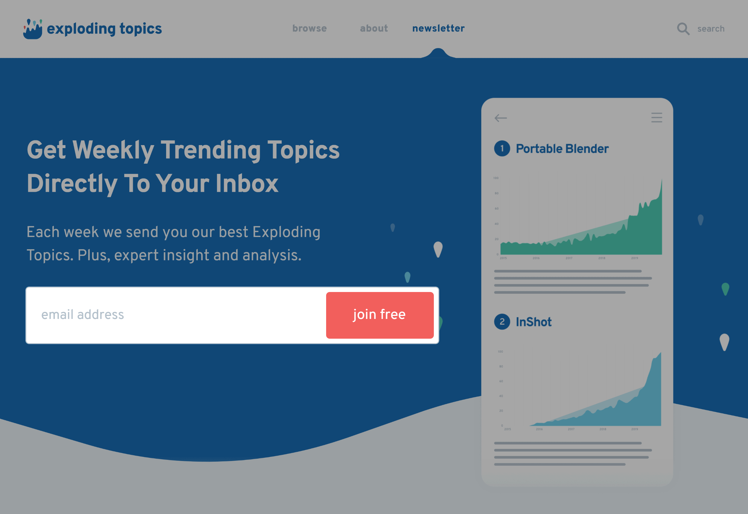
Explodingtopics – Newsletter Form Above The Fold

If your headline and subheadline are strong, the majority of your conversions will come via this form.


Feature List

If someone scrolls down past your first form it means that they need more info before signing up.

Enter: The Feature List.

Here’s where you dive more into why your offer is worth trading for someone’s email address.

The exact list of features depends on what you’re giving away.

If the Squeeze Page is for a webinar, you might have a bulleted list of the top things someone will learn.

If it’s a report, you should outline the strategies that you’ll cover.

If it’s an email newsletter, list out exactly what you’re going to send them.

For example, the Exploding Topics about page has a thorough “How It Works” section that walks people through how the newsletter is developed, packaged and sent.


Social Proof

Like any landing page, social proof can help boost your squeeze page conversion rate.

This can be the number of people that have already signed up.
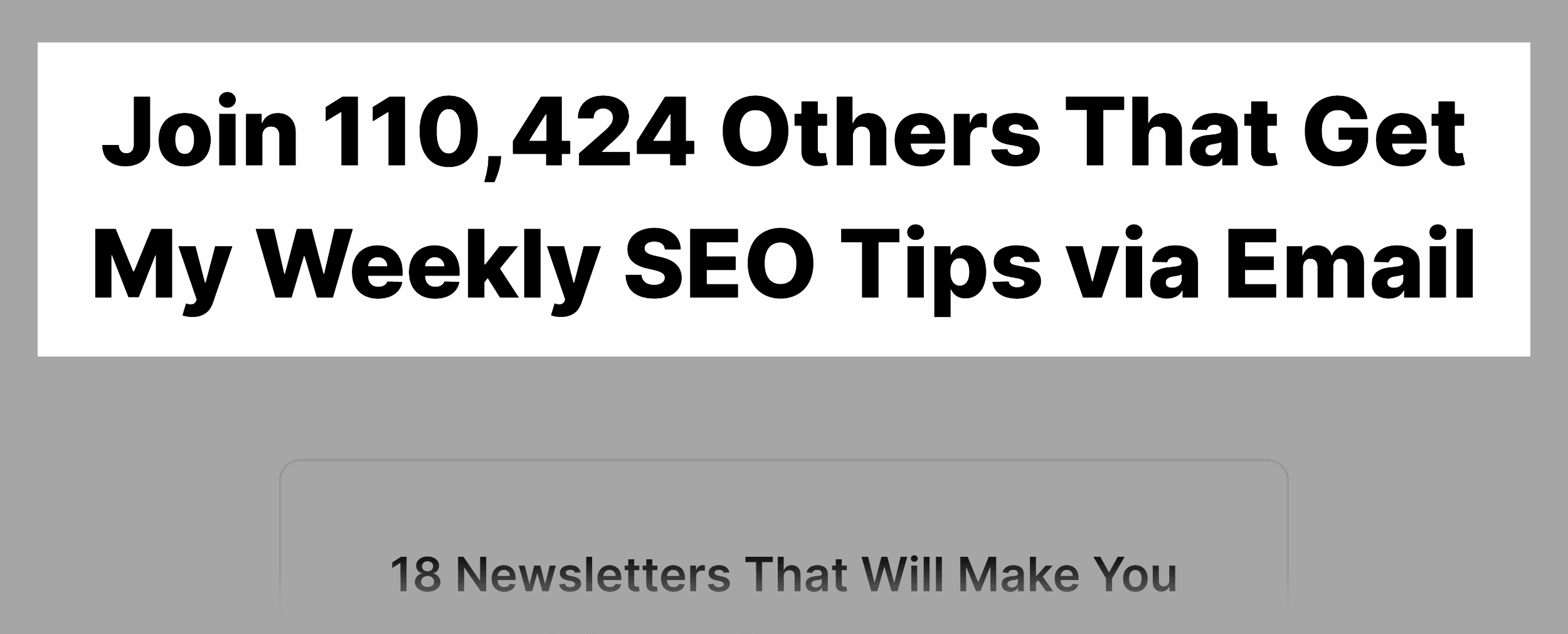
Backlinko – Newsletter Subscribers

Or testimonials from a handful of happy subscribers.
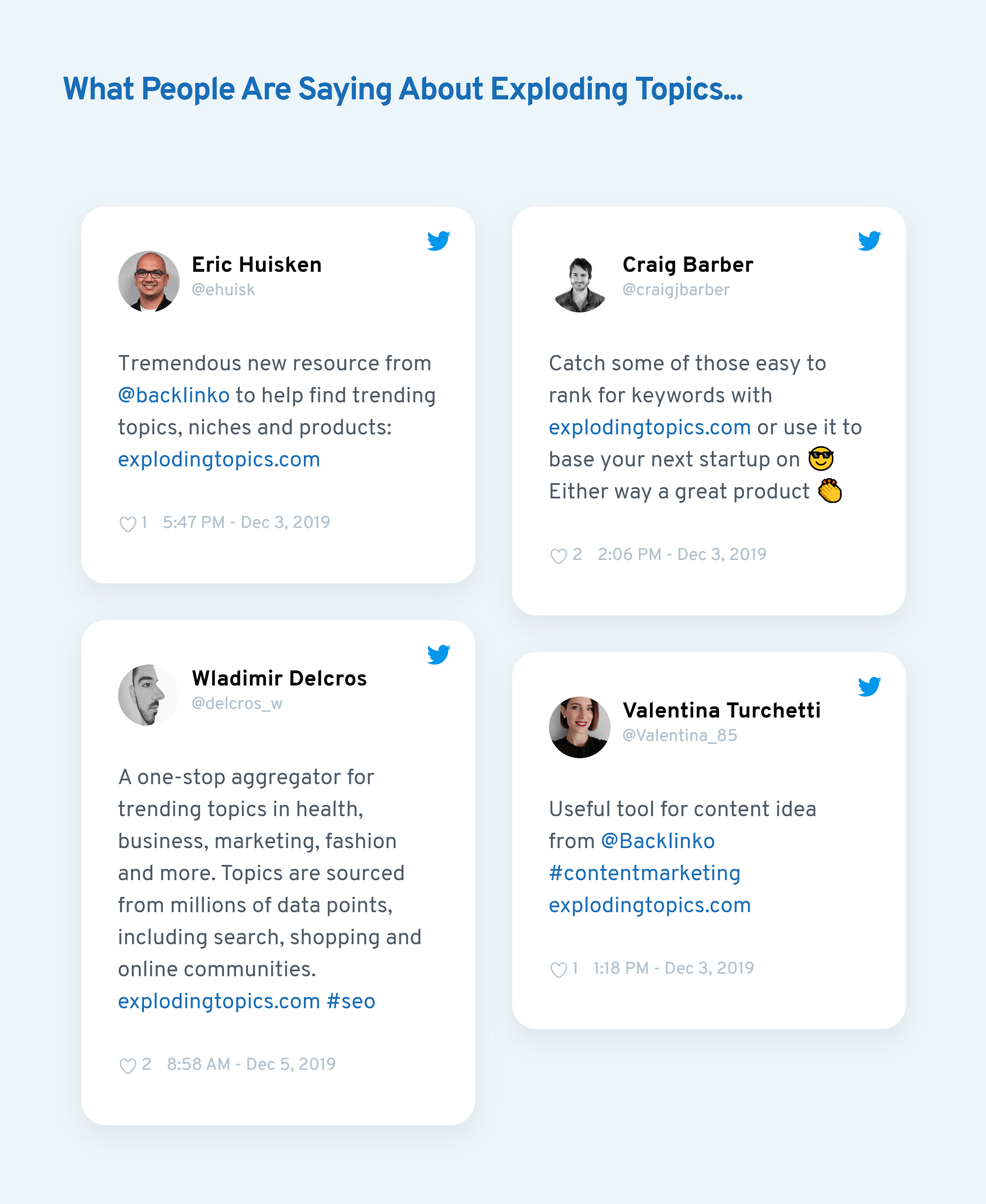
Explodingtopics – Social Proof

Second CTA

I recommend adding a second CTA at the very bottom of your page.
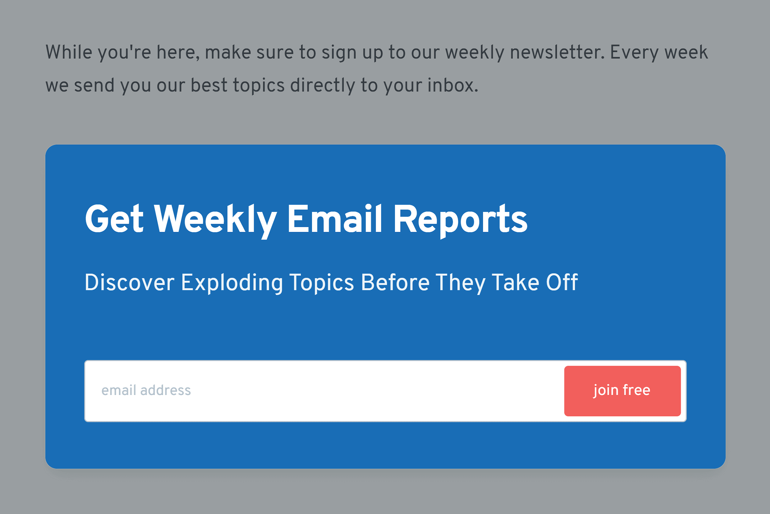
Explodingtopics – Second CTA

That way, your visitor ends their scrolling directly on top of a CTA button and signup form.

Sales Page Template

Here’s a template that you can use to sell online courses, one-on-one training, premium newsletter subscriptions, live event tickets and more.

Sales Page Template

Headline=Clear Benefit

The single goal of your sales page headline is to grab someone’s attention with a CLEAR benefit.

Here’s an example from one of my long-form sales letters:
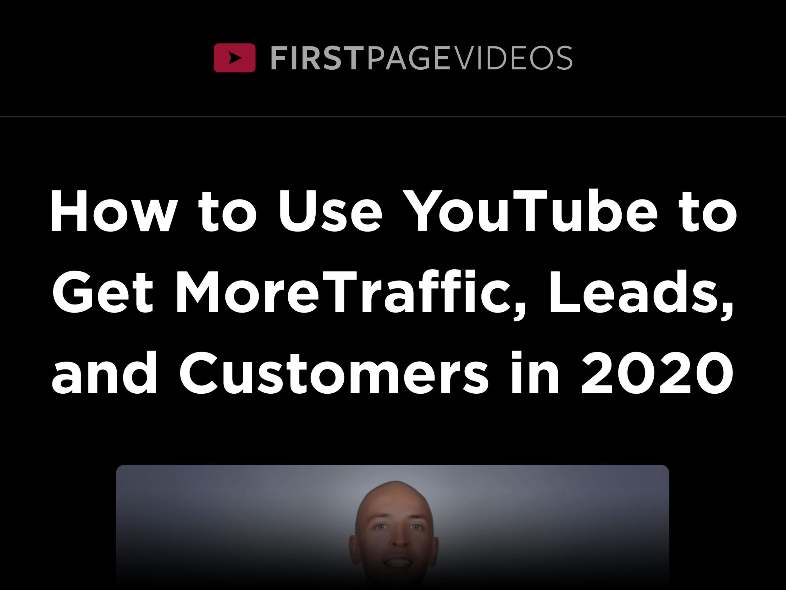
Firstpagevideos – Sales Page Headline

If you’re at all interested in YouTube marketing, that’s the kind of headline that makes you want to stay on the page and learn more.


The First Paragraph Hook

Follow up your benefit-driven headline with a hook in the first few lines of your sales page.

Here’s an example:

Firstpagevideos – Sales Page Hook

Again, this is pretty “salesy”. But we’re targeting a specific person (small business owners that are serious about marketing their business on YouTube). Which is why this hook works despite coming on stronger than most leads.


The Background Story

Here’s where you tell the story behind your product: the problem you have, how you solved it, and why you decided to offer this particular product.
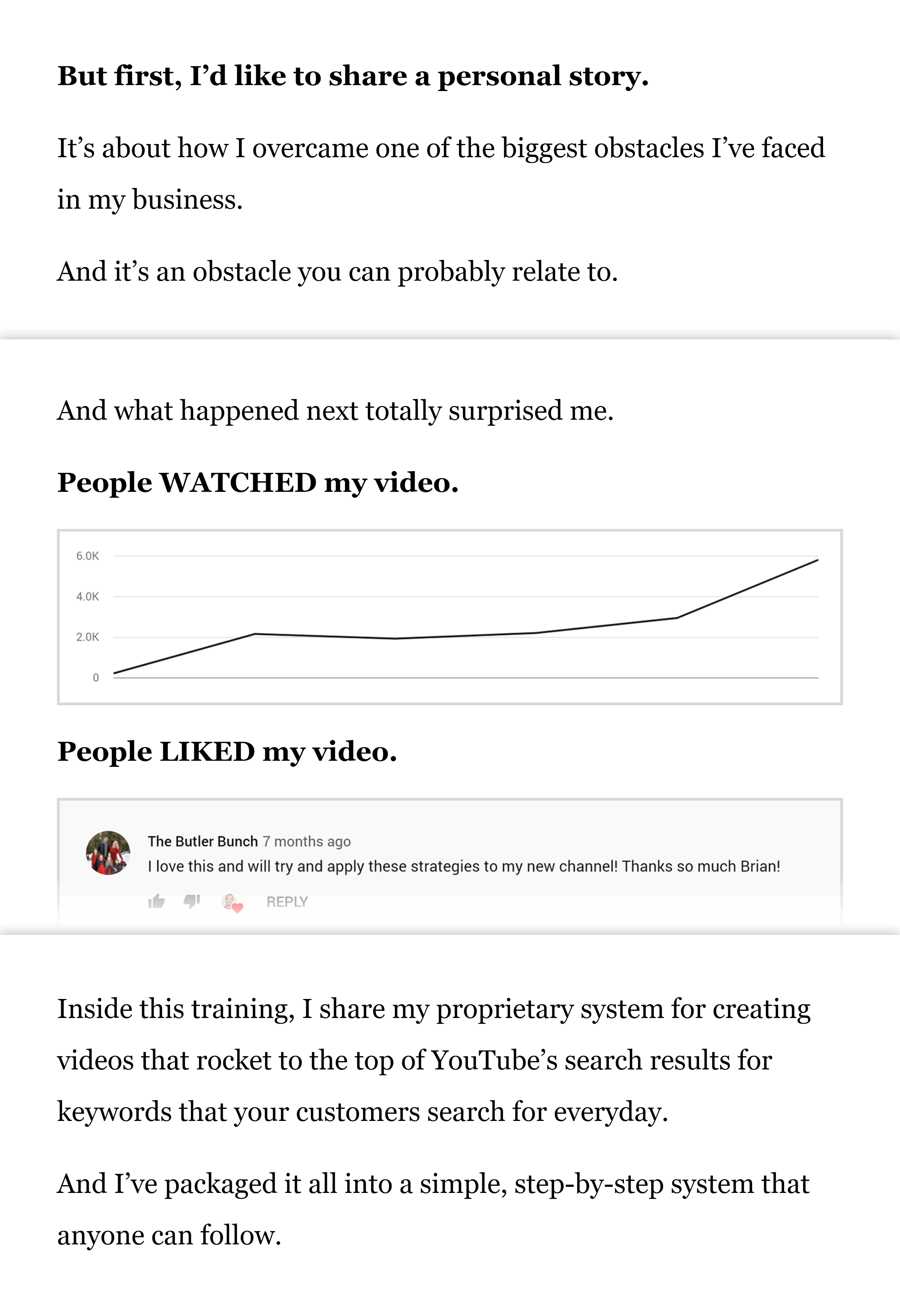
Firstpagevideos – Sales Page Story

The Big Reveal

Here’s where you introduce your product… and list out what’s included.
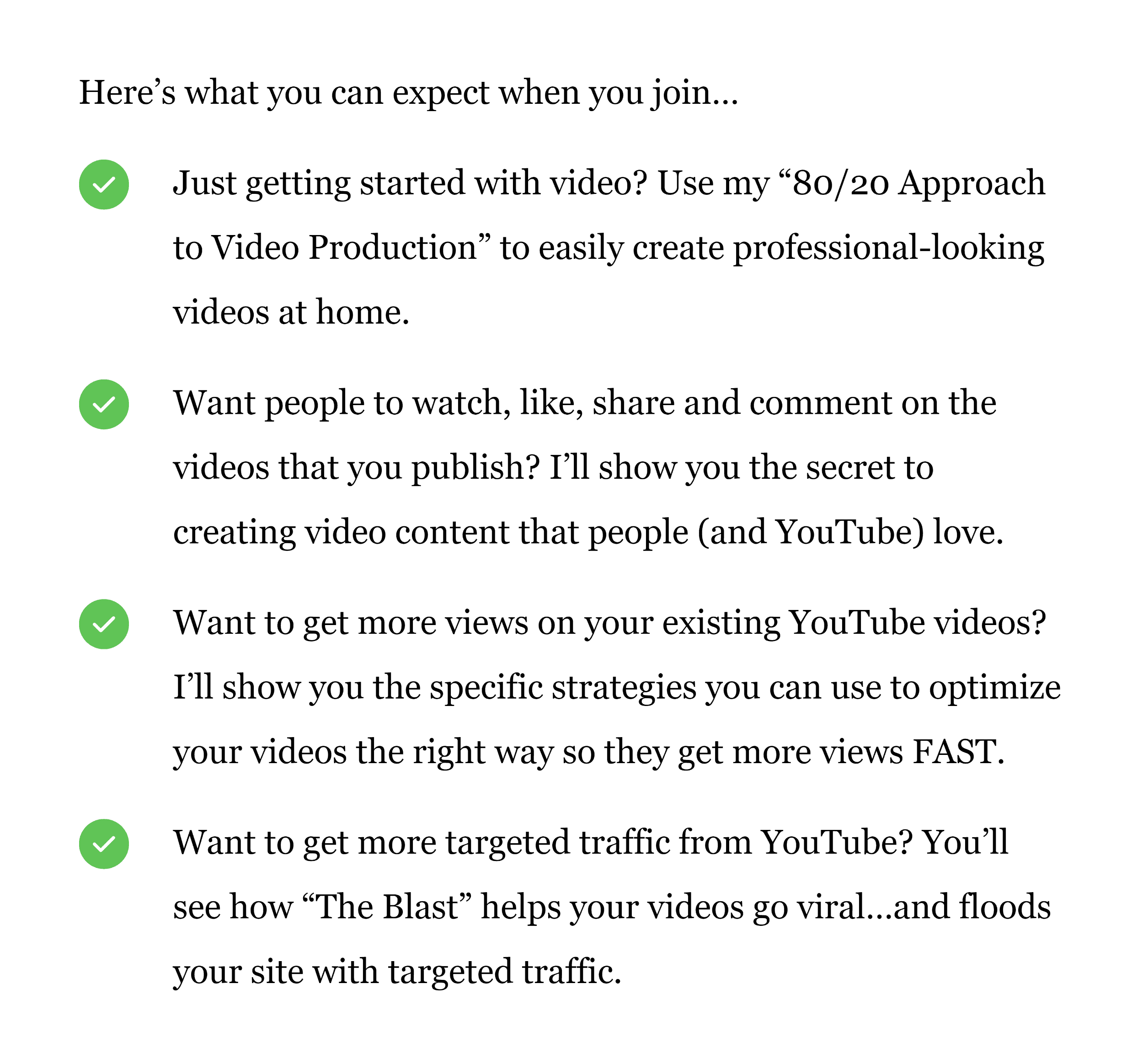
Firstpagevideos – Sales Page Product Info

Customer Testimonials

You want to sprinkle these throughout your sales page.
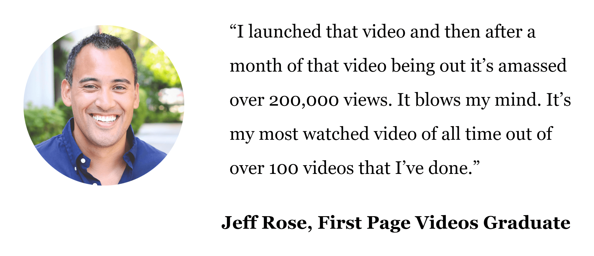
Firstpagevideos – Sales Page Testimonial

Buy Now CTA

You want to have at least two clear “buy now” CTAs on your sales page.


Solid Guarantee

Outline what your guarantee is and any restrictions you have (like a 30-day window).

Don’t skimp over this section. It’s one of the most important parts of your sales page. So I recommend writing a long, detailed outline of your guarantee.

For example, the guarantee section on one of our sales pages is 228 words long.
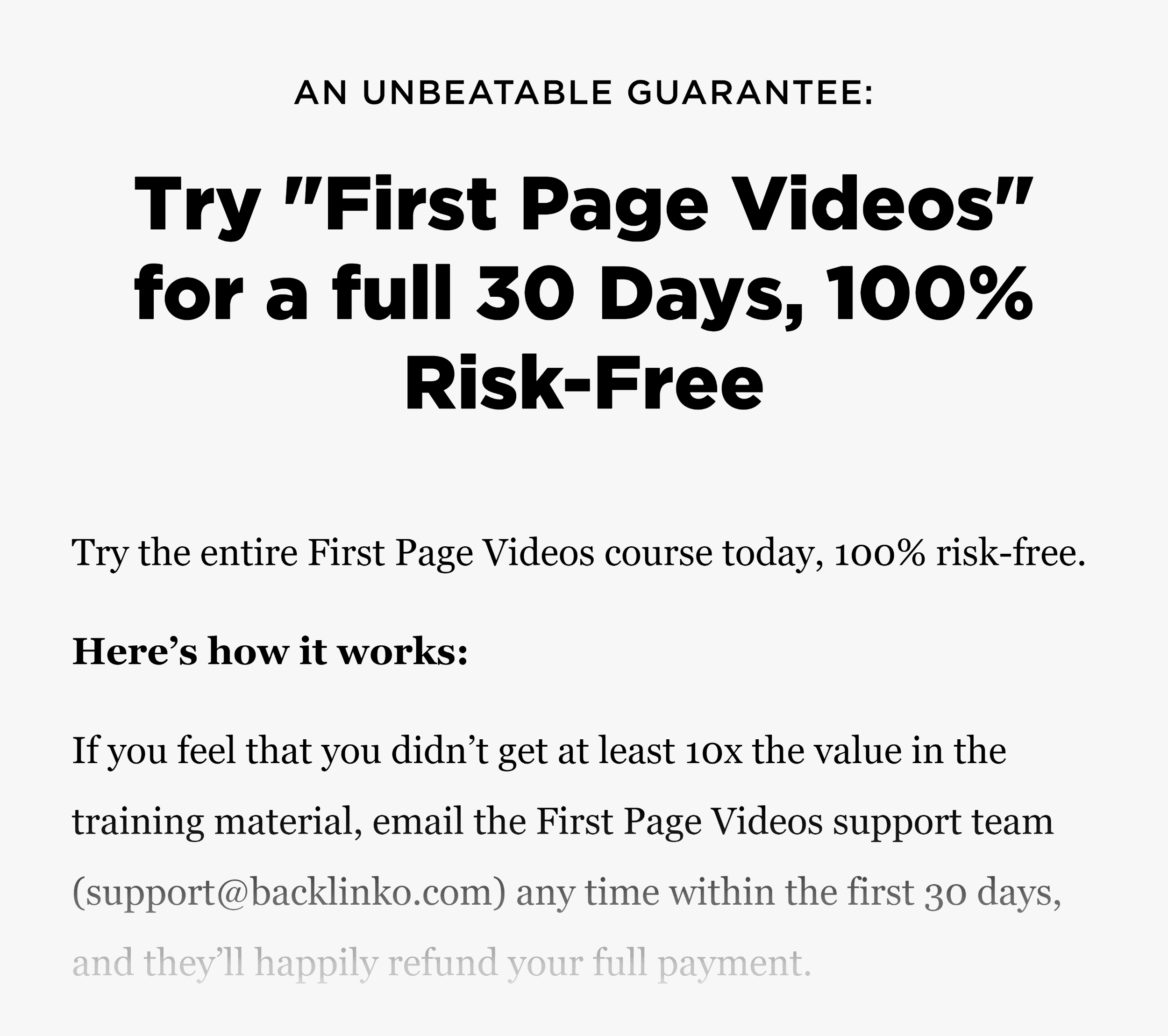
Firstpagevideos – Sales Page Guarantee

SaaS Free Trial Page Template

The main goal of your SaaS Free Trial landing page is to get someone into your sign up flow.

This is a little bit different than a Squeeze Page. With a Squeeze Page, the conversion actually happens right there on the page. But with a SaaS page, you usually push them towards another page where they actually sign up.

With that, here’s the template:

SaaS Free Trial Page Template

Plain English Headline

This is something a lot of B2B SaaS companies struggle with. Instead of a straightforward headline, they write some nonsense like this.

Landing Page With A Nonsense Headline

Instead, I recommend a straightforward headline, like this one from Help Scout.

Helpscout Headline

“What We Do”

You just established a clear benefit. Now it’s time for you to give a high-level overview of how your software gets people there.
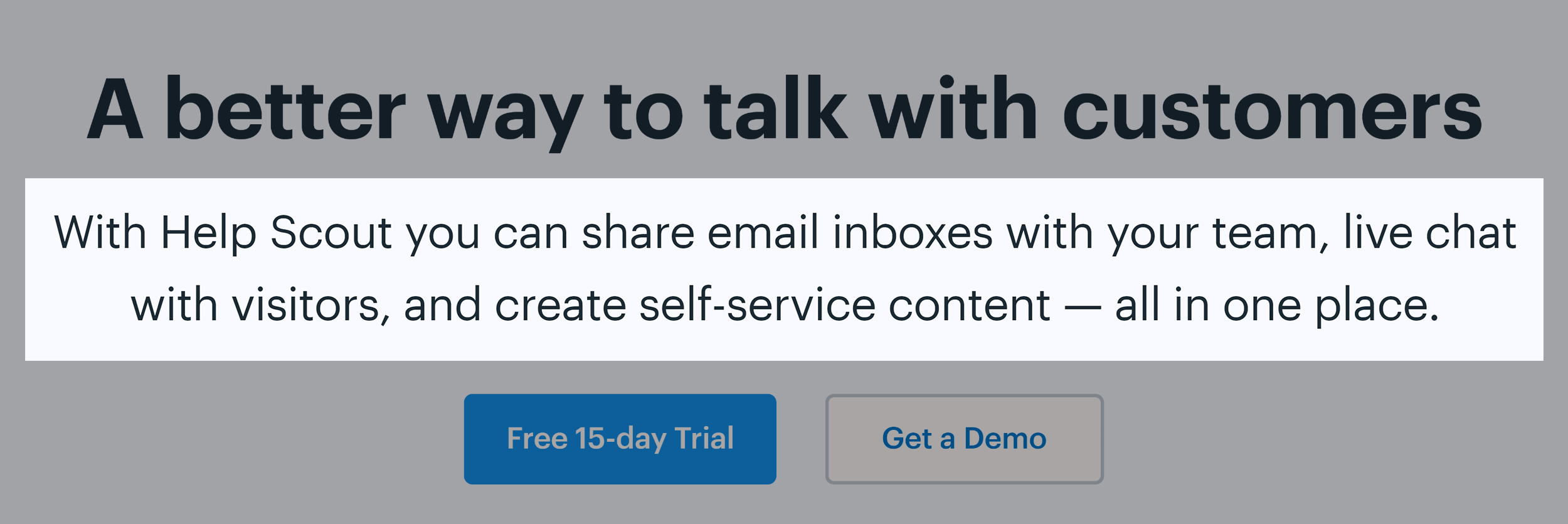
Helpscout – What We Do

Concept Hero Image

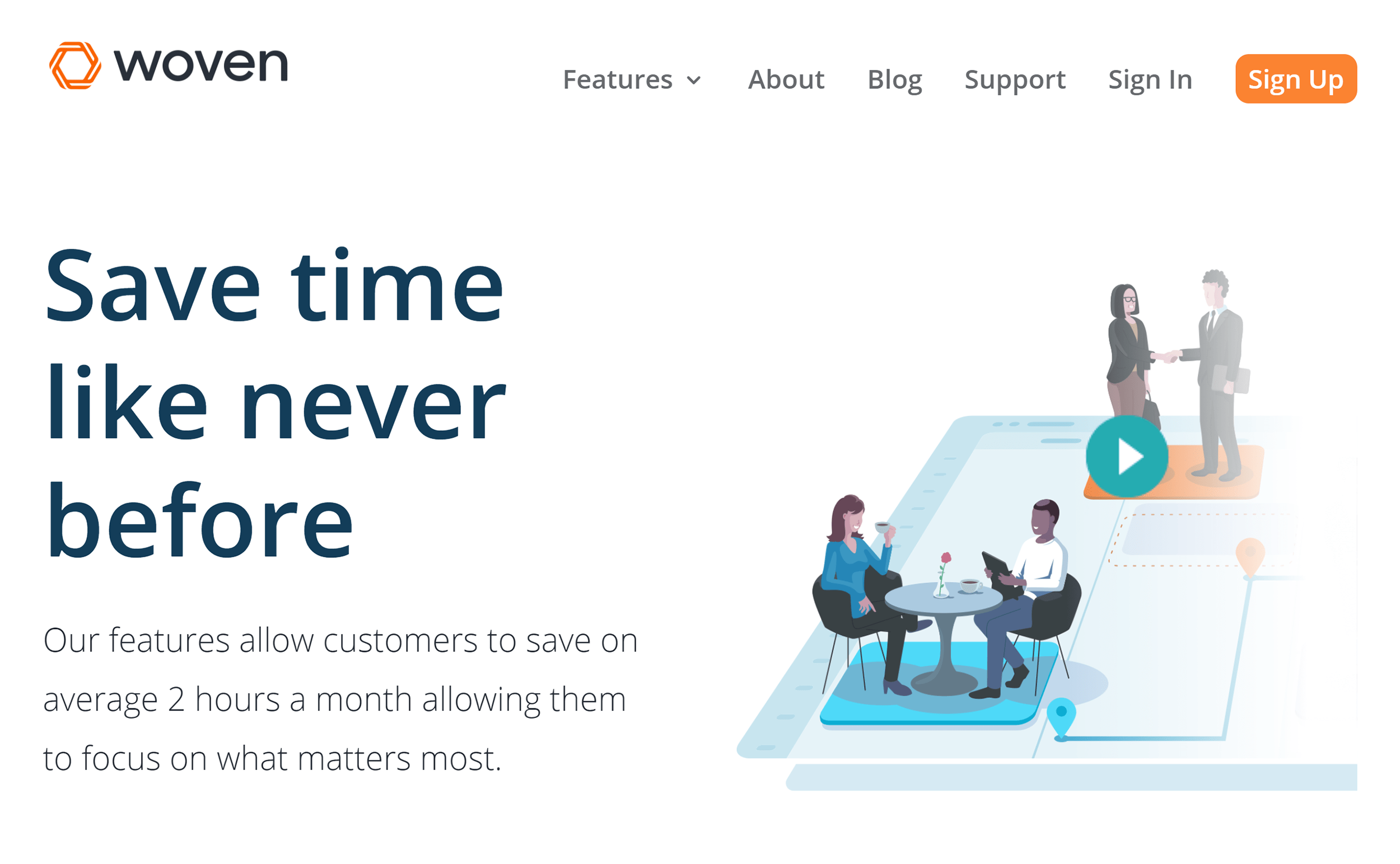
Back in the day, SaaS companies would use a screenshot of their software for their hero image. And this can still work.

The issue with that approach is that it’s tough to understand what the software does based on a screenshot.

Which is why many SaaS companies opt for illustrations that show what the software actually does for people.

For example, Woven’s hero image shows groups of people meeting up.
Woven – Hero Image

Get Started CTA

This is an above the fold button that usually takes people to a signup page.


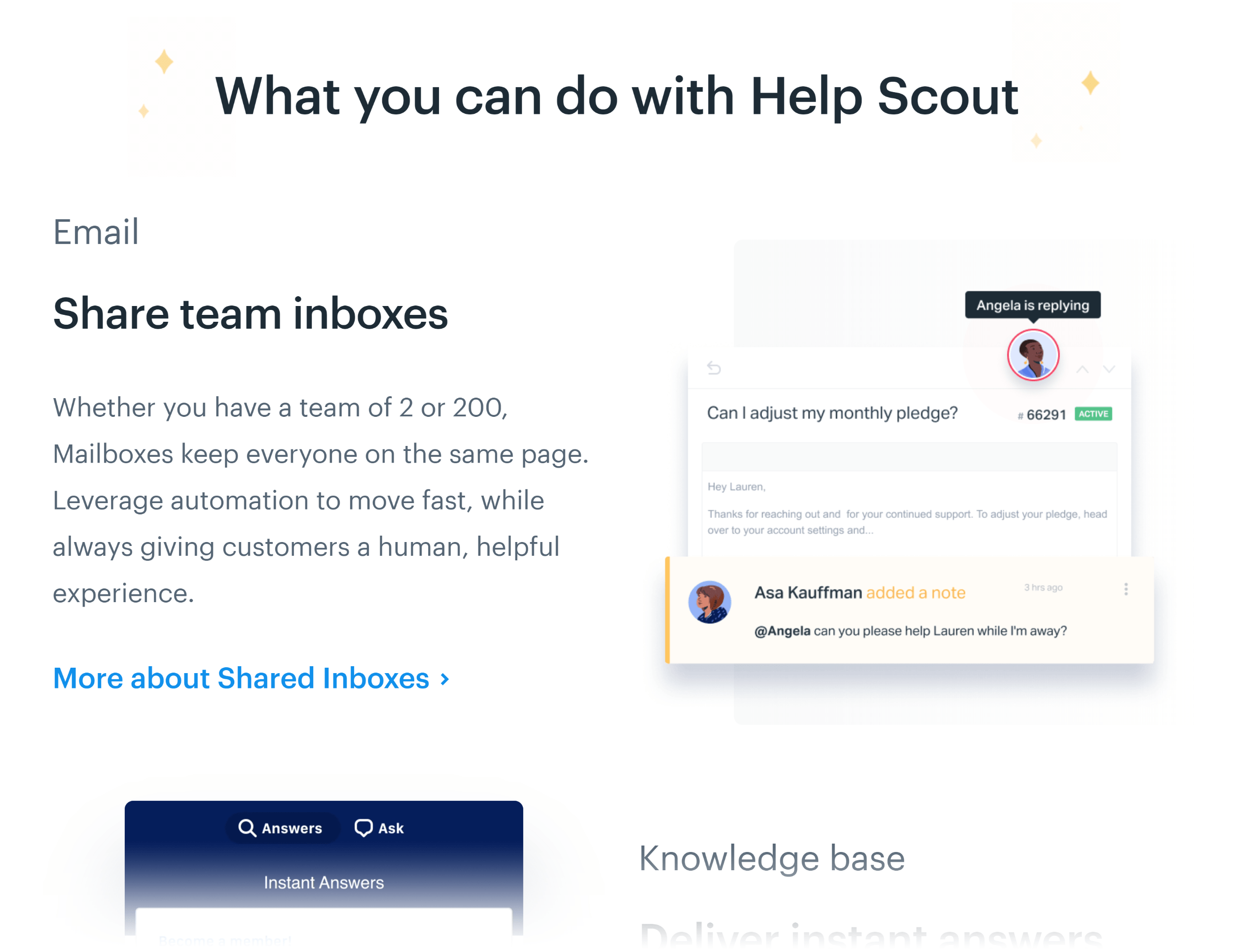
Feature List

Nothing fancy here. Just a list of 4-5 of your software’s best features (and benefits).
Helpscout – Features

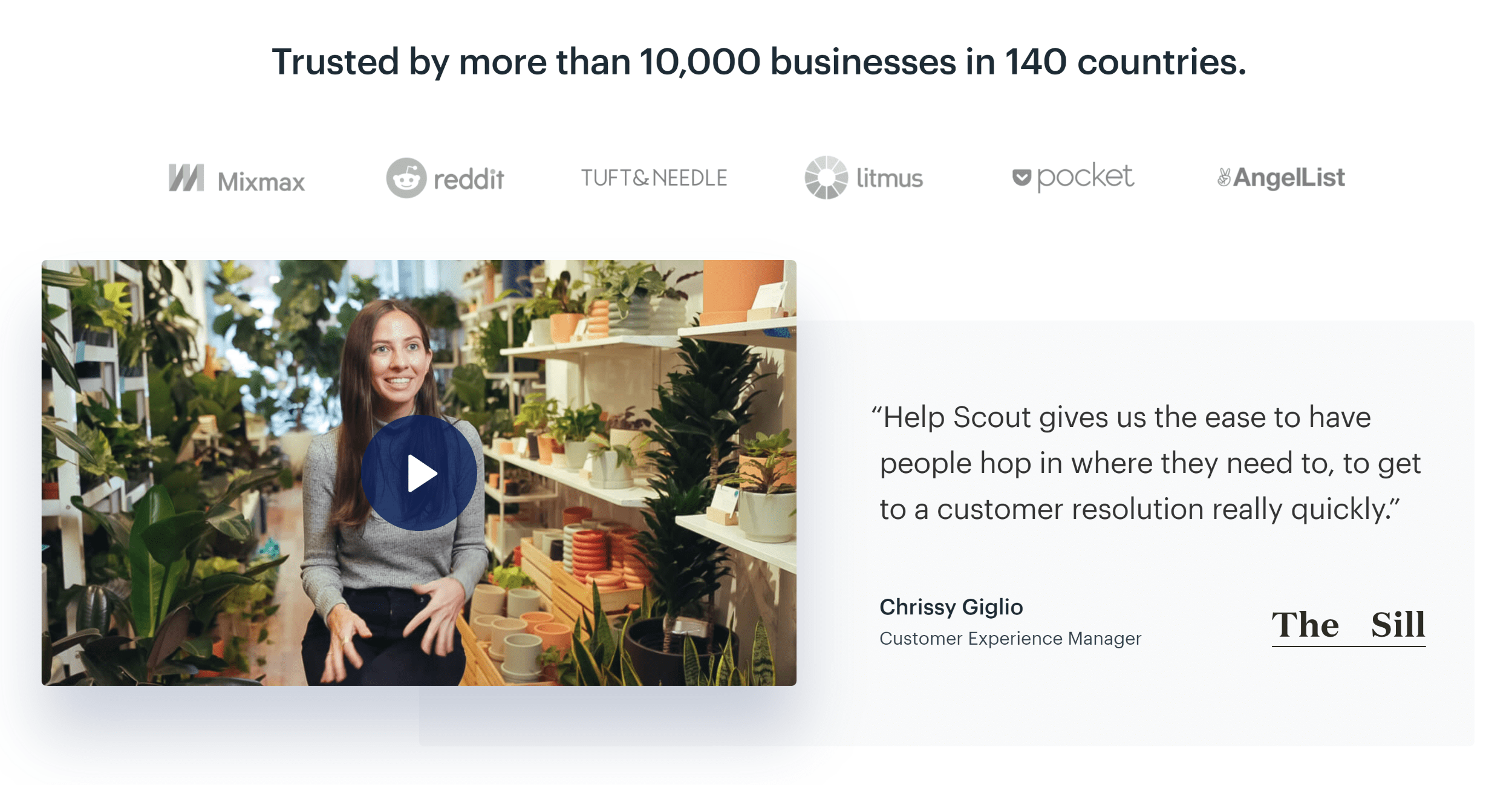
Social Proof

This can be a customer testimonial, number of customers, big name businesses that use your product, or all three.
Helpscout – Social Proof

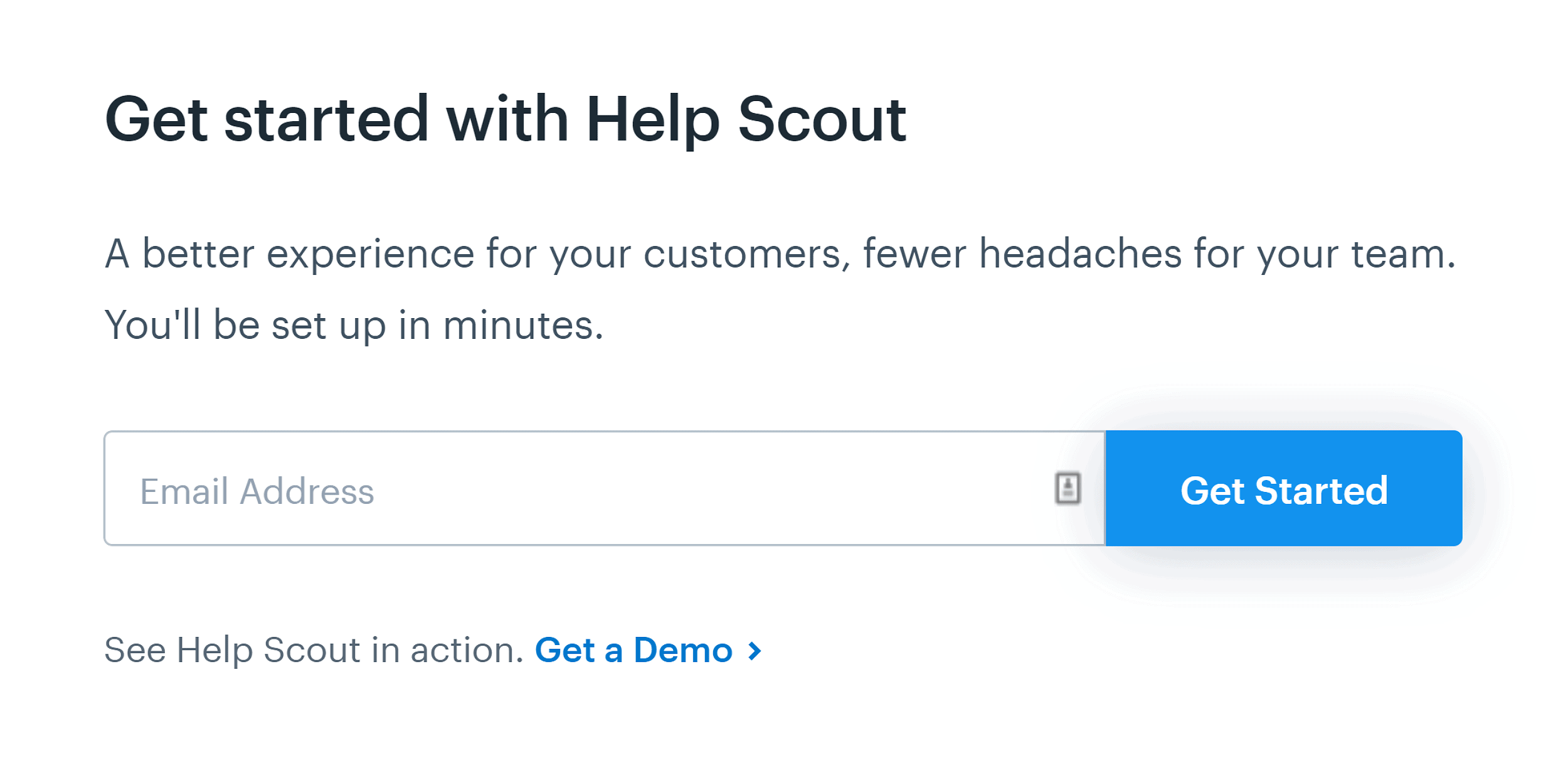
Final CTA

It never hurts to add a CTA to the bottom of your landing page.
Helpscout – CTA

Lead Gen Page Template

A lead gen landing page is similar to an email signup page, with two major differences:

  1. A lead gen page usually asks for more info (to qualify prospects)
  2. Leads usually get a follow-up phone call or email soon after signing up

With that, here’s how to structure a lead-generation landing page.

Lead Gen Page Template

Headline=Benefit-Oriented Offer

Remember: with a lead gen page you’re not just asking for someone’s email.

You’re also asking someone to fork over their name, address… and sometimes even their phone number.

So whatever you’re offering (whether it’s a quote or lead magnet) better be amazing.

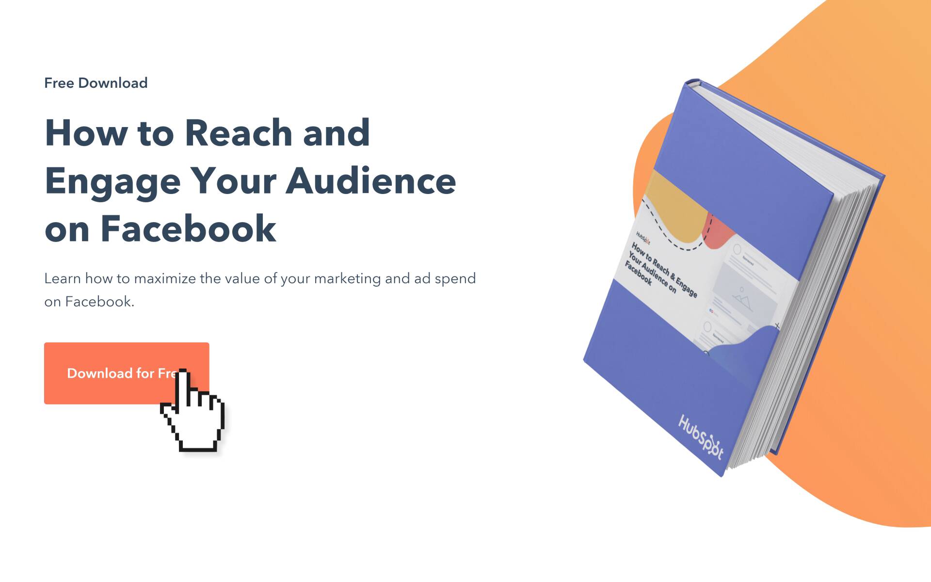
HubSpot might have the world’s best lead gen pages. So let’s take a look at an example from them.
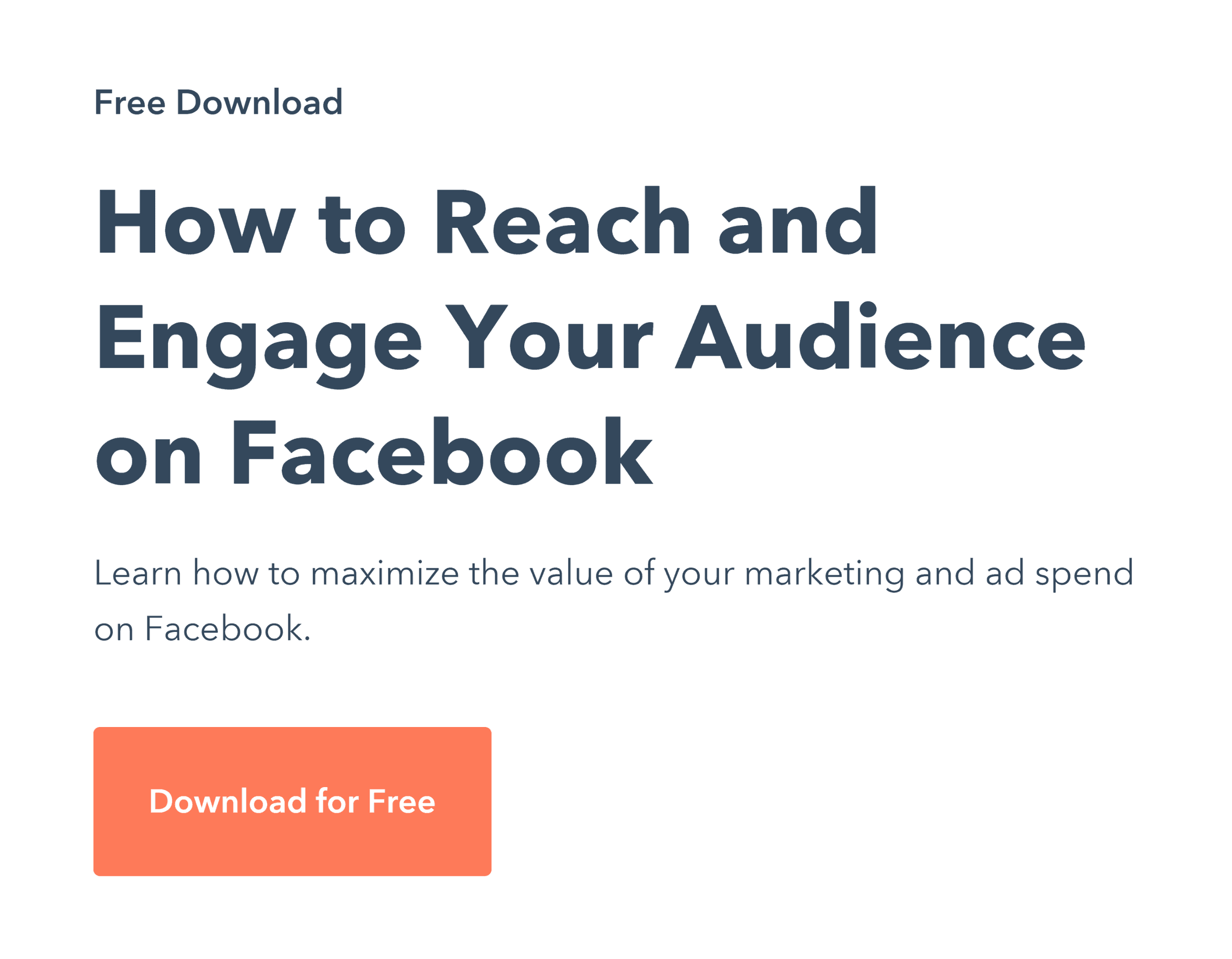
Hubspot – Facebook Offer

That’s a great, straightforward headline. And if they send targeted traffic to that landing page (people that want to learn more about Facebook marketing), this headline is perfect.


Hero Image

Just like with a Squeeze Page, it never hurts to have a visual of what someone’s going to get.
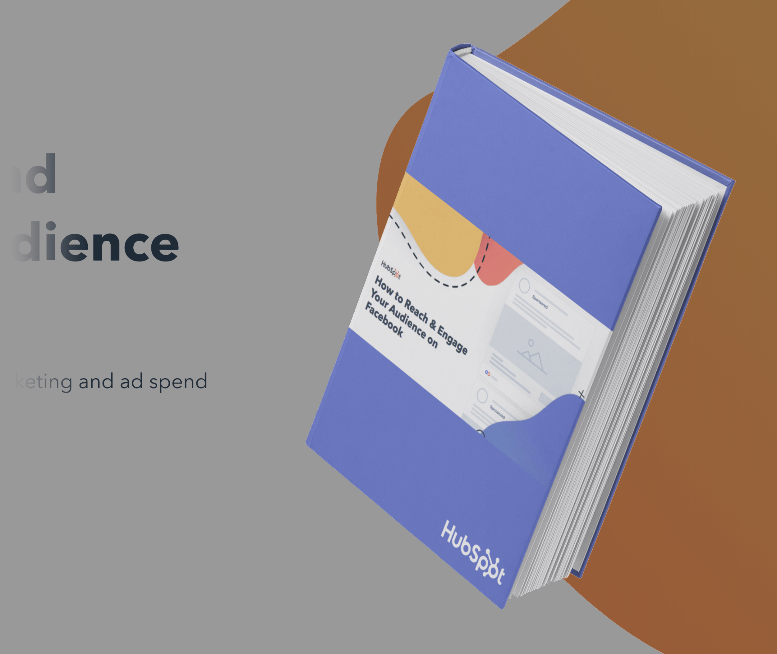
Hubspot – Offer Hero Image

CTA #1

HubSpot uses a “download for free” button as their first CTA.
Hubspot – Offer Download Button

And when you click on that button, a capture form appears with a bunch of fields.

This approach makes total sense. It’s super intimidating to see that many fields on the page. This way, HubSpot is only showing those fields to people that already took an action (clicking on the button). Plus, it takes advantage of The Zeigarnik Effect.


The Key Details

Here’s where you outline a few key details about your offer. A few benefit-oriented bullets work well here.
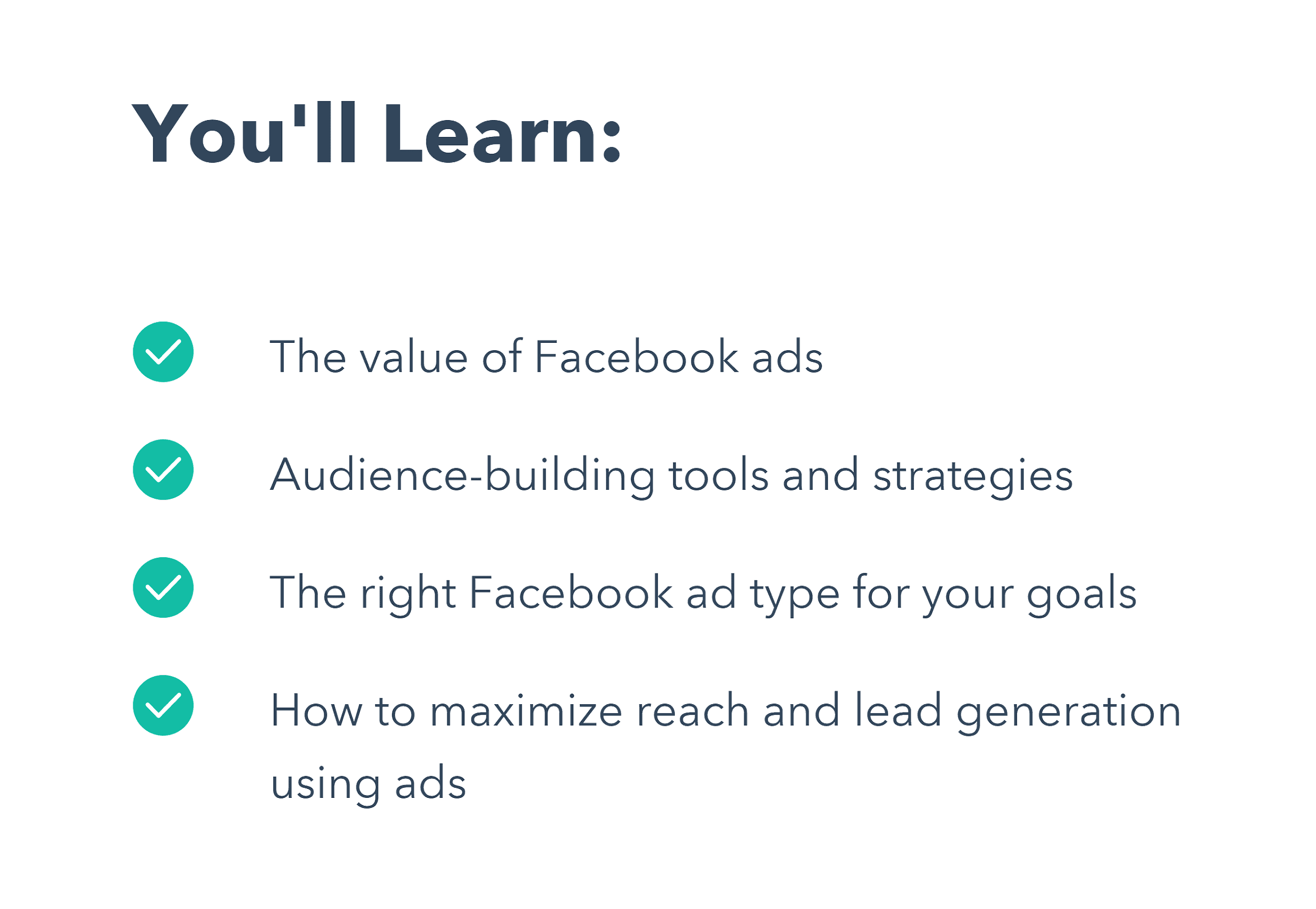
Hubspot – Offer Details

The Fine Print

Because this is a lead gen page, you want to be SUPER transparent about what’s going to happen next.

So if someone’s signing up for a quote to get vinyl siding on their house, you want to let them know that you’re going to give them a ring. That way, there are no surprises.

Here’s an example from HubSpot.
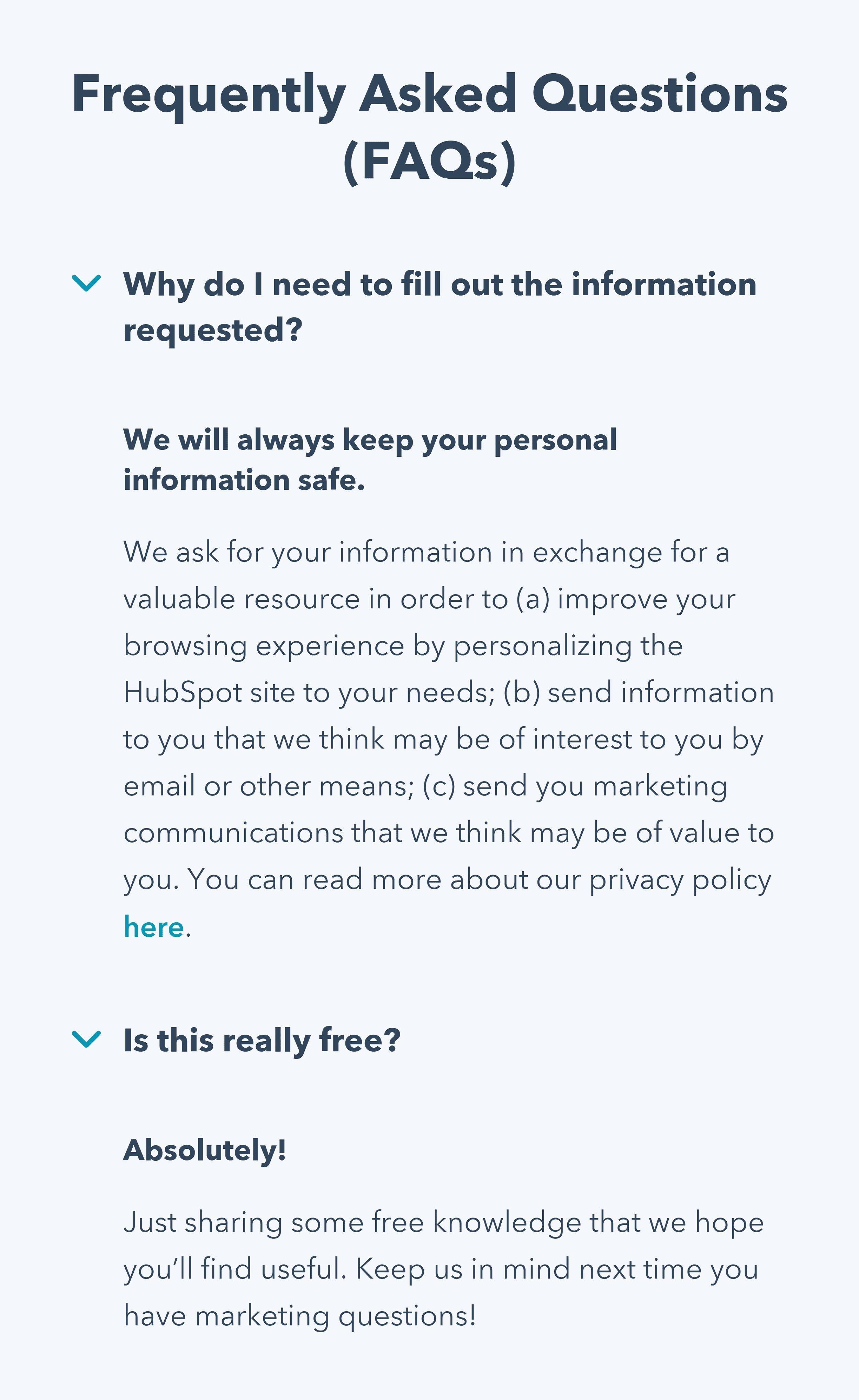
Hubspot – Offer FAQ

The Last Chance CTA

Like any good landing page, you want to have a final CTA at the end of your lead gen page.
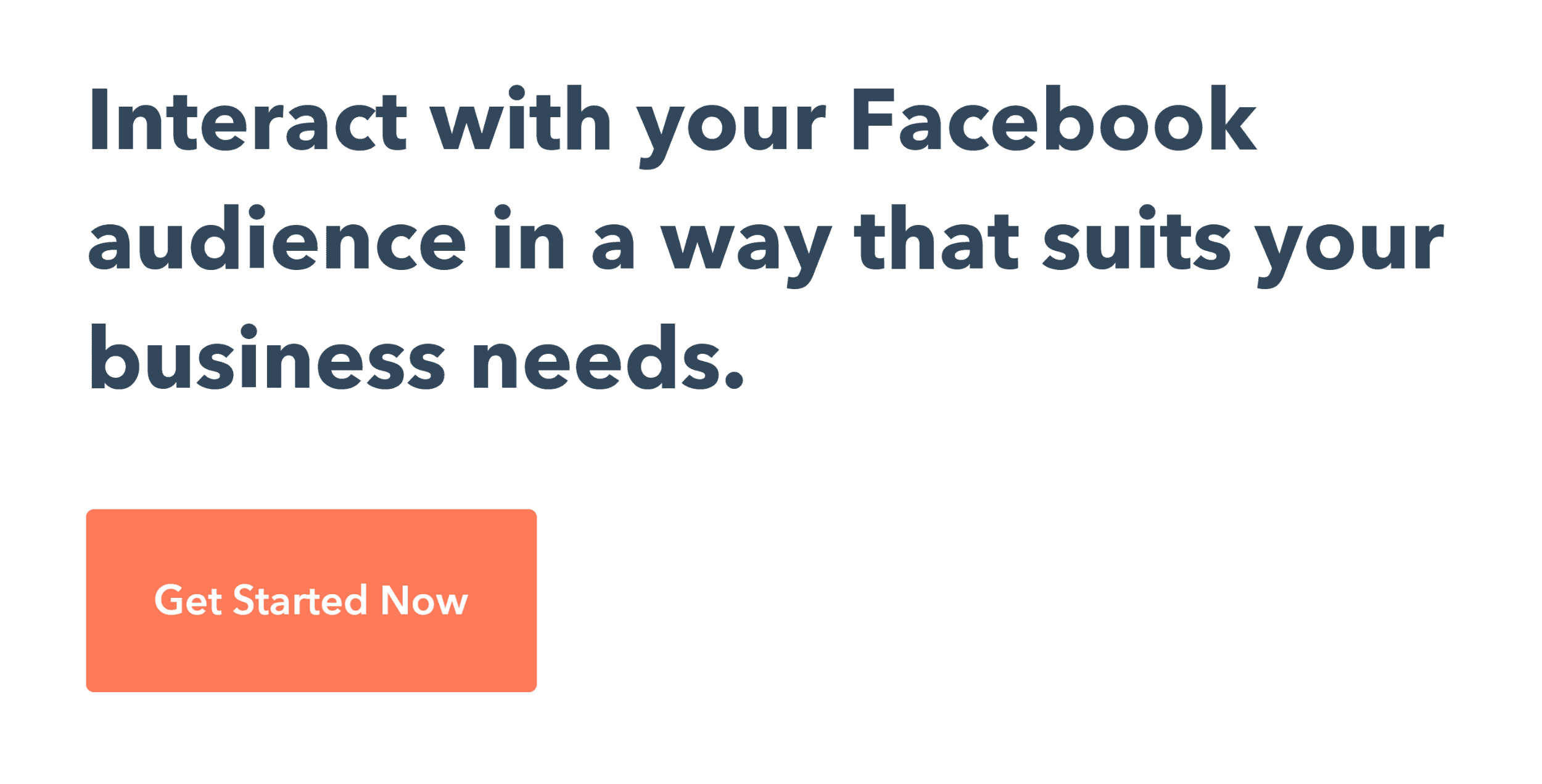
Hubspot – Offer CTA

Chapter 3:Amazing Landing Page Examples

Amazing Landing Page Examples

This chapter is a list of some of my all-time favorite landing pages.

I’ll not only provide you with a bunch of awesome landing page examples, but I’ll
also show you WHY each page works so well.

(And how you can replicate the same approaches on your landing pages).

With that, let’s check out the examples!

SaaS Landing Page Example From Confetti
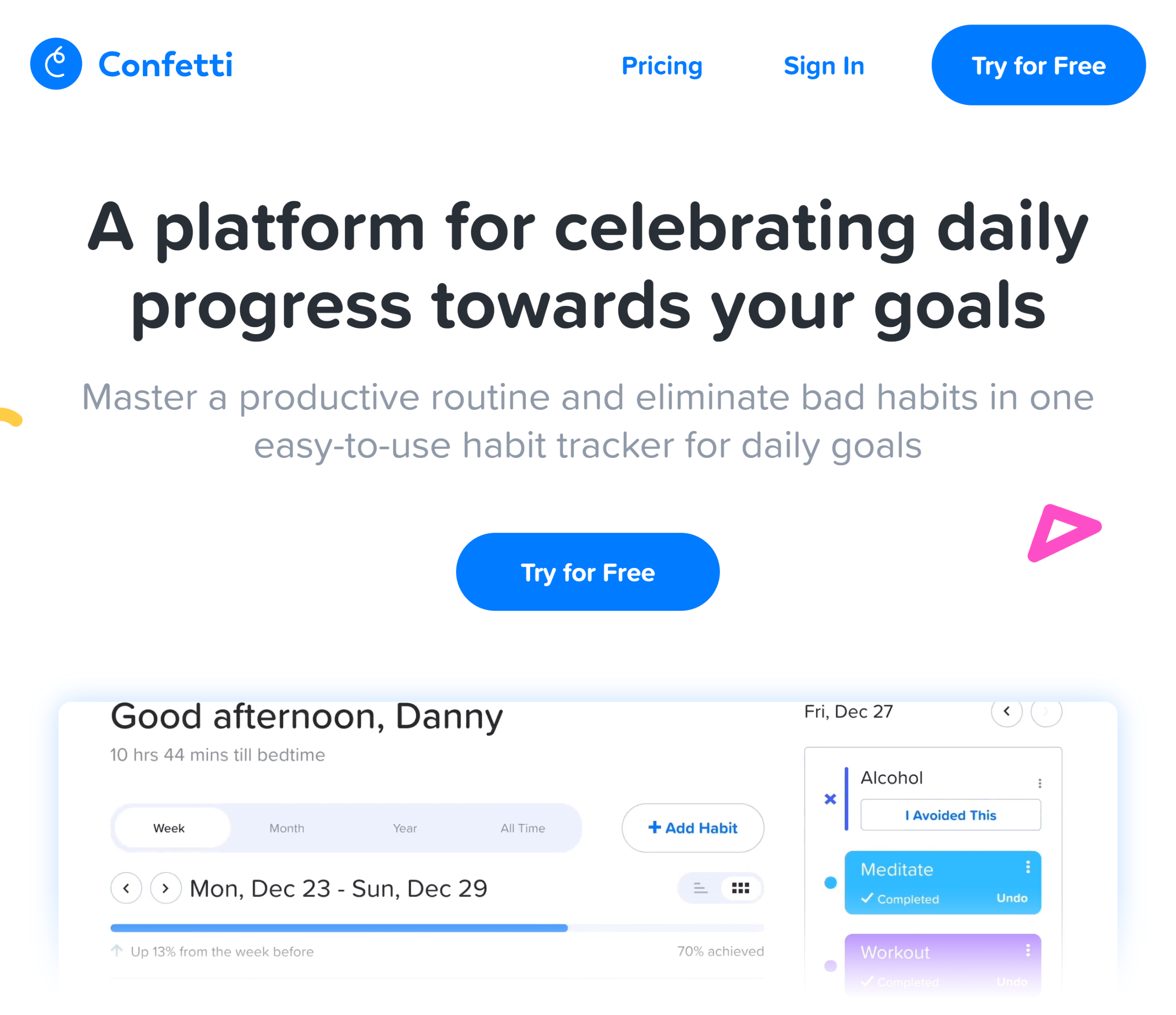
Tryconfetti – Landing Page

Why It’s Awesome:

  • Crystal clear headline
  • Subheadline adds context
  • Multiple CTAs throughout the page

Sales Page Landing Page Example From Nerd Fitness
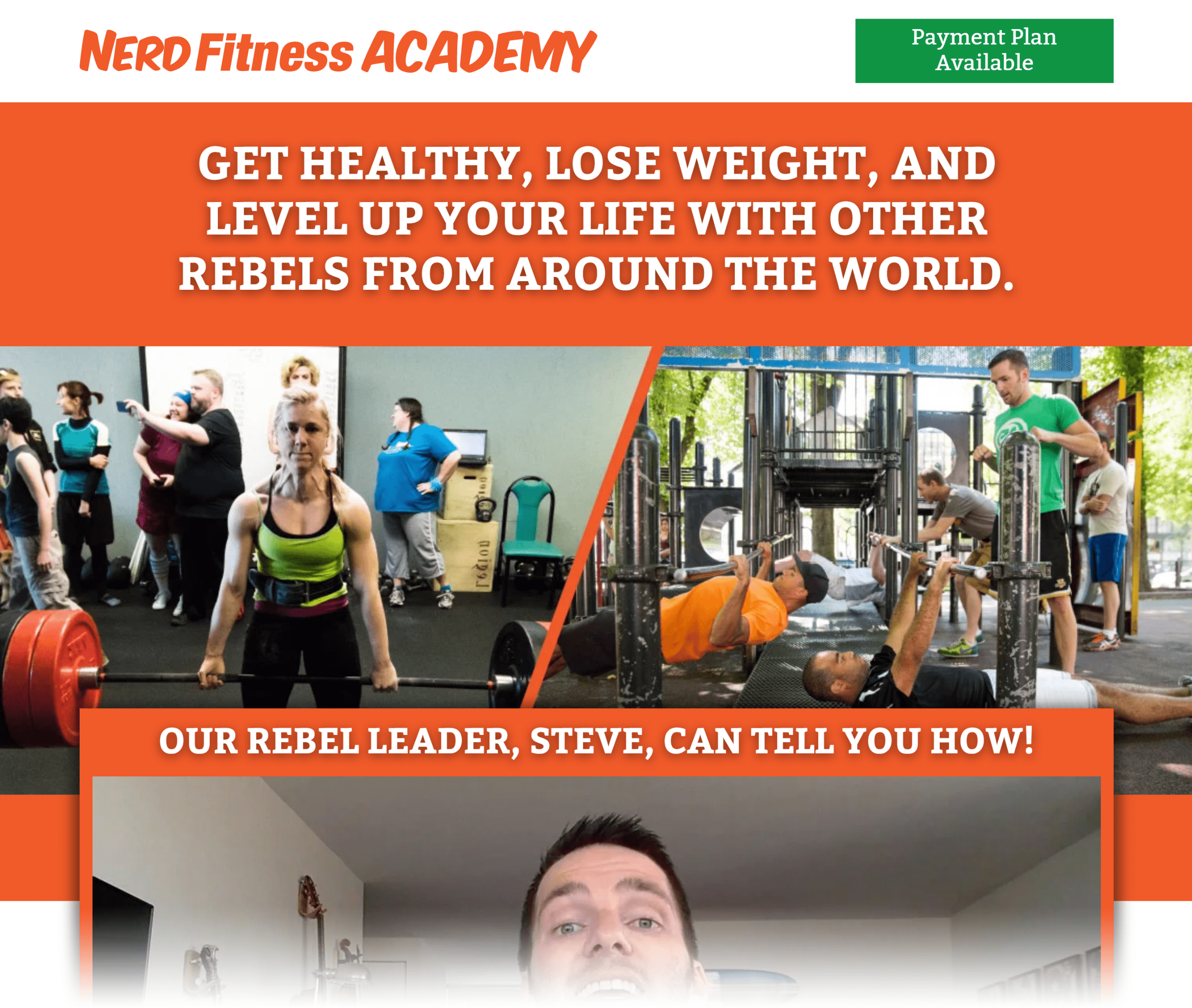
Nerdfitness Academy – Overview Page

Why It’s Awesome:

  • Benefit-packed headline
  • Strong testimonials
  • Compelling risk-reversal

Newsletter Signup Landing Page Example From Ramit Sethi

Ramit Sethi – Landing Page

Why It’s Awesome:

  • Clear and direct call to action
  • Social proof in the form of media mentions
  • No distractions or competing goals

Lead Gen Landing Page Example From Zillow
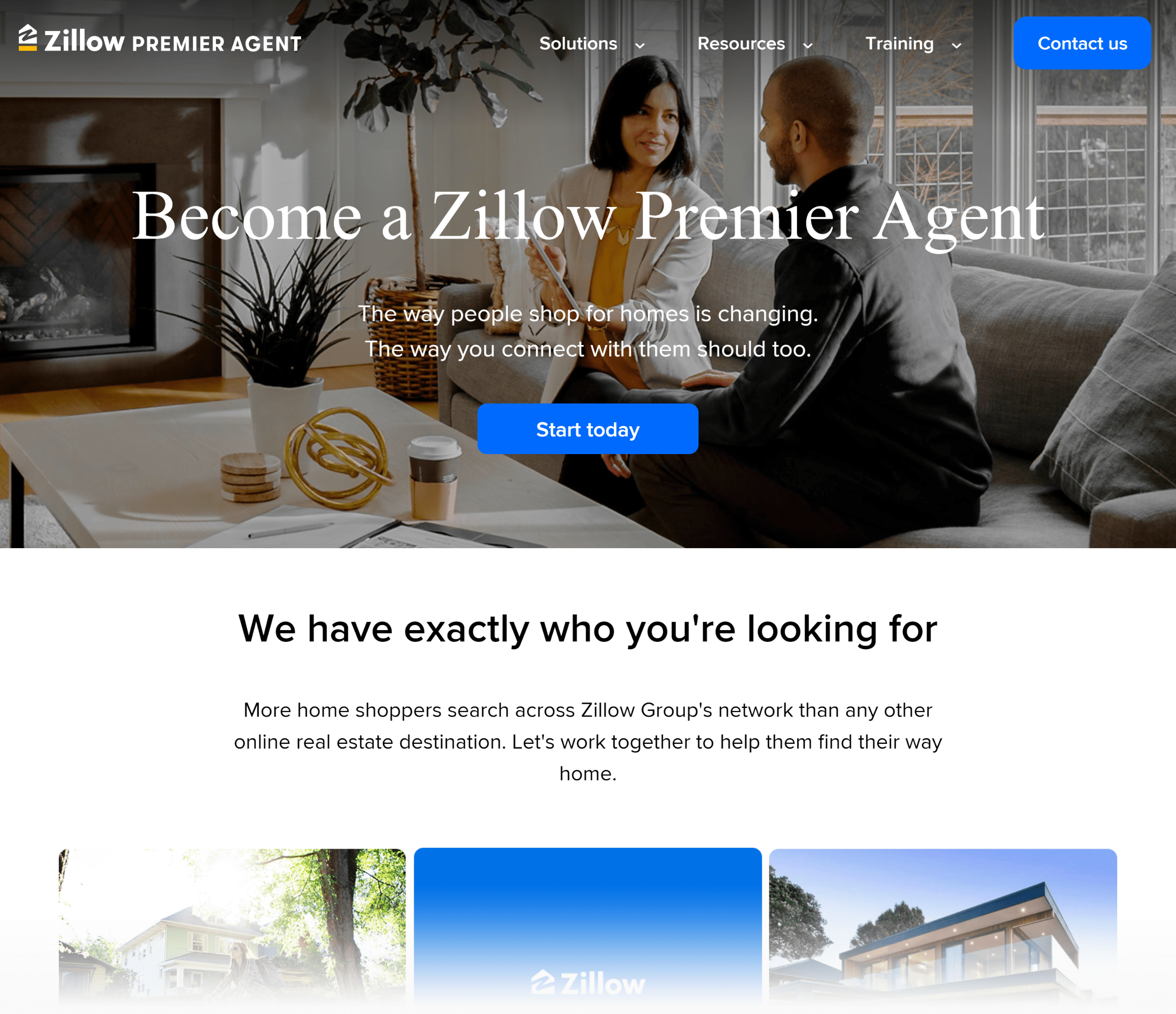
Zillow – Landing Page

Why It’s Awesome:

  • Forms only appear after the user clicks on the “start today” button
  • Nice illustrated “fine print” section
  • Well-curated testimonials

Ecommerce Landing Page Example From Casper
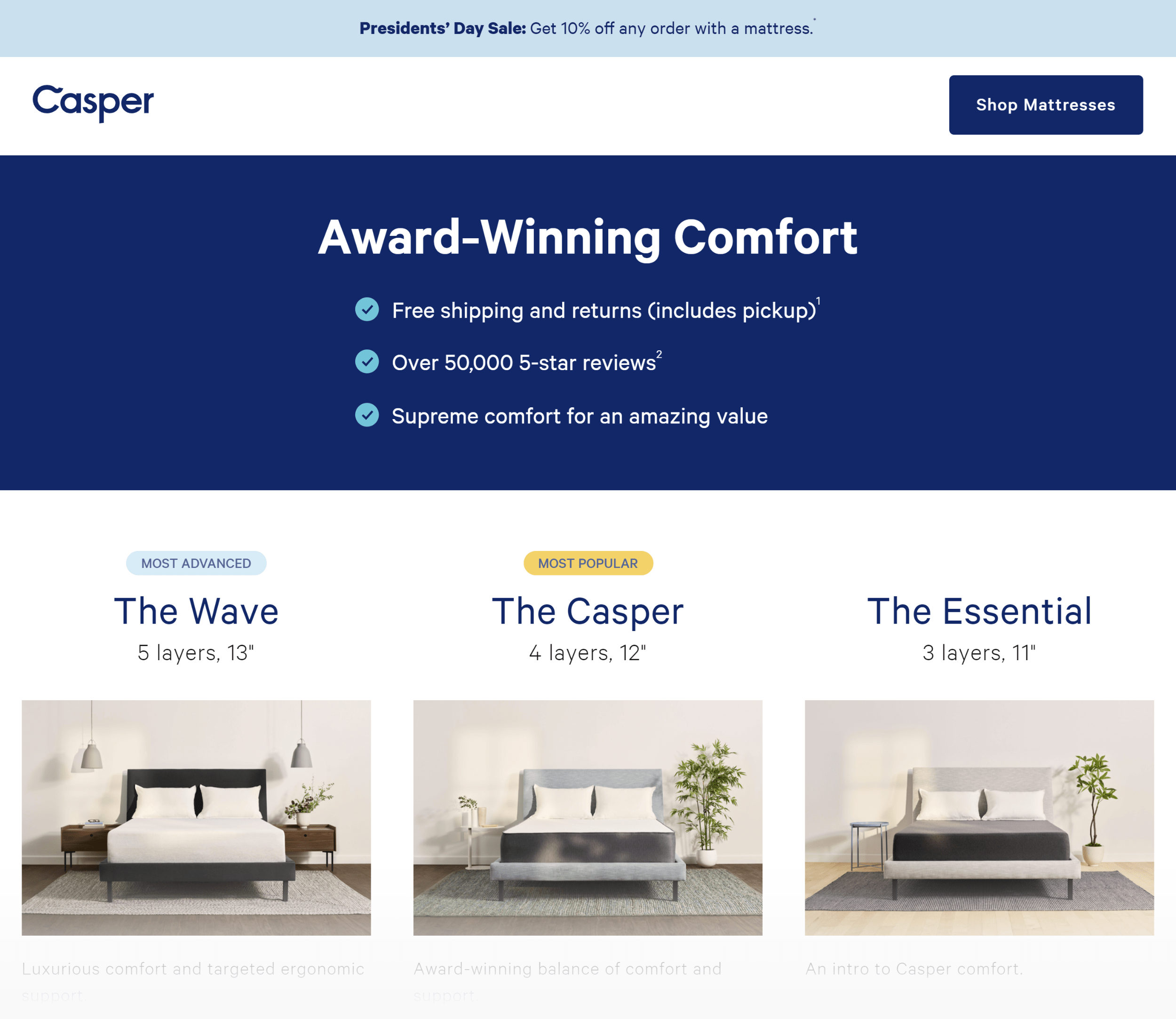
Casper – Ecommerce Landing Page

Why It’s Awesome:

  • Multiple CTAs up and down the page
  • Page is optimized for Facebook traffic
  • Super well written feature list

Chapter 4:How to A/B Test Landing Pages

How To A/B Test Landing Pages

Creating landing pages using the strategies I’ve outlined so far should set you up for a high-converting page.

But you have to test your page in the real world to be sure.

And in this chapter you’re going to learn exactly how to run A/B tests on your landing pages.

Test BIG Changes First

If I could give you one piece of advice for split testing ANY page it would be this:

Test BIG changes. Especially early on.

This is a mistake that I made a lot back in the day.

I’d test a slightly different headline. Or change my button color from red to green. And none of these changes made ANY difference.

That’s when I realized something:

If you want big improvements, you need to make big changes.

For example, my friend Larry Kim used to offer a “free trial” on all of his landing pages.

And no matter how many minor changes he made, the page was stuck at 2%.

So he decided to do something drastic: change the offer.

Instead of a free trial, he offered people an “Adwords Grader”.
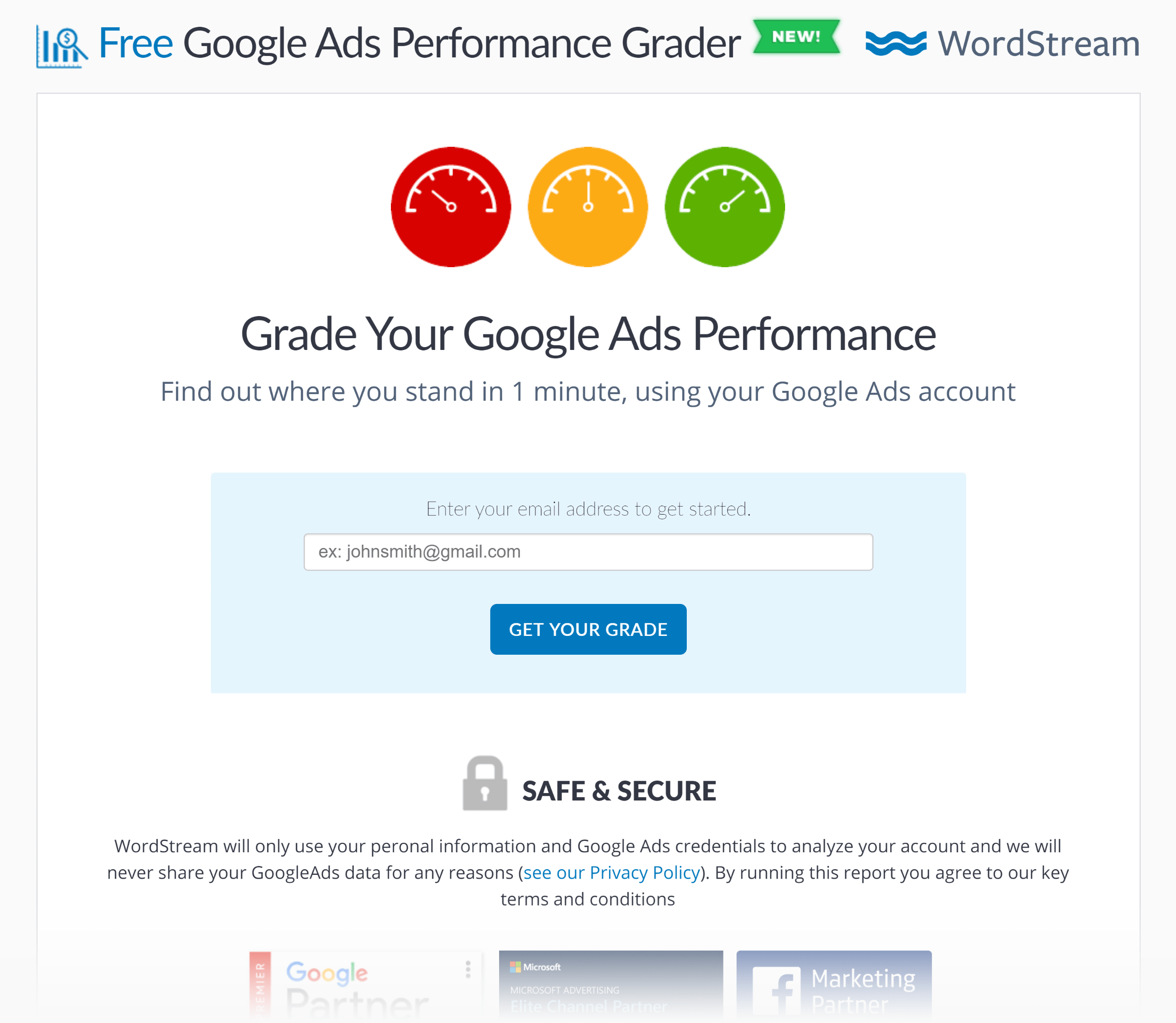
Wordstream – Adwords Performance Grader

And this single change took that page’s conversion rate from 2% to 40%.

Another example: we’re currently testing two different pages at Exploding Topics.

Version #1 (the control) is a super long page that explains what the newsletter is, has tons of social proof, and more.

Version #2 is the same page… with 80% of it chopped off. It’s literally just the above the fold area now.
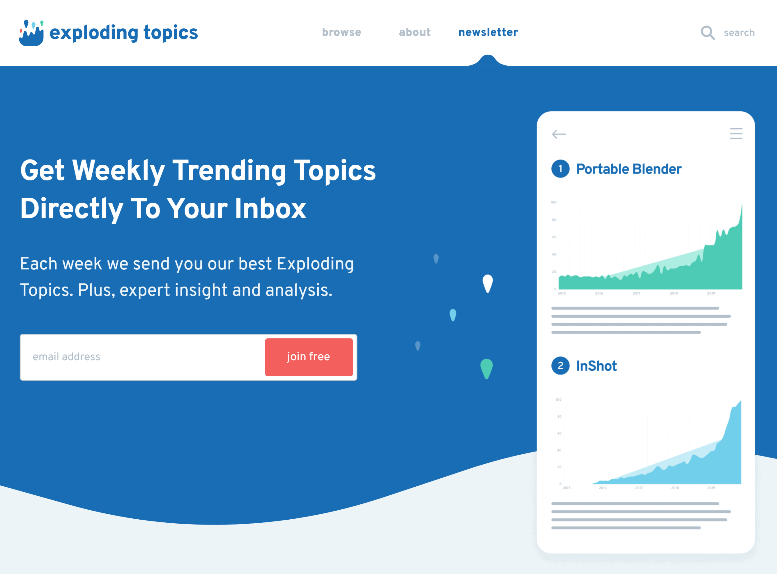
Explodingtopics – Newsletter Short Version

Which one will do better? I have no clue. That’s why I’m testing it. But I’m showing you this example to highlight the types of changes that you want to A/B test.

Use Heatmaps to Figure Out Why a Landing Page Isn’t Converting

When someone lands on your landing page and doesn’t convert, what happened?

It’s hard to say.

It could be your headline. Or your offer. Or it could be that your site looks weird on Safari.

Enter: heatmaps.

Heatmaps won’t tell you: “Here’s exactly why people aren’t converting and how to fix it”.

But they DO give you some objective data that you can use to figure things out.

For example, we run heatmaps for Exploding Topics. And I’m constantly surprised at how people actually interact with our landing pages.
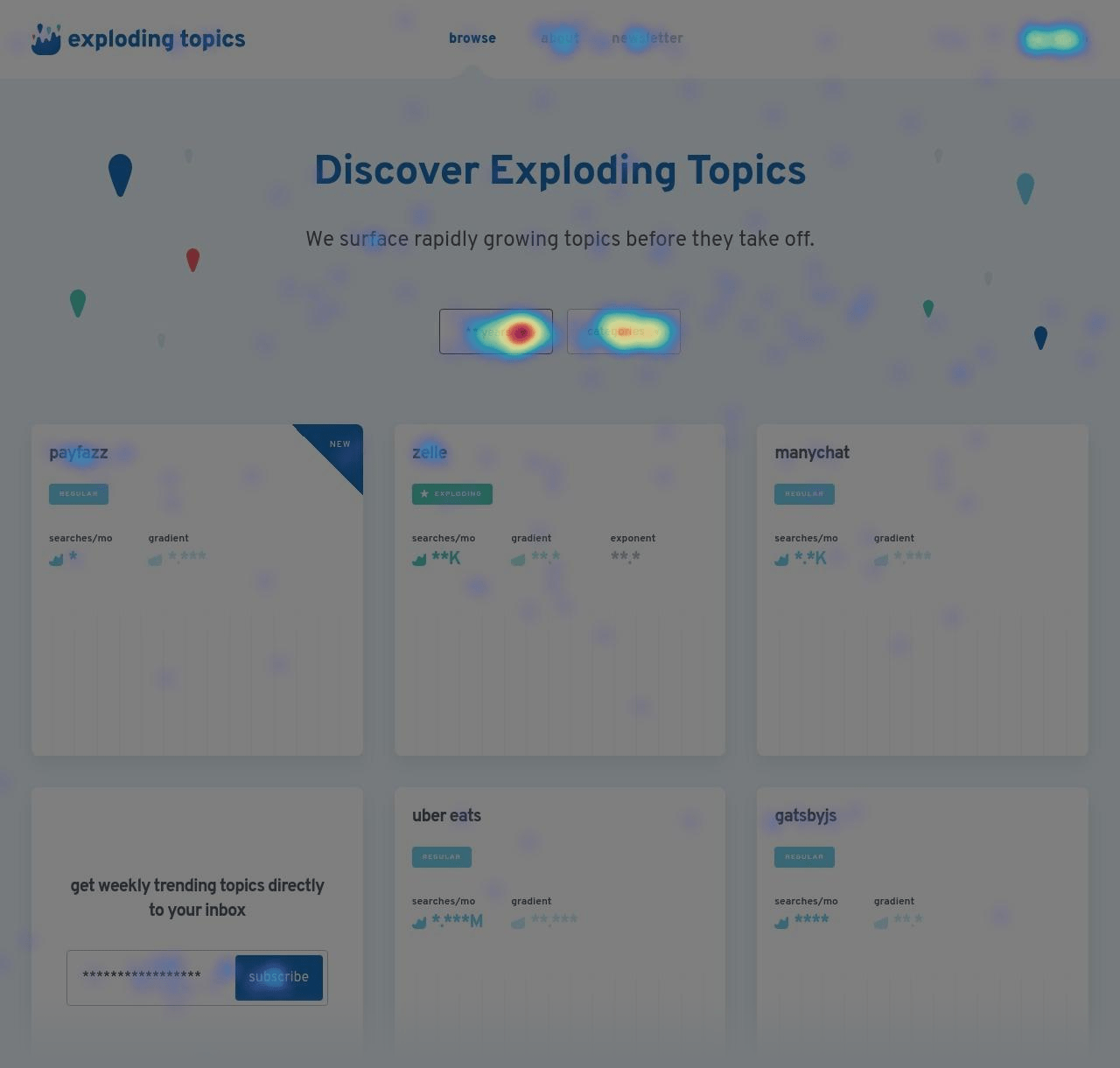
Explodingtopics – Heatmap

These heatmaps give us insight on how we can improve the site’s UI. And things to A/B test down the road.

Let The Test Run For At Least Two Weeks

I’m super impatient. So, for me, waiting weeks for a split test to fully do its thing is like watching paint dry.

In fact, when I was brand new to this whole conversion rate optimization thing, I would stop a test the MINUTE that it reached statistical significance.

As it turns out, this was a mistake.

Instead, you want to run your tests for several weeks. And you want to continue running the A/B test even after hitting 95% confidence.

Why?

Peep Laja explains the math better than I can (math isn’t my strong suit). But it comes down to the fact that most “wins” that you see from split testing are flukes.

So to be SUPER confident that your “winner” is actually a winner, you need more conversions than you probably think (and more than most A/B testing software estimate). You also need to run your tests for long periods of time to iron out any flukey stuff like holidays and weekends.

Chapter 5:Advanced Landing Page Conversion Strategies

Advanced Landing Page Conversion Strategies

At this point you probably have a landing page that’s converting super well for you.

Nice!

Now it’s time to tap into advanced
strategies that you can use to get even MORE conversions.

Let’s jump right in.

Turn Your About Page Into a Landing Page

A landing page isn’t just a random page that you send Facebook ads traffic to.

In fact, you can turn pretty much any page on your site into a landing page.

Including your about page.

For example, we have two signup forms on the Backlinko about page.
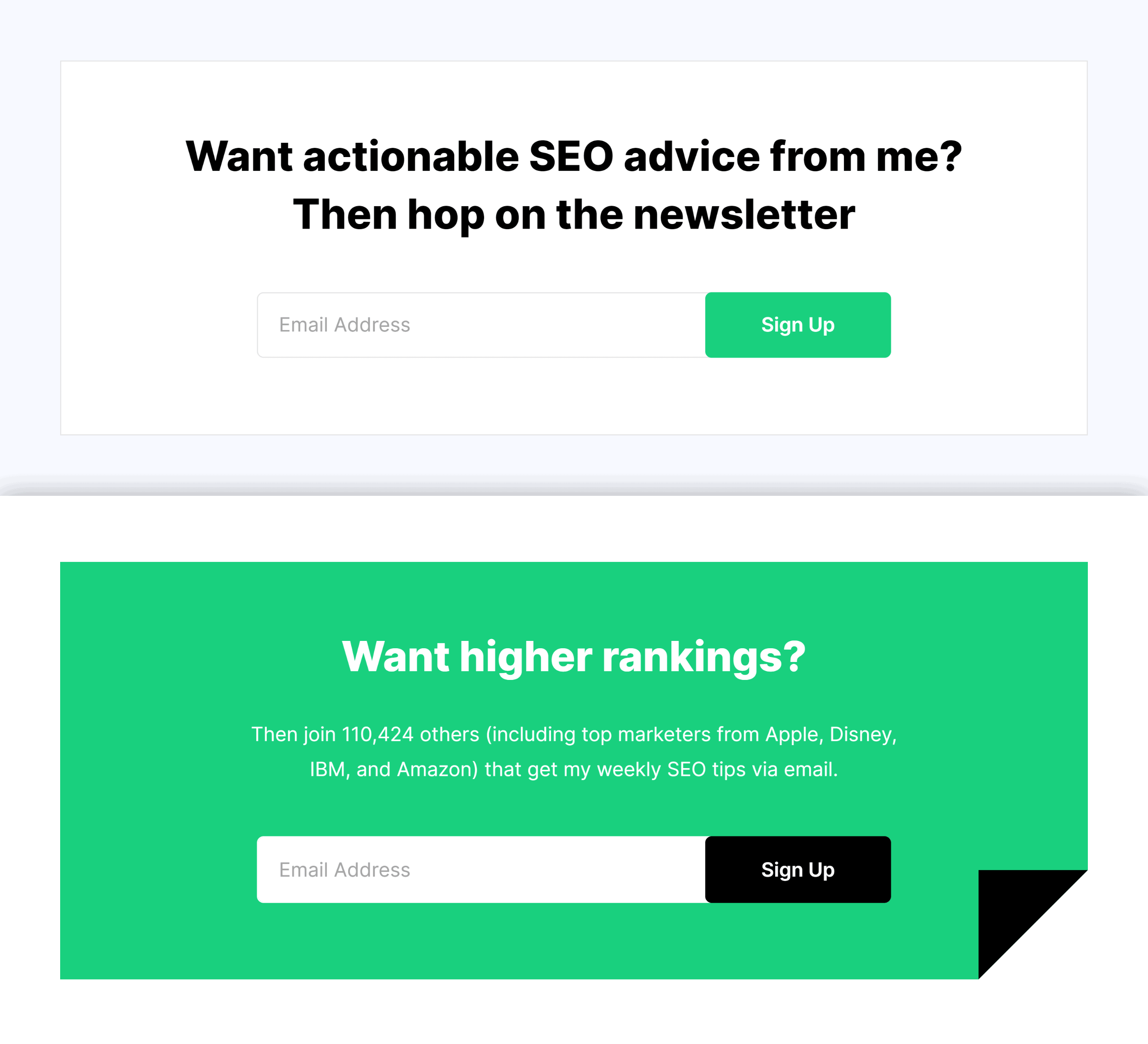
Backlinko – About Page Forms

And thanks to these two forms, that page converts at 4.49%:
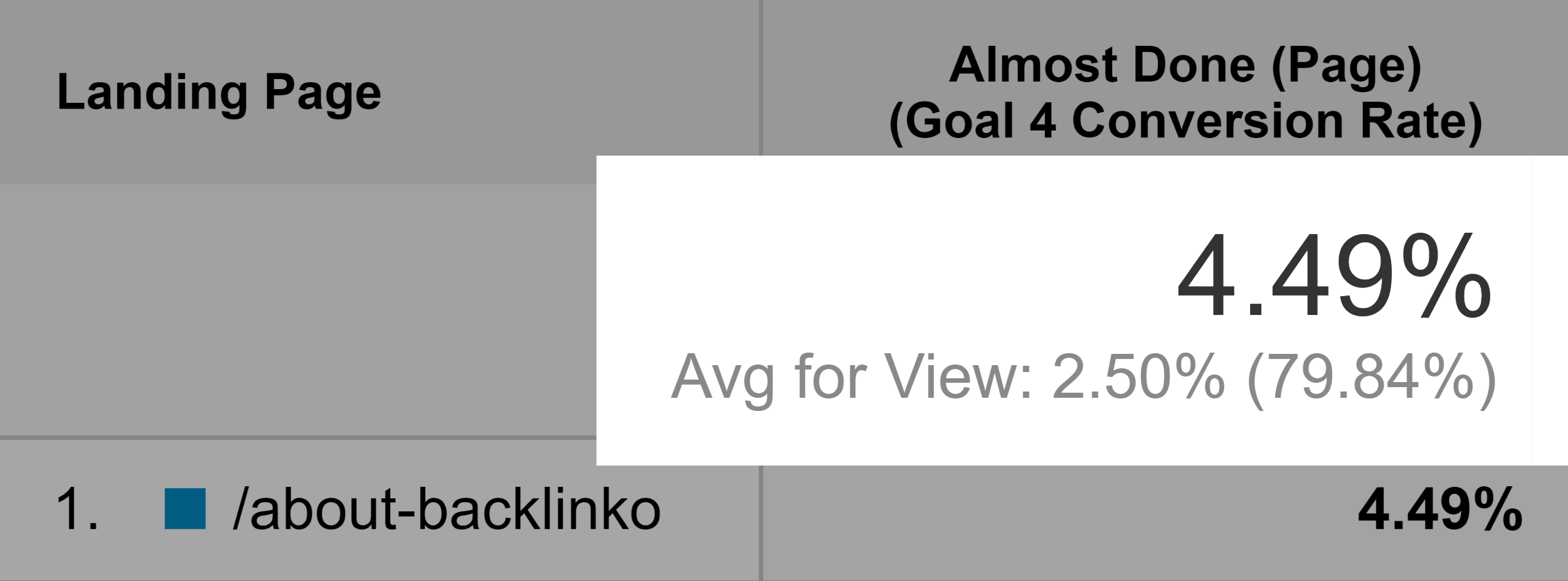
Backlinko – About Page Conversions

Not amazing. But 4.49% is infinitely higher than if we didn’t use any forms at all.

How to Rank Landing Pages in Google

It’s REALLY hard to rank landing pages on the first page of Google.

After all, most SERPs are packed with helpful, valuable content… not lead gen or sales pages.

But that doesn’t mean that it’s impossible to rank your landing page at the top of Google.

It just requires a little bit of planning.

First, you need to choose a keyword that already has a landing page or two in the search results. In other words: find a keyword where people WANT to see landing pages.

For example, a while ago I noticed that the results for “SEO training” wasn’t only a bunch of blog posts.

There were quite a few traditional landing pages too.
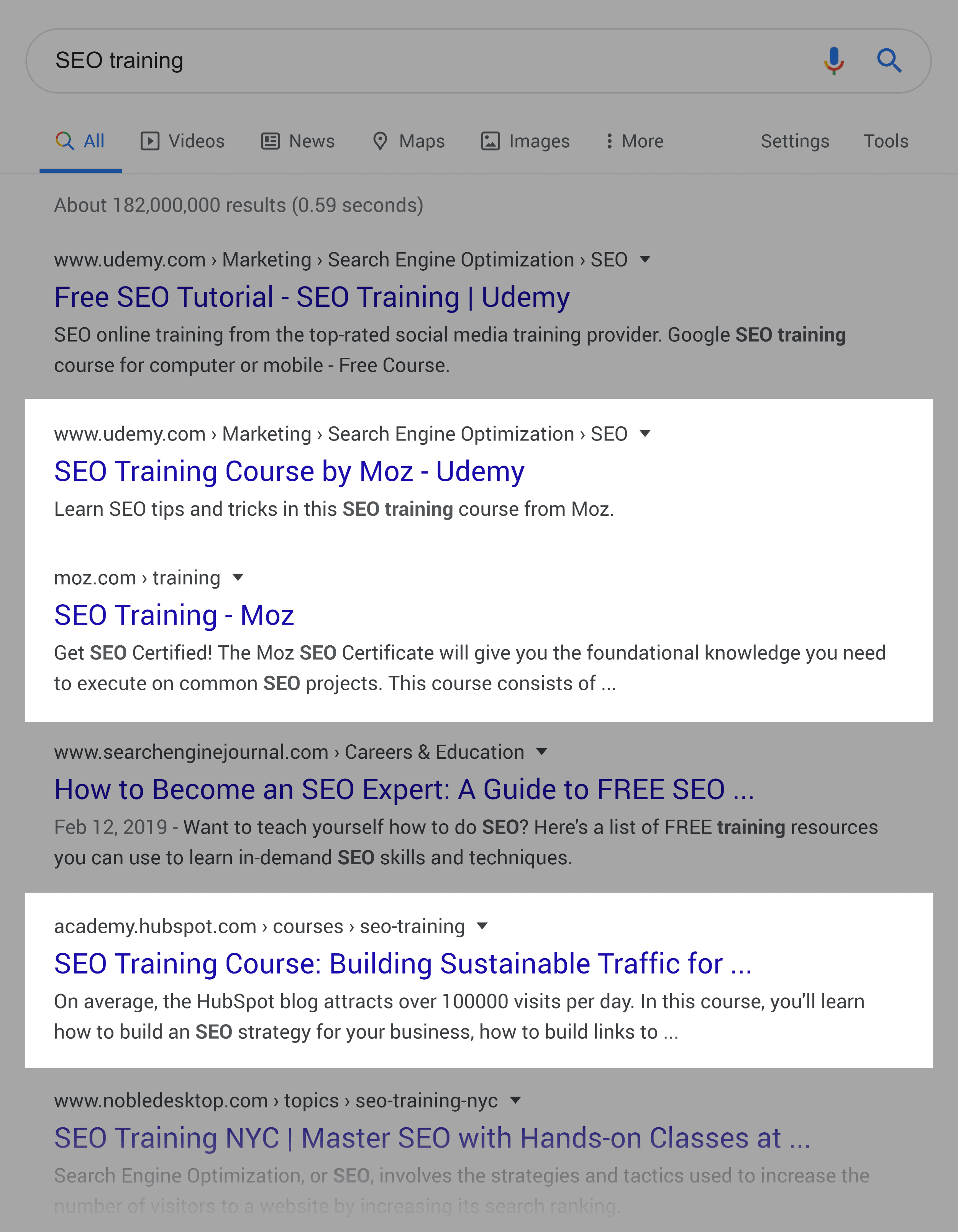
SEO Training Landing Pages In SERP

So, I created a page that outlined our flagship search engine optimization training program (which we don’t offer at the moment).
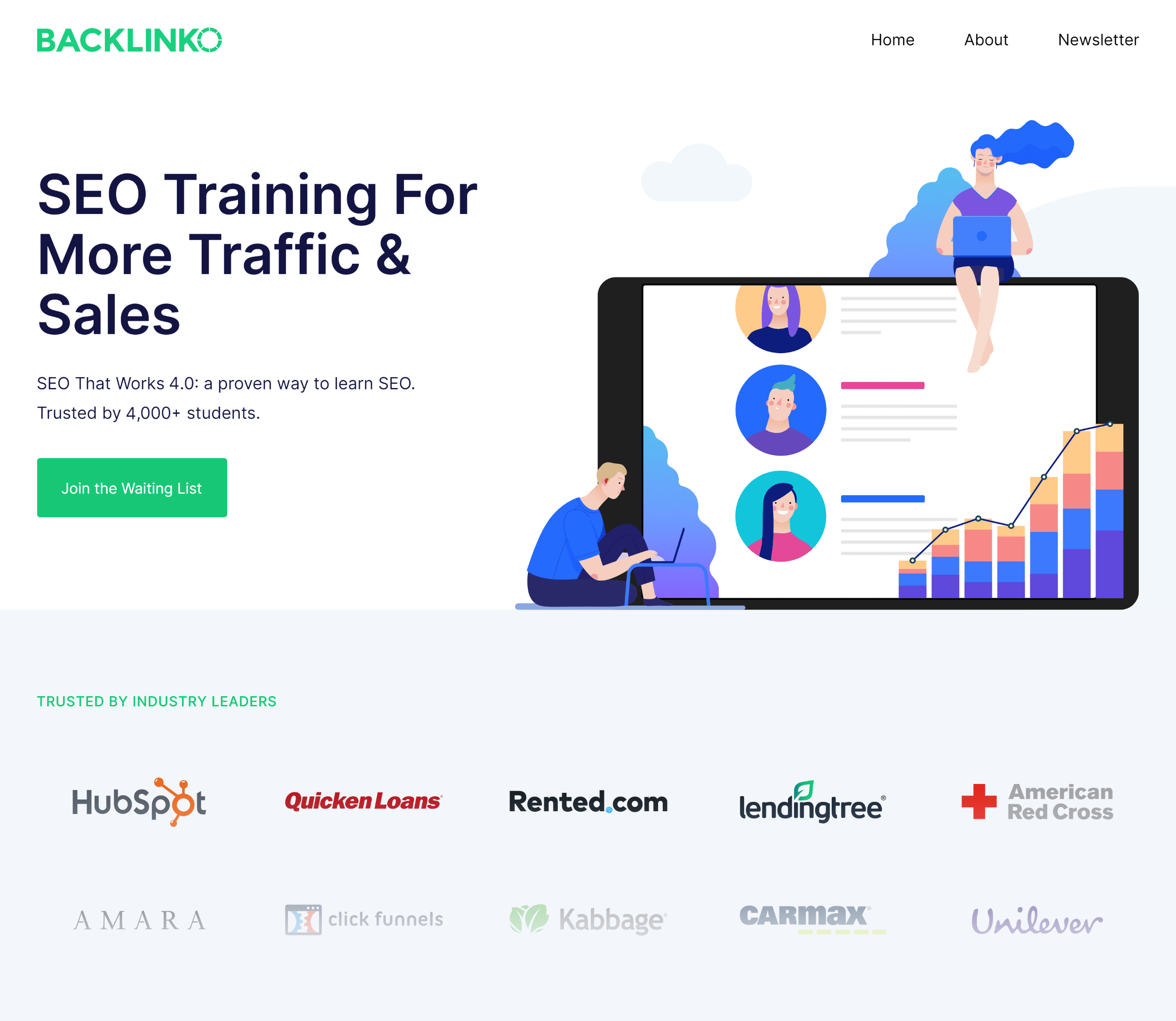
Backlinko – SEO Training Landing Page

Then, you need to optimize your page around that term. I’m personally testing a long-form landing page that I’m optimizing like a blog post.

That way, there’s enough content for Google to fully understand my page’s topic. And for users to learn more about my course.

Remove Site Navigation

Remember: one of the main features of a landing page is that it’s focused on ONE action.

Which is why I recommend stripping your site’s navigation from your landing page. That way, the focus is on your offer.

For example, we remove the “Contact” and “About” links from the header on our newsletter signup page.
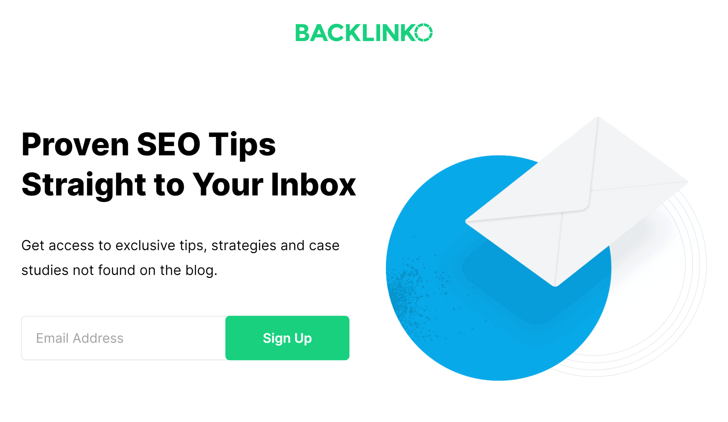
Backlinko – Newsletter Page Without Links

We also use a simplified footer that only has links to our terms and privacy pages.
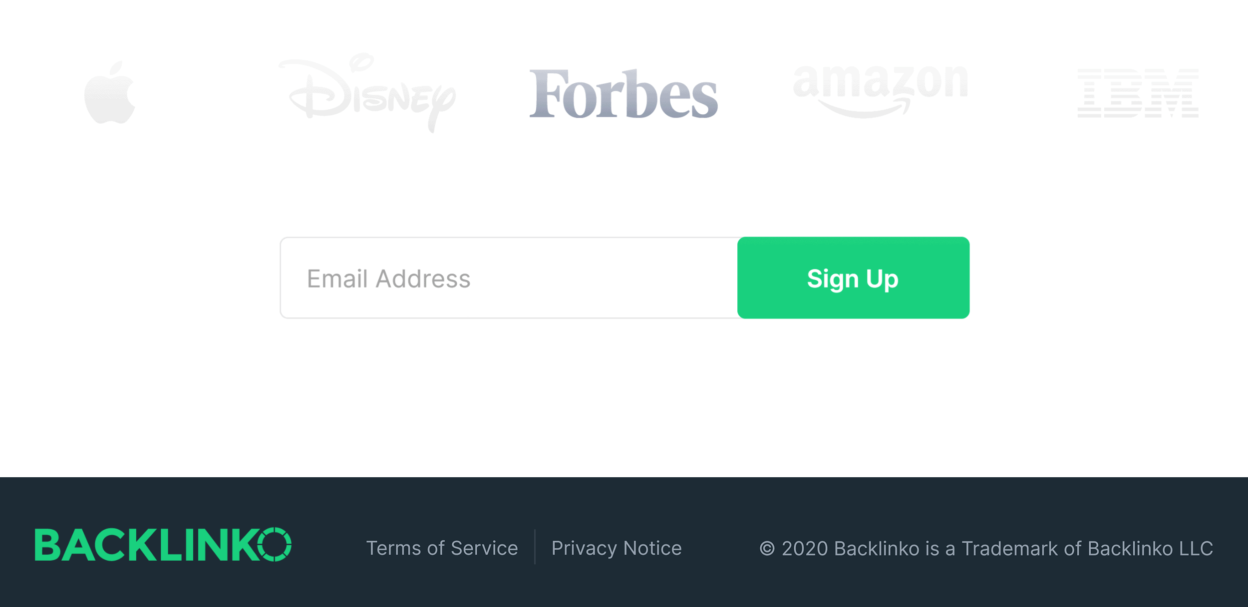
Backlinko – Newsletter Footer

Match Your Landing Pages to Audiences and Traffic Sources

When you’re just getting started, you’ll probably send everyone to the same exact landing page.

Same Landing Page For Different Audiences

There’s nothing wrong with this approach… at first.

But eventually, you’ll want to create different landing pages for different audiences.

For example, let’s say that you’re running a Facebook ads campaign.

Instead of sending everyone to the same exact landing page, you want to create landing pages that appeal to each target audience that you’re targeting with ads.

Match Your Landing Pages To Audiences

That way, instead of a generic page, they land on a page that’s JUST for them.

Landing Page For A Specific Audience

Use Your Confirmation Page to Get “Lateral Conversions”

When someone signs up to your email list or for a free trial, you probably send them to a confirmation page.

Well, I recently discovered that you can use your confirmation page as a landing page.

Obviously, you don’t want them to take the same action again.

Instead, go for a “lateral conversion”.

You still want to give people the info that any good confirmation page should.

But don’t stop there.

You can also gently ask people to take another small action from your confirmation page.

For example, in addition to the usual confirmation page stuff, I also ask new email subscribers to follow me on Twitter.
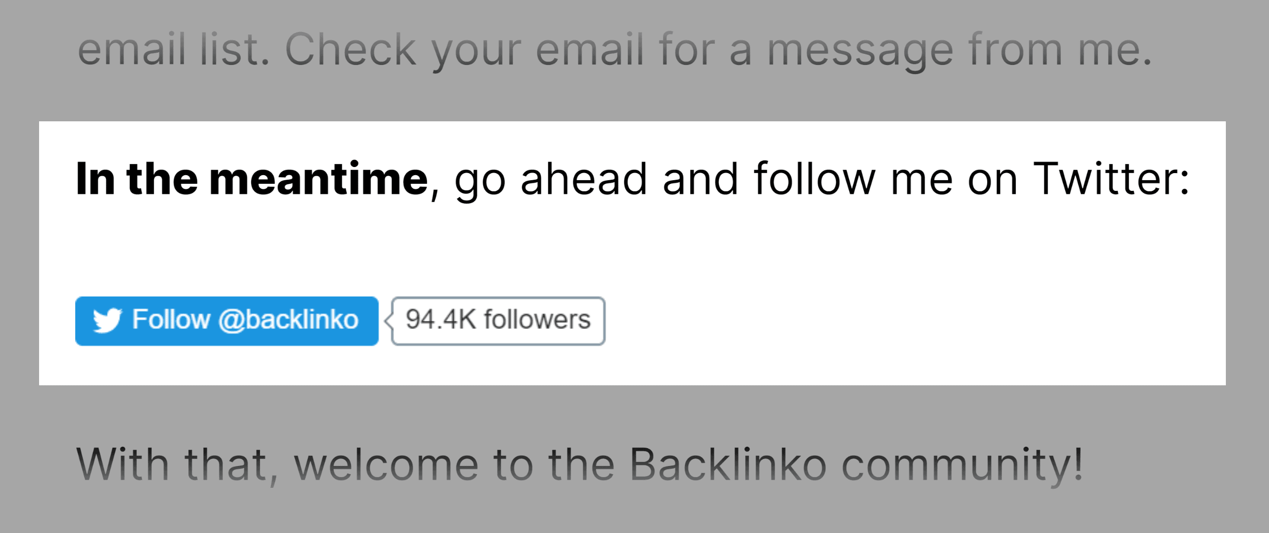
Backlinko – Follow Me On Twitter

Which leads to dozens of new followers every week.

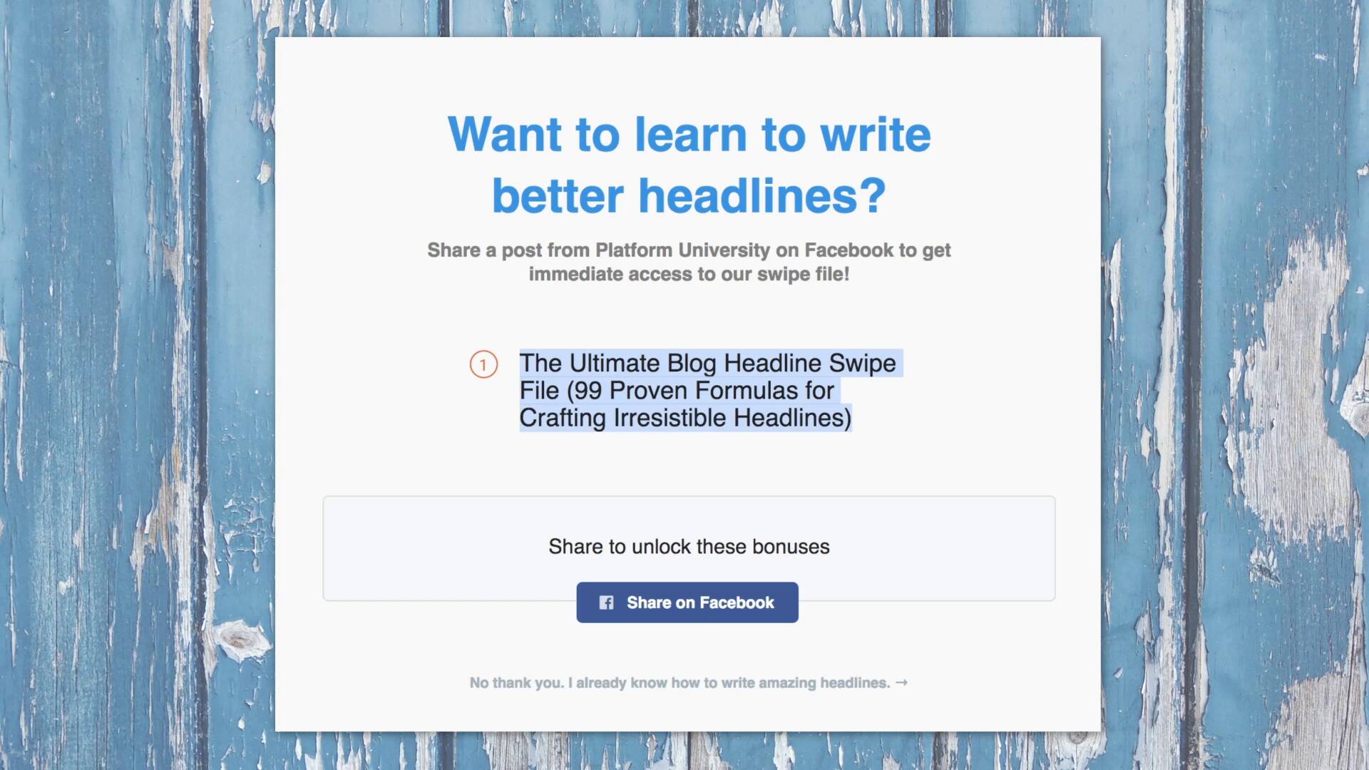
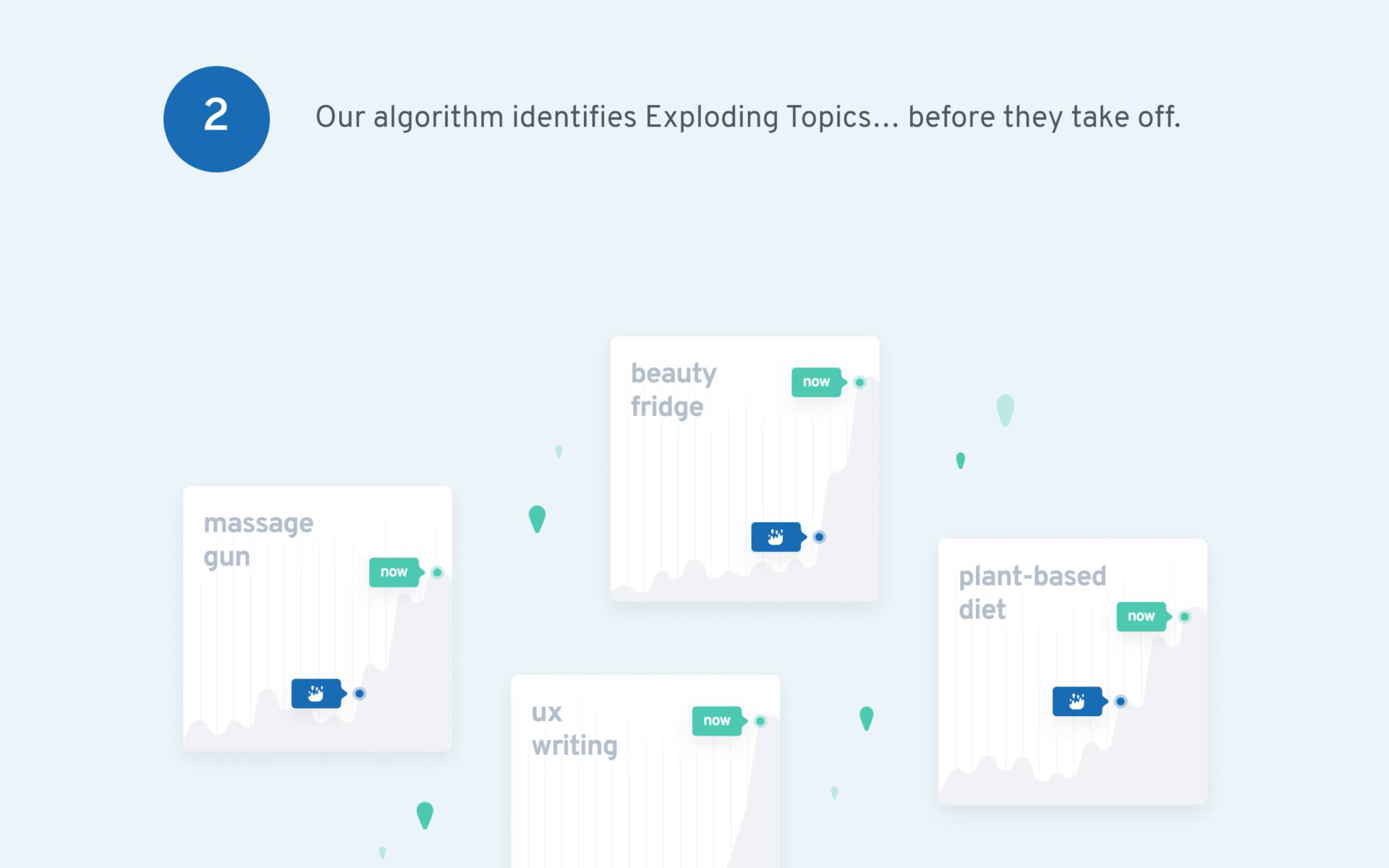
Other folks use their confirmation page to spread the word about their site. Here’s an example:

See how that works? As soon as you sign up, there’s another offer (a swipe file). To get it, all you need to do is share a post on Facebook and it unlocks.
Conclusion

Landing Pages Guide

I hope you enjoyed my new landing pages guide.

Now I’d like to hear what you have to say:

Which technique from this guide are you going to try first?

Do you want to add signup forms to your about page?

Or maybe you want to start A/B testing.

Let me know by leaving a comment below right now.

183 Comments

  1. Thanks for the awesome guide, Brian! Do you have any tips on the best landing pages for affiliate sites (reviewers)?

    Thanks!

    1. Brian Dean Avatar Brian Deansays:

      Thanks Amy.

      Good question there. Most affiliate site reviews are a landing page/blog post combo. So I’d incorporate a lot of the strategies here with some of the templates from this guide.

  2. Brilliant Brian, your guides are always so comprehensive. We’ve been following a lot of them to the letter over at myTribe Insurance. Would love to get your input on our site at some point if you have the time.

    1. Brian Dean Avatar Brian Deansays:

      Thanks Chris. Happy to hear that. And props for putting my material into practice.

  3. Wow, what a great guide. Do you think the landing page on my site converts well?

    1. Brian Dean Avatar Brian Deansays:

      You tell me 🙂

  4. Hey Brian, that’s a great article about landing pages!

    1. Brian Dean Avatar Brian Deansays:

      Thanks Andrzej. Glad you enjoyed it.

  5. Awesome stuff Brian. You are a machine at putting out amazing content!

    1. Brian Dean Avatar Brian Deansays:

      Thanks Davis. If you want to see how I’ve been able to scale quality, I recommend checking out this post I wrote a few months back: https://backlinko.com/scale-content

  6. Brian I wish if you add how to create landing pages like drag and drop. BTW excellent guide!

    1. Brian Dean Avatar Brian Deansays:

      Hi Rebecca, thanks. I might include more tools and whatnot in the future. But for now, I wanted to share the approaches and strategies that work no matter what landing page builder you happen to use.

  7. Richard Avatar Richardsays:

    Great article. Very informative.

    Would you happen to have a PDF of it available?

    1. Brian Dean Avatar Brian Deansays:

      No worries, Richard. I don’t have a PDF available yet. But if I get one made, I’ll add a download link to this page in the future.

  8. Excellent article. I was expecting more e-commerce demos. What is “Grader Adwords”? I’ve never heard of it as a beginner.

    1. Brian Dean Avatar Brian Deansays:

      Thanks Martin. It’s basically a tool to grade your Google Adwords account.

  9. Hey Brian awesome post on landing pages! You hit it out of the balll park again

    1. Brian Dean Avatar Brian Deansays:

      Hey Ivan, thank you. Yup, this is basically everything I’ve learned from building and testing landing pages over the last 10 years. And I’m happy with how it turned out.

  10. I am reinventing myself as a web designer after 2 decades of work as graphic designer.
    I recently discovered Figma that I am now using as a simple design platform ( not prototyping yet)
    I find your approach very clear, scientific and inspiring.
    thank you for sharing.
    Best
    Gianluca

    1. Brian Dean Avatar Brian Deansays:

      You’re welcome, Gianluca. Figma is great. We use it for design mockups all the time.

  11. Very well written article. Which landing page builder would you recommend?

    1. Brian Dean Avatar Brian Deansays:

      Thanks Rohas. Thrive Themes is really good.

  12. Good work as always, Brian. I own a blog and don’t really have a product I’m selling at the moment and I want my visitors to view my blog posts. Do I still need a landing page?

    1. Brian Dean Avatar Brian Deansays:

      Hi Anaso, I’d still set up a landing page to collect emails. That way, when you’re ready to sell something, you’ll have an audience.

  13. Just got done with the reading Brian! Hats off to your writing Style. Thanks for sharing.
    Also, I have a question about your post on SEO Tools. Which plugin have you used in creating that post? I am very curious to know.

    1. Brian Dean Avatar Brian Deansays:

      Hi Vansh, that’s a custom plugin that we made a few years ago. I think there are some similar filtering plugins floating around though.

  14. This is a great article. Although I have not completed reading it yet as am saving it for later. One of the insights I have gained is that having a great landing page is similar to having a great car on the road that draws peoples attention.

    1. Brian Dean Avatar Brian Deansays:

      Thanks Shane. That’s true. A good landing page needs to grab attention. And get the person to convert. But it starts with the “A” in “AIDA”.

  15. Nice guide! Thanks for sharing Brian.

    1. Brian Dean Avatar Brian Deansays:

      You’re welcome, Nigel 👍👍👍

  16. Great resource, as ALWAYS Brian! Thanks for putting this up for all of us who can truly use it.

    1. Brian Dean Avatar Brian Deansays:

      Hi Darshana, thank you. Hope it helps you out.

  17. Borana Avatar Boranasays:

    This info wrapped up in one scroll was so much needed and much appreciated.

    Thank you and following 🙂

    1. Brian Dean Avatar Brian Deansays:

      Hi Borana, you’re welcome 👍

  18. Hi Brian,

    I find your emails very interesting. I own an e-commerce site that sells home furnishings and accessories. I’ve been in business for 6 years with moderate success. I find it difficult to get to the next level. Do you have any information that would target this kind of business.
    Look forward to hearing from you. Thanks!

    1. Brian Dean Avatar Brian Deansays:

      Hi Nancy, thank you. Do you mean taking your landing pages to the next level? Or the business as a whole?

  19. Great post and content Brian and very informative!

    Keep up the great job!

    Thanks
    Haris

    1. Brian Dean Avatar Brian Deansays:

      You’re welcome, Haris.

  20. This is simple, straight-forward, and powerful information! You’ve really cleared up the “landing page” mystery for me after all these years online. You have no idea of how thankful I am. I’m going to turn this information into “MONEY” and come back & purchase anything you have for sale! Thanks for everything.

    Toney

    1. Brian Dean Avatar Brian Deansays:

      Hi Toney, nice! In my experience, the ROI in improving landing pages can be great. It’s usually easier to double your conversions than double your traffic.

  21. Hey Brian, This is a very amazing piece of content for the landing page ideas. Do you recommend anything specific to CBD/Hemp industry? Love you hear your thoughts on this.

    1. Brian Dean Avatar Brian Deansays:

      Thanks Josh. I’ve worked on dozens of landing pages in tons of different industries. The same basic structure and principles apply. That said, every landing page needs to speak to your target customer. So it depends on who specifically you’re targeting with your CBD products.

  22. I am still in search of a more detailed step by step guide on landing pages cause I want to learn more. Thanks to you Brian I won’t have to search for one anymore after reading your guide. I really enjoy reading every guide and blog you make because I know that I will definitely learn something.

    1. Brian Dean Avatar Brian Deansays:

      👍👍👍

  23. Wow!

    What an excellent breakdown of landing pages and how to format them.

    I will definitely pass this off to my development team.

    1. Brian Dean Avatar Brian Deansays:

      Thanks Arash. Glad you got so much value from today’s guide.

  24. Ken Avatar Kensays:

    OK so I came here from an email that I received promising:

    So if you want to:

    -Create super high-converting landing pages

    -See in-depth breakdowns of the world’s best landing pages

    -Get access to detailed landing page templates

    #1 – check
    #2 – check
    #3 – nope. Where are the detailed landing page templates?

    Seems a little bit like I was misled (only a little bit as the content is great) but still …

    1. Brian Dean Avatar Brian Deansays:

      Chapter 2 is literally made up of 100% templates.

  25. A-ron Avatar A-ronsays:

    Since I’m standing up a brand new site, I’m going to try the email landing page template with two different offers to test. Then I’m going to go eat a hamburger and scream at people with my mouth full.

    1. Brian Dean Avatar Brian Deansays:

      OK…..

  26. Hey Brian, very very well written 👌🏻 You put everything in a nutshell which even helps experienced marketeers to check and update their knowledge in a decent way. Thanks for your work 🔥

    1. Brian Dean Avatar Brian Deansays:

      You’re welcome, Martin 👍👍👍

  27. Thanks Brian for this awesome article,
    Can you please share the definitive guide to earn money through website/blogs?

    1. Brian Dean Avatar Brian Deansays:

      You’re welcome, Ashish.

  28. Hi Brian, as always, thank you for the top shelf marketing information. You saved me the trouble of researching this. And I want to thank you again for your amazing review of the video I made of you and Rand Fishkin before… https://idesignyours.com/video-marketing/

    I will try one or more of your landing page techniques for a fb ad I intend to run. Do you have any ideas to get people to call, as opposed to opting in with an email?

    1. Brian Dean Avatar Brian Deansays:

      Hey Philip, you’re welcome. Calls are tough unless the person WANTS to call (for example, has a plumbing emergency). Your best bet is to get their email. And email them to schedule a time for a call.

  29. Wondering if I can glean anything for a non-profit specialised site too.

    1. Brian Dean Avatar Brian Deansays:

      The same approach applies for non-profits. If you’re looking to build your non-profit’s newsletter. Or get more donations. You’ll want a high-converting landing page to help get the job done.

  30. Reiz Avatar Reizsays:

    This is helpful! Thanks Brian!

    1. Brian Dean Avatar Brian Deansays:

      You’re welcome, Reiz.

  31. There are two people I have come to respect recently when it comes to thought leadership online marketing, you my friend Brian, and Nat, you both are doing cool stuff.

    Even as an expert, I still learn new stuff from your articles and the lot you give out here for free.

    You are so very cool. Keep it up!

    1. Brian Dean Avatar Brian Deansays:

      Thanks Oluseyi. Do you mean Nat Eliason?

  32. Great post!
    There are a lot of landing page builders out there, do you have any opinions on using those?

    1. Brian Dean Avatar Brian Deansays:

      Thanks Loftie. Thrive Themes is pretty good. And if you want to build a site from scratch, Webflow is awesome.

  33. Again – an awesome resource Brian. Thanks for sharing.

    1. Brian Dean Avatar Brian Deansays:

      You’re welcome, Mike. Glad you enjoyed it.

  34. Thank you for excellent content once again, Brian! As a freelance writer who’s recently started expanding to writing online copy (such as landing pages!), this was an incredibly educational read. Better than anything else I’ve read on the subject.

    Is there any way to get this guide as a PDF? It would be a very helpful quick reference guide to have!

    1. Brian Dean Avatar Brian Deansays:

      Hi Ile, glad to hear that. I don’t have a PDF yet but might get one designed in the future.

  35. Amazing Brian, love the explanation of each and added examples, I was wondering if I could use similar structure also for an email template, which is basically the “landing page” before the landing page itself. If the email isn’t good, the LP can be amazing, but no one will see it. If taking into account only email marketing, of course.

    A bit offtopic, but I’m struggling with first email to a new prospect, any tips on that? Going small and short, then longer template if interested or big from the start?
    Thanks.

    1. Brian Dean Avatar Brian Deansays:

      Hey Anna, in my experience I’d actually stick to a relatively simple email structure. The combo of simple email + nice LP works well. To answer your question: I’d go short-ish at first. But still personalized. Then wow them with a longer email if they show interest.

  36. Hi Brian, great article. Currently I am preperanig a landing page for e commerce which I sell in my e store. Now I am running some campaigns for one of the product categories and I wonder if you suggest that I make several CTA for the product category which are related to my campaign.

    1. Brian Dean Avatar Brian Deansays:

      Thanks Zlatko. I’d definitely start with one page at a time. Test large differences. Then scale up. A mistake I made early on was testing several pages and CTAs at once. It’s hard to manage and learn that way.

  37. Jule Avatar Julesays:

    Hi Brian,

    Thank you for your article!

    Which A/B test plugin for WordPress do you recommend?
    At this moment I test the plugin “simple page tester”. But for some reason it doesn’t work on mobile. I wrote them.

    Thrive optimize is also interesting, but for this I need Thrive architect.

    Which do you recommend?

    Thank you.

    Regards

    1. Brian Dean Avatar Brian Deansays:

      Hi Jule, I’d try Google Optimize. You don’t even need a plugin to run it. Just a few lines of JS.

      1. Jule Avatar Julesays:

        Thank you Brian

  38. Great post as per usual, Brian. I’ve been experimenting with design change recently and it seems to be showing positive results so far. I think the structure element of this post will be very helpful for everyone. Thanks for sharing.

    1. Brian Dean Avatar Brian Deansays:

      Hi Hazel, thank you. I’ve found the same thing. Which makes sense: I know I’m more likely to buy something to sign up for something if the design of the landing page looks professional.

  39. Some great examples. I’m wondering if you came across a resource of landing page examples by category. I enjoy going through the copies and design of landing pages.

  40. Webflow is awesome, you’re right Brian. We find it helps us punch above our weight from an SEO perspective too. But shhhh, it’s a secret.

    1. Brian Dean Avatar Brian Deansays:

      Hey Chris, yup Webflow is legit. Although I think the secrets out. They’re HUGE.

  41. The structuring of the page is vital for both SEO and marketing.

    Your post is excellent because it explains in details both and more!

    1. Brian Dean Avatar Brian Deansays:

      Hi Michalis, thank you.

  42. We had just started to deal with the topic of landing pages and to plan our first steps. Now comes this great guide. Thanks a lot, Brian.

    1. Brian Dean Avatar Brian Deansays:

      Hi Lars, sounds good. This guide should come in handy in that case.

  43. Brilliant and complete as always thanks Brian.

    1. Brian Dean Avatar Brian Deansays:

      Hey Craig, thank you.

  44. Awesome timing Brian! I’ve been working on a landing page right now, so this is super helpful. We’re trying to design the page so that it’s easy to duplicate so that we can tailor it to different audiences as you proposed in Chapter 5. I think that’s going to make a big difference.

    1. Brian Dean Avatar Brian Deansays:

      Hey Joshua, nice! For sure. The more targeted each LP is, the better. So your approach makes total sense.

  45. Another great post as always Brian. Thank you! You nailed all the landing page questions I had. Now for the other issue. Considering that 65% of all landing page traffic comes from paid ads, I guess it’s time to put some of this advice to work into creating an enticing ad offer.

    1. Brian Dean Avatar Brian Deansays:

      Hey Rick, thank you. For sure. Can’t go wrong with a strong ad. It’s actually an underrated part of conversions. In other words: the ad does more than just send someone to your landing page. It can make them more primed to convert when they get there too.

  46. Nice guide! Thanks for sharing Brian.

    1. Brian Dean Avatar Brian Deansays:

      👍👍👍👍

  47. I’m going to build landing pages in WordPress. Does it make a difference if the landing page is set up as a Page or a Blog Post? Which one is the best start point?

    1. Brian Dean Avatar Brian Deansays:

      Hi Tony, I’d start with pages. It doesn’t make a huge difference. But in most cases you don’t want landing pages in your blog feed.

      1. Brilliant thanks for your speedy reply – Legend!

  48. Have never read a better post regarding landing pages.

    John

    1. Brian Dean Avatar Brian Deansays:

      That was my goal, John. To create the most comprehensive guide to landing pages online.

  49. Lola Chikivchuk Avatar Lola Chikivchuksays:

    Thank you, Brian! Your guides are awesome! Condensed, super-readable, and valuable!

    1. Brian Dean Avatar Brian Deansays:

      You’re welcome, Lola. Glad to hear that you’re getting so much value from my guides.

  50. Hi Brian,

    Great read, as always.

    What tool you use to do A/B testing?

    What is your opinion about Google Optimize?

    Thanks

    1. Brian Dean Avatar Brian Deansays:

      Hi Karol, we use Google Optimize. It’s not perfect. But it works well.

Leave a Comment

Your email address will not be published. Required fields are marked *