Thumbnail
What Is a Thumbnail?
A thumbnail is a clickable, visual icon that represents the content of a YouTube video. Thumbnails are used on every YouTube video, and are considered a major factor in a video’s click-through-rate and views.
Why Are Thumbnails Important?
According to YouTube, 90% of top-performing videos use a custom thumbnail. That’s no coincidence.
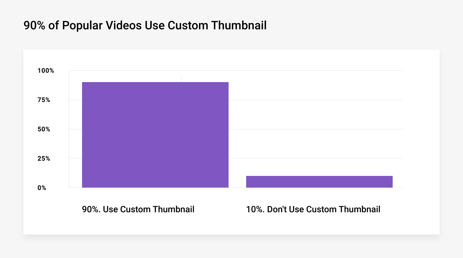
That’s because YouTube viewers rely on thumbnails to help them decide what videos to watch. In fact, it’s no exaggeration to say that your thumbnail can make or break your entire video.
Unfortunately, making a thumbnail that stands out isn’t easy.
After all, your video is competing with thousands of other videos… many of which also use custom thumbnails.
That’s where these thumbnail best practices come into play. They’re designed to help you easily create thumbnails that get noticed and clicked on.
Best Practices
Use Lots of Contrast
Contrast is when colors and visual elements stand out from one another:

In most everyday pictures, too much contrast can make an image look unnatural and off putting.
But when it comes to thumbnails, you want to use lots of contrast. Why? High-contrast images are more noticeable than low-contrast images.
For example, take a look at these two thumbnails:

The thumbnail on the left has very little contrast.
On the other hand, the thumbnail on the right uses a ton of contrast. The colors all have a strong contrast. Also, visual elements (like icons and text) stand out from one another.
Which one are you more likely to notice?
Use Consistent Layout and Colors
Do your best to use thumbnails with a consistent look and feel. This helps establish your channel’s branding and positioning.
For example, the Backlinko YouTube channel uses a consistent thumbnail color scheme and layout:

Also, consistent thumbnails help your videos stand out on the YouTube homepage and in the Suggested Video sidebar.

As you can see, when a group of videos from the same channel are shown together, they form a pattern. This pattern catches your eye compared to a random group of mismatched thumbnails.
Add Graphics
Adding graphics to your thumbnail can help people understand what your video is about.
For example, this thumbnail includes an image of a phone and the Instagram logo. That way, users can see at a glance that this video is about: instagram.

You can also use graphics to make your video stand out. For example, you’ve probably noticed that lots of video thumbnails today use arrows and circles:
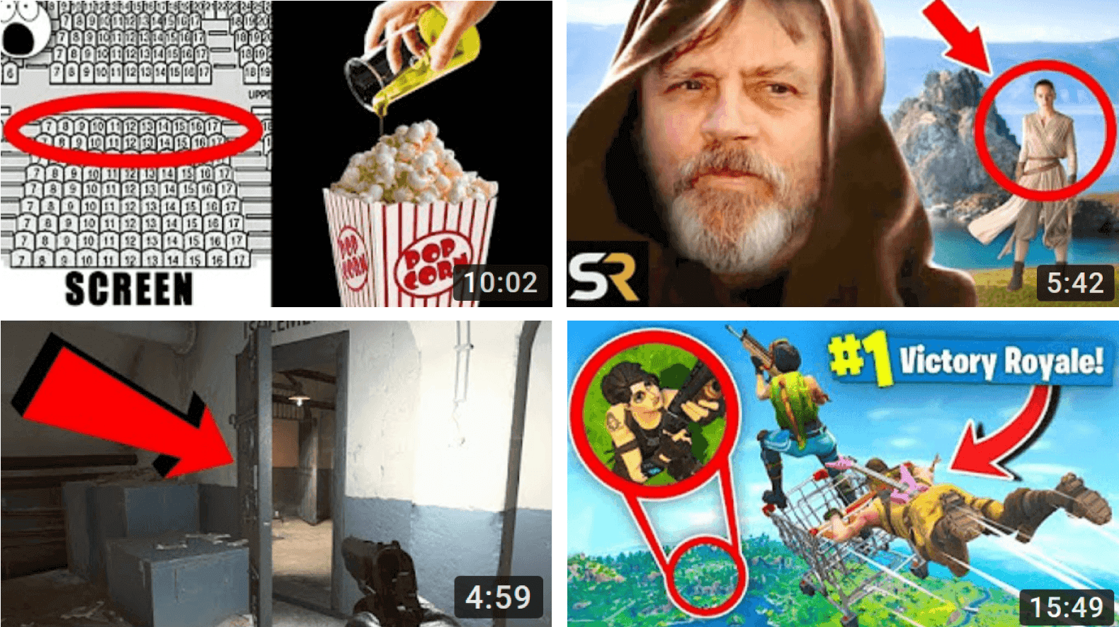
Some people consider using graphics like this clickbait. That said, as long as you deliver on the promise of your thumbnail and title, YouTube has no problem with attention-grabbing graphics.
Use a Color Scheme That Stands Out
As you may have noticed, YouTube uses three main colors on their site: white, red and black.
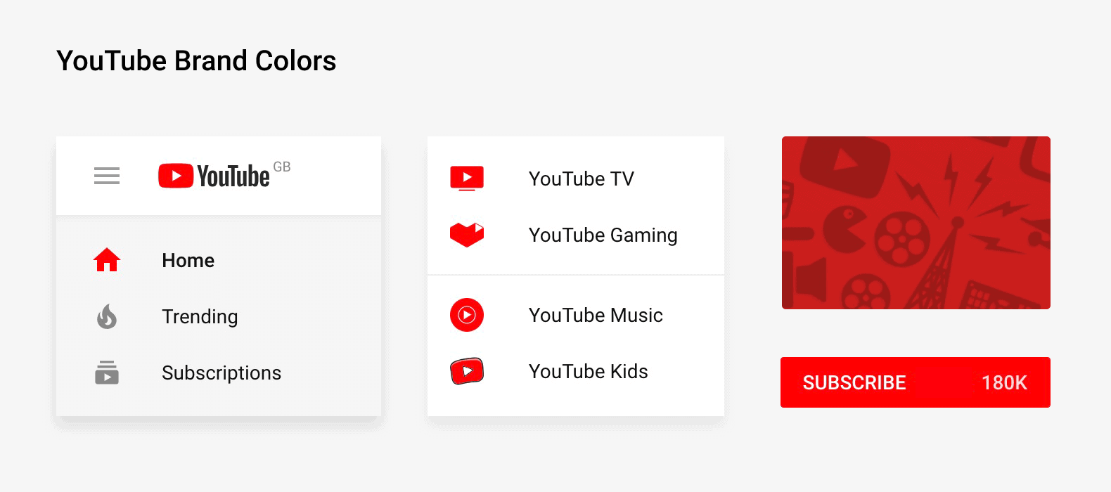
If your thumbnail uses lots of white, red and black it’s going to be hard for your thumbnail to stand out.
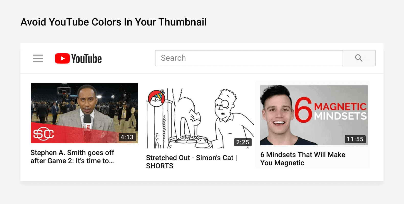
Of course, you’re free to use white, red and black in your thumbnail (many big YouTubers do). But you don’t want them to make up your thumbnail’s primary colors.
Instead, try using these colors in your thumbnail:
- Yellow
- Green
- Orange
- Purple
- Pink
- Blue
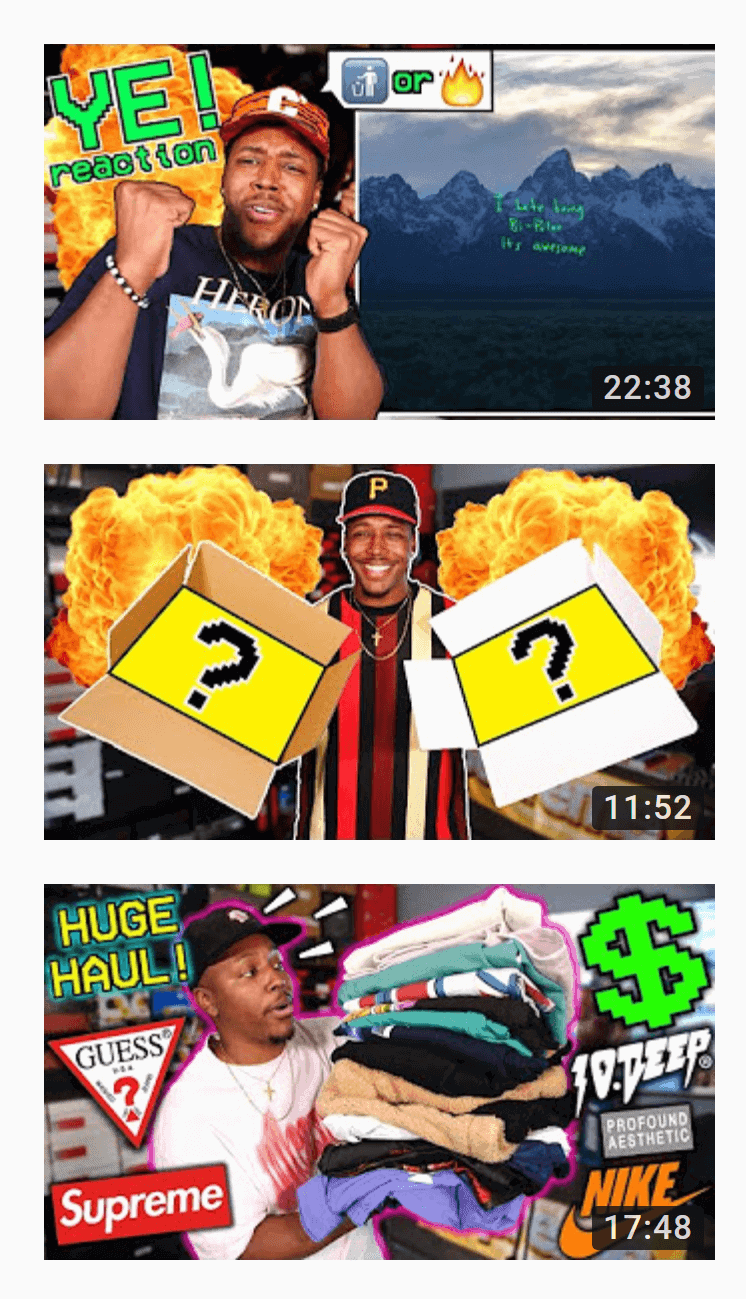
For example, the BULL1TRC channel tends to use thumbnails with lots of yellow and orange.
Try Some Text
Text is a great way to add some context to your thumbnail. Ideally, someone should understand your video’s topic without needing to read the title.
This is tricky to pull off with an image alone.

But with some text, you can easily convey your video’s topic from within your thumbnail:

Here are some tips for adding text to your YouTube thumbnails:
- Use Huge Text: Your thumbnail is really, really small (especially on mobile). So make sure that your text is easy to read on all devices.
Here’s a great example from Evan Carmichael’s channel:
- A Little Bit Goes a Long Way: Too much text can overpower the visuals in your thumbnail. Stick to 20 characters or less.
- Text Doesn’t Have to Be Your Title: A common mistake is using your title as your thumbnail text. Instead, use a short word or phrase that summarizes your video content. For example, this video’s full title is: “Making Money as a Beginner Photographer – How to book your first photoshoot!”. Instead of cramming all that text into his thumbnail, Sheldon summarized his video’s topic in 3 words:

Check and Track Performance
The new YouTube Studio has an nifty feature to help you track your thumbnail’s performance: “impressions click-through rate”:
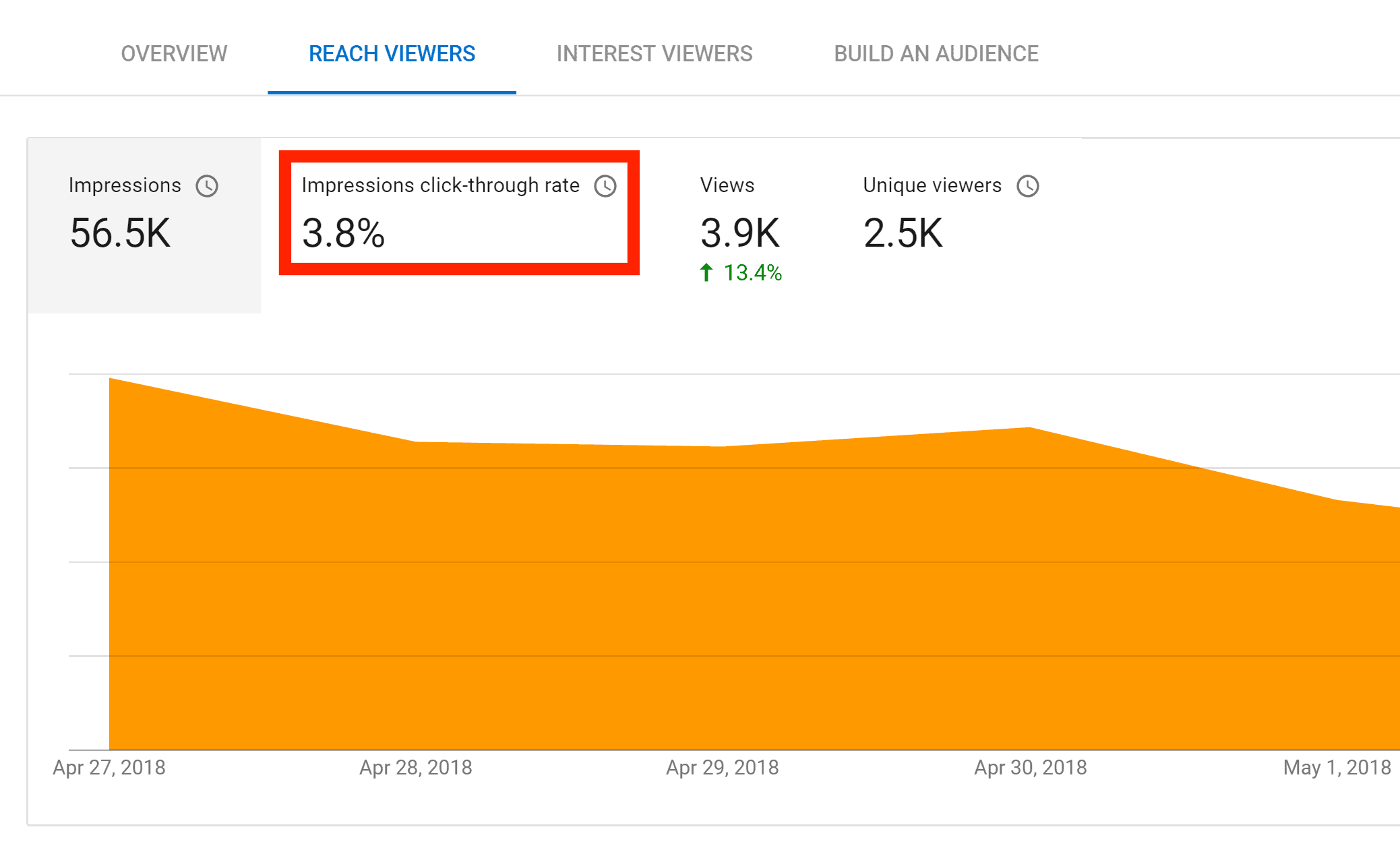
This report lets you know how many people saw and clicked on your video.
If one of your videos has a low CTR, your thumbnail could be the reason. So go ahead and try another thumbnail. Then, use the “impressions click-through rate” report to track how the new thumbnail performs vs. the old one. Simple, yet powerful.
Tips and Advanced Strategies:
- Plan Your Thumbnail Before You Shoot: You want to have an idea of how your thumbnail will look before you film your video. Why? It’s really hard to grab a sharp still image from a video. Instead, take a few pictures during your shoot. For example, check out this thumbnail:

That specific shot of the vegan curry is nowhere to be found in the video itself. This picture was taken during the shoot specifically for this thumbnail.
- Check Your Thumbnails on Mobile: YouTube thumbnails are really small on mobile devices. Take a second to see how your thumbnails look on your phone. Can you clearly see what’s going on in the shot? Is the text easy to read?
- Try a Logo: Some YouTubers (like Vice) use a logo to make their videos easily recognizable:

The downside of a logo is that it takes up valuable space in your thumbnail.
- Try Including Faces: While not a hard-and-fast rule, in general, thumbnails with faces get a better CTR than thumbnails without a face. For example, the BuzzFeed channel includes faces in almost 100% of their thumbnails… even on videos about food:

Learn More
Add Video Thumbnails: How to add thumbnails to videos (and some of YouTube’s rules and regulations around thumbnail use)
How to Make a YouTube Custom Thumbnail Tutorial: A helpful tutorial that shows you how to create a thumbnail image.
20 Awesome Thumbnail Examples: A bunch of examples of attractive thumbnails (and why they work).