I’ve been running more static ads lately for my own e-commerce store.
And here’s the thing: they work.
Static ads are faster to produce, easier to test, and simpler to scale than video or animated formats. You can launch a new creative in hours, not days. You can quickly iterate on headlines, images, and offers without worrying about reshoots or complex edits.
While marketers love to chase the next shiny format, the reality is static ads still deliver clicks, sales, and ROI in 2026 — when you know how to use them.
Big thanks to Colin at Ad Oven for helping me sort through these examples and pick the best of the best. His creative agency specializes in high-performance static image ads for brands in ecom, digital products, and more. If you need help scaling your creative operations, check them out!
In this post, you’ll see real examples of static ads that nail it. You’ll learn why they work, and how to apply the same principles to your own campaigns.
1. Arata
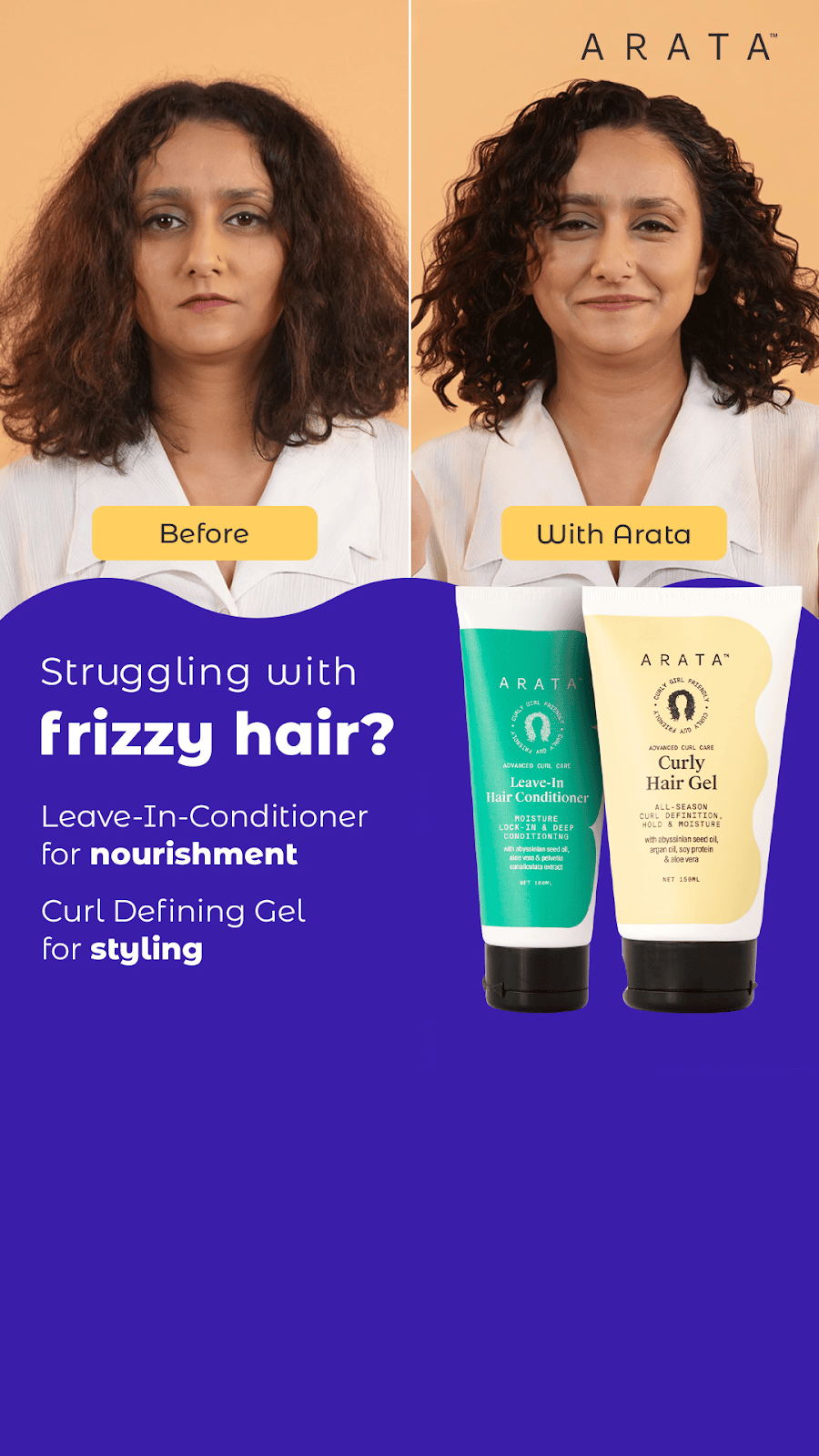
Want to prove your products really work? Then take a cue from Arata and show your audience the transformation they can experience with your product.
Why does this work?
- Headline: “Struggling with Frizzy Hair?” creates a relatable pain point for many people.
- Before & After: Features a clear and striking comparison of before and after using the product.
- Emotional Appeal: The image of a smiling woman with smooth, frizz-free hair makes viewers envision themselves with similar results.
- Takeaway: Before and after visuals can work wonders in convincing customers of your product’s effectiveness. Just ensure featured transformations are indeed genuine and not exaggerated.
2. How Deep Will You Go?
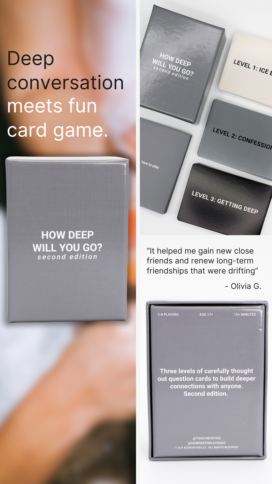
One of my underrated trends of 2025 are ads that look like Pinterest boards. This one from How Deep Will You Go? Functions as a mini landing page in a single image.
Why does this work?
- Headline: The “X meets Y” headline framework can be used to position a novel product at the intersection of two familiar concepts. Done well, it allows you to carve out a category for yourself and connect with cold audiences quickly.
- Grid Composition: There’s something visually satisfying about viewing a grid or collage. The structure makes the brain want to stop scrolling and explore.
- Stacking Elements: This ad shows you a lot in just a single image. You get to see the front and back of the box, learn a bit about how it works with the different card levels, and read a powerful, transformation-focused testimonial.
- Takeaway: If you have a product that requires some amount of education before people “get it”, give this format a shot. Just make sure you’re establishing a strong visual hierarchy so things don’t get too chaotic.
3. Dirty Dog Farm
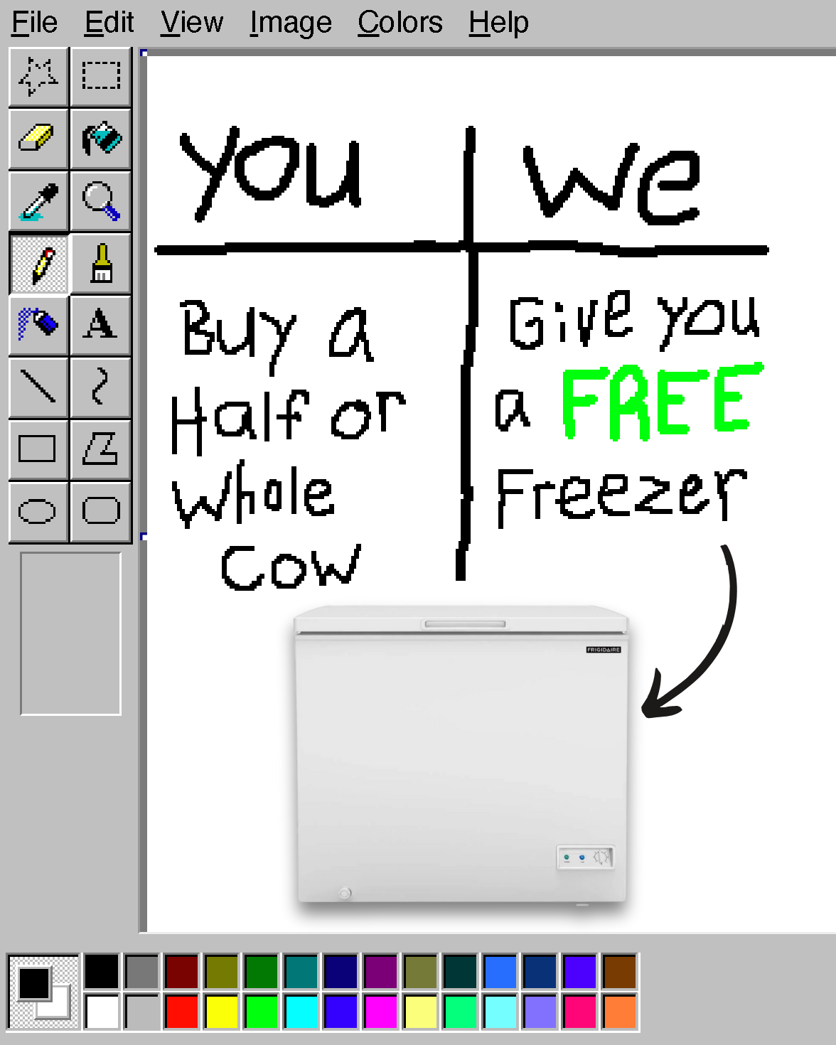
MS Paint is still undefeated. It’s ugly, which makes it feel real. It cuts through the pretty, branded noise most advertisers are putting out like a hot knife through butter. Take this one from Dirty Dog Farm, for example.
Why does this work?
- Ugly Format: This format is sort of an “anti-ad”. It’s so ugly and unlike what most people see on their feed that it’s funny. As a result, these ads tend to get a lot of engagement.
- Simple Language: If you’re ever tried to write words in MS Paint, you know it’s no easy task. You can’t fit much in there, so you’re forced to distill your message down and use fewer, simple words. The constraints become an advantage.
- Takeaway: Step outside of your brand guidelines every now and then and take a walk on the wild side. Relevance wins, pretty doesn’t.
4. Curology
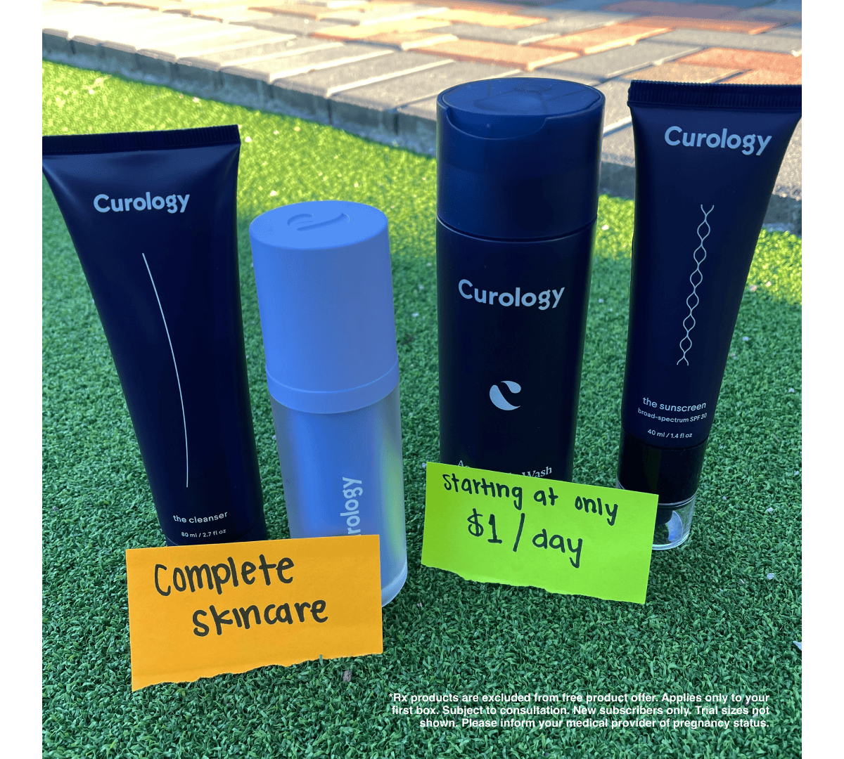
Most skincare ads try to look perfect. This one from Curology does the opposite. It’s authentic, clear, and shockingly simple.
Why does this work?
- Authentic Photo: No fancy lighting or studio background. It looks like something captured spontaneously by a normal person with a smartphone. The ad doesn’t feel like it’s coming from a brand. It feels like something a friend might share.
- Sticky Notes: I don’t know what it is about post-it note ads, but they’re so hard to ignore. Maybe it’s the bright colors, or the human handwriting, or the fact that the message is concise and digestible to conserve space. Whatever it is, they always feel like something to pay attention to and read.
- Price Anchor: This is a classic marketing tactic. You reframe the price in a way that makes it accessible (only $1/day). It’s what you want (complete skincare) at a no-brainer price.
- Takeaway: Take more low-fi pictures of your product on your smart phone, and add in some benefit callouts in the form of sticky notes.
5. AG1
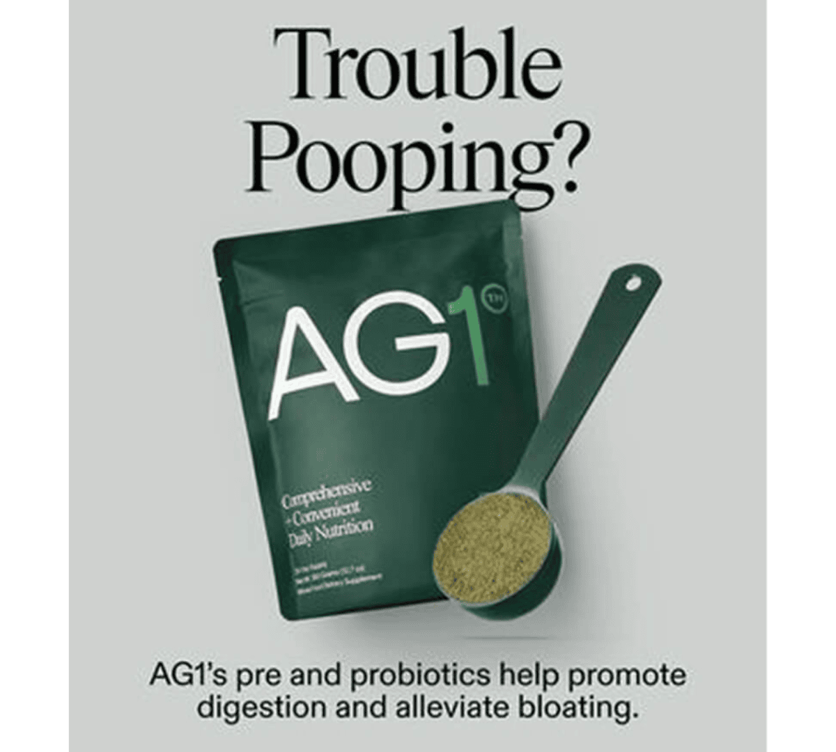
Trouble Pooping? That’s it. That’s the whole hook with this simple static from AG1.
Why does this work?
- Headline Callout: “Trouble pooping?” is an indirect or implicit callout. It targets a specific audience by zooming in on one highly relatable (and uncomfortable) problem. If your answer to this question is “yes”, you’re going to pay attention.
- Product Image: Having the product image right below the headline implies that AG1 is a solution for those who have trouble pooping.
- Solution Subhead: The subheading at the bottom explains why AG1 is the solution by highlighting a relevant benefit that solves the audience’s core problem (trouble pooping). The design respects the viewer’s attention span. Zero clutter. One clear message.
- Takeaway: Try making ads that zero in on one benefit and one customer persona, even if your product has several. You’ll be able to tap into different pockets of customers by speaking more directly to their problems and pains.
6. Four Sigmatic
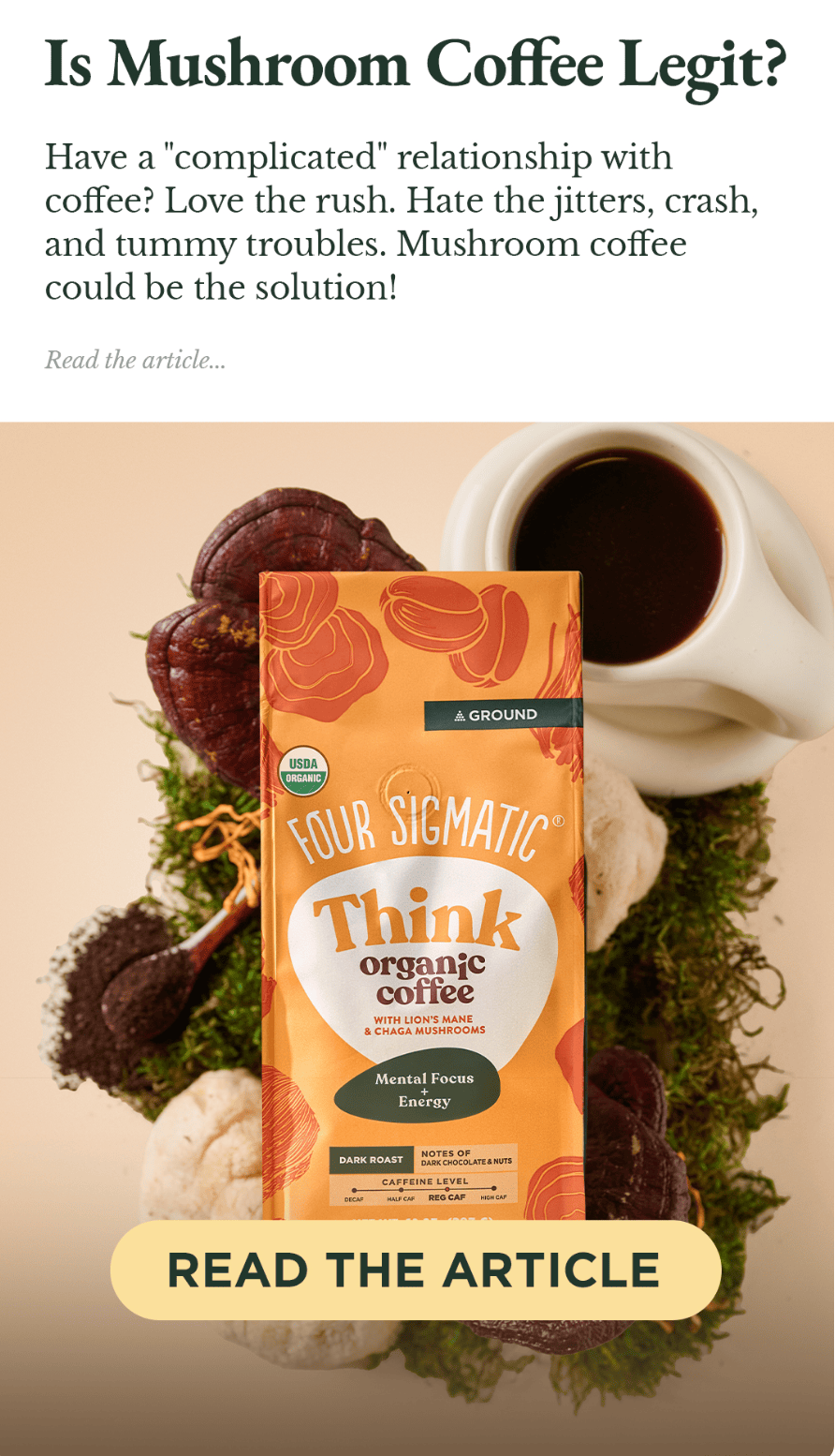
You can’t “create demand” for your products. You can only capture it. If you want to sell your products profitably at scale, you have to meet prospects where they are. This static from Four Sigmatic is an excellent example of this principle in action.
Why does this work?
- Problem-Aware Education: This ad, and the pre-sell article on its landing page, look like organic news content. It’s not hard-selling yet. It’s educating audiences that are higher in the funnel. As you scale, you’ll need ads that can work on less aware audiences, because there are only so many people ready to buy off the first or second ad they see from you. You need ads that can serve as prospecting tools, not just closers.
- Collier Principle: Legendary copywriter Robert Collier once said “Always enter the conversation already happening in the prospect’s mind”. The copy in this ad makes you feel understood and encourages your sense of curiosity.
- The Takeaway: Use ads like this to educate an audience who’s maybe not quite ready to make the switch, but could be soon.
7. Everyday Dose
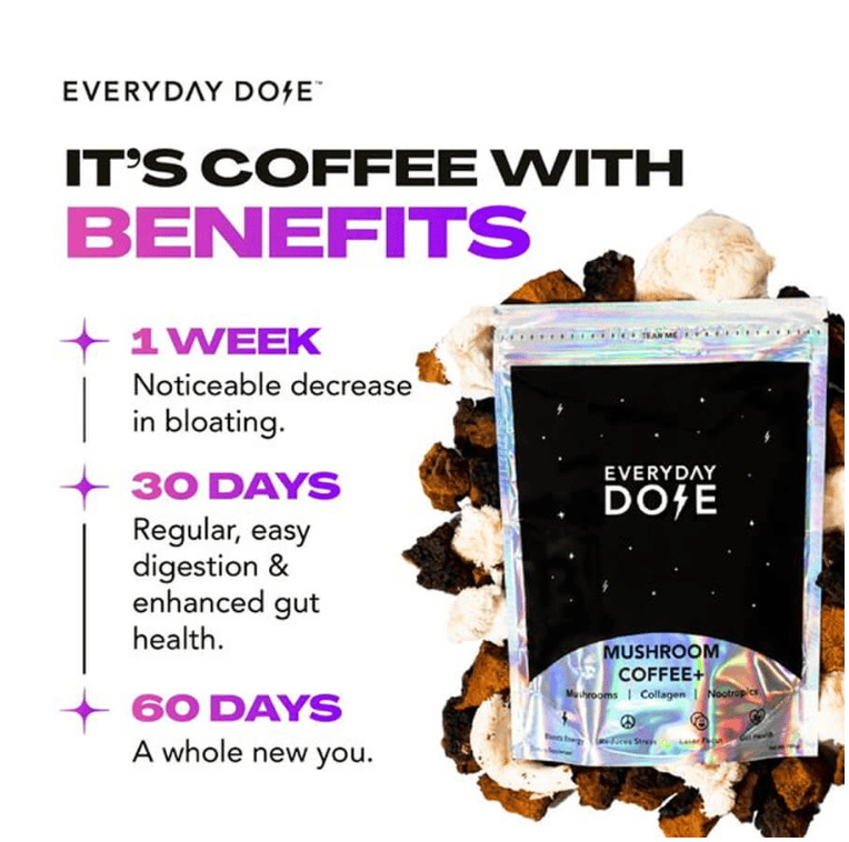
If you want to boost customer retention, particularly for consumables, give customers a compelling reason to develop a “ritual” built around your product. Everyday Dose does this masterfully with this ad.
Why does this work?
- Headline: The headline calls out coffee drinkers who care about optimizing their health.
- Benefit Timeline: Instead of using traditional benefit callouts or a normal before and after layout, the benefits here are organized along a timeline. This is brilliant because it plants a seed for customers to use the product consistently in order to experience the benefits.
- The Takeaway: If you have a product that you want people to use every day, show them why they should and what results will follow if they stay consistent.
8. True Classic
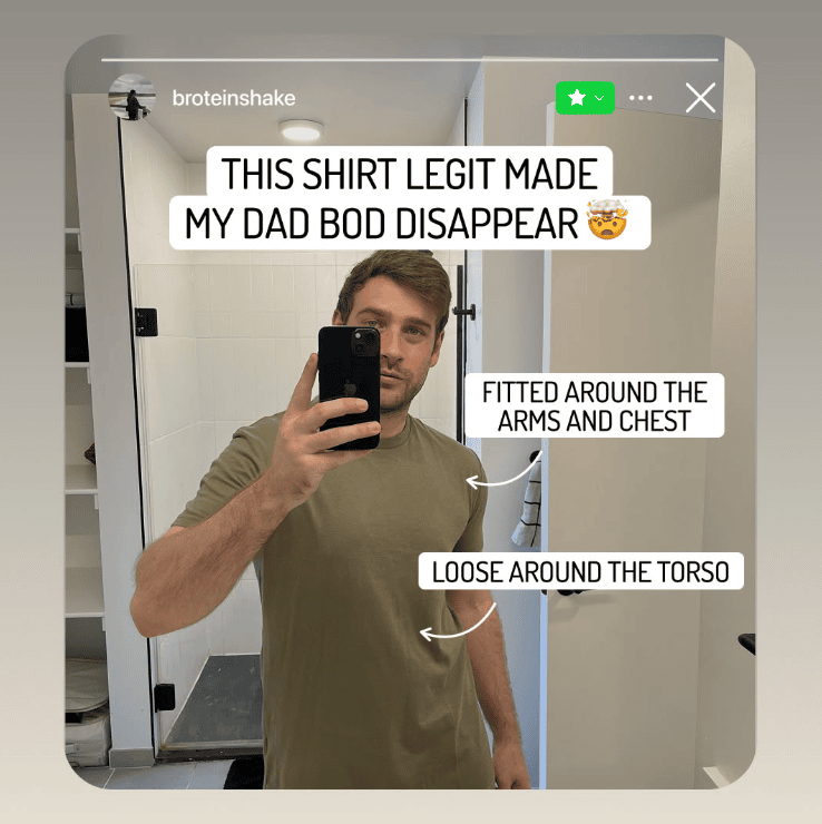
As AI gets better at making perfectly polished creatives, the power of ugly, native looking ads will only become more apparent. Take this one from True Classic for example:
Why does this work?
- Format: This ad is a master of disguise. It’s a mirror selfie on an Instagram Story overlaid with native looking text. It makes you pause and pay attention because it feels like an organic piece of content from someone you know (it even has the “close friends” badge in the top right).
- Headline: The headline speaks to guys with “dad bod” who still want to look good and feel confident in their clothes. We get an aspirational claim (My Dad Bod Disappeared!), plus the visual proof to support it below.
- Feature Callouts: Once you read the headline, you may wonder “how does a shirt hide dad bod?”. The callouts on the right answer that question by drawing attention to two critical features that deliver on the promise being made.
- The Takeaway: Use relevant, low-fi formats like this in your ads to disarm users and speak to them in a way that will resonate.
9. Huel
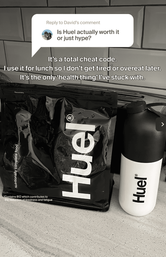
The reply to comment format is another native way for you to address common questions your prospects might have about your products
Why does this work?
- Authentic Question: It’s likely that a segment of the MOF and BOF audience for Huel has the same question as the one asked here. Maybe they’ve heard of Huel, but they don’t know if it’s actually worth the money.
- Social Proof Response: Notice how the answer to the comment uses accessible customer language. That plus the low-fi smartphone photo makes this ad basically indistinguishable from an organic influencer post.
- The Takeaway: If you’re looking for new angles to try, take a trip to the comment section of your existing ads or organic posts and see what trends emerge.
10. Ridge
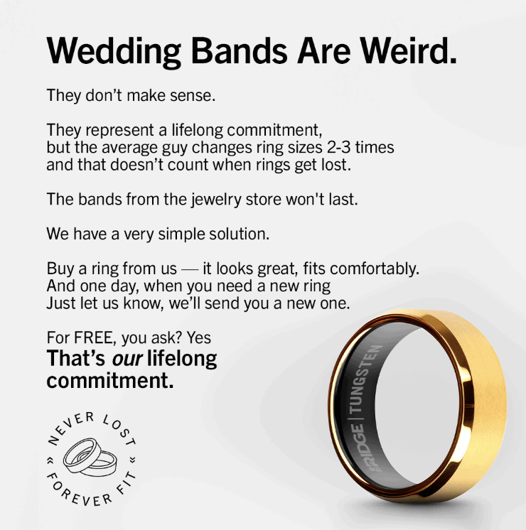
Some people get nervous about having too much text in an ad. But as this one from Ridge demonstrates, it’s not just about the text, it’s about the context.
Why does this work?
- Headline: This headline is pure curiosity. You feel compelled to keep reading to see what they’re getting at.
- Problem-Solution: This ad reads like a mini direct-response sales page using a problem-solution copywriting framework. It introduces a very real and relatable problem (losing your wedding ring), and introduces their simple and unique solution. Even though there’s a lot of copy, none of it feels unnecessary.
- The Takeaway: If you have a message that needs more than a few words, don’t be afraid to write it all out. Just make sure you make it worth reading.
11. Butcherbox
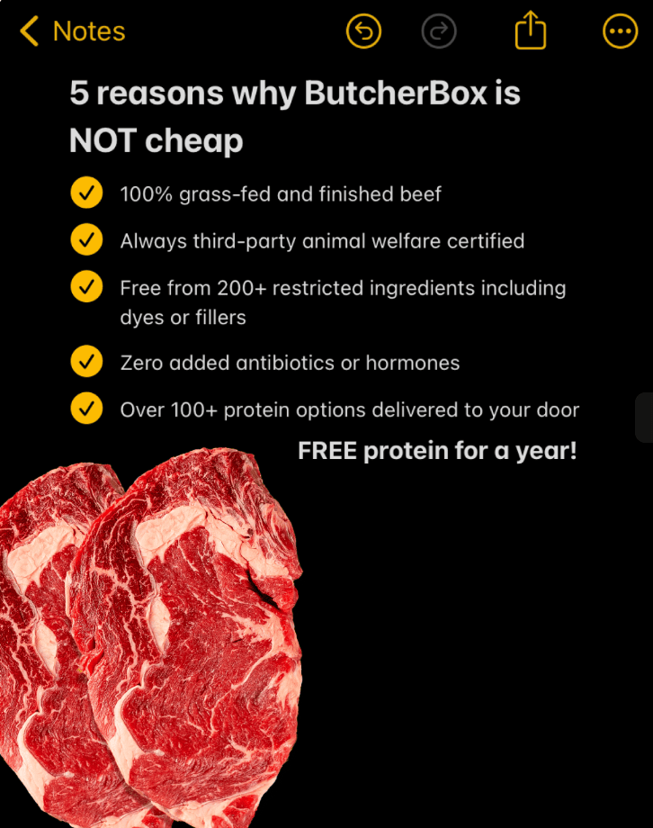
To create a truly bulletproof ad campaign, it helps to have some objection-handlers on deck to drive home any logic-driven buyers. This ad from Butcherbox is a blueprint.
Why does this work?
- Value Positioning: Price is one of the most common objections in sales, but you can get out ahead of it with your messaging. Butcherbox is priced at a premium because they offer superior value to alternatives on the market. They put together this listicle ad to educate consumers so they make a value-based decision instead of one based solely on price.
- Notes App: The Apple Notes format is still a popular one. It feels casual and relatable to iOS users in particular.
- The Takeaway: Some of your audience requires a more logical approach to selling. This format is a great way to address their concerns and move them closer to a conversion.
12. Loop Ear Plugs
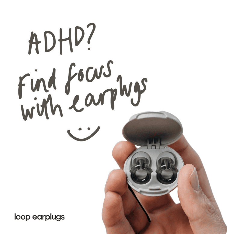
Just because you understand why people use your product, doesn’t mean everyone else does. This static from Loop does a great job dimensionalizing their product for a specific group of people.
Why does this work?
- Problem-Solution Headline: Price is one of the most common objections in sales, but you can get out ahead of it with your messaging. Butcherbox is priced at a premium because they offer superior value to alternatives on the market. They put together this listicle ad to educate consumers so they make a value-based decision instead of one based solely on price.
- Handwritten Copy: The messy handwriting grabs attention and makes the message come of as authentic and
- Visual Heirarchy: Notice how simple and focused this ad is. There’s a product image and a very concise headline. There’s not even a colored background. It makes you wonder if the decision to keep things minimal for an ADHD audience was intentional.
- The Takeaway: Some of your audience requires a more logical approach to selling. This format is a great way to address their concerns and move them closer to a conversion.
13. Menerals
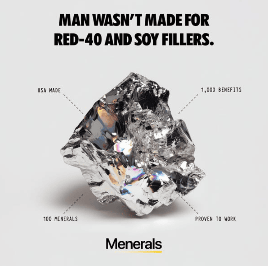
Menerals is absolutely unhinged with their organic content (go look at their Instagram if you don’t believe me). Their ads are a bit more tame, but still cut right to the chase with No B.S. messaging.
Why does this work?
- Problem-Solution Headline: When writing copy, it’s helpful to imagine yourself standing next to your ideal prospect rather than across from them. It should be clear that you care about the same things they do, and that you share common enemies. The headline in this ad does an excellent job of taking a stance against something that a lot of modern men are fed up with.
- Callouts: Since the headline is so problem-focused, the callouts serve to clarify the solution. “100 Minerals” “1,000 Benefits” “Proven To Work” USA Made.” They’re short, punchy, and to-the-point, something that the ideal customer will likely appreciate.
- Intriguing Image: The image of the mineral rock at the center is pure curiosity. Not only is it an attention magnet, it also gives the impression that there’s something unique about the product. If you visit the Menerals website, you’ll see they use lots of pictures of minerals in their raw form.
- The Takeaway: When writing headlines, consider the provocative statements you could make… ideally ones your ideal audience agrees with but doesn’t hear from other brands.
14. Manukora
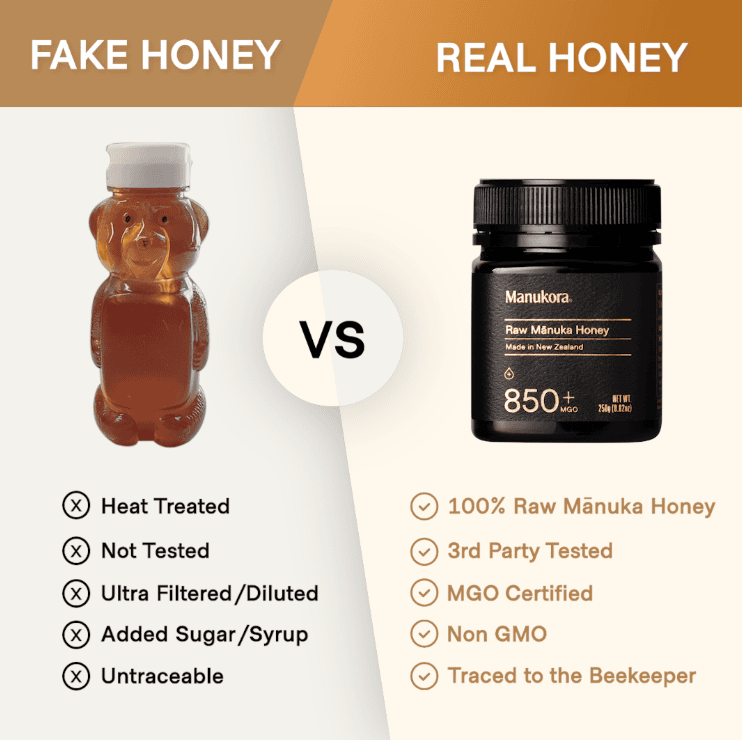
No list of statics would be complete without an Us vs Them ad. These are still some of the most effective statics when done right.
Why does this work?
- Format: Humans have a natural tendency to compare things. Here we see Manukora honey pitted against the generic grocery store alternative honey most people are using. It’s not a fair fight, and that’s the point.
- Feature Comparison: Below each image, we have a list of features for each option. The features on the left are deeply unappealing to the target audience, while the ones on the right are perfectly matched to their desires.
- The Takeaway: If there’s an inferior alternative to your product on the market (and there should be), show what makes you the obvious choice.
Backlinko is owned by Semrush. We’re still obsessed with bringing you world-class SEO insights, backed by hands-on experience. Unless otherwise noted, this content was written by either an employee or paid contractor of Semrush Inc.

