Blog Design

Written by Brian Dean
What Is Blog Design?
Blog Design is the practice of optimizing a blog’s look, feel, branding, readability and functionality in order to maximize visitors, readership and conversions.
Why Is Blog Design Important?
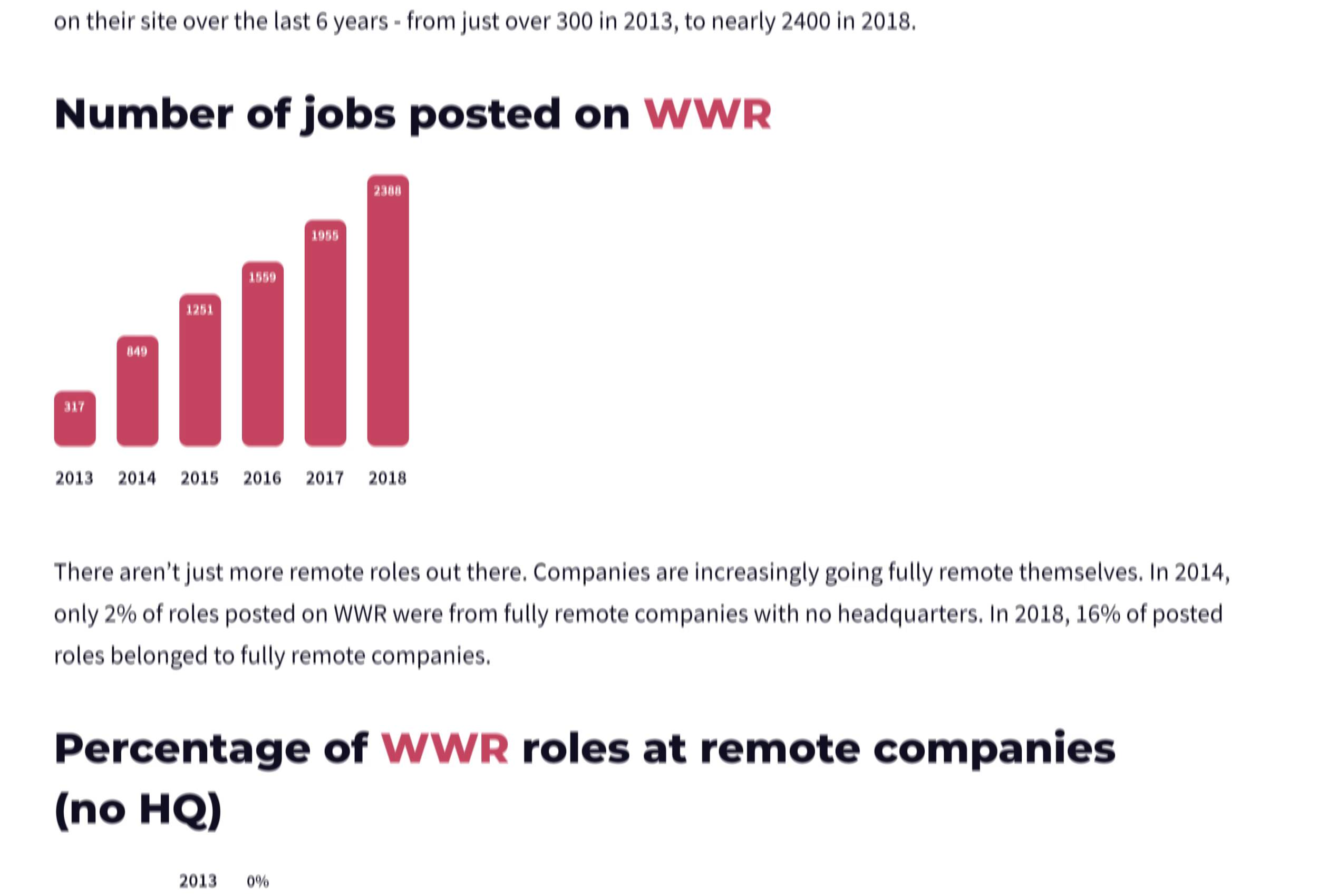
According to the latest numbers from WordPress, 70 million individual blog posts are published every month.

So for your content to get noticed, yes, you need to publish high-quality content.
But that content also needs to LOOK really good.
In fact, according to NN/g, website design has a dramatic impact on a site’s trustworthiness and credibility.

I’ve seen the impact that blog design can have on a blog’s success firsthand. When I first launched my blog, I was a new player in the highly competitive digital marketing space.
And I knew that design would help me stand out from the big blogs in my space.
So I put a lot of time and effort into my initial blog design.

I also invested heavily in visual content, like infographics.

And this focus on design helped my blog get noticed in the early days.
Even though my blog has grown exponentially since then, my entire team and I still make design a high priority for the blog.
Not only do we do the extra mile with custom screenshots:

But we work with web designers to create custom-designed guides.

In fact, we get comments on a weekly basis from blog readers complimenting us on our design.

And I can confidently report that design is one of the main reasons that our blog brings in over 480k monthly visits.

The one caveat here is that custom-designed pages can be expensive. You essentially need to have someone design a webpage from scratch. Then, have the page coded up and integrated into WordPress.
So if you don’t have a huge content marketing budget, focus on cheaper design elements, like blog post banners and visuals.
Now that you’ve seen exactly why blog design matters, it’s time to make sure that your blog is designed the right way.
Best Practices
Focus On High Readability
When most people hear “blog design”, they think about things like colors, illustrations, branding and UX.
And yes, those things are important for a blog’s design.
But they’re not nearly as important as your typography.
After all, a blog is a place people go to read text and informative content. And if that text content is hard to read, the blog won’t succeed.
(No matter how amazing that type of content happens to be.)
Fortunately, making your blog content easy to read isn’t rocket science.
The most important thing is that you use a font that’s between 15px-18px.
In fact, a study out of Carnegie Mellon University found that larger fonts are easier to read and understand.

This is something I’ve noticed from my own experience. If I land on a blog with a small font, I usually click away.
But if I wind up on a blog with a highly readable font I’ll usually give the content a chance.
Medium.com is the king of readable fonts.
They use a 21px font. And it’s big, bold and insanely easy to consume.

Other than font size, you also want your blog’s design to include plenty of white space around the text.
For example, here’s a blog with text that’s all squished together.

That’s super hard to read.
On the other hand, on our blog, we use a ton of white space around the content.

Last up, use a blog layout that’s easy to read… and skim.
This means using wide margins, like this:

And creating bold subheaders that break long-form content down into smaller chunks.

Use a Consistent Design
Like any website design, consistency for your blog’s design is HUGE.
A consistent design makes it easier for people to remember your blog. Which, considering how many blogs are out there, is super important.
For example, at Backlinko, we use “Backlinko Green” across our whole site.

And at Dropbox, they use custom-illustrated blog post banners that all have the same look and feel.

The Canva blog uses non-cheesy stock photos at the top of every post.

If they used a stock photo for one post and an illustration for another, their blog design would look all over the place. But this consistency helps their blog look super professional.
In fact, if you stripped out the text from each blog, you’d still be able to tell which blog you were on based on design alone.

That’s the power of consistent design.
Design to Stand Out
Your blog should be easy to read. And use consistent design elements.
But if your blog looks like every other blog in your niche, it’s going to blend in.
This is why at least some of your blog design should be dedicated to standing out.
That’s not to say that you need to reinvent the wheel. But your blog should do something that makes it look different than competing blogs.
Here are a few examples of things you can tweak to make your blog design look unique:
- Your blog feed
- Your banner images
- Your WordPress theme
- Font and typography
- Illustrations
- Comments section
- Site navigation
- Footer
To give you some design inspiration, let’s look at a few examples of blogs that do a great job of standing out.
Intercom has a really unique layout for their blog feed.

Most blog feeds are vertical with a single column. But Intercom features their latest post at the top of the feed…

…and has a list of their older content in a 3×3 grid.

Whether this makes Intercom’s content easier to find is another story. But there’s no denying that their design really stands out.
The Loom blog is another great example of stand-out blog design.
All of their posts use a massive, bold font, cool illustrations and other design elements that look really different from most other B2B blogs.

And if you’re a personal brand, I highly recommend checking out Marie Forleo’s blog.

Marie’s layout, typography and style are 100% unique to her.

Feature Your Best Content
Most blog feeds look something like this:

You have their latest post at the top. And their older posts underneath.
Now:
There’s nothing WRONG with this layout.
But there is one big downside with using the chronological approach: it’s hard to find your blog’s best stuff.
For example, let’s say you published an amazing guide 2 years ago. Well, someone that lands on your blog for the first time has no way of easily finding that guide. It’s probably buried on page 10 of your feed.
That’s why more and more blogs are using a “library approach” to their blog feed.
With this approach, you highlight your best stuff… not the content you published most recently.
For example, a while ago, the Lattice blog feed wasn’t really a feed at all. It was a curated list of their most popular content.

In fact, you had to scroll down to the bottom of the page to see their recent posts.
This approach isn’t for everybody. If your blog covers industry news and trends, then you probably do want to use a traditional blog feed.
But if you publish lots of evergreen content, then a library approach might make sense for you.
If you’re married to the blog feed format, you can show off some of your best content in your blog feed sidebar, like we used to do.

Add Visuals and Images
Blog design isn’t just about the design of your page.
Your content’s format, layout and even the copy itself can impact design.
And to give your content that little bit of extra pop, I recommend adding visuals and images throughout your post.
For example, take a look at this blog post made up of 100% text.

On the other hand, check out this section from one of our posts.

These visual elements — screenshots and high-quality images make our content look more interesting. But we don’t use images just to make our posts look pretty. Our images break up the content, which makes it easier to read.
That’s not to say you should add images just for the sake of adding images. But when you CAN use an image, you SHOULD use an image.
Create Custom Pages for “Big Content”
For lists posts, case studies and other run-of-the-mill posts, your standard blog layout will work just fine.
But what about when you publish something HUGE?
Well, that’s where you might want to consider a custom page design.
For example, most of our posts use the same exact layout with a featured image.

But every now and again we publish a piece of “big content”, like an industry study or report.
When we do, we use a custom design to let people know that this content is a big deal.
For example, when we published the results from a survey, we created a custom header just for that post.

Because the rest of the post was exactly the same, this custom design was pretty easy to pull off.
But you can also go crazy and create an entirely new page just for one post.
In fact, that’s what FYI did with their “Why Everyone Loves Remote Work” post.

This post is a completely custom-designed page with hundreds of custom images, graphs and design elements.
Create a Blog “Homepage”
For most people, their blog’s “homepage” is their blog feed.

The upside is that this layout makes it really easy to find your content.
But it’s HORRIBLE for conversions.
Instead, I recommend testing out a blog homepage that’s designed solely to build your email list.
Then, put your blog feed on a /blog URL.
For example, our blog’s homepage used to be a normal feed.

But a few years ago, we moved the feed to /blog. And launched a homepage that was optimized for list building.

And because that homepage was designed to collect emails, it converted 8x better than our old blog homepage.
Use a Byline
Ever land on a blog and wonder: “Who the heck wrote this?”.
It’s human nature: we want to know who’s behind the content we’re consuming.
This is why you want to use a clear byline at the top of every post. Preferably with a headshot of the person that wrote it.
For example, the Buffer Blog features the blog post author right underneath the blog post title.

Add Social Sharing Buttons
If you want more people to share your content on social networks, you need to make it SUPER easy for them.
This is why I recommend incorporating social sharing buttons into your design.
In our case, we use floating buttons that follow you down the page.

But you can also just add static buttons to the top or bottom of your post.
Pro Tip: Pick the 2-3 social media sites that your audience spends the most time on. And ONLY feature those networks there.
Not only does a long list of buttons look super ugly…

…but it makes it less likely that they’ll use ANY of your buttons.
(Option overload.)
For example, most of our audience shares content on Facebook and Twitter. So we only use Facebook and Twitter buttons.
But if your audience is all about Pinterest, then you’d want to use that.
Learn More
Why Your Blog is Set Up Incorrectly for SEO: An excellent video by Ross Hudgens that outlines a few creative ways to set up your blog feed layout.
Designing & Building My Blog (Charli Marie): A case study/tutorial that shows you how to design a blog using WebFlow. I like how Charli breaks down the thought process behind every design decision.
Why I Spent $25,100 On A New Blog Design: In-depth case study of how one popular blogger rebuilt his blog’s minimalist design from scratch.