Email Marketing: The Definitive Guide
This is the ultimate email marketing guide for 2026.
So if you want to:
- Build your email list
- Improve your open rates
- Write amazing newsletters
- Turn more subscribers into customers
Then you’ll love this new guide.
Let’s get started.
Chapter 1:Email Marketing Fundamentals
In this chapter, we’re going to cover the basics of email marketing.
(Including what it is, why it works and why it’s still important.)
I’ll also show you how you can use email marketing to grow your business.
What Is Email Marketing?
Email marketing is the digital marketing practice of communicating with leads and customers with email. Common email-based marketing messages include email newsletters, promotional campaigns and event announcements. Email marketing typically has a significantly higher ROI than many other marketing channels (like social media).
The #1 thing that makes email marketing more effective than SEO and social media is that you have a direct line to your audience.
But with new platforms like Tik Tok and LinkedIn Live on the rise, does old-school email still work?
Let’s find out…
Does Email Marketing Still Work?
I’m not going to bore you with a million stats.
Instead, I’m going to quickly show you why email marketing still works GREAT.
The average email subscriber is worth $48.87 (DMA).
Email marketing’s ROI is 36:1 (Constant Contact).
This super high ROI is probably why 86% of marketers consider email “important” or “very important” (DMA).
Why Email Marketing Still Works
Why does email still work so well?
#1: With Email, You Own The Distribution
This is a big one.
When a new subscriber signs up to your list, you have a direct line to that person’s inbox.
That’s simply not the case with Facebook, Twitter, Instagram… or any other social media platform.
In fact, a study found that Facebook organic engagement plummeted to less than 1% (RivalQ).
Contrast that number to the engagement rate you get from email.
The average newsletter open rate is 21.33%… 20x higher than Facebook post engagement (MailChimp).
#2: People WANT to To Get Marketing Messages via Email
People don’t go on social media to see ads.
In fact, 45% of consumers report that social media ads are annoying (AdWeek).
On the other hand, people don’t mind marketing messages in their inboxes. In fact, they expect them.
For example, one study found that 86% of consumers prefer to get email-based marketing messages over Facebook ads, TV commercials and display ads (HubSpot).
#3: Email Converts REALLY Well
Sure, email has a better reach than social. But does that translate into more sales?
Yup!
In fact, when it comes to turning browsers into buyers, nothing beats email.
Email converts 40x more leads into customers than Facebook and Twitter combined (McKinsey).
These stats are nice and all. But you’re probably wondering:
“How do I get started with email marketing?”.
Well, that’s what our next chapter is all about…
Chapter 2:How to Build Your Email List
The first step of any email marketing campaign is to build your email list.
In this chapter, I’m going to show you exactly how to build your email address list using strategies that are working right now.
In fact:
These are the same exact list building techniques that I used to grow my email list to 189,044 total subscribers.
Let’s do this!
Optimize Your About Page for Conversions
If you’re like most people, your about page is one of the most-visited pages on your website.
Even better:
The people that go to your about page usually like you.
Which means they’re PRIMED to subscribe.
So I recommend putting at least one email sign-up form on your about page.
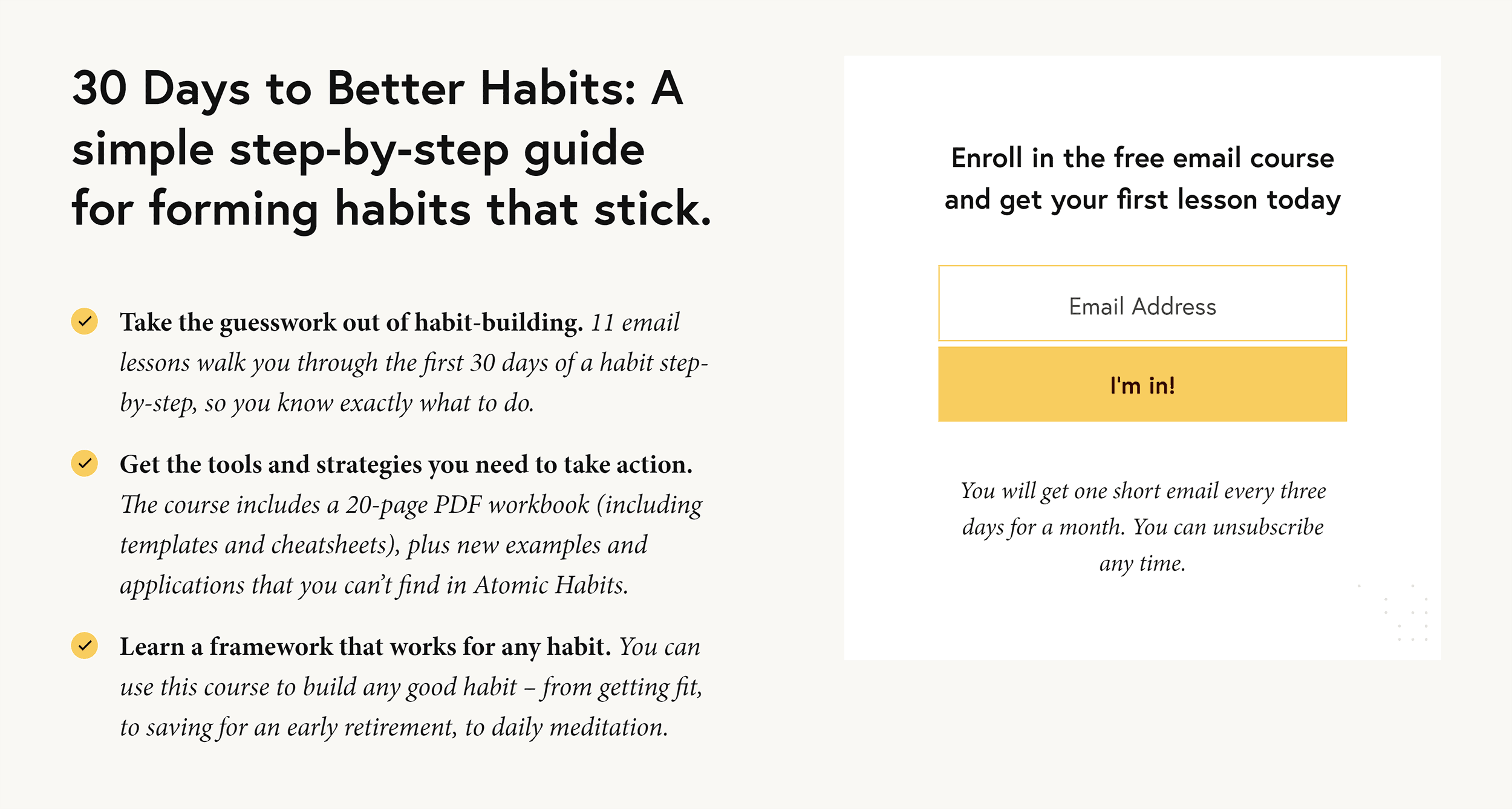
For example, my friend James Clear (who has over 500k subscribers) includes a form at the bottom of his about page.
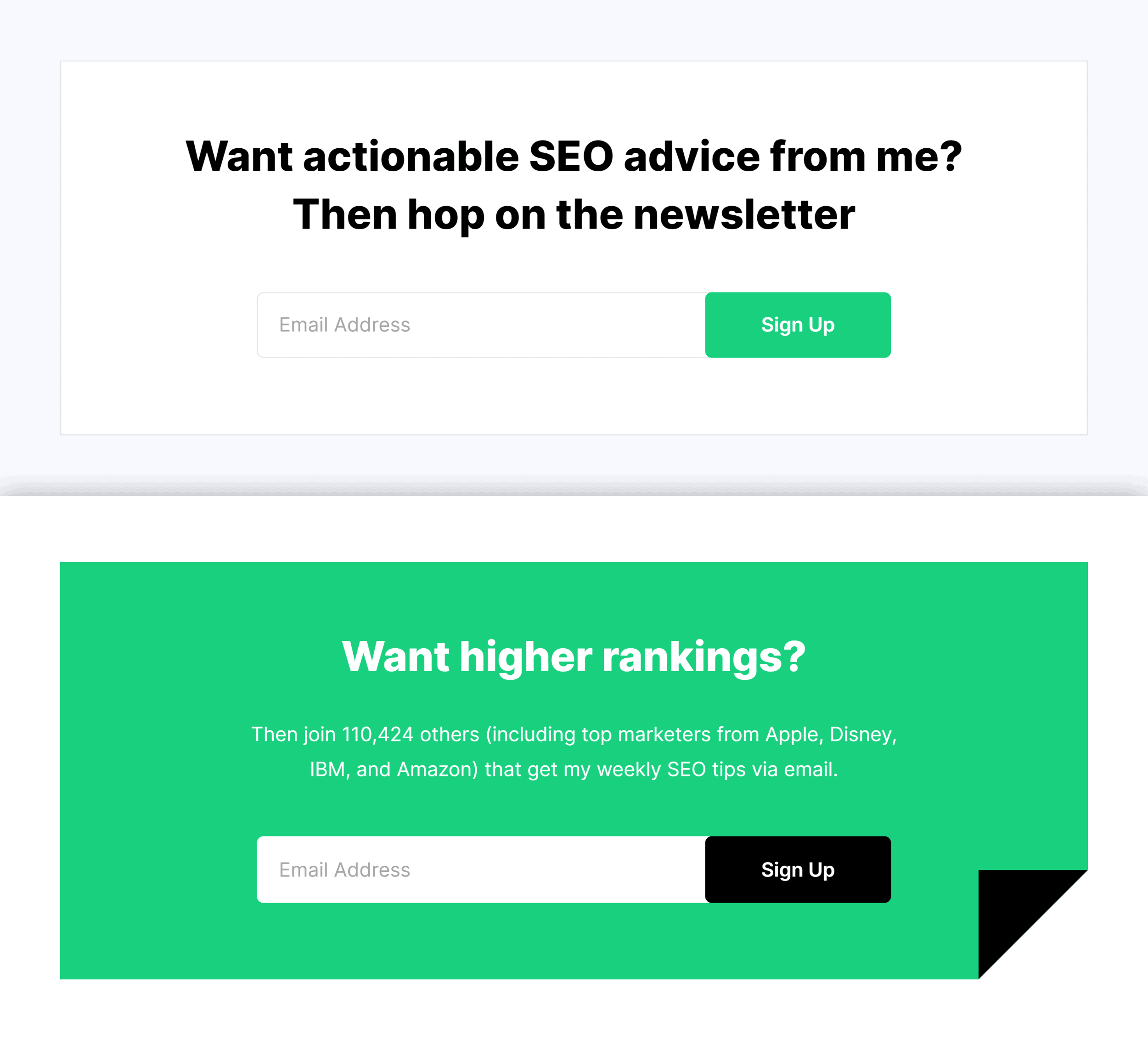
My about page is on the long side… so I use two forms:
Create Squeeze Pages
If you’re serious about building your email list you NEED a squeeze page.
(In other words: a page designed to convert visitors into email subscribers.)
Here’s an example from my site:
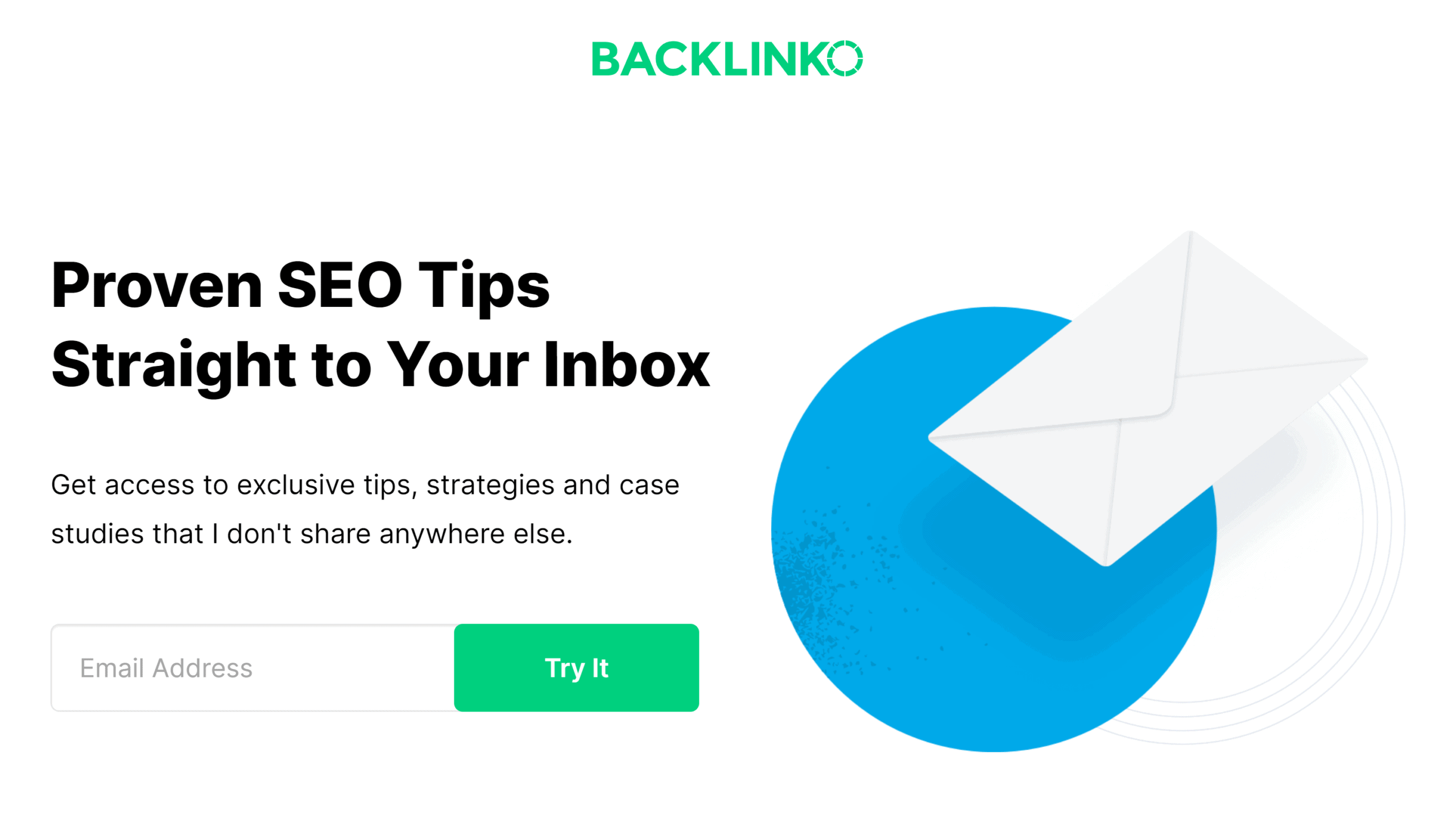
As you can see, this page doesn’t give you many options. It’s completely focused on the offer (signing up for my newsletter). This is why it converts at 14%.

If you want to take this to the next level, you can create different squeeze pages for different audiences.
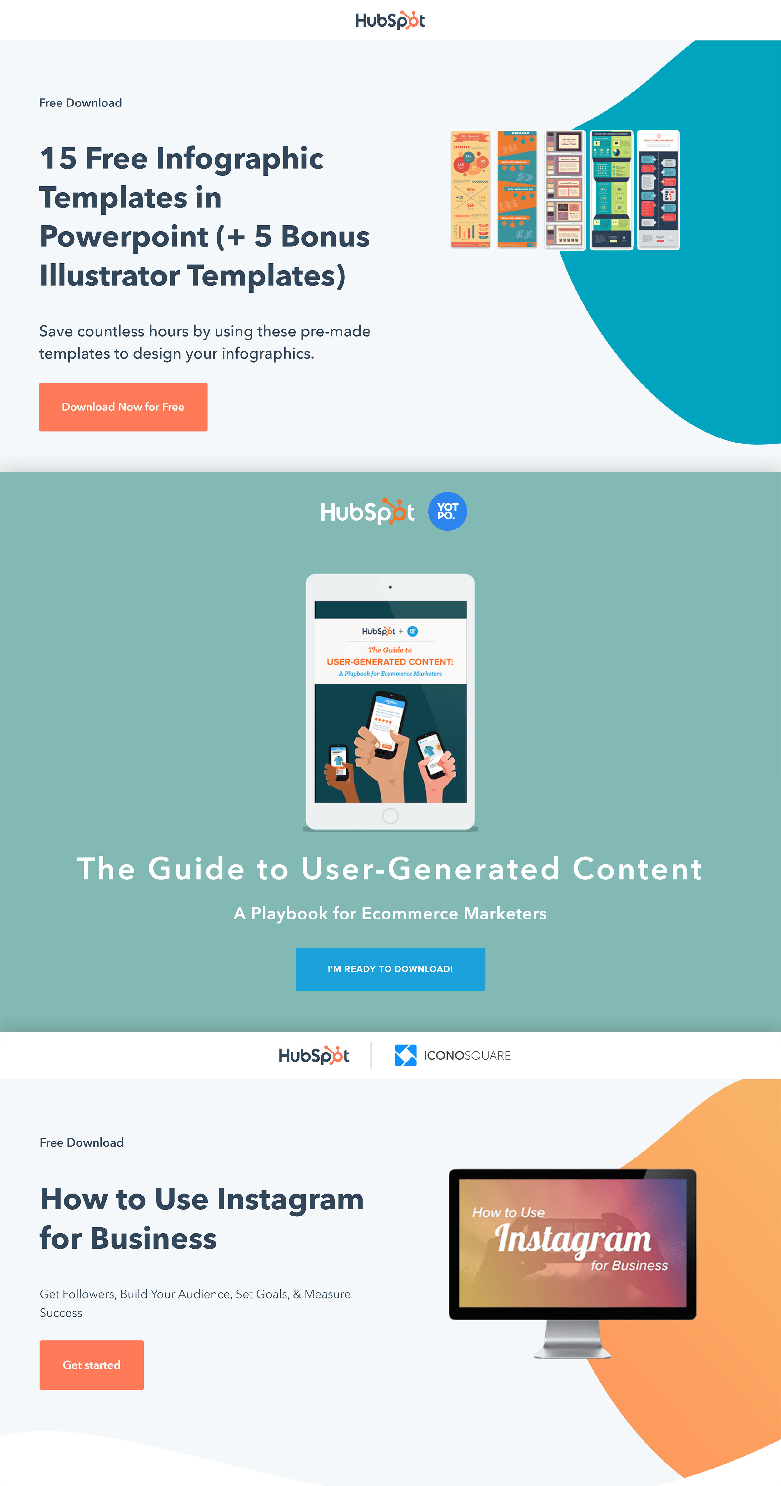
For example, HubSpot has 463 different squeeze pages. Each one offers a different lead magnet.
Speaking of lead magnets…
Create Compelling Lead Magnets
Lead Magnets are the lifeblood of any list building campaign.
Why?
It’s REALLY hard to get someone to sign up for a “newsletter” or “21-day email course”. Instead, you need to offer people something they can use right away.
I’m talking about:
- Checklists
- Ebooks
- Swipe files
- Case studies
- Templates
- Videos
In other words:
The more valuable your lead magnet, the more signups you’ll get.
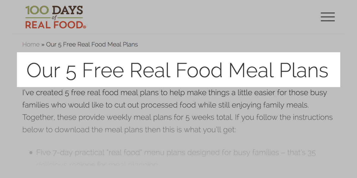
For example, 100 Days of Real Food offers up a full meal plan as a lead magnet:
Optimize Your Blog’s Homepage for Email Signups
Most blog homepages look something like this:
A list of their latest blog posts.
And hey, there’s nothing wrong with a blog post feed.
But if you want people to subscribe to your email list, you need to put your offer front and center.
In other words:
Design your blog’s homepage to convert readers into subscribers.
For example, my old homepage was your typical blog feed.
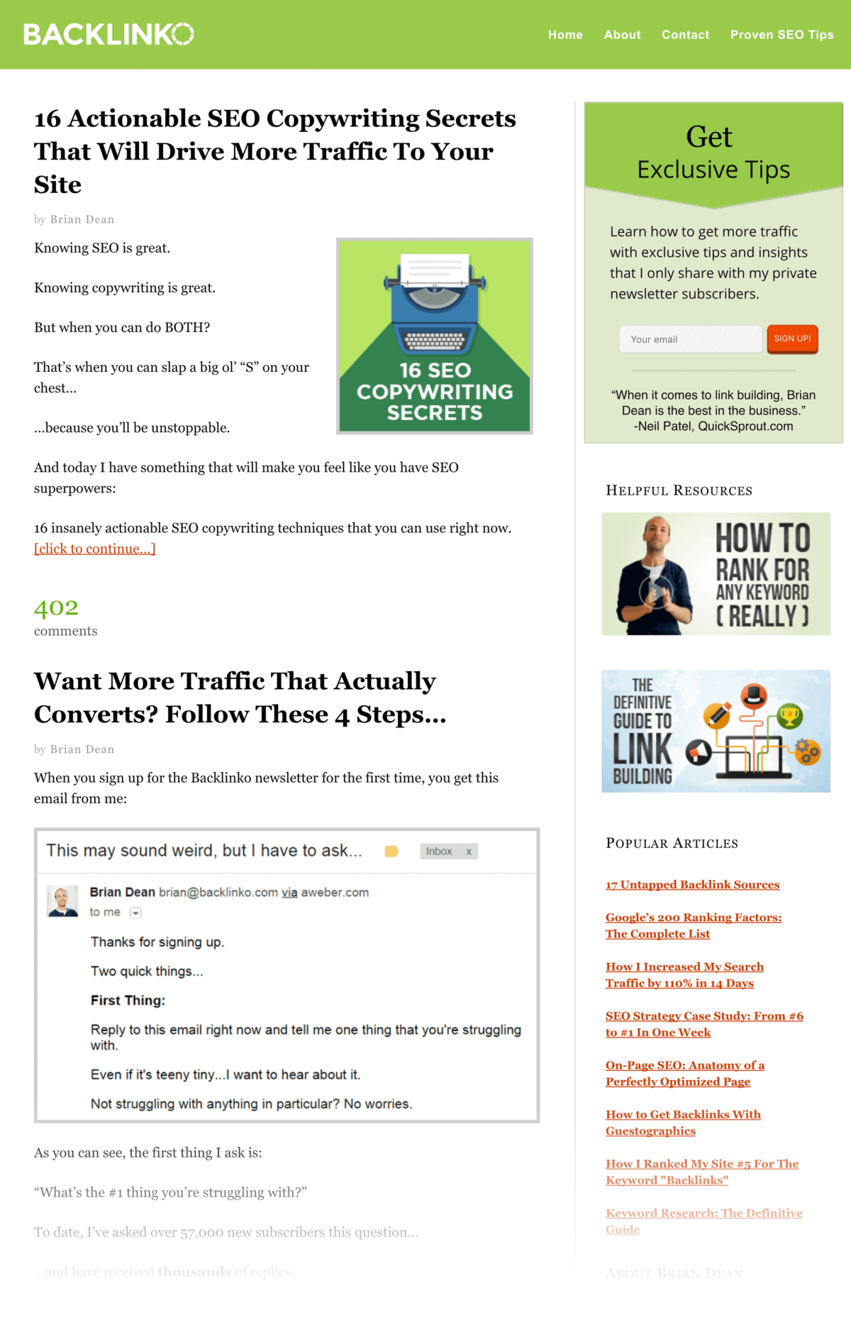
And it converted HORRIBLY.
That’s when I realized that most of the big sites (like Pinterest, Twitter and Facebook) don’t feature content on their homepages.
Instead, their homepages are optimized for signups.
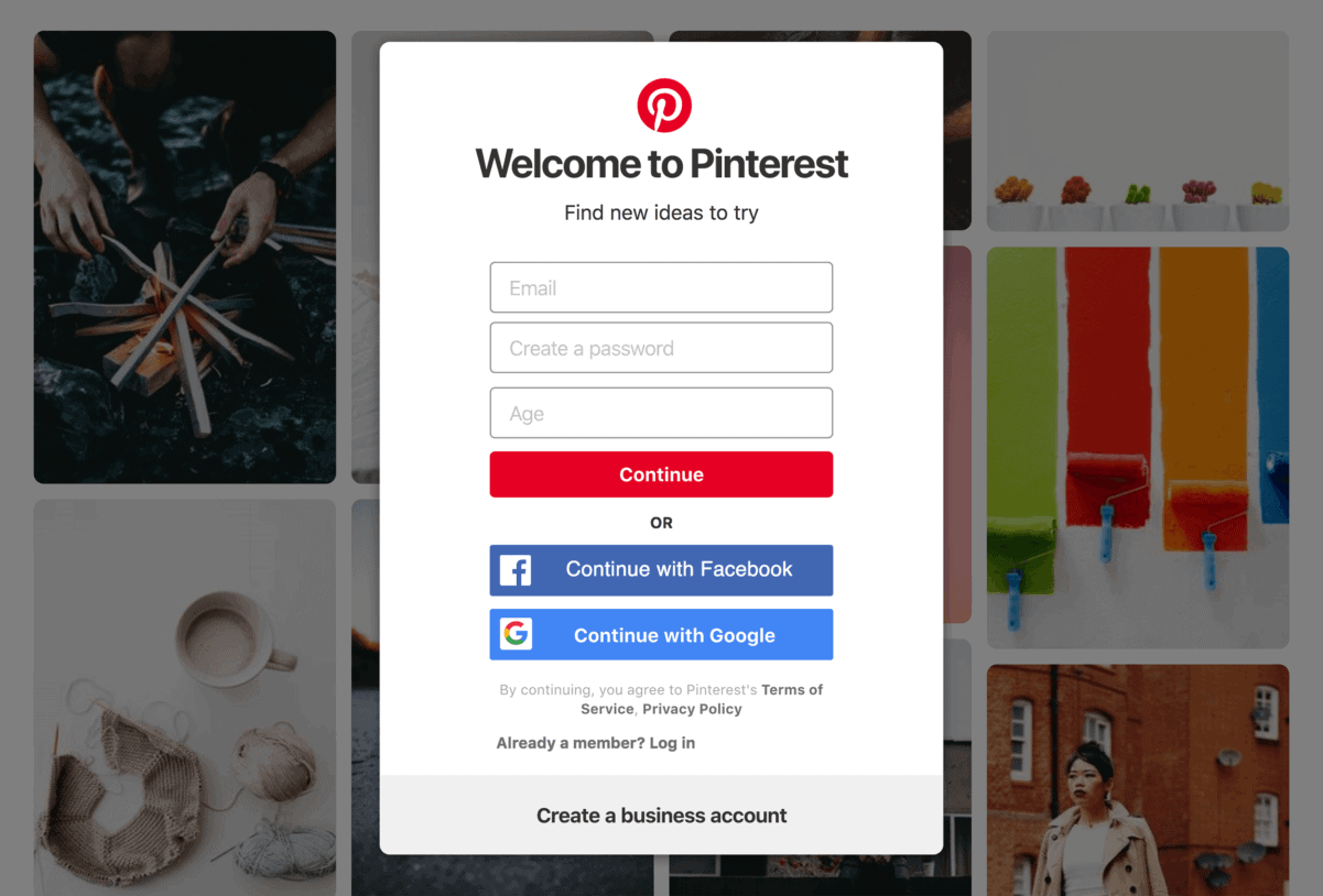
So I decided to try the same thing.
The result? This new homepage.
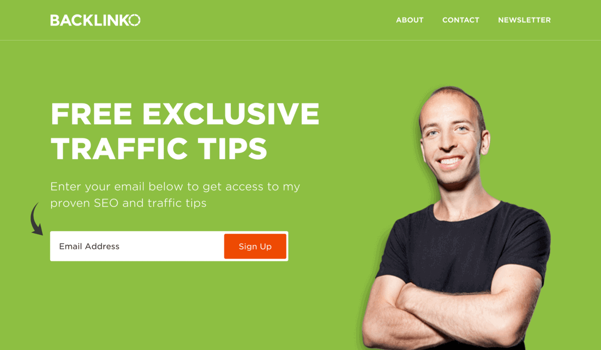
My old blog feed homepage converted at 4.6%. The new one? 9.01%.
95% better than my old homepage.
Legit.
Exit-Intent Popups
I’ll be the first to admit it:
I HATE popups.
In fact, I hate them so much that I swore I’d stop using them.
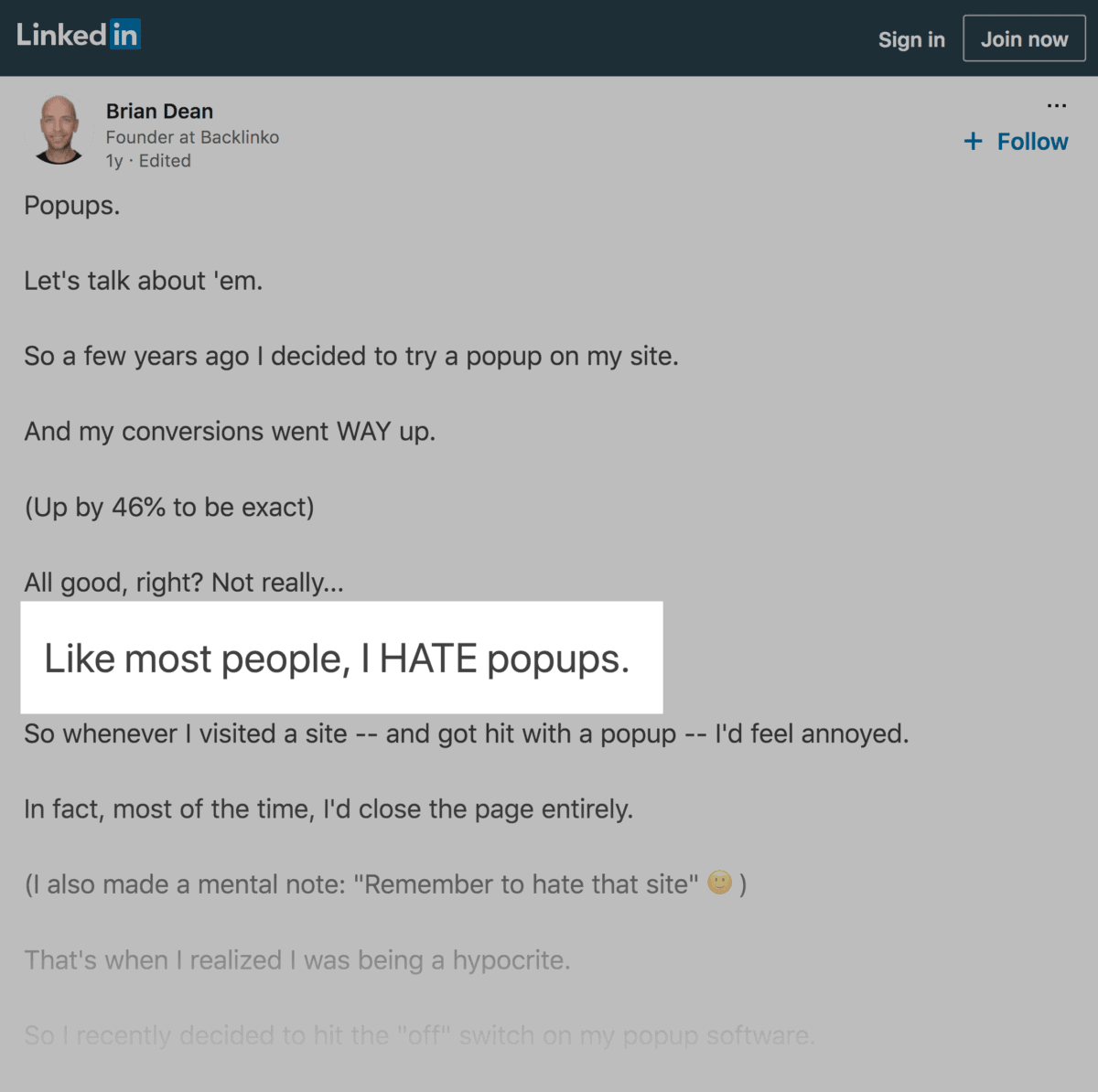
Then one day I realized something:
Not all popups are created equal.
In other words, there’s a BIG difference between a popup that attacks you the second you land on the page…
… and one that offers something of value as you leave.
So a while ago I decided to try popups again.
This time, I’d ONLY use exit-intent popups. And I’d ONLY offer super valuable stuff.
That way, I’m not annoying people with crap nobody wants, like this:
Here’s the popup my team came up with:
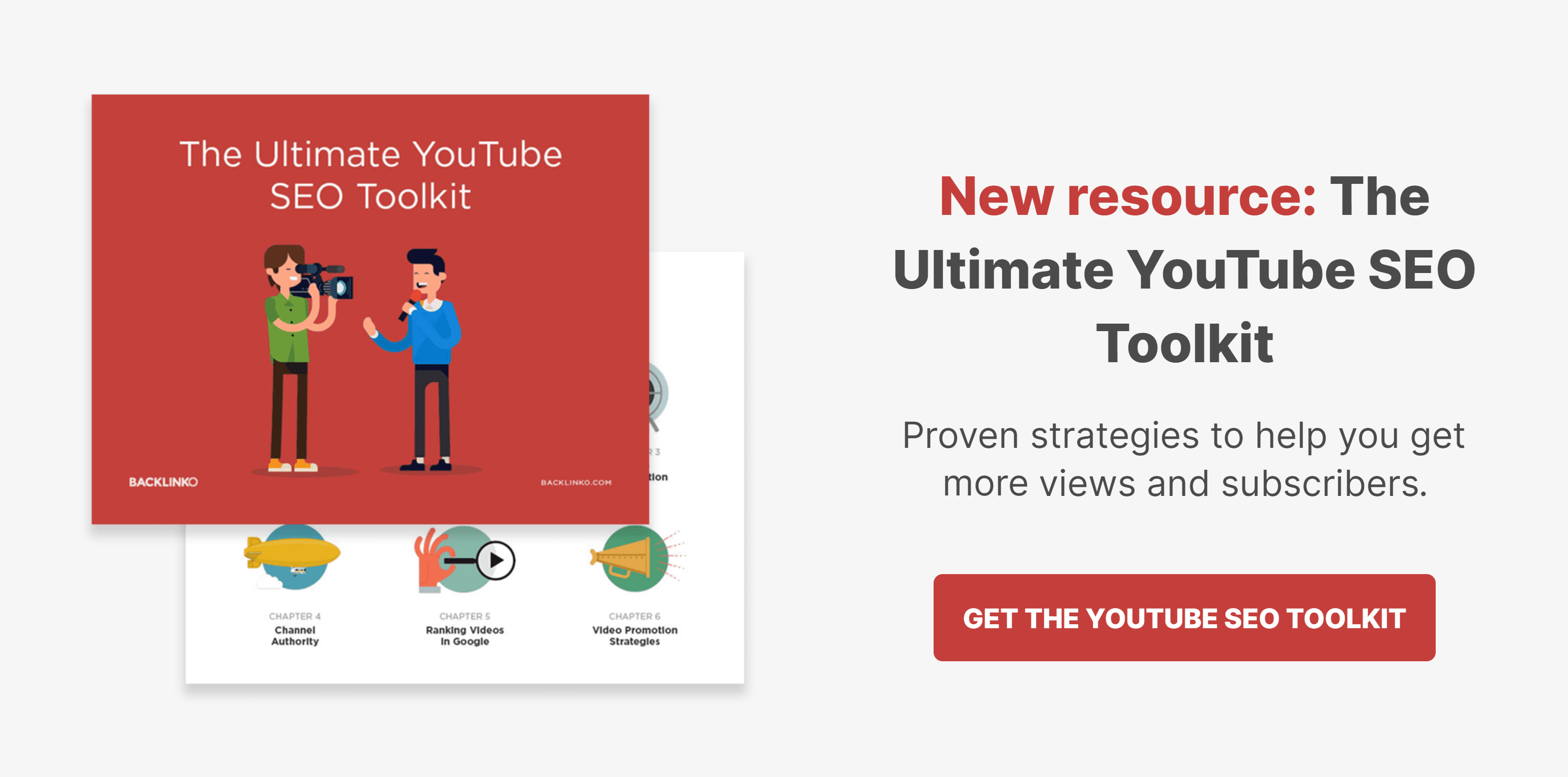
Not only does it offer something cool, but this popup only appears if you’re leaving the site anyway.
That way, you’re not distracted from the content on the page.
So, how did the new popup do?
Before the popup, my site’s overall conversion rate was 3.55%. After the exit-intent popup, it shot up to 6.14% (a 72.9% increase).
Very cool.
Use Content Upgrades
Content Upgrades are one of my all-time favorite list building strategies.
In fact, a single Content Upgrade boosted conversions on one of my blog posts by 755.2%.
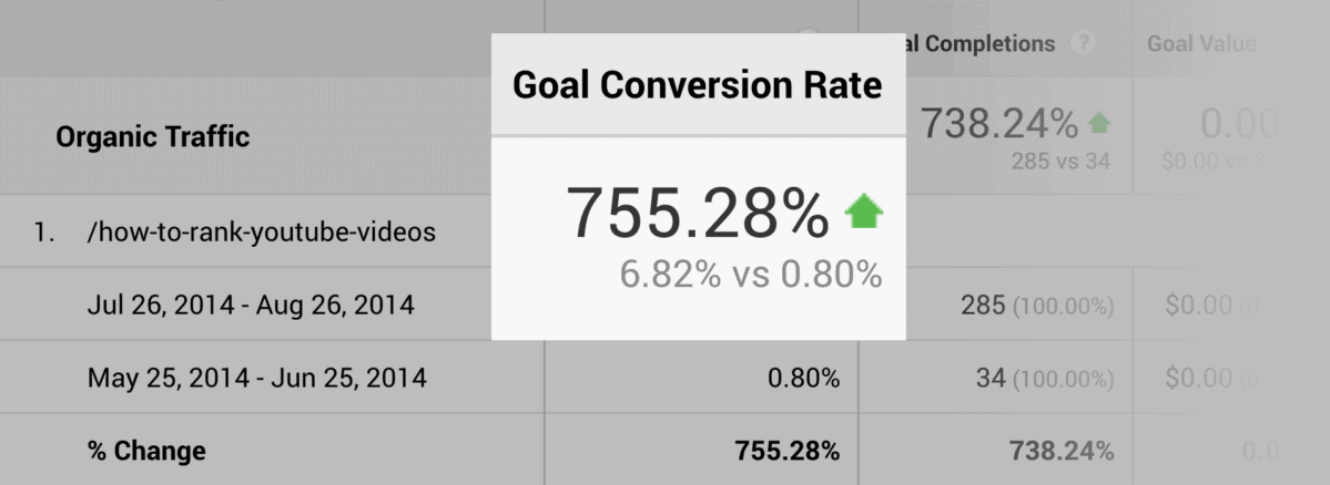
Here’s the exact process:
First, log in to Google Analytics. And find a blog post on your site that gets a ton of traffic.
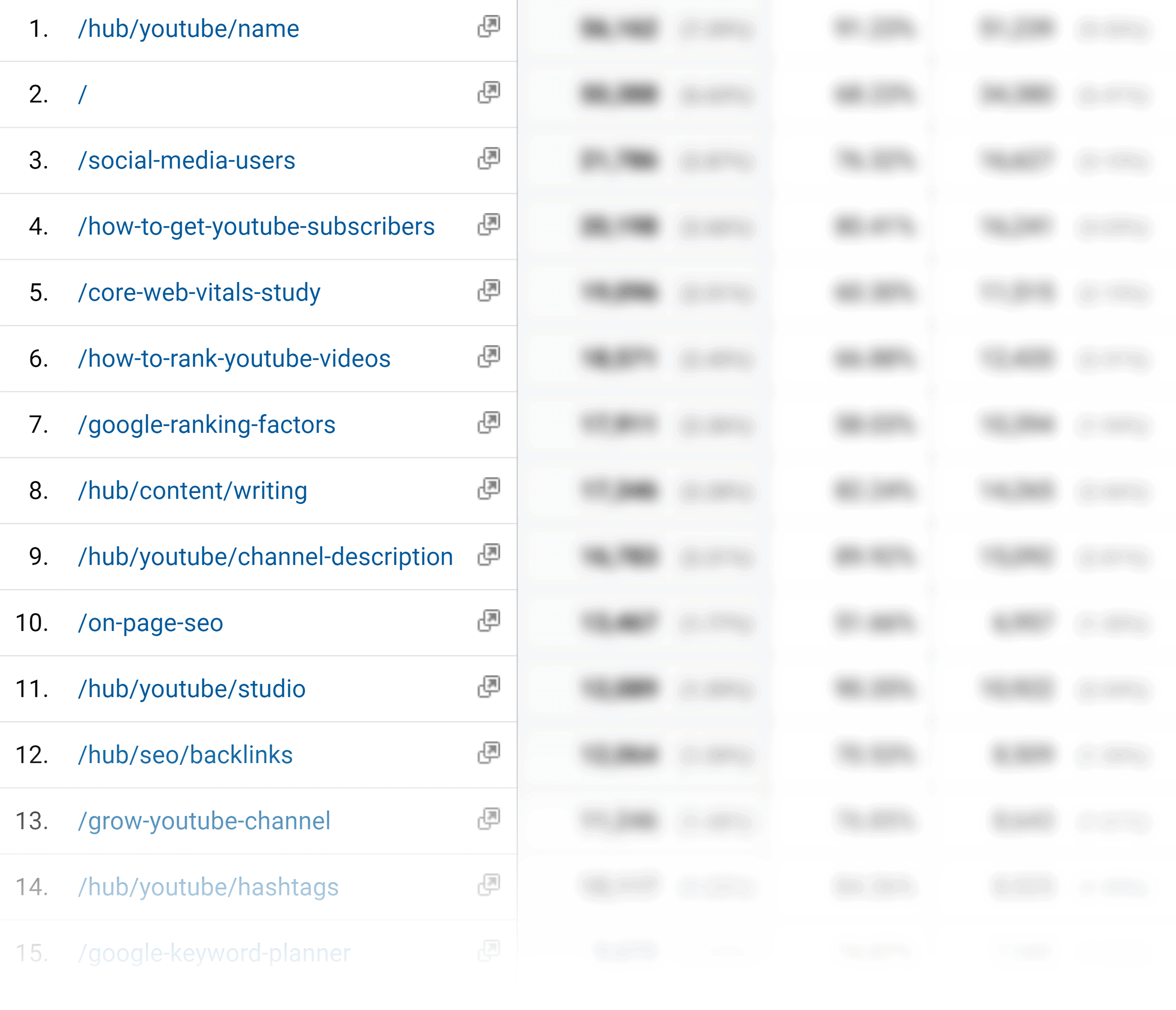
Next, figure out what someone reading that specific article would want.
For example, this guide gets 8,578 visitors every month:

The problem is: it’s 4,623 words. That’s WAY too long for most people to read in one sitting.
This is probably why lots of people asked me for a PDF version.
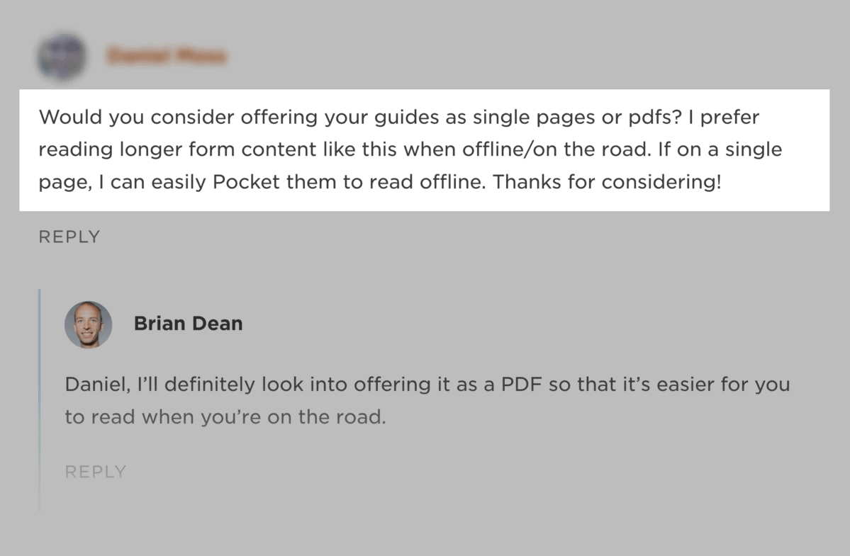
So I decided that a PDF version of my guide would make a great Content Upgrade.
Finally, feature your Content Upgrade in your post.
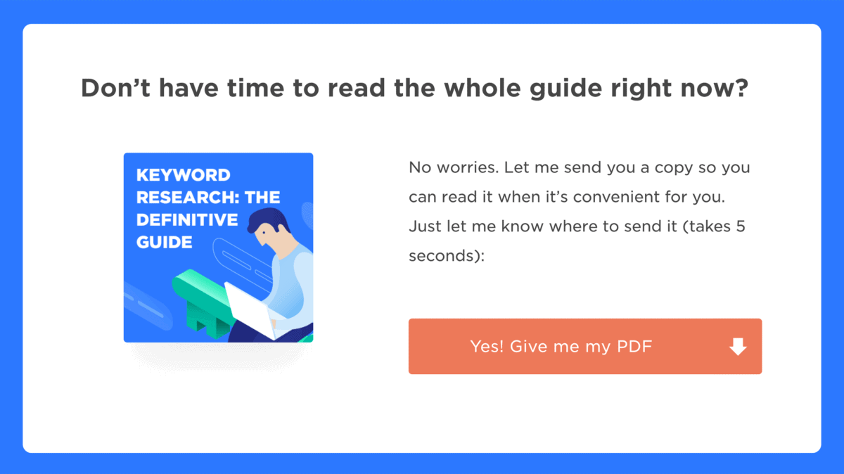
You can offer it at the top of the page:
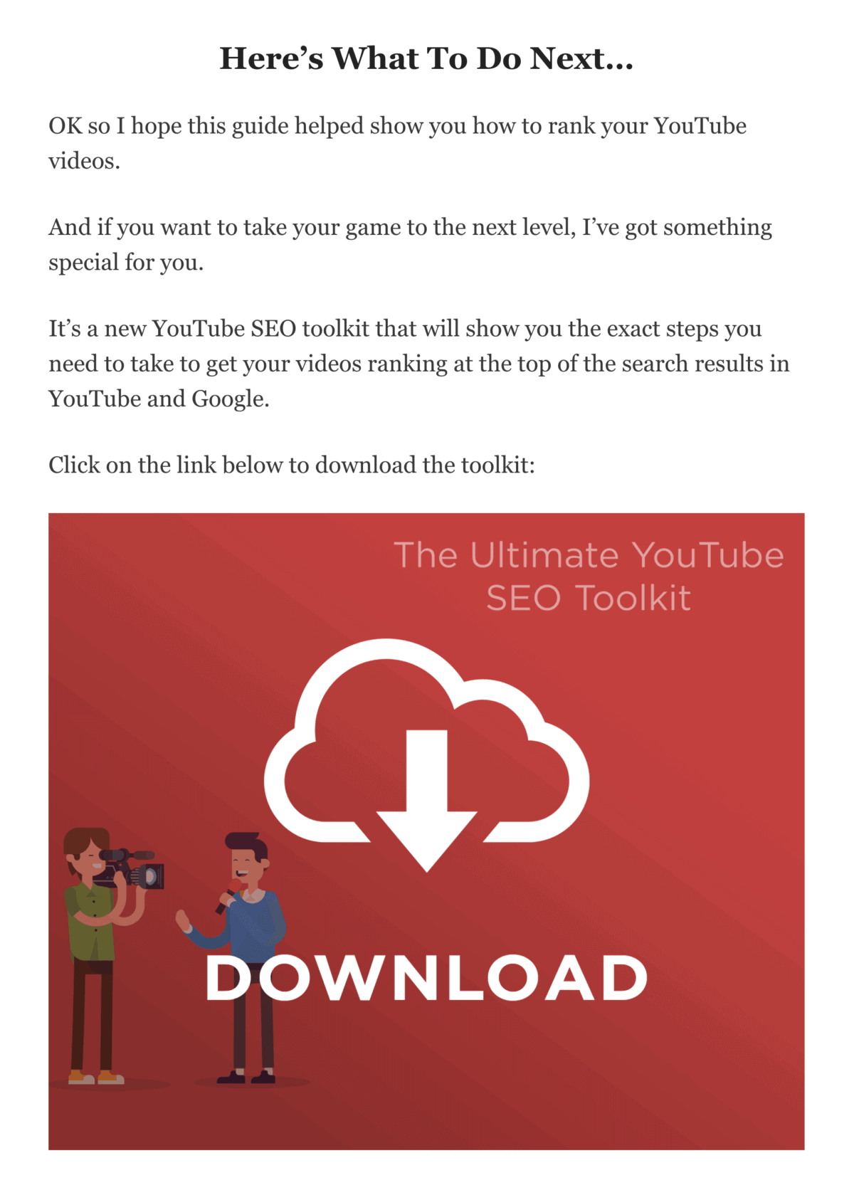
At the bottom of your page:
Or both.
That’s all there is to it.
Chapter 3:Email Campaign Templates
Now it’s time to show you how to create emails that get opened and clicked.
Specifically, I’m going to share four proven email templates.
These templates are specifically designed to help you crank out super valuable email content that your subscribers will love.
So if you’re ready to start sending emails that people WANT to read, this chapter is for you.
The Content Newsletter
The Content Newsletter is a newsletter that provides 100% pure value.
The value can be in the form of a handful of tips. Or links to helpful resources. Or a personal story.
The exact type of value doesn’t really matter. As long as you don’t pitch anything, you’re good.
In fact, pure value newsletters are so rare that your subscribers will LOVE you for them.
For example, I sent out this Content Newsletter a while back:
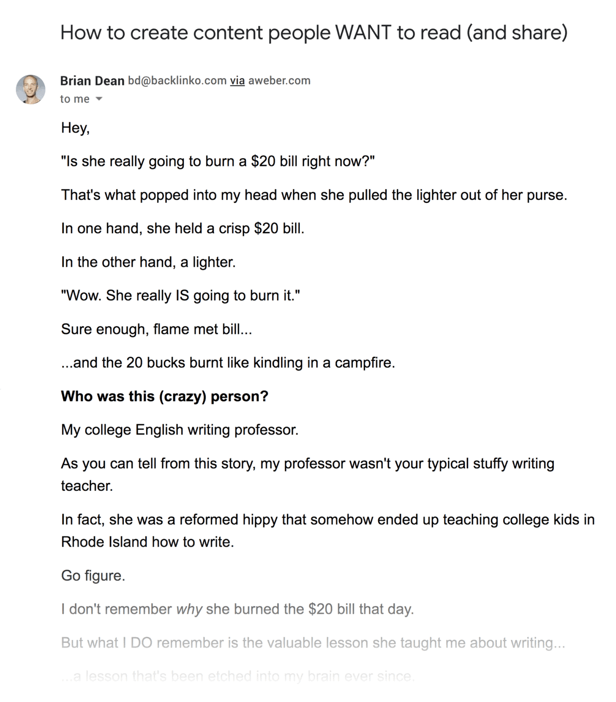
(A handful of copywriting tips.)
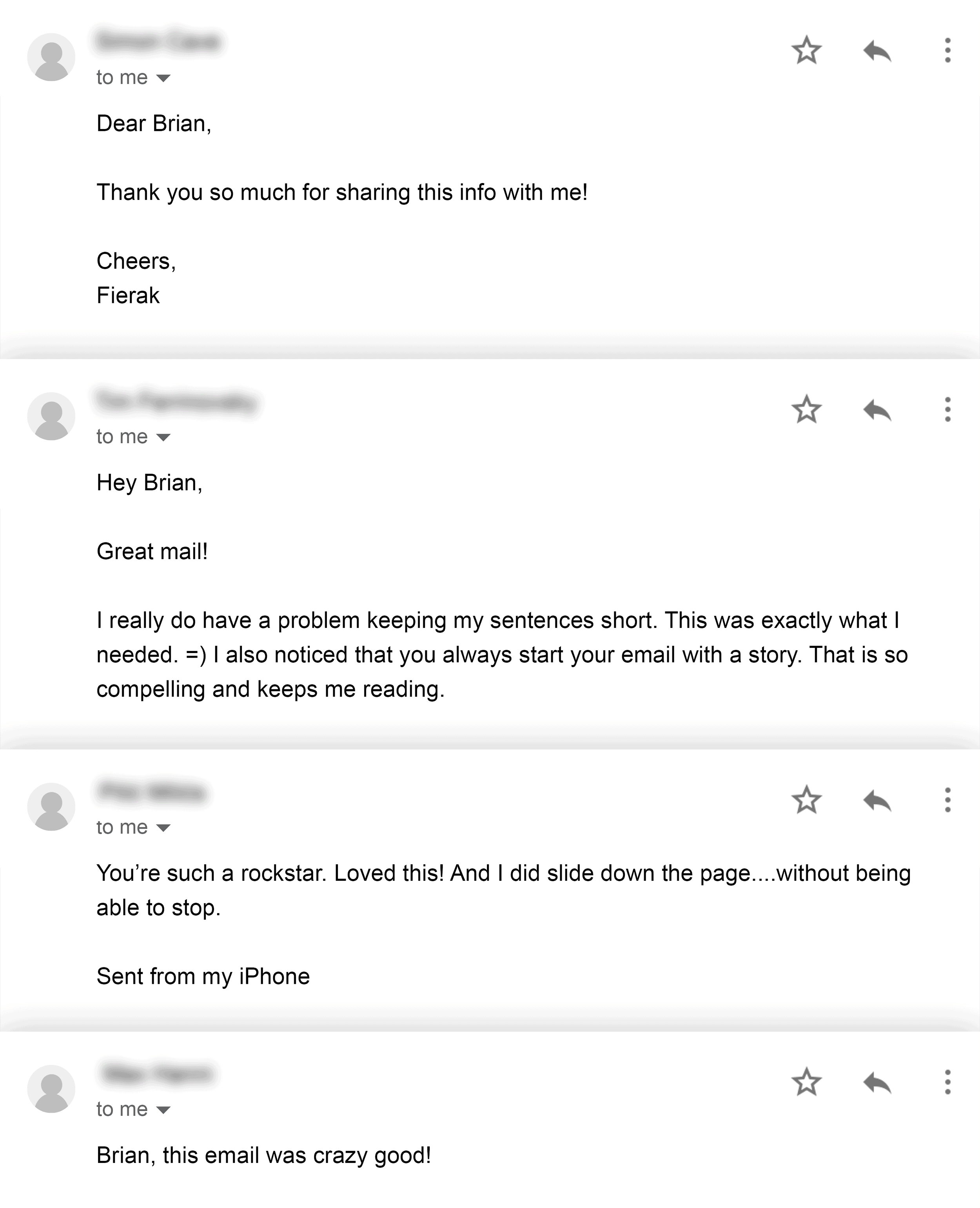
And dozens of people replied to my email to thank me.
With that, here’s the template:
Intriguing Subject Line
Use a subject line that will make someone curious about what’s inside your message.
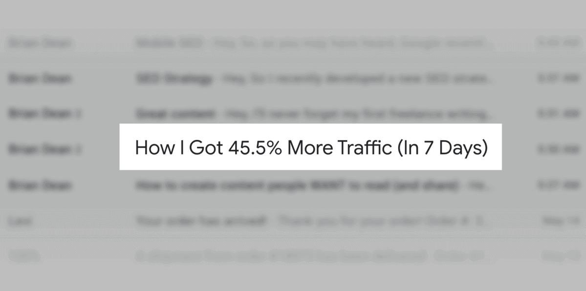
For example, I used the subject line “How I Got 45.5% More Traffic (In 7 Days)” for one of my Content Newsletters. And that email got a 32.3% open rate.
Bold Opening
Start your newsletter off with something SUPER compelling.
That way, you hook your reader right off the bat.
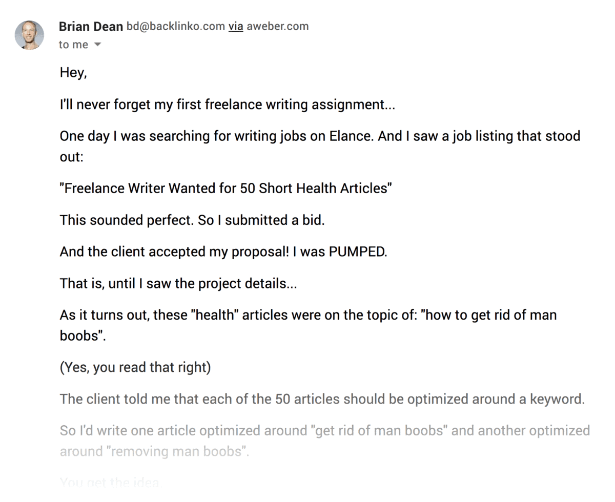
Personally, I like to kick things off with a mini-story.
But you can also use a straightforward intro that previews what’s coming next.
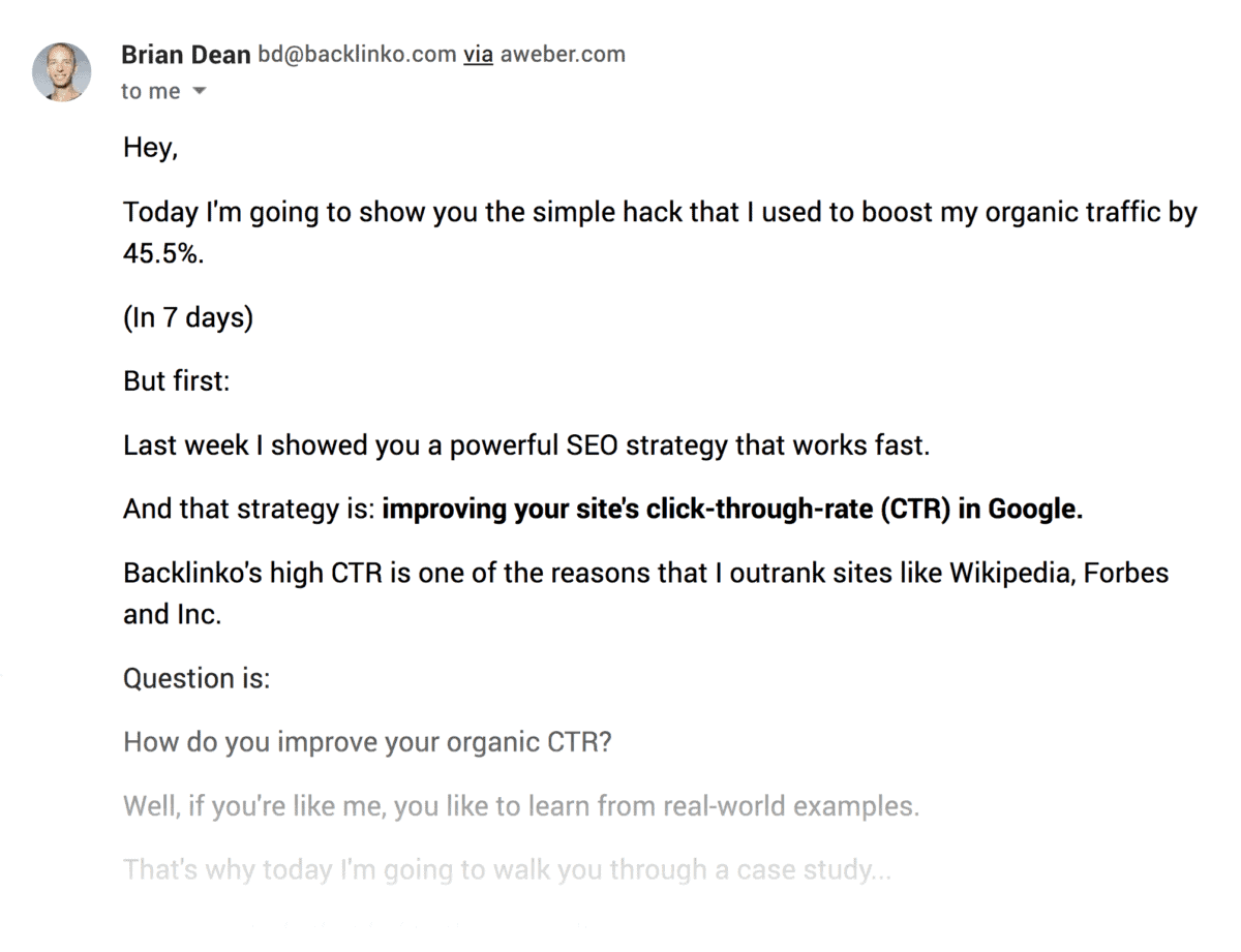
Either way works.
Valuable Content
Now it’s time to deliver the goods.
If you’re not sure what to write here, I recommend going with a list of 3-5 actionable tips that people can use that day.
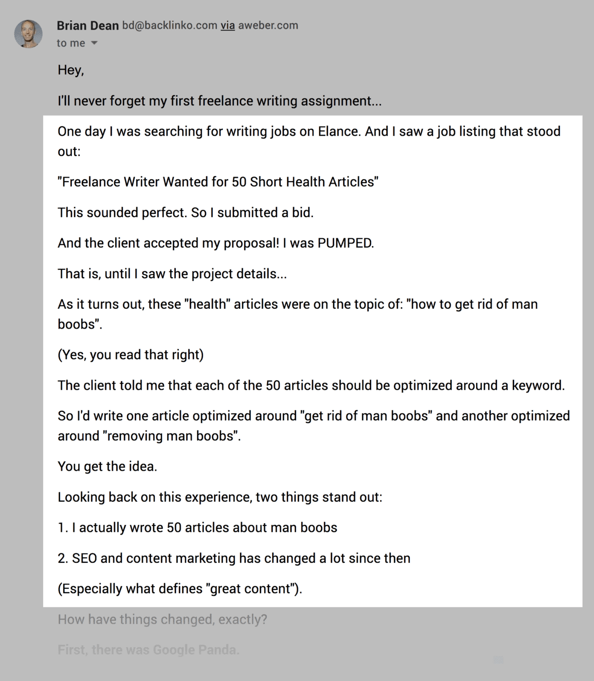
Otherwise, you can teach your subscribers an important lesson in the form of a story.
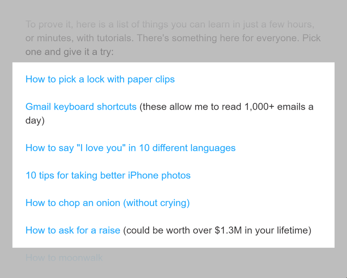
Or curate links to content that will help your reader achieve a specific outcome, like this newsletter from Ramit Sethi.
CTA
Nope, you’re not pitching anything in your Content Newsletter.
But that doesn’t mean you should skip your call-to-action.
So:
How can you use a CTA if your email is 100% value?
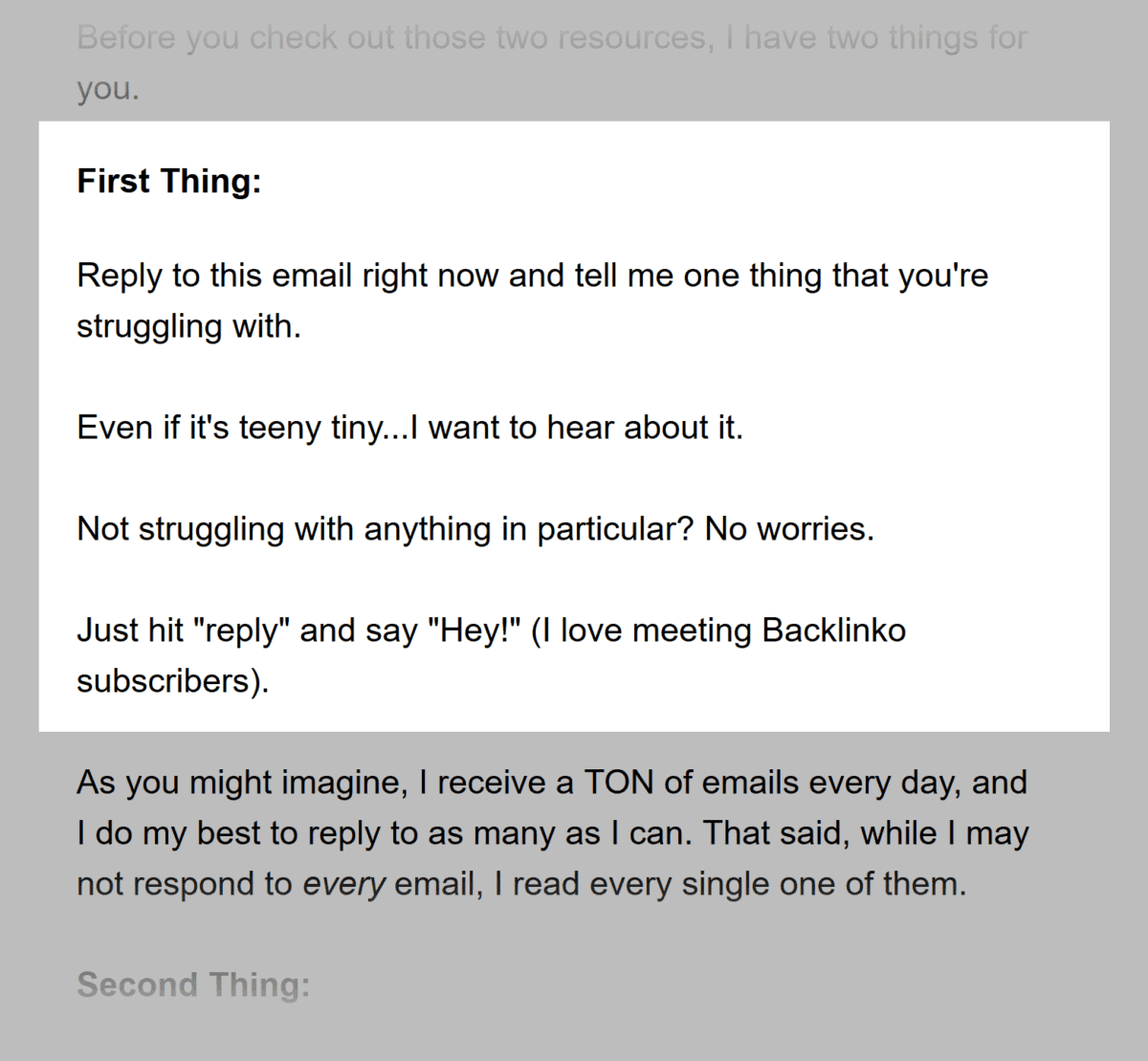
Well, when I send out a story to subscribers, I use a CTA that asks people to reply with their opinion or take.
Or let’s say you just sent out a list of links to Paleo breakfast recipes.
Your CTA could be to try one of the recipes this week.
The type of CTA you go with isn’t that important.
The important thing is to always include a CTA in your newsletters.
That way, when you DO pitch something, your subscribers aren’t caught off guard.
The Marketing Offer
The Marketing offer is just like it sounds:
It’s an email that pushes your subscribers to make a purchase.
(Usually in the form of a limited-time sale.)
Here’s the template to follow:
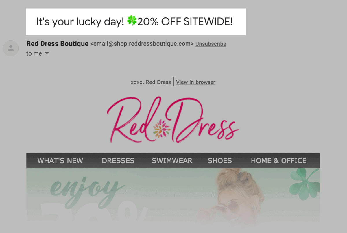
Straightforward Subject Line
No need to be super creative.
Instead, just let people know about your offer.
Here’s an example from Red Dress Boutique.
The Offer
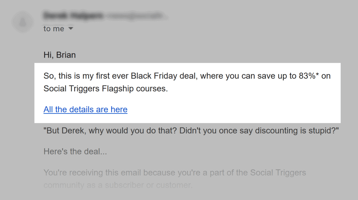
Start your email off with a line or two that describes your offer.
You don’t want to get cute here. Just outline what your offer is and why it’s worth paying attention to.
The Details
So you just outlined your offer. Now it’s time to get into the nitty-gritty.
Here’s where you outline a few key details about your offer, like:
- Start and end dates
- Key benefits
- Story behind the promo
- Any conditions or limitations
Here’s a real-life example:
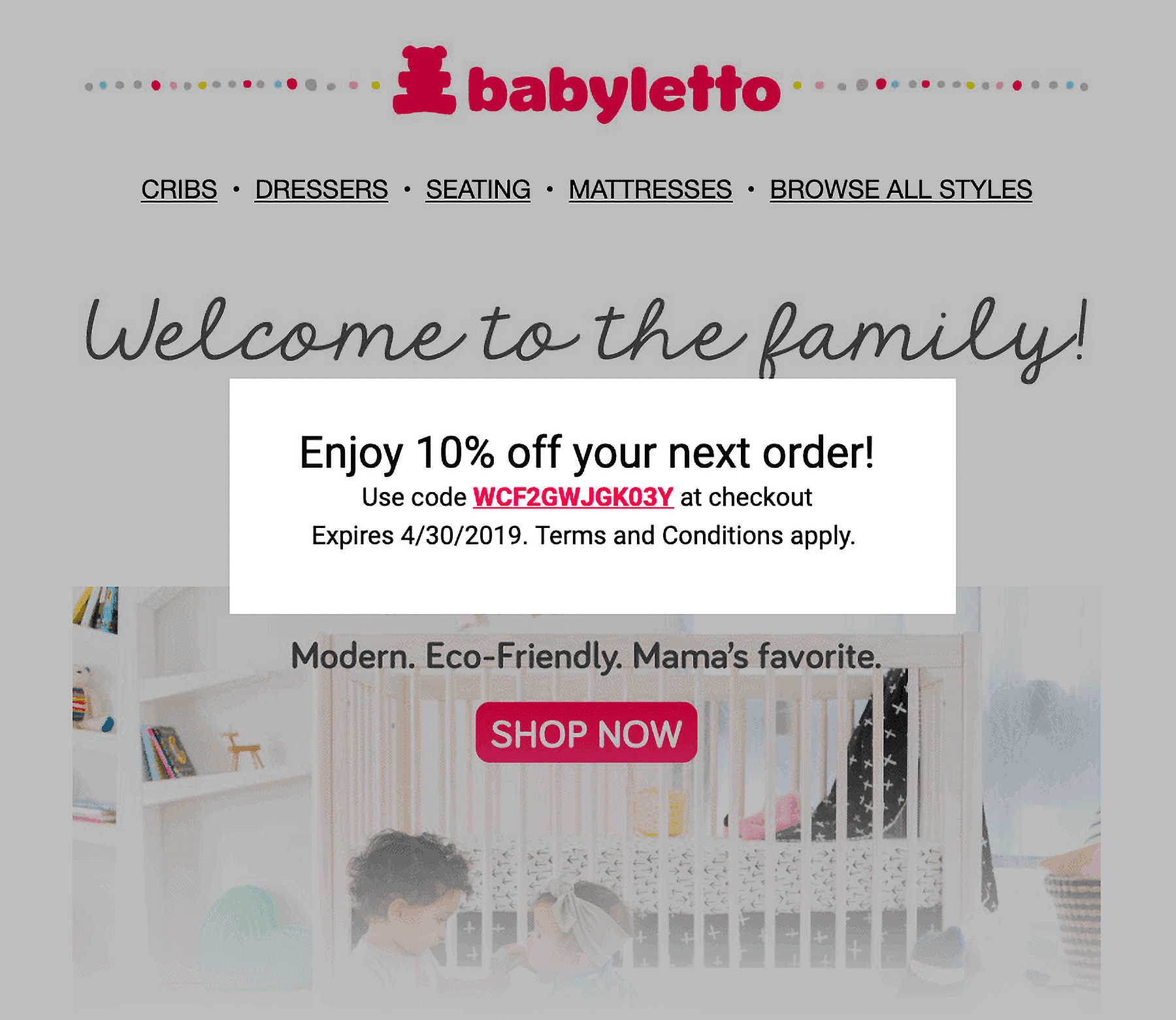
One thing to keep in mind here is that you don’t want to overwhelm people with details.
Remember: it’s impossible to close the deal inside of your email. After all, they have to actually go to your site to buy. So let your landing page do most of the selling.
In short: the goal of this section is to get people to learn about your offer and visit your website.
The CTA
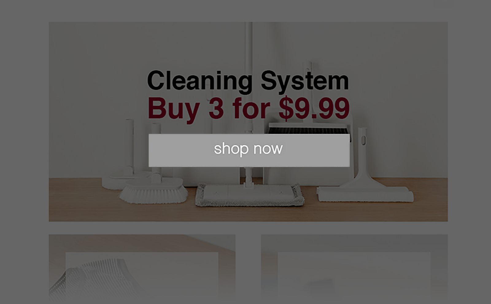
Nothing fancy here. Just a strong CTA that lets people know exactly what to do next.
The PS
A PS is an underrated little tactic that can easily double your conversion rate.
Why?
Because lots of people will skim your message… but stop and read your PS word-for-word.
That’s why I recommend using a PS in almost all Marketing Offer emails. All you need to do here is summarize your offer and include another call-to-action.

The Announcement
With “The Announcement” email you’re not pitching a “10% Off Sale”. That type of thing works best with The Marketing Offer template I just showed you.
Instead, you want to save this template for BIG announcements, like:
- Brand new product or service
- Live event
- New version of a popular product
- Limited-time product release
- Important features added to an existing product
Here’s the template:
Subject Line=”Introducing” or “Announcing”
You want to make it clear that your announcement is a big deal.
After all, you’ll probably only send one or two Announcement emails per year.
So don’t be afraid to use terms like “Introducing” or “For the first time” in your subject line.
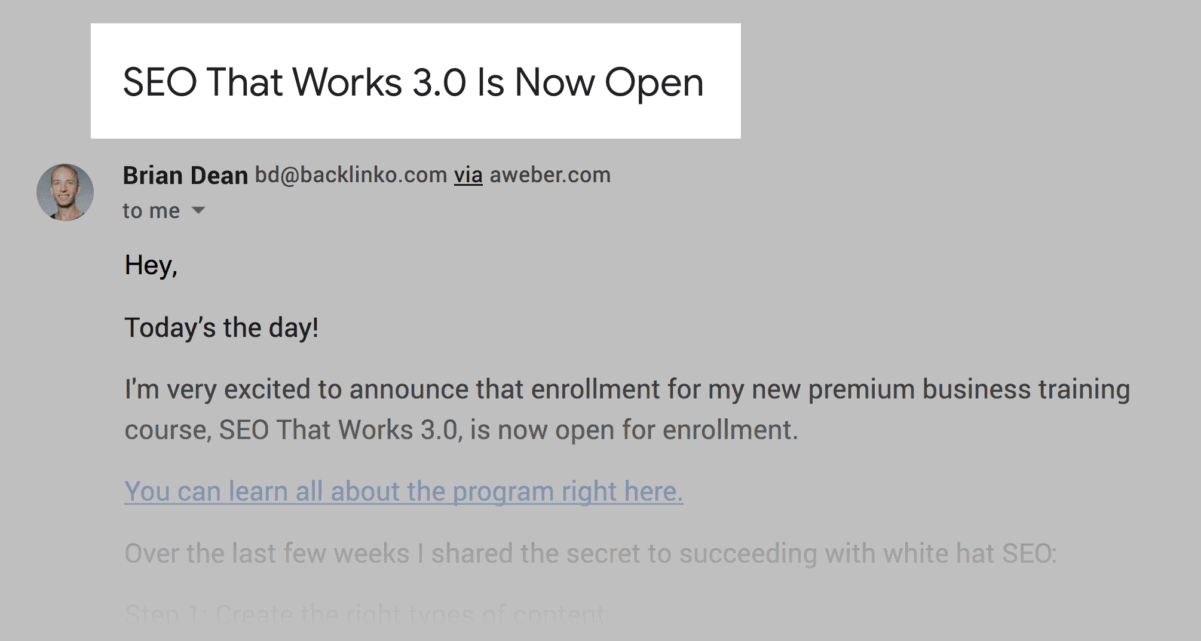
For example, here’s the subject line I used when I launched a new version of my flagship course:
Compelling Lead
You have a few different options here.
You can jump right into your product announcement:

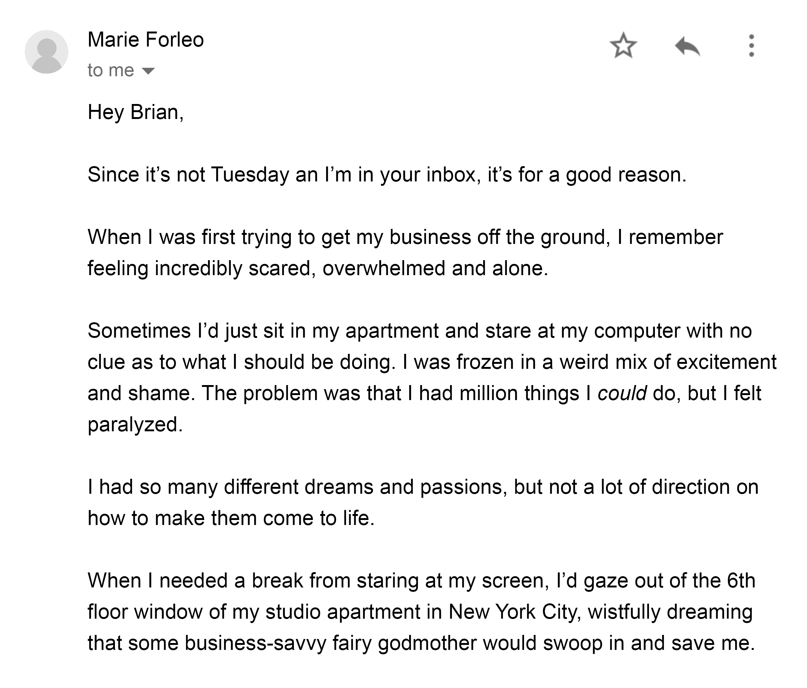
Or you can build up a little bit of anticipation, like Marie Forleo does here:
The Big Reveal
Now it’s time to outline what exactly you’re announcing and why it’s important.
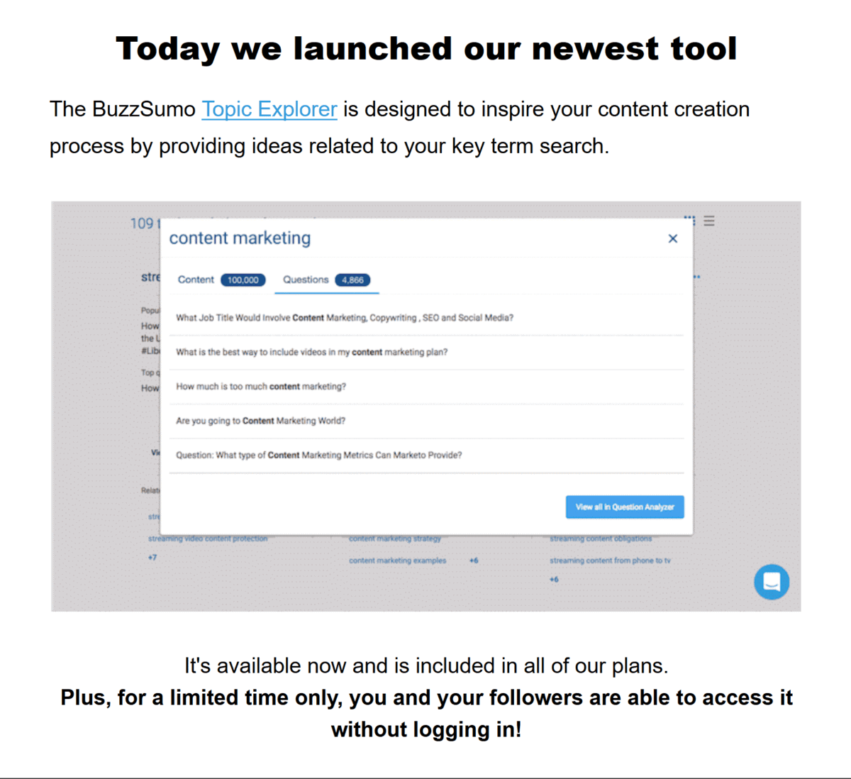
For example, in this announcement email BuzzSumo quickly outlines what makes their new feature unique.
Clear CTA
Now that your reader is pumped about your announcement, let them know the next step.
If it’s a product, your CTA should tell people to head over to your sales page and sign up.
If it’s a new service, you might ask people to fill out a form.
Either way, let your subscriber know EXACTLY what to do next.
The Blog Post Newsletter
When it comes to content promotion, email is king.
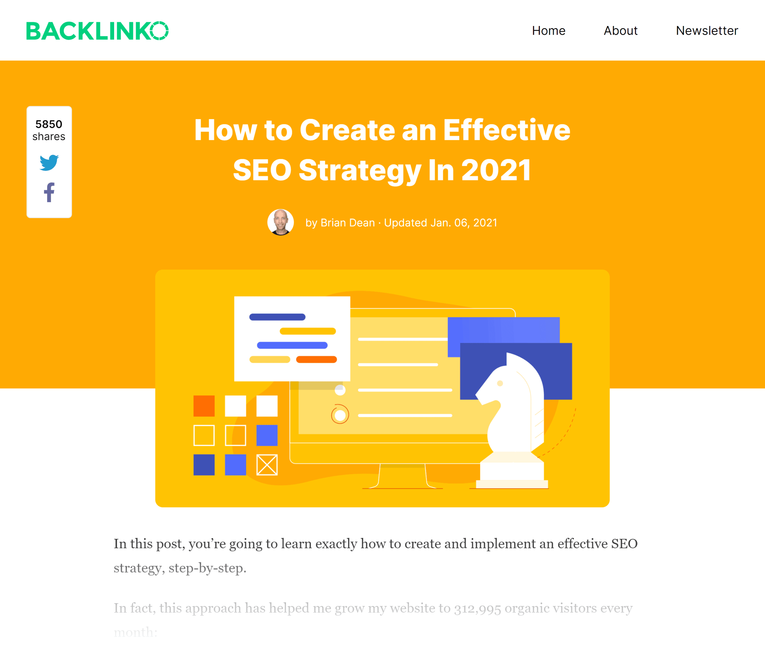
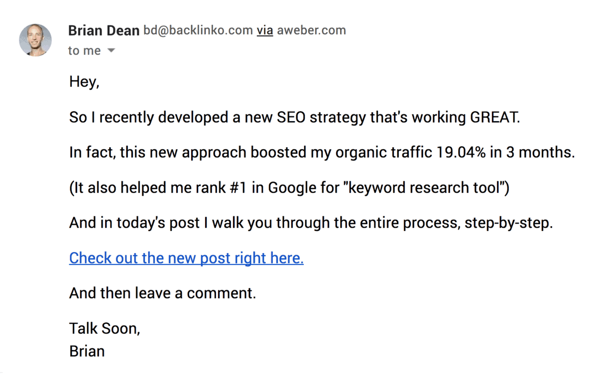
For example, I published this post in the 2019.
And to get the word out, I sent a newsletter out to my email list:
I also posted a Tweet.
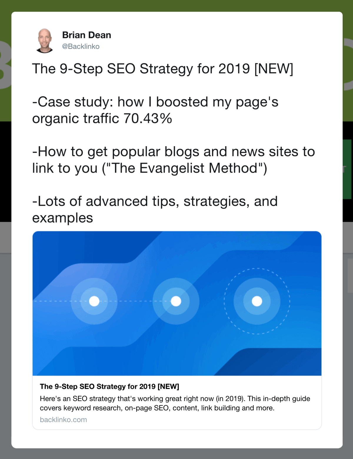
The Tweet got 962 clicks. And the newsletter got 15,744 clicks.
That’s 16x more clicks.
With that, here’s the template I recommend:
Subject Line=Blog Post Topic
I’ve tested dozens of subject line templates over the last six years.
And when it comes to promoting blog content, I’ve found that your blog post topic itself works GREAT.
For example, when I launched this guide to mobile SEO, I went with the subject line: “Mobile SEO”.
And that dead simple subject line led to a 44.6% open rate.

The Lead
The type of lead you use depends a lot on your blog post’s topic.
For example, if the topic is something personal, include an anecdote:
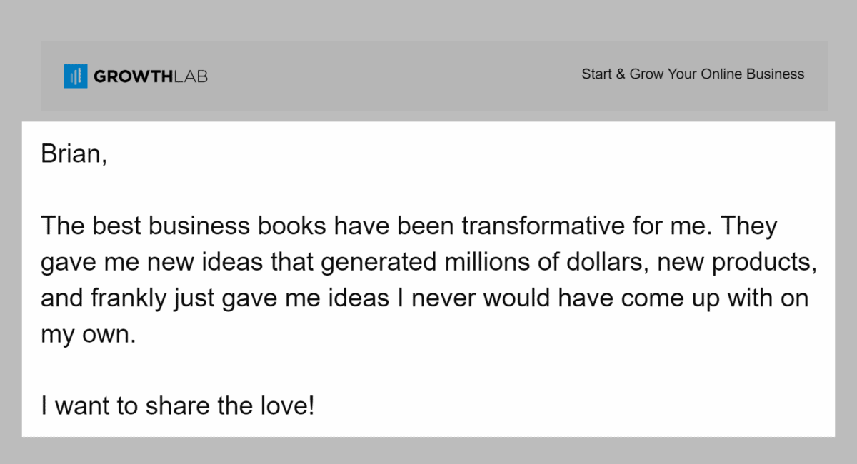
If it’s newsworthy, you want to write something like: “As you might have heard, a new study found…”.
Or you can just let people know that you published something new:
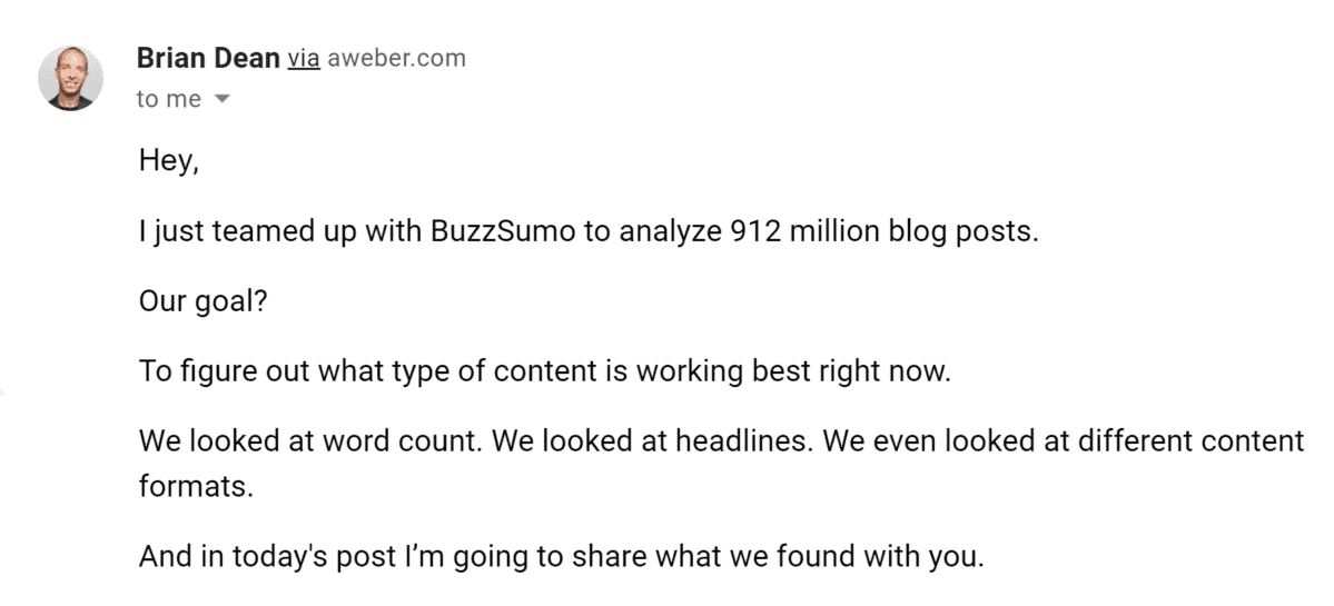
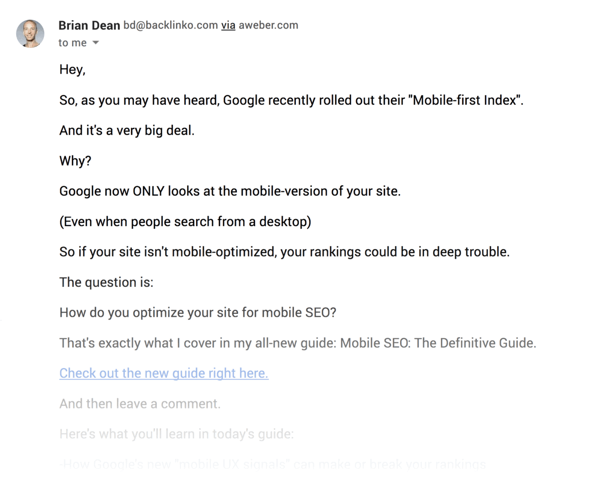
Bulleted List
Next, list 3-4 things that someone will learn from your post.
Don’t give away the farm here. Instead, you want to build up excitement for your new content.
Here’s an example from one of my newsletters:
Link To The Post
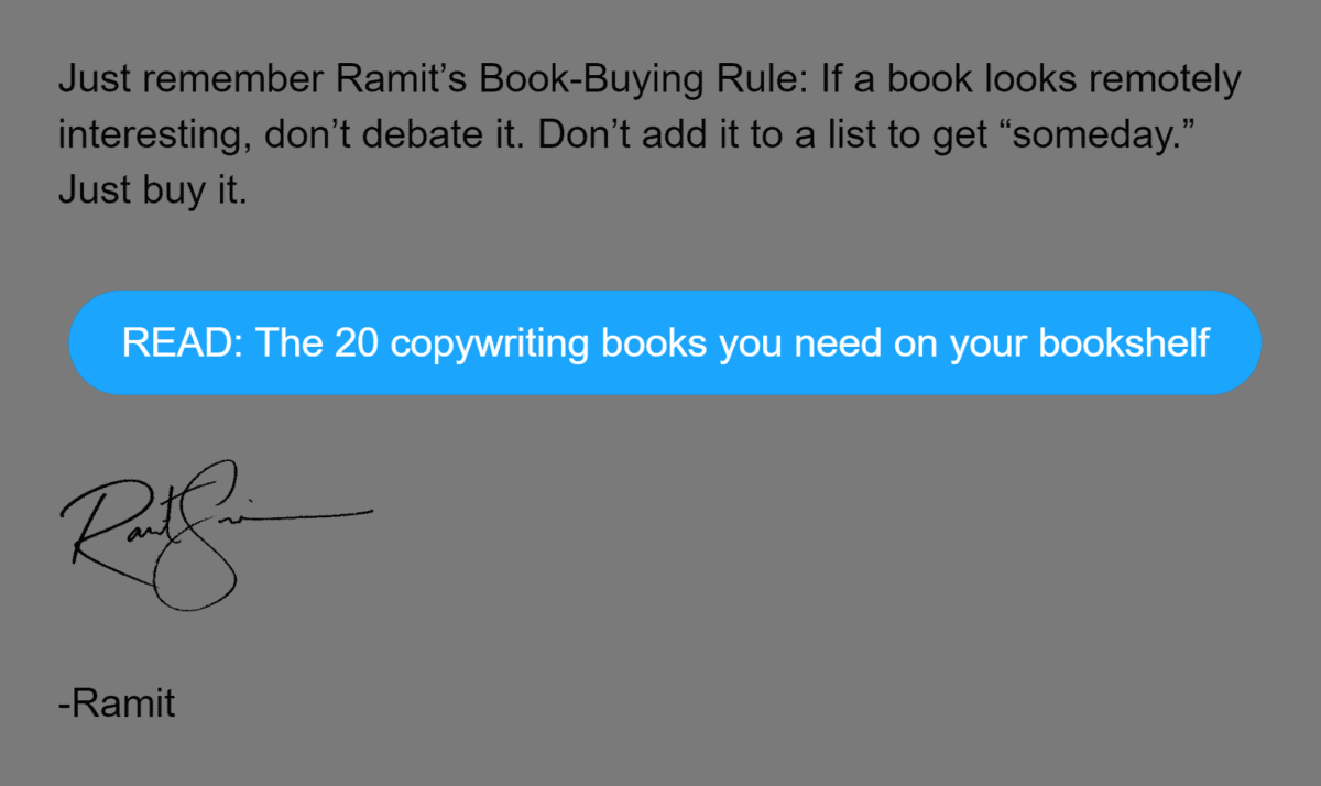
Finally, add a link to your post.
This can be a normal link:

Or a big ol’ button:
Chapter 4:How to Get Super High Open Rates
Now it’s time for me to show you how to get SUPER high open rates.
In fact, I consistently get 35%+ open rates on newsletters that go out to 100k+ subscribers.
(Which is double the industry average for a list that size.)
Let’s get right into the strategies.
Optimize Your Send Time
You want to send emails…
- When people are awake
- When people’s inboxes aren’t crowded
That’s why I DON’T recommend scheduling newsletters for first thing in the morning.
Otherwise, your message gets buried in someone’s crowded inbox.
Instead, send your emails out when your subscribers’ inboxes are empty. This is usually late morning or early afternoon.
That way, your newsletter will pop up at the top of their inbox.
That said:
There’s no “best time to send an email” that works for everyone.
You need to test different send times to see which times get the highest open rates for you.
For example, after testing a dozen different send times, I found that 11am Eastern works best for our subscribers.
11am Eastern is perfect because people on the east coast and in Europe are at work. And by 11am they’ve already cleared out their morning inboxes.
That said, Backlinko is B2B.
If you’re in B2C, it might not make sense to send to people’s personal inboxes while they’re at work.
Again, it’s different for every business.
That’s why I recommend testing a bunch of different times to find the best one for you.
Send People a GREAT Welcome Email
Most welcome emails look something like this:
As my Mom told me: “you don’t get a second chance to make a first impression”.
And this type of welcome email makes a TERRIBLE first impression.
So:
What should you do instead?
First, warmly welcome people to your newsletter.
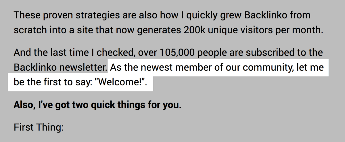
It’s not 1996. No one is excited to sign up for a newsletter.
In fact, new subscribers are on guard. They’re looking for ANY reason to unsubscribe.
Reassure them. Let them know that they made the right decision.
Next, layout the deets of your newsletter.
Specifically, cover what they can expect in the next few days or weeks.
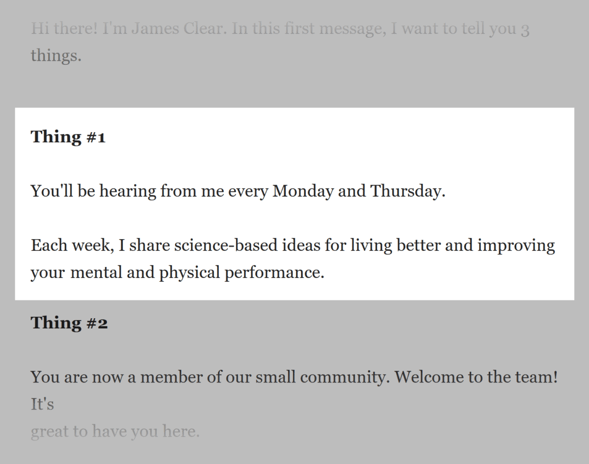
Finally, end with a call-to-action.
This can be a CTA to check out a few resources from your site that you recommend. Or a link to your latest products.
For example, when I first started Backlinko I asked new subscribers to reply with their #1 struggle:

Not only was this a goldmine of blog content ideas, but it helped me establish a strong relationship with new subscribers.
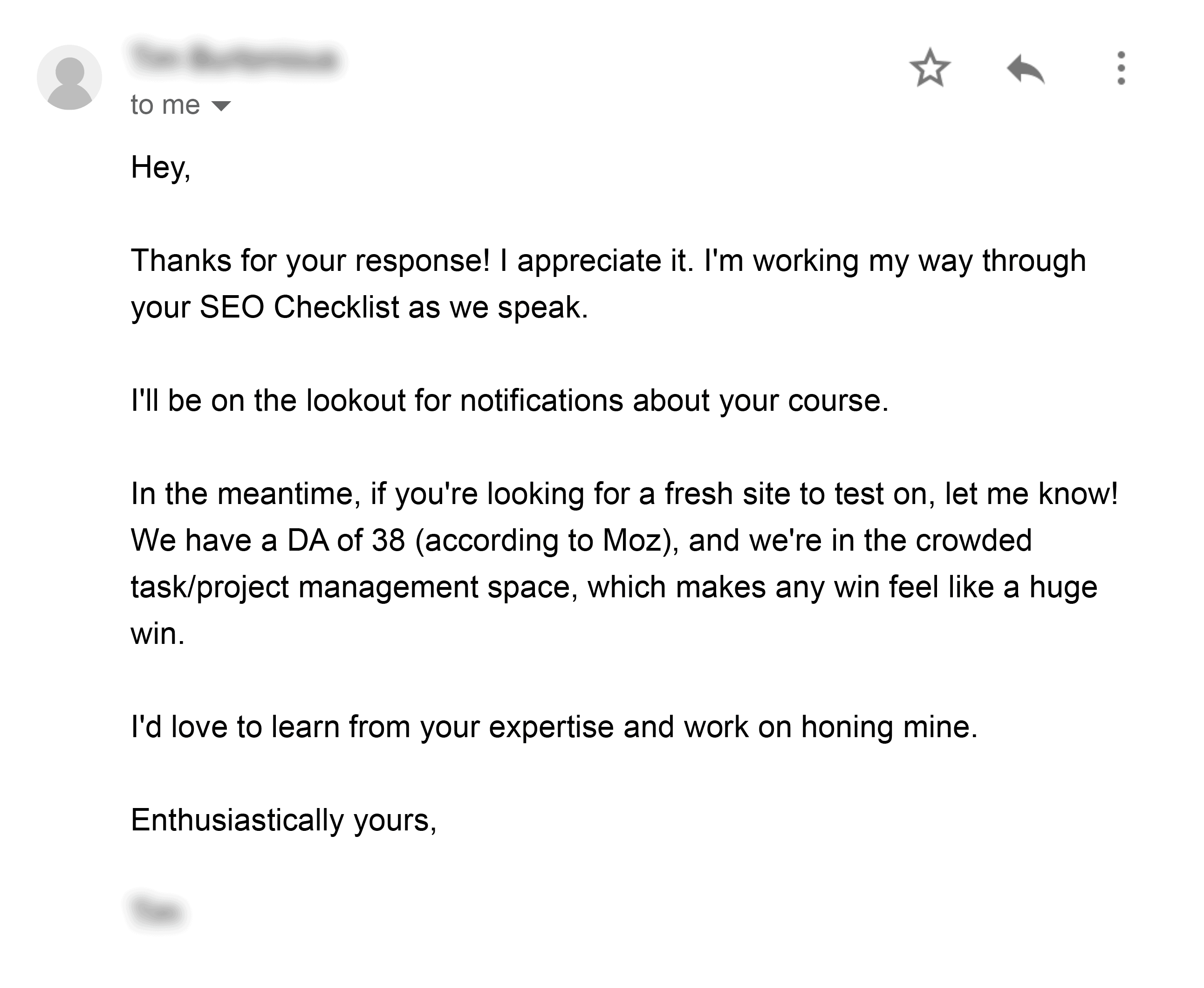
Remember: These are brand new subscribers. So you don’t want a hard sell CTA.
But you DO want to get them in the habit of taking action.
So don’t skip this step.
Follow “The 80/20 Rule” of Email Content
The 80/20 Rule of Email Content is simple:
80% of your emails should provide value.
And 20% should pitch your products and services.
For example, I usually send about 10 pure-value messages for every sales email.
That way, I don’t burn out my list.
And my subscribers know that when I send something, it’s worth opening.
(Which, at the end of the day, is the real secret to increasing open rates.)
To be clear:
“Value” doesn’t have to be in the form of content.
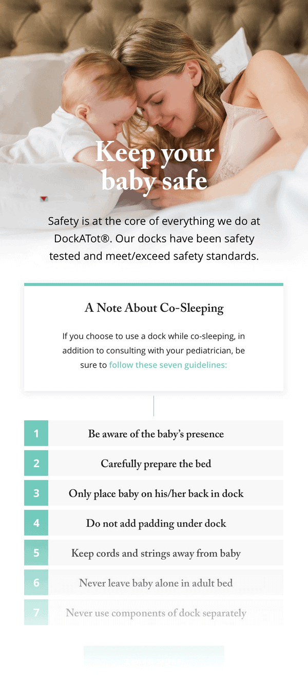
For example, let’s say you run an eCommerce site that sells paleo protein bars.
Well, a 25% off sale for your new line of bars is valuable to people that are in the market for them.
Even so, it’s not a bad idea for eCommerce sites to send value-packed newsletters too.
For example:
Optimize For Gmail’s Preview Snippet
When someone’s deciding whether or not to open an email, they look at three things:
- The subject line
- The sender
- The message preview
Most people sleep on the preview. And it KILLS their open rates.
In fact, your message preview is like a second subject line.
And if it looks like this, you’re in trouble:
That’s why you want to optimize the first few lines of your message so it looks SUPER enticing.
Here’s a great example:

Chapter 5:How to Improve Email Deliverability
Let’s face it:
Email deliverability isn’t the most interesting topic in the world.
Most marketers would rather spend time building their email list or coming up with catchy subject lines.
But in my opinion, email deliverability is THE most important part of email marketing.
After all:
What good is an email list if no one actually sees your emails?
And in this chapter you’re going to learn how to get your emails delivered to people’s inbox.
Ruthlessly Delete Non-Openers
A few years ago I had a MAJOR deliverability problem on my hands.
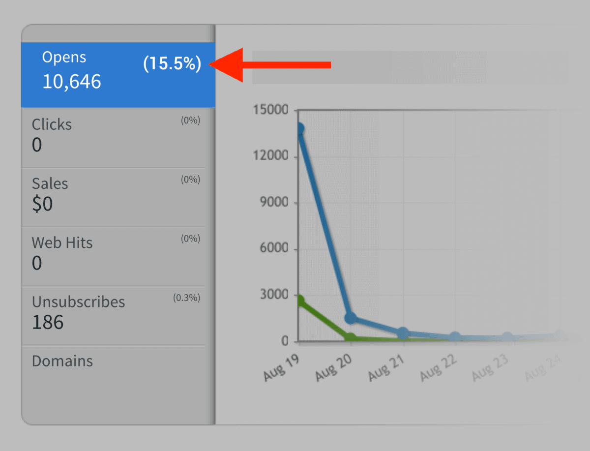
My open rates went from 40% to 30% to less than 20%… within a few months.
It got so bad that some of my newsletters were getting 15% open rates:
And lots of subscribers were telling me that my newsletters were going to spam.

No matter how many different subject lines I tested or how many tweaks I made to my content, nothing seemed to help.
But there was one thing I hadn’t tried yet. Something I’d been putting off for months:
List hygiene.
In other words: deleting unengaged subscribers.
I had to try it. I couldn’t let my open rates continue to freefall.
So I logged into Aweber and deleted any subscribers that hadn’t opened an email in the last 4 months.
This meant deleting 28,018 subscribers from my email list.
Did it hurt to delete those hard-earned subscribers?
Yup.
Did it work?
Heck yeah!
A few weeks later my open rates shot up like a rocketship.
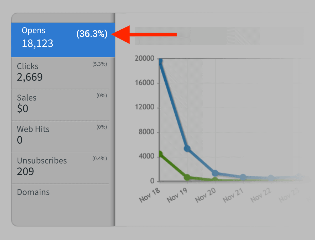
Today, I delete any subscriber that hasn’t opened or clicked on an email in 4 months.
And it’s one of the main reasons that I have an outstanding deliverability rate.
Keep Spam Complaints Low
Email services like Gmail, Yahoo and Outlook take spam complaints VERY seriously.
As they should.
If lots of people are marking your emails as spam, it sends a clear message that people don’t want to read your emails.
The question is:
How can you lower your spam complaints?
Well, there’s the obvious stuff… like sending great emails.
But you already knew that 🙂
Besides the obvious, here are two quick tips that I’ve picked up over the years.
Tips that have helped my spam complaint rate stay insanely low (approximately 10 complaints per 100k emails):

First, make it REALLY easy to unsubscribe.
In other words, don’t be “that guy”:

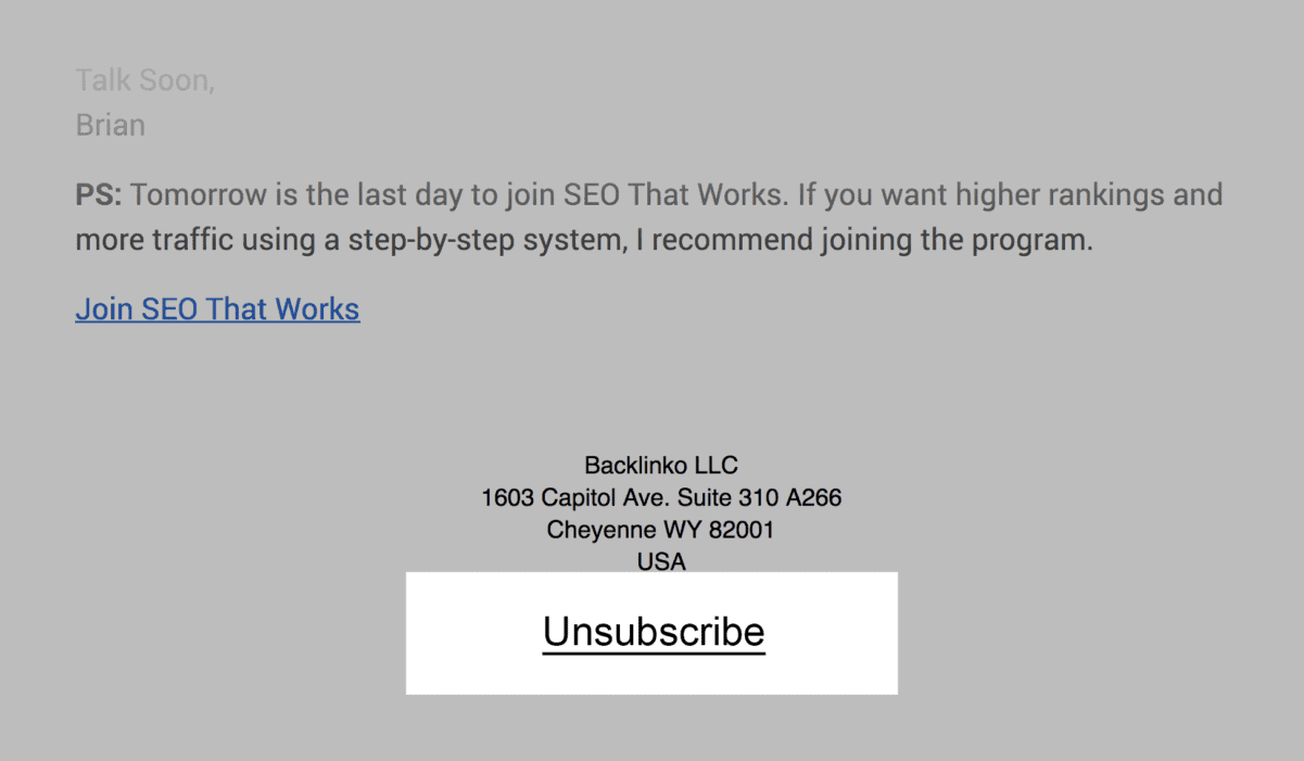
If you make someone hunt for an unsubscribe link, they’re going to give up and hit the spam button instead.
Instead, make your unsubscribe link super obvious:
Second, don’t send a bazillion emails.
The fact is, most people hit “Spam” out of frustration.
(Especially for newsletters that they signed up for.)
And nothing frustrates people more than a non-stop barrage of emails.
So if you send more than one email per week, consider condensing that content into a single, weekly email.
(Note: There are exceptions to this rule. For example, you may want to send 5 emails in 5 days for a big promotion or limited-time product launch. Just don’t make daily emails a habit unless that’s what people signed up for.)
Test Short Subject Lines
Here’s something I recently noticed:
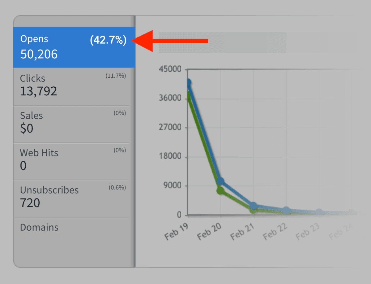
Newsletter with super short subject lines gets the best open rates.
For example, the subject line “Great Content” got a 42.7% open rate:
This could be due to the simple fact that short subject lines get more opens than long subject lines.
But I have another theory:
Short subject lines help deliverability.
Here’s why:
Spam filters flag messages that contain certain words and phrases. And they put lots of emphasis on the subject line.
So the more words you use in your subject, the more likely one of them will get flagged:
But when you use short subject lines, you’re much less likely to get caught in the filter.
Again, this is just a theory. I have no concrete proof that short subject lines get through spam filters more often.
But if you’re having deliverability issues, it’s something worth trying out.
Use Double Opt-In
When it comes to the Single Opt-in vs. Double Opt-in debate, there’s no “right’ answer.
If your #1 goal is to maximize the sheer size of your list, Single Opt-in is obviously the way to go.
But if you want to maximize engagement and deliverability, I recommend Double Opt-in.
I’m a deliverability nut, so I personally use Double Opt-in. But it’s ultimately up to you.
Chapter 6:Email Marketing Software
In this chapter I’m going to quickly review five of the top Email Service Providers (ESPs).
Obviously, there’s no single “best email marketing provider” that’s right for everyone. The “best” option depends on your list size, marketing goals, and features that are important to you.
That’s why I’m not going to crown a winner here. Instead, I’ll highlight the pros, cons and use cases for each email platform.
So if you’re in the market for email marketing software, these reviews should help you choose the best option for you.
MailChimp
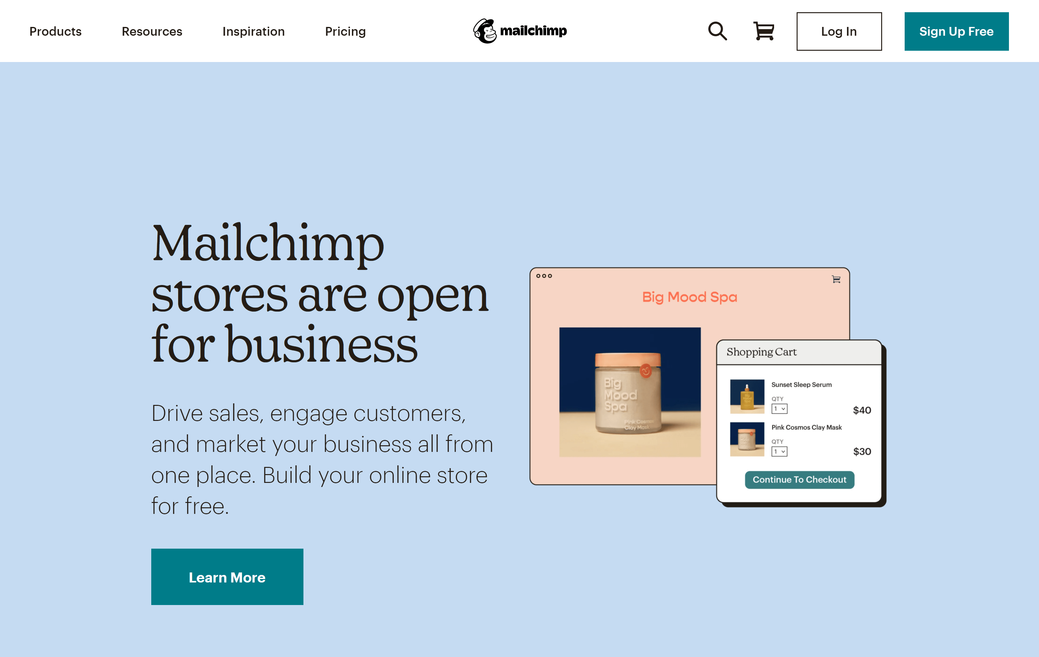
You can use MailChimp to send simple newsletters. Or it can be a full marketing automation platform that taps into behavior-based messages and cart abandonment emails.
It’s one of the few platforms that lets you keep it simple. But if you do want to dig into more complicated stuff, you can.
Pricing is free for up to 2k subscribers (with limited features). Their pro plans start at $10/month.
Constant Contact
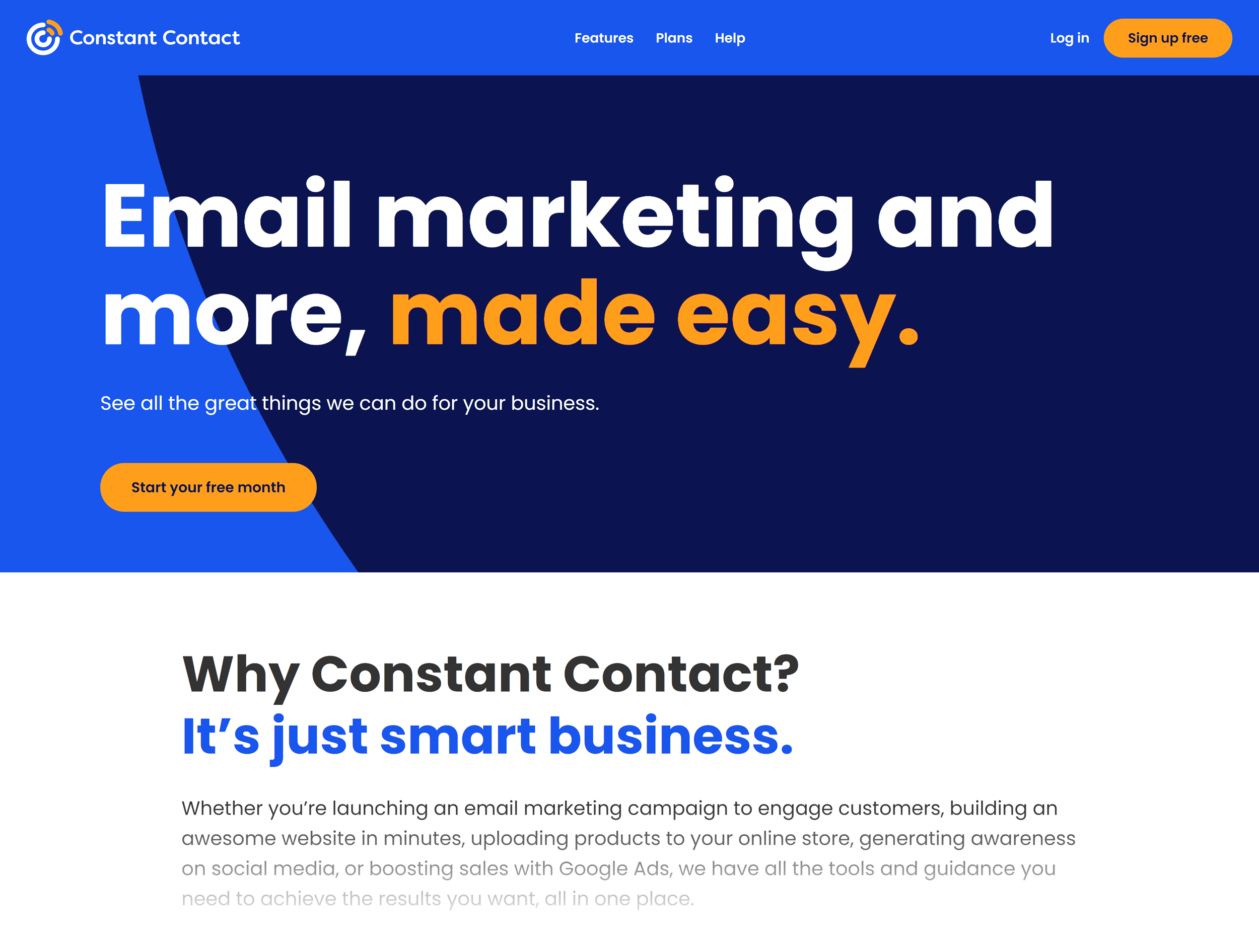
With a focus on drag-and-drop design and ecommerce platform integration, Constant Contact is definitely focused on the ecommerce market. That said, quite a few bloggers, nonprofits and service businesses use it too.
So if you run an eCommerce site, you might want to give Constant Contact a spin.
Plans range from $20-$45 and up depending on how many subscribers you have.
ConvertKit
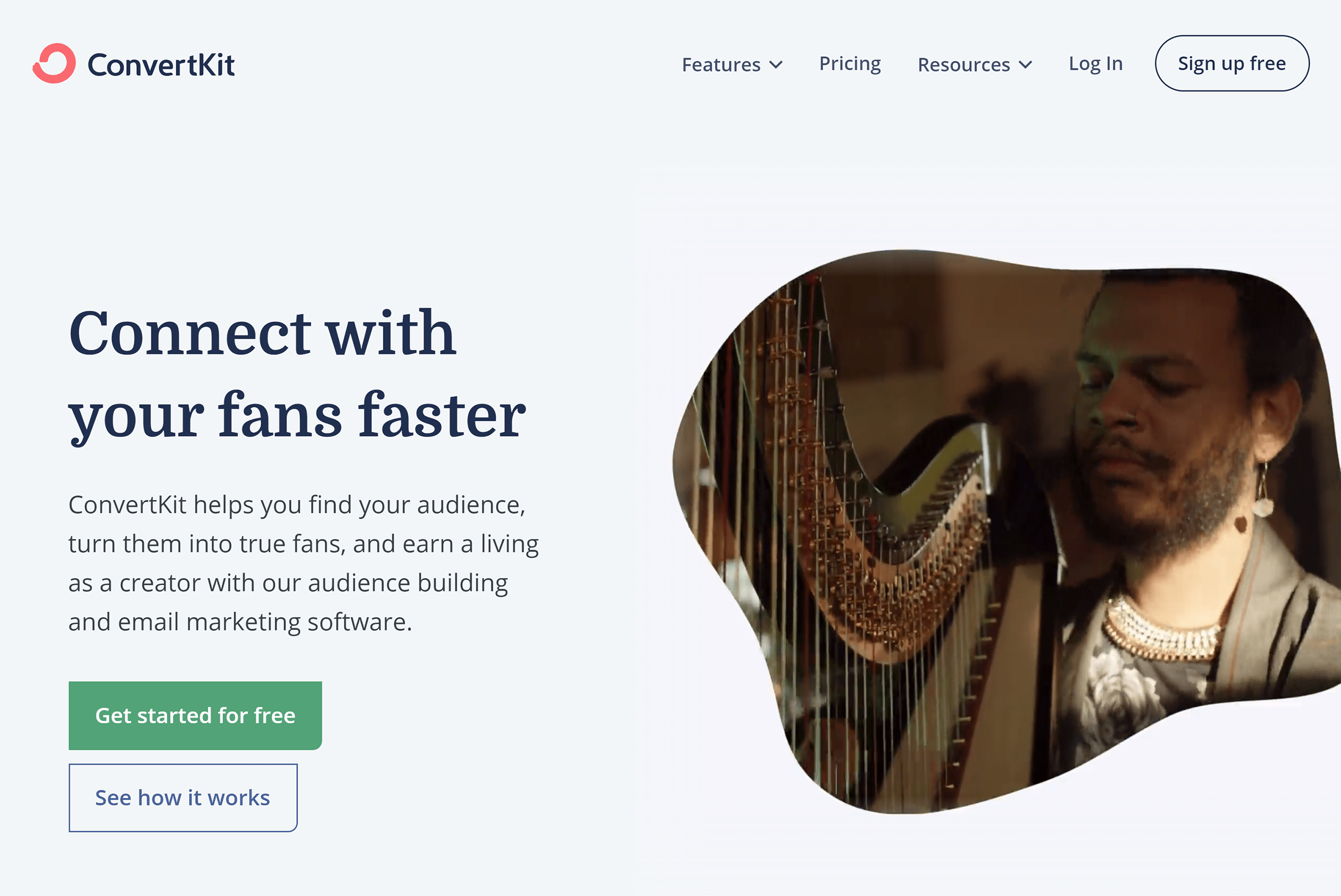
ConvertKit came out of nowhere to become one of the most popular email marketing platforms on the planet.
One thing that makes ConvertKit unique is that 100% of its features are focused on helping “Online Creators”.
(Like bloggers, artists and musicians.)
So if you fall in that category, you can’t go wrong with ConvertKit.
Like most ESPs, pricing is based on subscriber numbers. Pricing is free for up to 1k subscribers (with limited features). A full-fledged plan at 1k subs or less starts at $29. They also offer a 14-day free trial.
GetResponse
GetResponse includes the features you’d expect from an ESP (like autoresponders and marketing automation).
Plans also come with email marketing tools that actually help you build your list (like landing page software and popups).
Plans start at $15/month with limited functionality. And there’s a full 30-day trial.
Aweber
Aweber is the king of simplicity. Which is why I use it.
Sure, they have some marketing automation stuff. But it’s pretty basic compared to most other ESPs. And their reporting leaves a lot to be desired.
But if you want simple and reliable software for sending newsletters and autoresponder emails, you can’t beat Aweber.
Paid plans start at $19/month. And you can test out any plan with a 30-day free trial as long as your list has fewer than 25k subscribers.
Comparing Email Marketing Software
Here’s a comparison of the features, pricing and levels of support for popular email marketing software options.
| Software | Key Features | Landing Page Tool | Support | Pricing |
|---|---|---|---|---|
| Mailchimp | Free plan. Email designs. | ✓ | Knowledgebase. Email (premium). Live chat (premium). Telephone (premium). | $14.99/month |
| Constant Contact | Ecommerce integration. Email design. | X | Knowledgebase. Twitter. Facebook. Live chat. Telephone. | $20/month |
| ConvertKit | Tagging and automation. | ✓ | Knowledgebase. Email. Twitter. Facebook. Live chat. | $29/month |
| GetResponse | Funnels. | ✓ | Email. Live chat. Twitter. Telephone. | $15/month |
| Aweber | Ease of use. Deliverability. | X | Knowledgebase. Email. Live chat. Twitter. Telephone. | $19/month |
| Drip | Automation. Ecommerce. | X | Knowledgebase. Email. Live chat. Twitter. Telephone. | $49/month |
Chapter 7:Marketing Automation 101

A lot of people consider marketing automation “the next big thing” in digital marketing.
Is it true?
Kind of.
No, marketing automation isn’t going to magically double your sales.
Like any tool, automation is all about how you use it.
When you use it right, you can get your messages in front of the right people at the right time.
Which is MUCH better than mass emailing your entire list with the same exact message.
How to Create Awesome Autoresponder Sequences
Autoresponder sequences are like marketing automation training wheels.
So if you’re brand new to automation, I recommend getting your feet wet with a simple autoresponder sequence.
Now:
The content of your autoresponder will be completely different for a blog vs. an ecommerce site vs. a SaaS company.
But they all have the same basic structure:
Once you get the hang of creating a basic autoresponder, you can try using different autoresponders for different people.
For example:
Let’s say you run a SaaS company that helps people make doctor’s appointments.
And you have two types of people that visit your site: doctors and patients.
Does it make sense to put a doctor and a patient in the same autoresponder?
Nope!
Instead, you want to create a different autoresponder for each group:
You might be wondering:
“How do you know if a doctor or a patient is signing up for my list?”
Well, you can go by the page they sign up on. Anyone that signs up from “register for a doctor account” page is probably a doctor. So you can automatically put them on that autoresponder.
You can also ask people which group they belong to during the signup process:
Set Up Segmentation
Segmentation is another easy way to get started with marketing automation.
Instead of putting people on different autoresponders, you segment (or “tag”) subscribers based on behavior.
Then, send those segments SUPER targeted content.
For example:
When I first launched our new YouTube training program, First Page Videos, we announced it to the entire Backlinko email list.
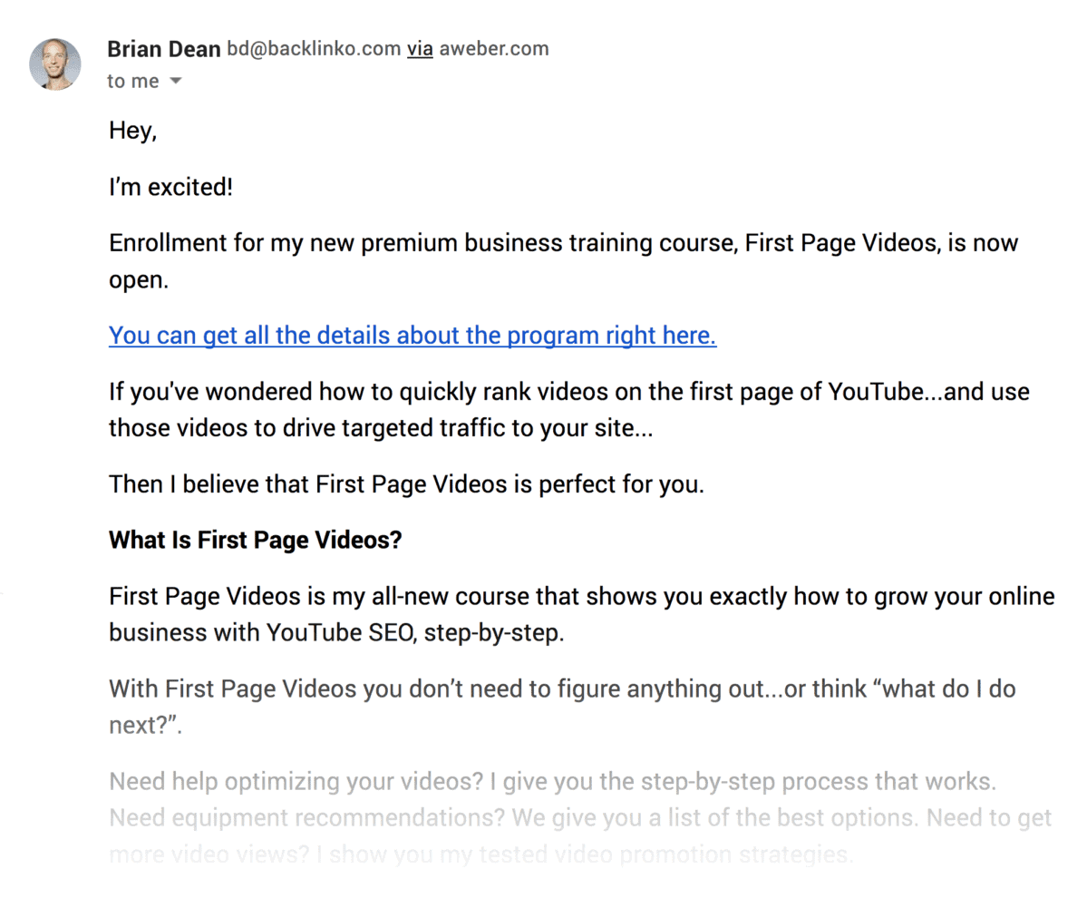
My thought process was:
“YouTube marketing is blowing up right now. Anyone that’s interested in SEO will probably want to grow their YouTube channel too.”
But I was wrong.
As it turned out, a good chunk of my subscribers had ZERO interest in YouTube.
So the next time we launched I course, I decided to use segmentation. That way, we’d ONLY send emails to people that cared about YouTube marketing.
To do that, I sent our entire list an invitation to a new training series about YouTube SEO.
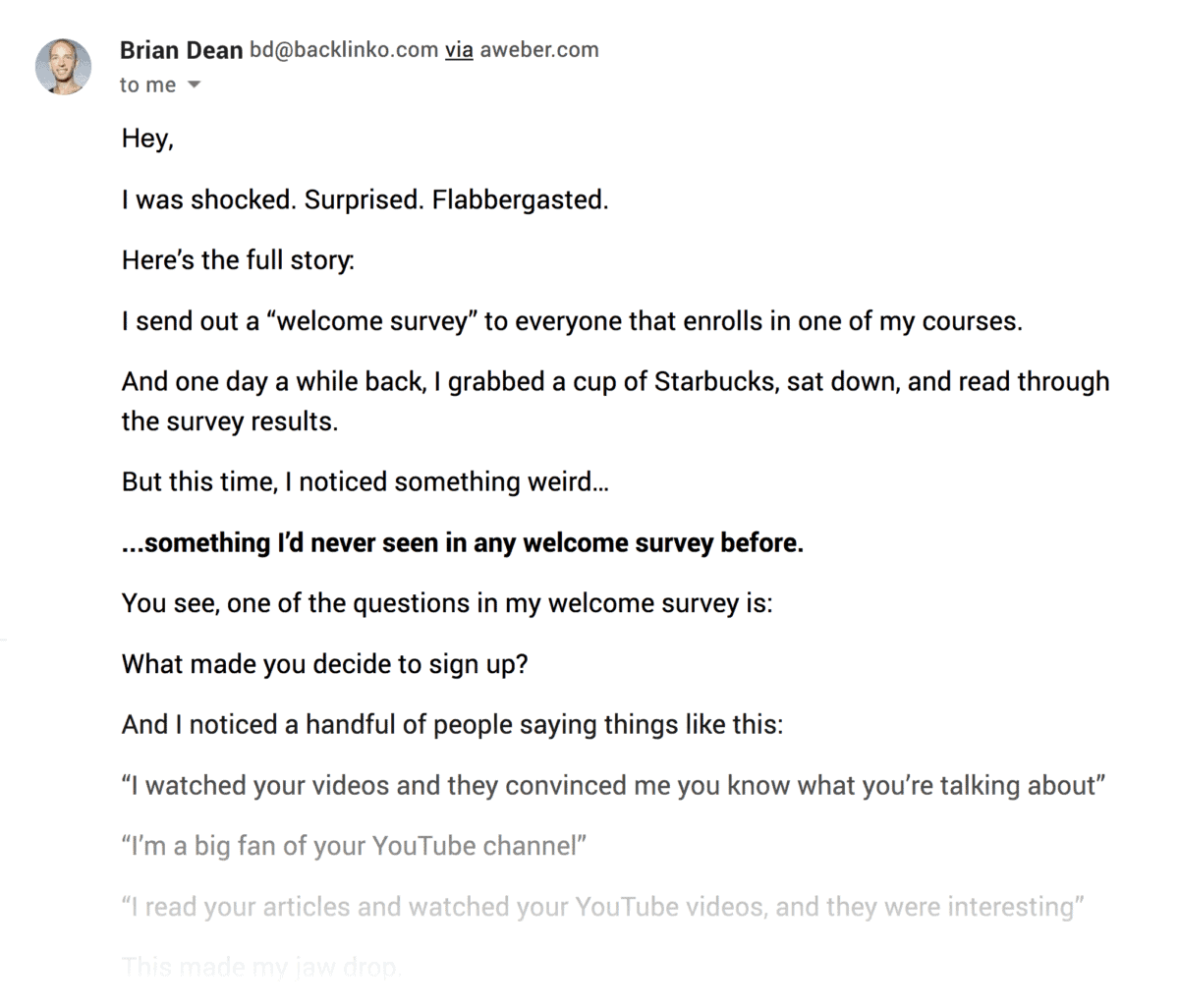
But to get access to the series, subscribers had to raise their hand and say: “I’m interested”.
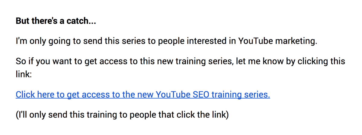
And because we sent messages to people that wanted to receive them, we had an awesome conversion rate for that launch.
Test Full Marketing Automation Campaigns
Let me be clear about something:
Marketing automation has a ton of potential.
But the downside of automation is that things can get REALLY complicated REALLY quickly.
Before you know it, you need a Ph.D. to understand what’s going on.
So if you’re new to email marketing, focus on building your list and sending subscribers AWESOME content.
And once you have a handle on that, set up an autoresponder.
And once you have a handle on that, use tags to segment your list into 2-3 different groups.
Then, once you feel like you’ve completely mastered tagging, try full-on email automation.
This means hyper-targeted messages based on opens, clicks, pages visited, past purchases, demographics, time on site, and lots more.
For example:
Let’s say you run an eCommerce site that sells grain-free dog food.
And when a new subscriber signed up they chose “Dachshund” from your “What breed of dog do you own?” question.
A few days later that person put a bag of dog food into their cart… then closed the page.
Well, with marketing automation, you could go beyond the generic “You forgot something” abandoned cart message.
Instead, you can send them a “new customer discount” for 20% off their first purchase. And you can mention the fact that Dachshunds LOVE the product they had in their cart. This can be the start of a great customer relationship.
Pretty cool.
Bonus Chapter:Advanced Email Marketing Strategies

In this chapter I’m going to share a handful of advanced tactics that I’ve picked up over the years.
So if you’re ready to get more from your email marketing campaigns, this chapter is for you.
Let’s dive right in.
Try Text Email Layouts
Nathan Barry said it best:
“Beautiful email templates are bad for business.”
And he’s 100% right.
The fancy design does nothing but distracts people from the content of your message.
Instead, I recommend sending emails that look like they came from a friend or coworker.
Here’s a great example from Dan Martell:
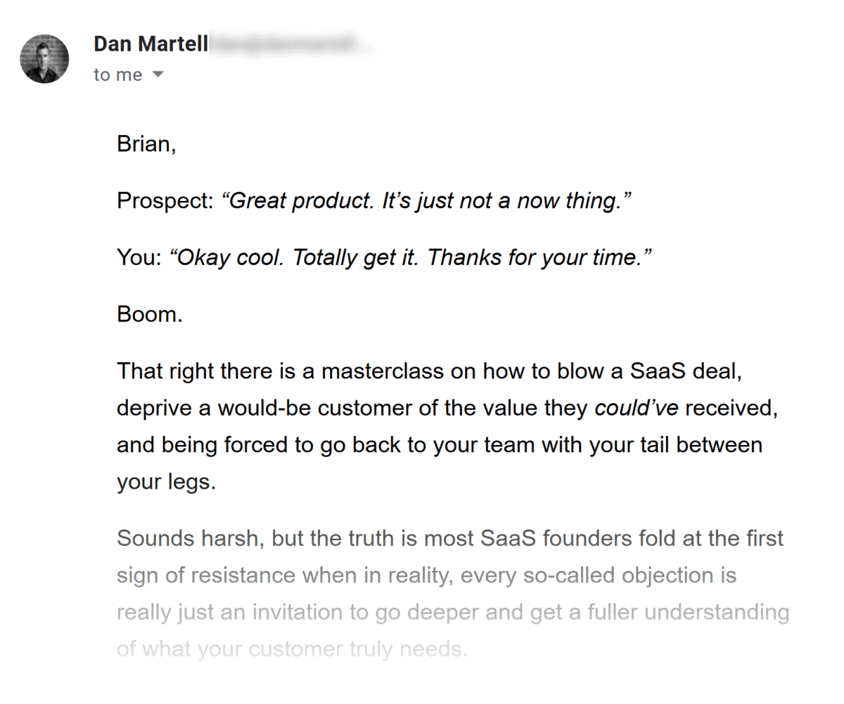
This email could EASILY have a logo, header and other nonsense.
But Dan decided to send a newsletter that’s super simple.
Nice.
Keep Things Personal
Most emails get ignored because they’re boring and generic.
What’s the solution?
Make your emails look like they’re written and sent from a single person.
(Yup, even if you’re a big brand with thousands of employees.)
For example, HubSpot is a publicly-traded company with hundreds of employees.
But even they send their newsletters from Aja, someone that writes for their blog.
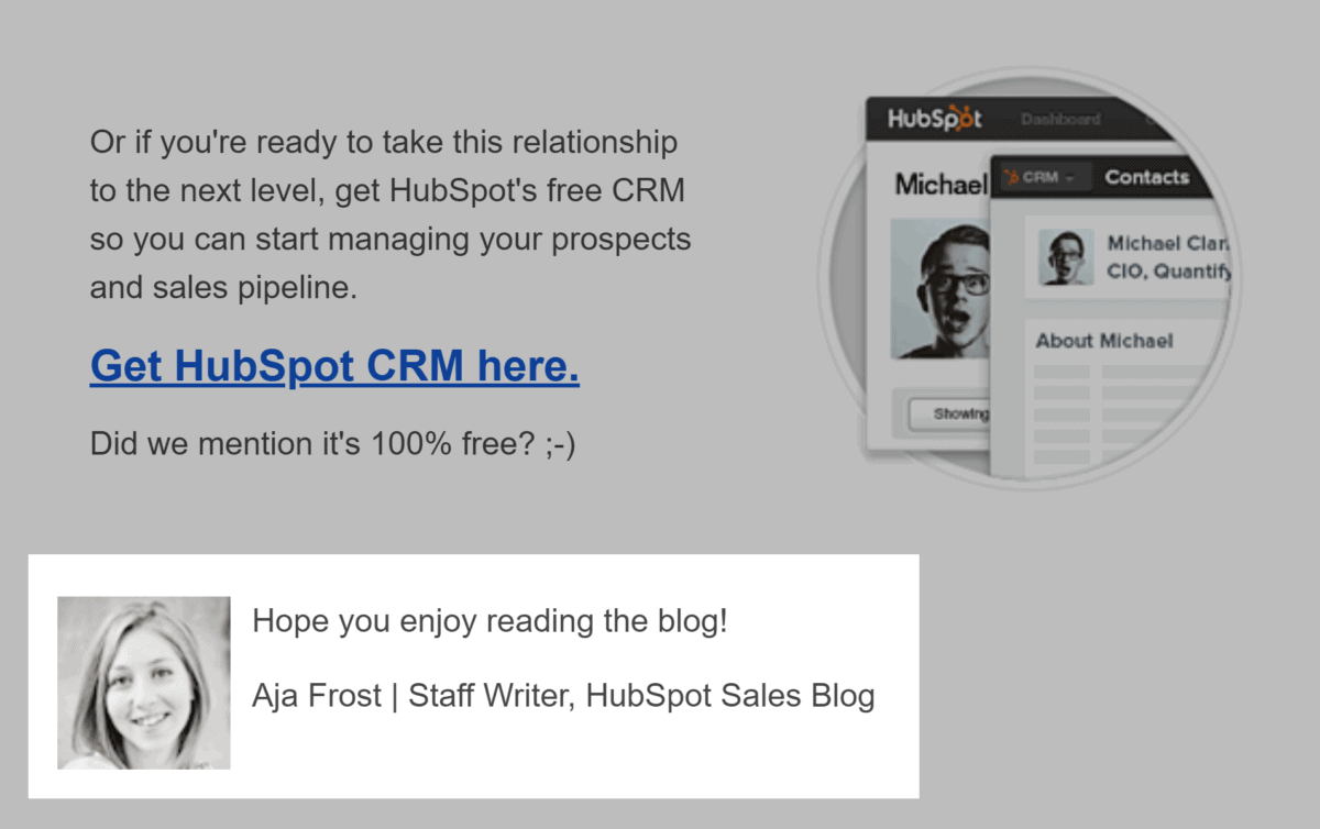
That way, you feel like Aja just sent you an email… not a faceless brand.
One CTA Per Email
Want to improve your email click-through rate?
Use ONE CTA per email.
In fact, WordStream reports that emails with a single CTA can boost clicks by 371%.
In other words, don’t send emails with a million options.
Instead, give subscribers ONE crystal clear option.
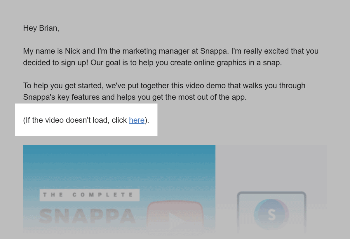
Use 15px+ Font
According to Litmus, 67% of all email messages are opened on mobile devices.
And one of the easiest ways to make your newsletters mobile-optimized?
Use a big font.
(Ideally, 15px+.)
Unfortunately, most newsletters still use 12-13px font.
This is fine for desktops.
But 12px font is almost impossible to read on an iPhone without pinching and zooming.
For example, look at the difference between these two newsletters:
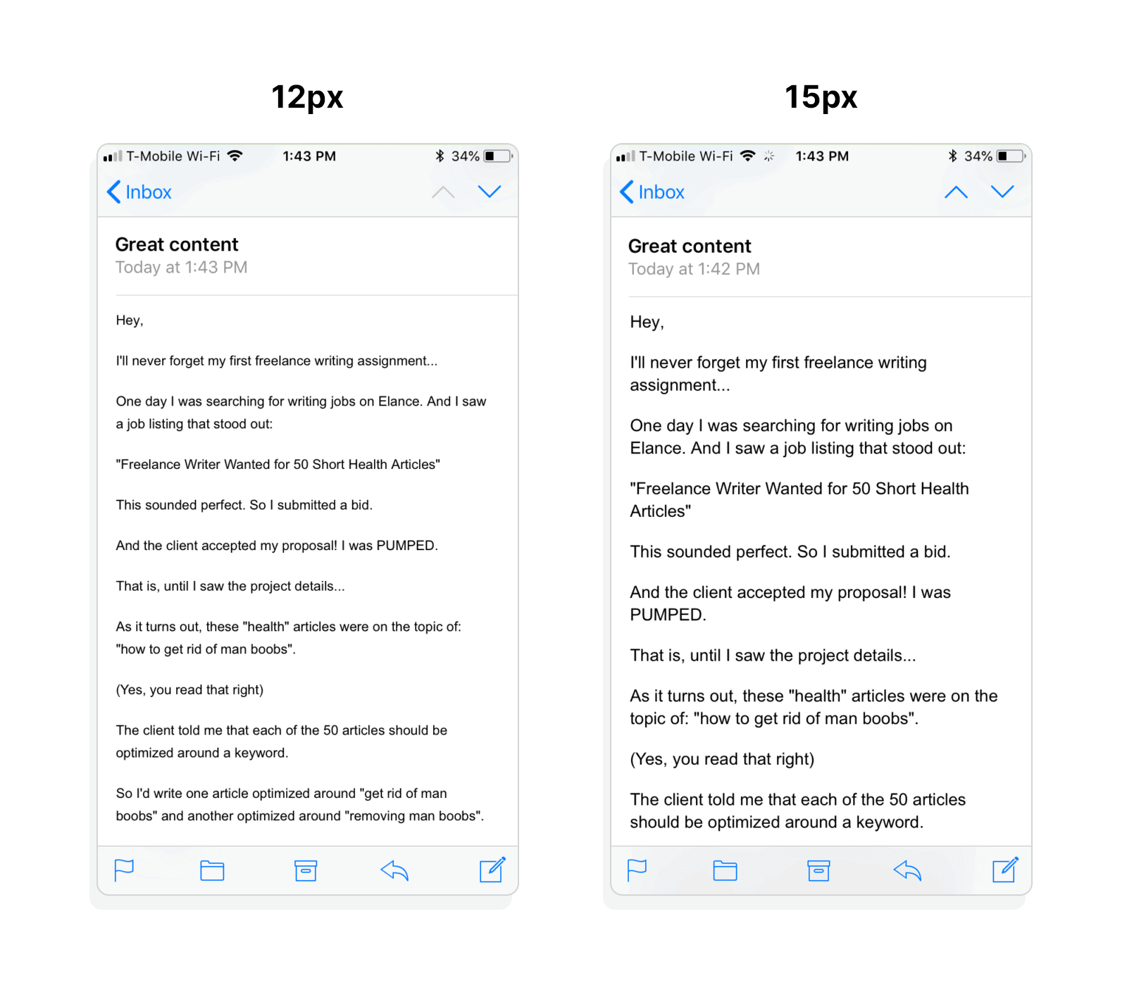
Same content. Same formatting. Different font size.
And a world of difference.
