Conversion Rate Optimization: The Definitive Guide
This is a complete conversion rate optimization (CRO) guide updated for 2025.
You’ll learn:
- How to convert first-time visitors into customers
- How to audit your site to figure out where you’re leaking revenue
- How to build high-converting landing pages
- How to optimize Ecommerce sites
- How to run A/B tests like a pro
- How to run customer research so you write copy that converts
In short, if you want to get more leads, sales, and signups, you’ll love this guide.

Contents
Chapter 1: CRO Basics

This chapter explores what CRO is and why it’s important.
So, if you’re just getting started with CRO, this chapter is for you.
Let’s jump right in.
What Is Conversion Rate Optimization?
Conversion rate optimization (CRO) is the process of increasing the percentage of visitors who perform a desired action on your website. This could be anything from buying a product, signing up for a webinar, interacting with live chat, to enrolling in a course upsell.
But increasing conversions is not the be-all and end-all of CRO.
At its core, it’s about diving deep to understand your customers–figuring out what makes them tick, what they need, and how you can smooth out their journey to take the action you want.
It’s not just guesswork, either. It involves a lot of testing and experimentation.
You try different things. See what works and what doesn’t.
And then use those insights to create an experience that’s not only easy for your customers but also gets them to convert more effectively.
What Is Conversion Rate?
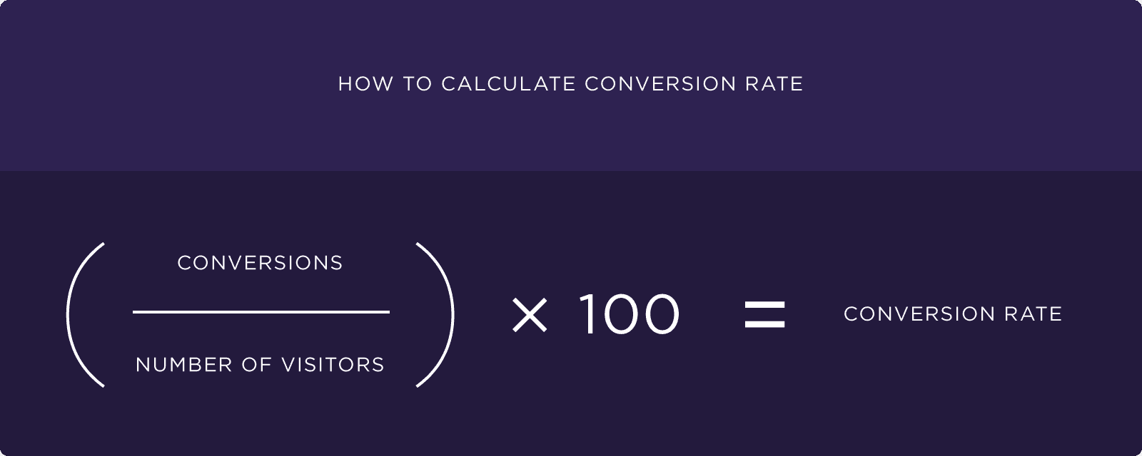
Conversion rate is the percentage of visitors who complete a specific action on your site.
To calculate it, divide the number of people who take the desired action by the total number of visitors.
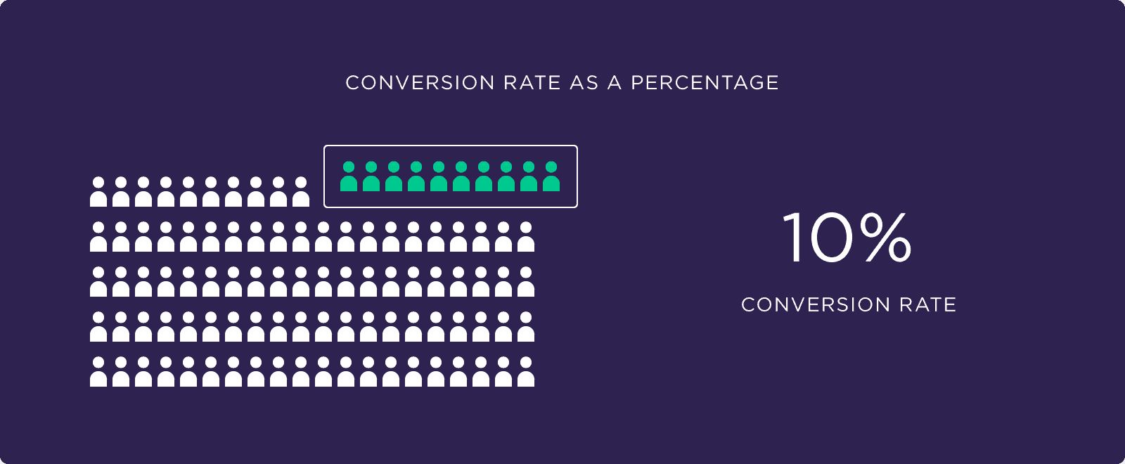
Let’s say your SaaS landing page gets 100 visitors monthly.
If 10 sign up for a free trial, your conversion rate is 10%.
Why Is Conversion Rate Optimization Important?
Well, higher conversion rates generally translate to increased revenue. That’s an obvious win.
Apart from that, it’s also an effective strategy for reducing your customer acquisition costs (CAC) and increasing your ROI.
Imagine you’re running an ecommerce website.
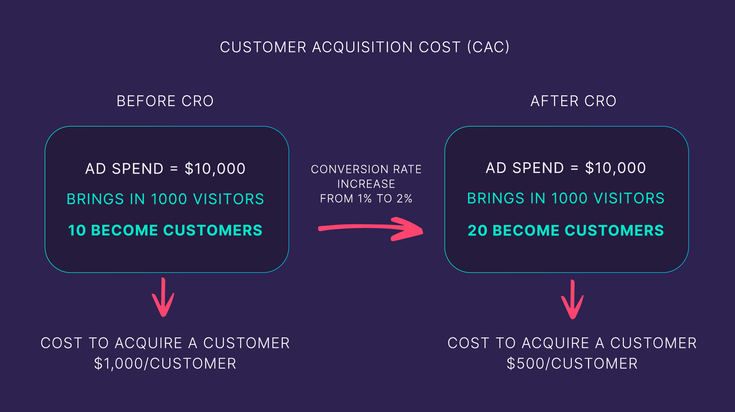
You spend $10,000 a month on advertising, which brings in 1,000 visitors. Out of these, 10 end up making a purchase, meaning your CAC is $1,000 per customer ($10,000 ÷ 10 customers).
Now, let’s say you implement CRO strategies on your top landing pages.
These changes lead to a better customer experience, encouraging more visitors to complete a purchase. As a result, your conversion rate doubles from 1% to 2%.
With the same advertising spend of $10,000, you now get 20 customers instead of 10.
This halves your CAC to $500 per customer ($10,000 ÷ 20 customers).
That’s the kind of numbers that make us happy, right?
But CRO’s value isn’t just in immediate gains.
You’re also playing the long game.
You’re consistently learning about your customers and understanding their buying psychology.
This is priceless.
These insights you gain through CRO allow you to continually refine your site to meet customers’ needs and drive even better results over time.
Why Conversion Rate Increase Shouldn’t Be Your #1 Goal
When you run CRO tests, a drop in conversions isn’t a setback. It’s valuable intel.
It tells you what’s not resonating with your visitors.
So what do you do when a test leads to fewer conversions? You test again.
But this time, you’re armed with better knowledge. You already know what not to do because your previous (failed) tests have shown what your customers don’t want.
This whole cycle–test, learn, adjust–it’s incredibly insightful.
It sharpens your understanding of what your customers want and don’t want.
Chapter 2: Laying the Groundwork for Effective CRO

It’s tempting to dive headfirst into tweaking your website.But hold up!
Without laying the right foundation, you’re basically shooting in the dark.
Random changes—such as tweaking a button’s color—might give you a small lift in conversions. But without understanding the “why” behind it, you’re missing out on big learning opportunities for even bigger wins.
So, let’s set yourself up for success with a solid CRO foundation.
Establish Clear Goals and Benchmarks
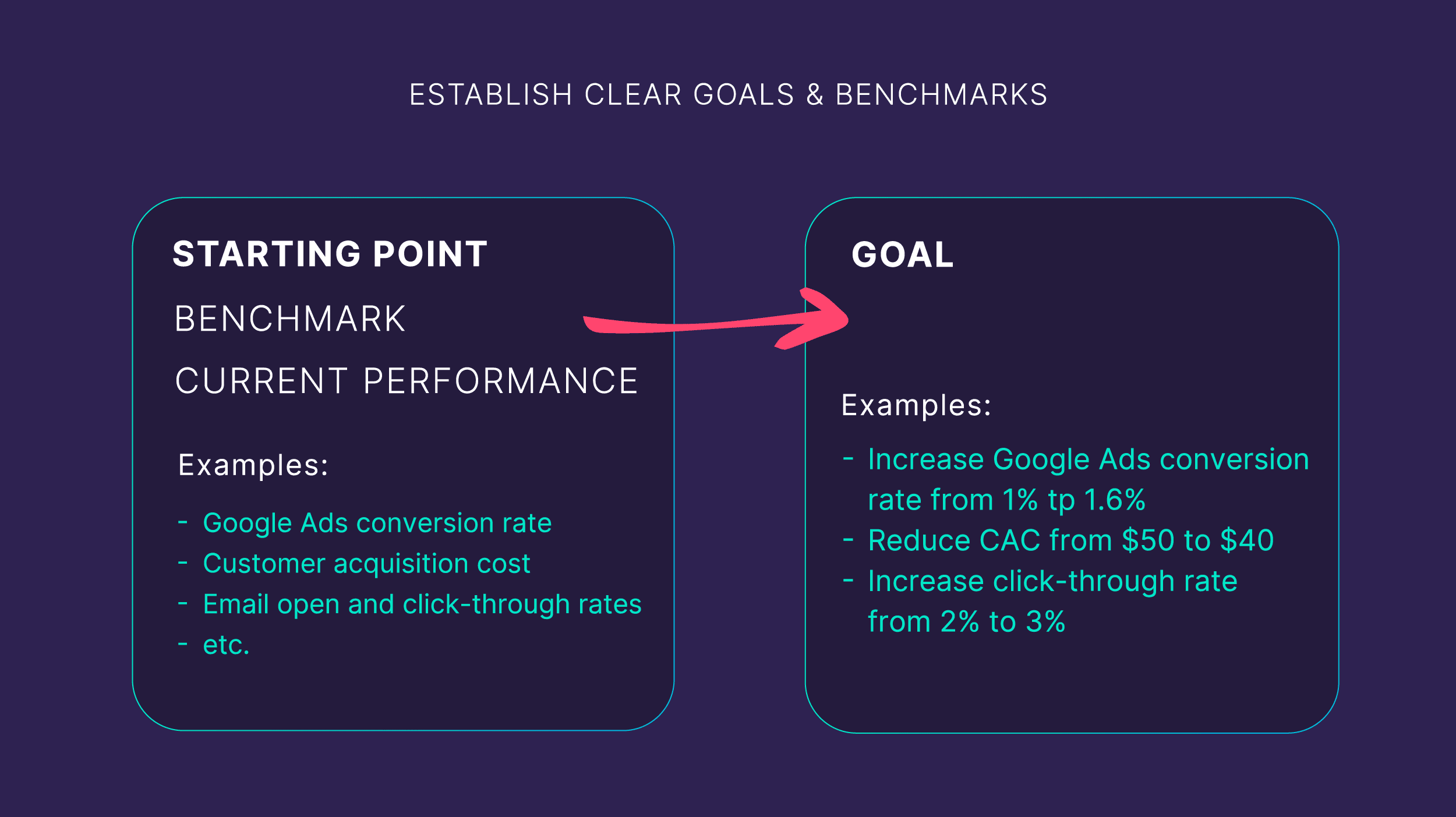
Before you dive into the CRO nitty-gritty, get clear on your overarching goals so you don’t get sidetracked by overwhelming data.
Start with the big picture. What are your key objectives?
- Boost revenue?
- Grow your customer base?
- Ramp up user engagement?
This goal will inform your strategy.
If your primary goal is to boost revenue, you might hone in on upselling or increasing the average order value.
But if you’re looking to grow your customer base, you’d likely focus on improving your site’s user experience to attract and keep new visitors.
For benchmarks, industry standards are a good starting point.
What’s even better?
Your own business’s numbers.
Here’s how to approach this:
Begin by clearly defining your goal.
This varies depending on what you want to achieve.
For example, maybe you want to:
- Boost overall revenue by 30% in the next 90 days
- Increase Google Ads conversion rate from 1% to 1.6%
- Reduce customer acquisition cost from $50 to $40
Pick one primary goal to focus on.
The more specific, the better.
A well-defined goal will guide your efforts and make it easier to measure success.
Got that goal? Great.
Now, it’s time to dig into your data.
Say you’re using Google Ads.
What’s your conversion rate?
How many people are clicking on those ads and then actually doing something like buying your product, signing up for your webinar, or downloading your ebook?
That becomes your starting line–your benchmark.
And this is where it gets real:
You know your goal and where you’re starting from. Now, the big task is to close that gap. Let’s figure out how to get from where you are to where you want to be.
Perform a CRO Audit
Think of a CRO audit as a health check for your website.
You evaluate your site to see any issues that could be costing you conversions.
Here’s what you do:
Go through your site, keeping an eye out for anything that might disrupt the user experience. Or clash with what your buyers expect to see.
Ask yourself:
- Can visitors easily find what they need in the navigation?
- Are headlines crystal clear?
- Do the visuals nudge users in the right direction?
- Does the copy convey the main message?
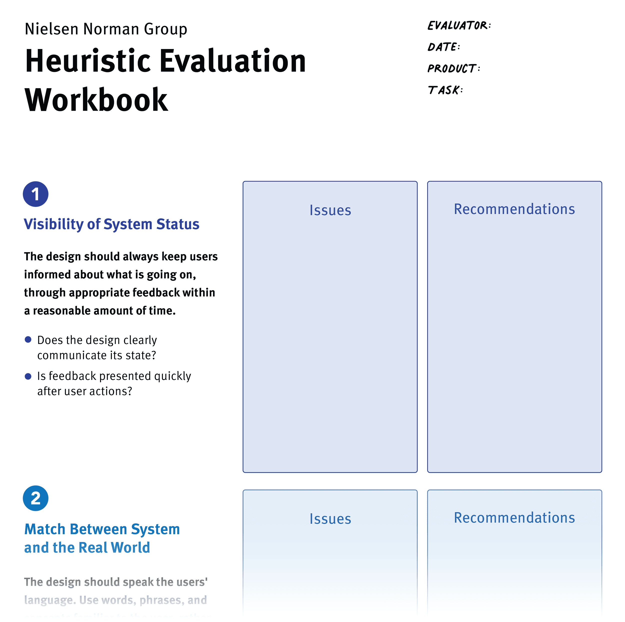
The Nielsen Norman Group’s Heuristic Evaluation Workbook is a great free resource that can walk you through this process.
Also, use heatmap tools like Crazy Egg or Google Analytics 4 (GA4) for your CRO audit.
These tools help spotlight areas where people are engaged, where they lose interest, and how they navigate through your pages.
Get Your Conversion Optimization Tools in Order
Picking the right conversion optimization tools can be overwhelming.
The trick is to zero in on tools that meet your specific needs.
Here are the choices available:
- User behavior analysis tools: Get data on user interactions with your site through heatmaps, scroll maps, and more. Think Microsoft Clarity or Hotjar.
- A/B and multivariate testing tools: These are great for comparing different webpage versions. Look at Optimizely Experiment or VWO.
- Conversion funnel analysis tools: Tools like GA4 are super for tracking user paths to conversion, helping you pinpoint where they’re dropping off.
- Landing page builders and optimization: Want to build landing pages quickly? Try platforms like Unbounce or Leadpages.
Chapter 3:Digital Marketing Principles for CRO Success

To win at CRO, start with solid digital marketing basics.These aren’t just nice-to-haves.
They’re must-haves that should inform all your CRO experiments.
With these principles guiding your strategy, you’re setting up your site for a real shot at boosting conversion rates.
So, let’s get down to these fundamentals.
5 States of Awareness
The stages of awareness are central to effective CRO.
The stages are:
- Unaware
- Problem-aware
- Solution-aware
- Product-aware
- Most-aware
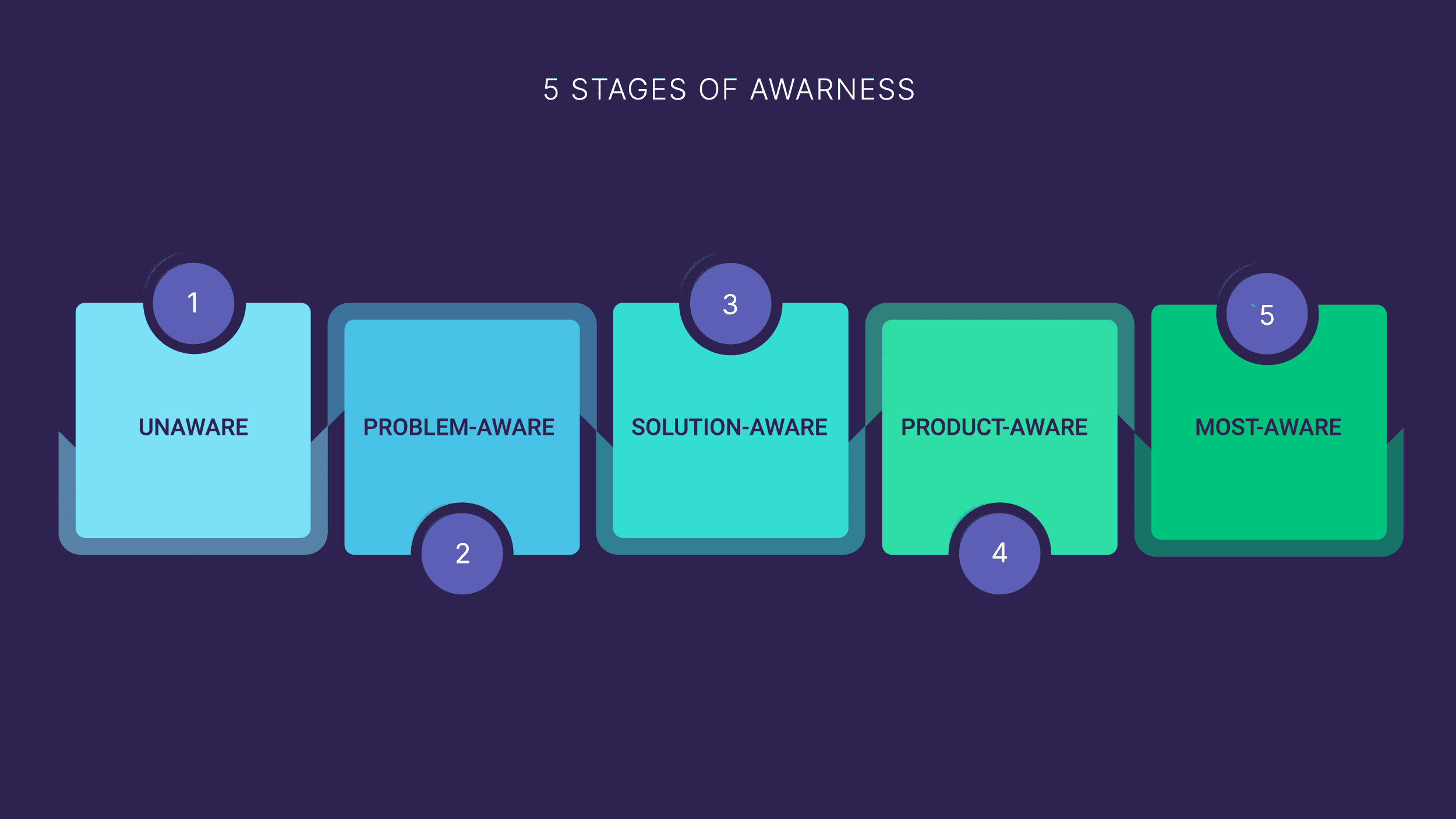
Individuals at the unaware stage don’t know they have a problem.
In the problem-aware stage, they recognize they have a problem but haven’t yet found a solution.
Those at the solution-aware stage are aware of potential solutions but haven’t encountered your specific product.
Product-aware readers already know about your product.
Finally, those in the most-aware stage have researched your product and are considering buying.
Why are these stages important?
Because each stage requires a different approach to how you talk to them.
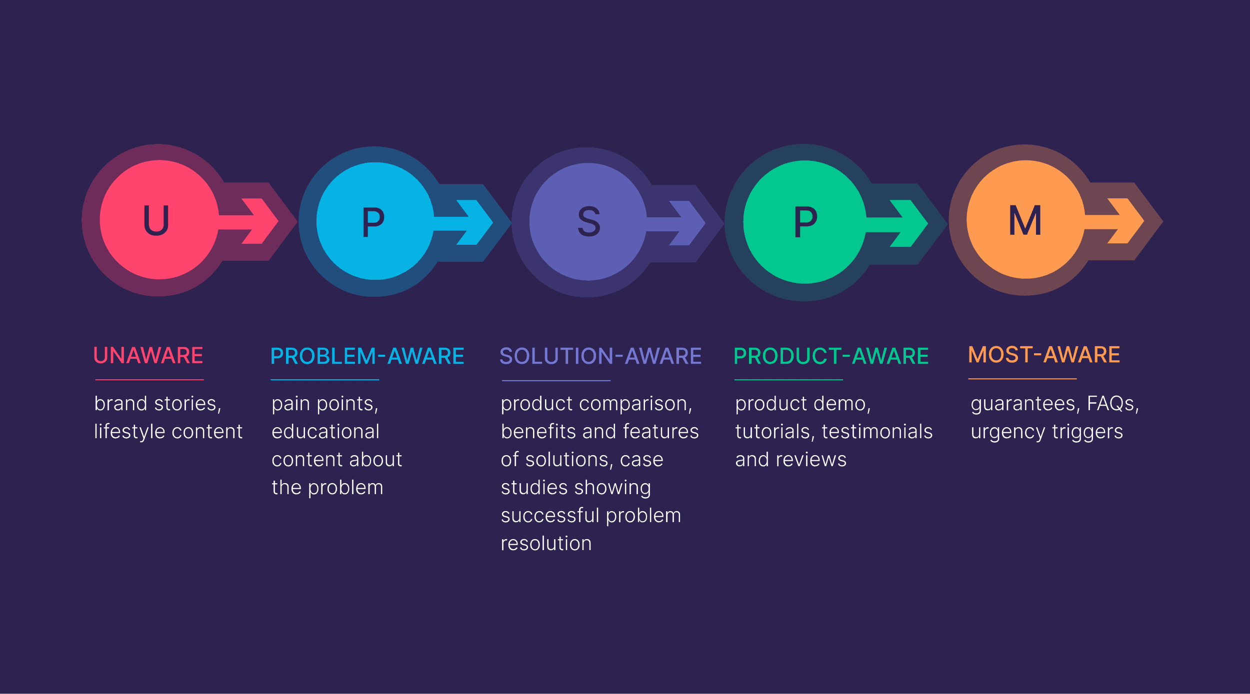
- For those in the problem-aware stage, content should empathize with their challenges and subtly introduce your solution.
- For solution-aware readers, landing pages that compare various products or case studies that highlight the superiority of your product are effective.
- For buyers in the product-aware stage, convincing them to make a purchase often involves showcasing demos or sharing positive customer testimonials.
- Lastly, for the most aware customers who are on the verge of buying, offers or discounts can be the final push they need to convert
Note: Often, CRO experiments tend to allocate less focus on the unaware stage, partly due to the challenges associated with tracking conversions at this early phase.
Message Matching
Before someone lands on your website, an event often triggers their visit.
It could be an ad clicked. A Google search. Or a video on YouTube.
That pre-visit context? It’s central to conversions.
It shapes what they expect to find on your site. Your job is to sync up with that backstory.
Keep the conversation in their head flowing smoothly when they land on your page. No jarring shifts. No disconnects–just a smooth, logical follow-through.
For example, the ad below promises a business plan in 15 minutes.
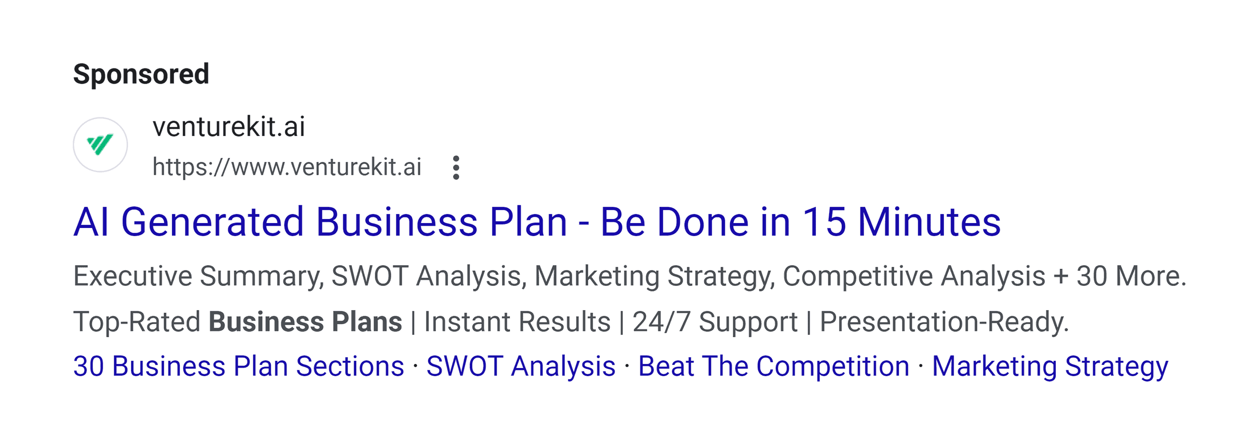
A searcher clicks it, expecting this promise to be reflected on the landing page.
They land on the page.
But there’s no mention of this 15-minute promise.
That’s a missed opportunity.
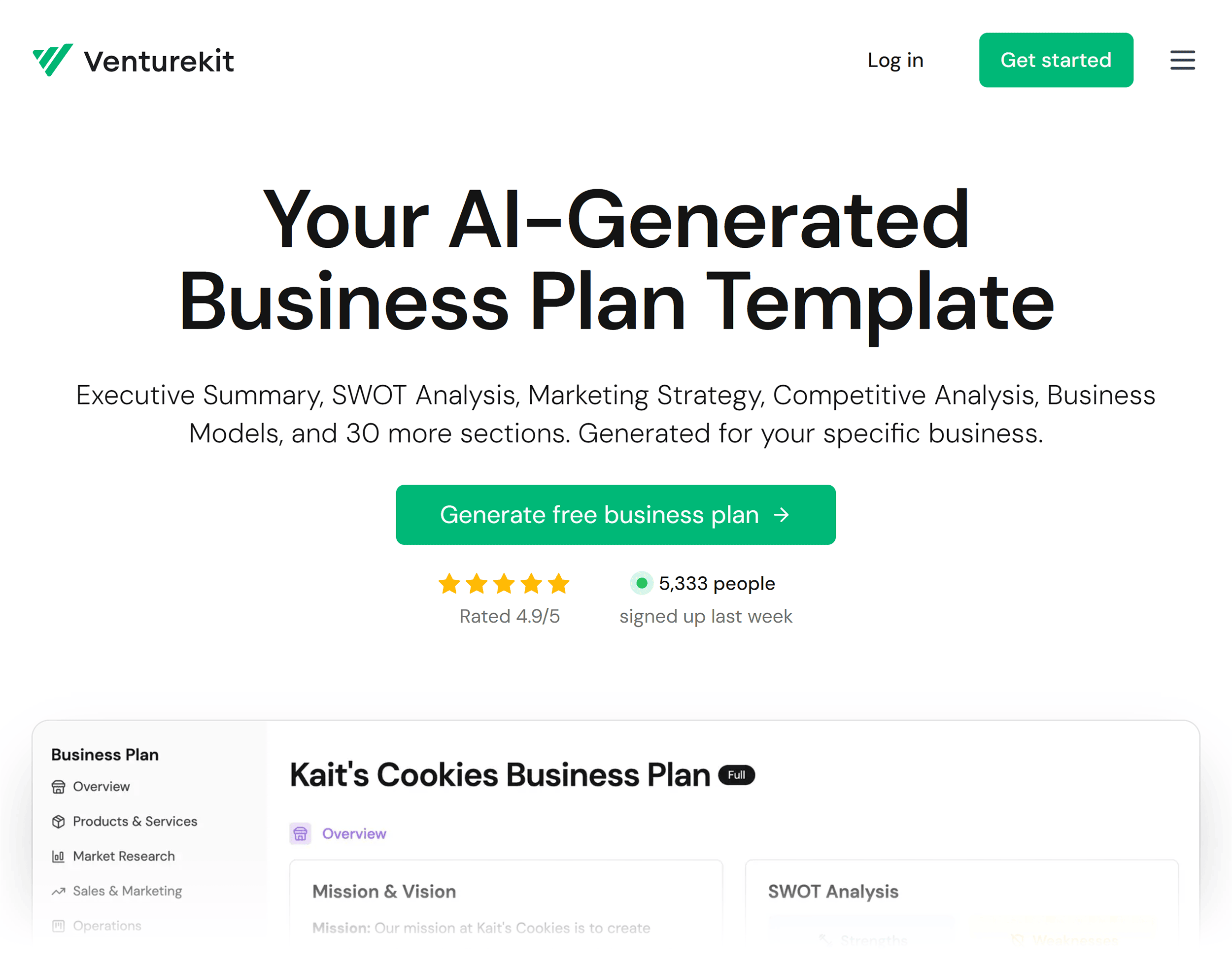
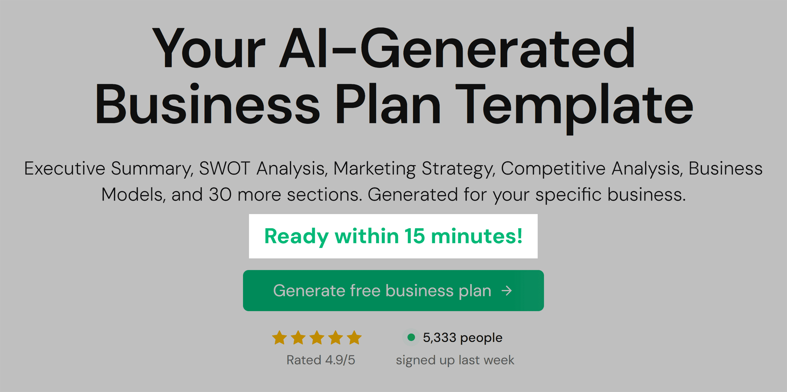
Here’s a quick fix:
Simply add a line like ‘Ready Within 15 Minutes’ to the hero section.
This simple addition aligns with the visitor’s expectations and clears up any confusion about how quickly they can get their business plan.
Not running ads? No problem.
You can still align your page with visitor expectations by understanding the keywords driving traffic to your site.
Once you’ve got those keywords, you can tweak your page’s messaging to reflect them.
Tools like Semrush are perfect for this.
Here’s how:
Head over to Semrush.
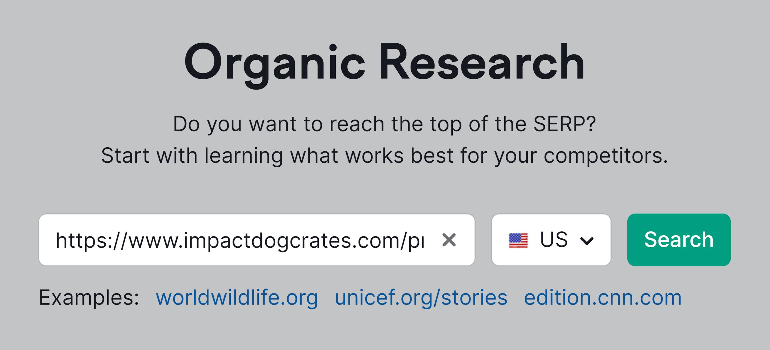
Click “Organic Research”:
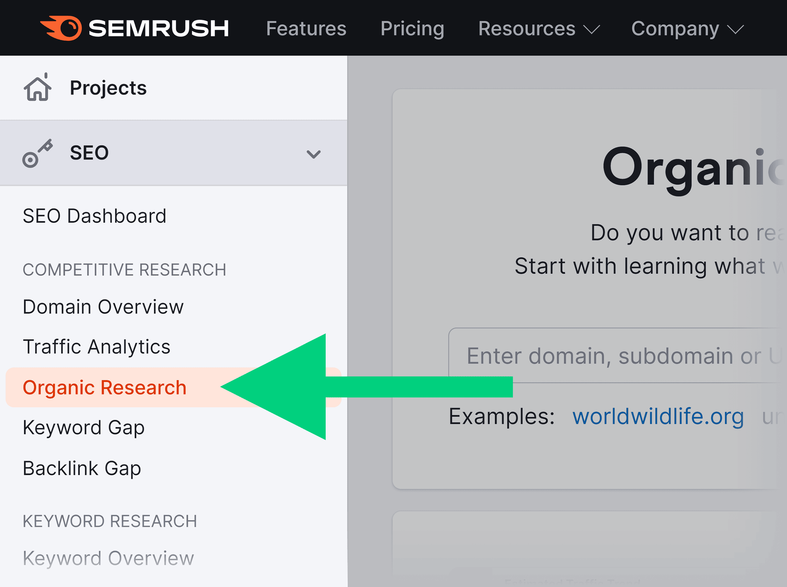
Enter the URL of the page you want to optimize. And click “Search.”
Then scroll down to the “Top Keywords” section. And click “View all keywords.”
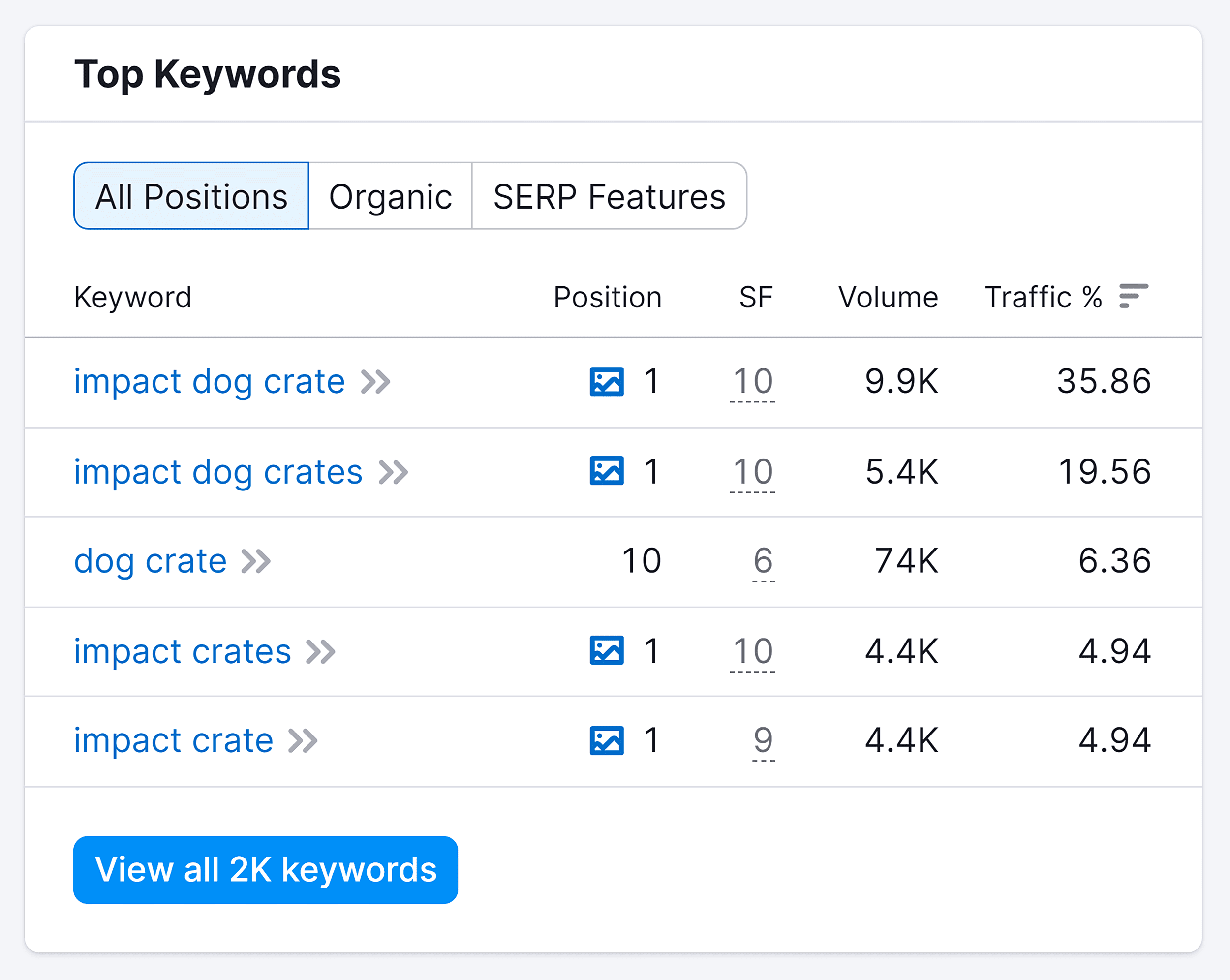
On the next page, you’ll see a list of keywords.
These words are like little hints, telling you what visitors expect from your page.
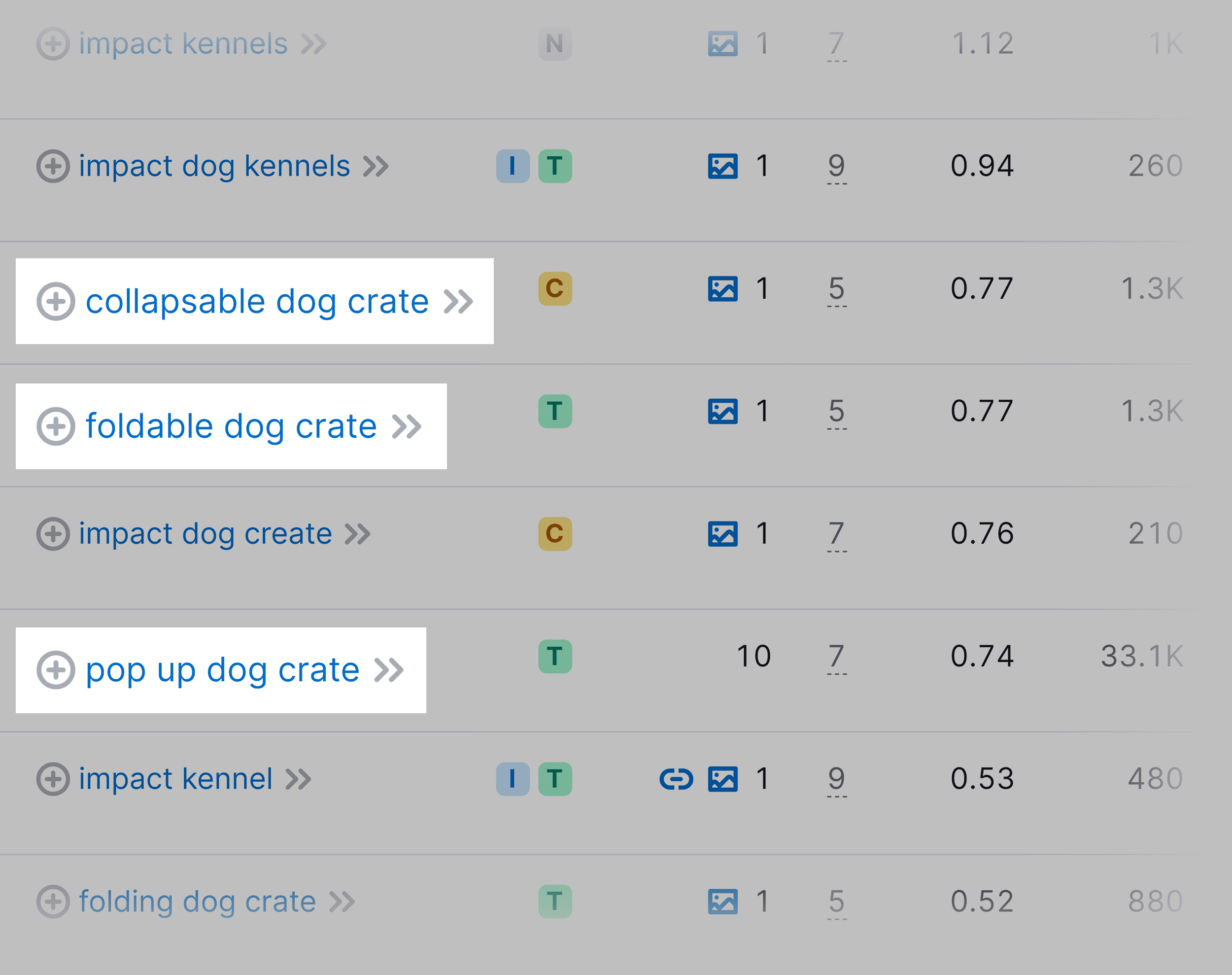
When we scroll through the list, we see words like:
- Pop-up
- Foldable
- Collapsible
Based on these keywords, we get an idea of what people are hoping to find on this page.
How do you use this insight?
Well, you can add these keywords in your hero section so that as soon as the visitor lands on the page, it’s immediately clear they’re in the right place.
Simple tweaks like this can make a big difference.
The Trio of Marketing Success: List. Offer. Copy.
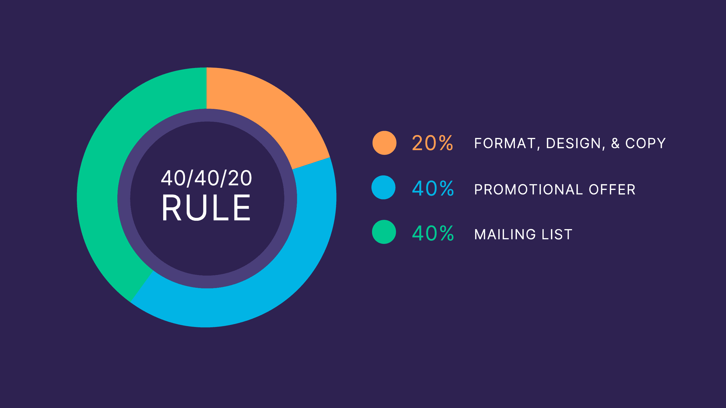
In a marketing campaign, three core elements drive conversions:
High-quality list meaning the right audience
A compelling offer that’s relevant and attractive to the audience
Engaging copy and design, optimized to convert
Here’s the deal:
Copy and design matter. But they’re part of a larger equation.
In fact, they’re not as impactful as the other two elements—your audience and your offer.
The point?
Don’t limit your optimization efforts to polishing your copy and tweaking your design.
Pay equal attention to aligning your offer with your audience’s needs and interests. And attracting the right audience, who are most likely to be influenced by your offer.
It’s this mix—the right people, the right offer, plus great copy and design—that truly boosts conversions.
Chapter 4: Qualitative and Quantitative Customer Research
Customer research is like a window into your target customers’ world.It helps you understand their core problems. Their past attempts at solutions. And what aspects of your product truly meet their needs
It’s a chance to step beyond your own assumptions. And dive deep into the viewpoints of your customers.
How do you get there? Let’s explore.
Qualitative Research
Qualitative research gives you the “why” behind customer behaviors. Why they visit your site, seek certain solutions, and choose or ditch products.
This understanding lets you craft a webpage that hits a deeper chord.
There are many ways to conduct qualitative research, including:
- Customer surveys
- Interviews
- User testing
- Message mining
- Usability testing
- Insights from the sales team
Customer Surveys
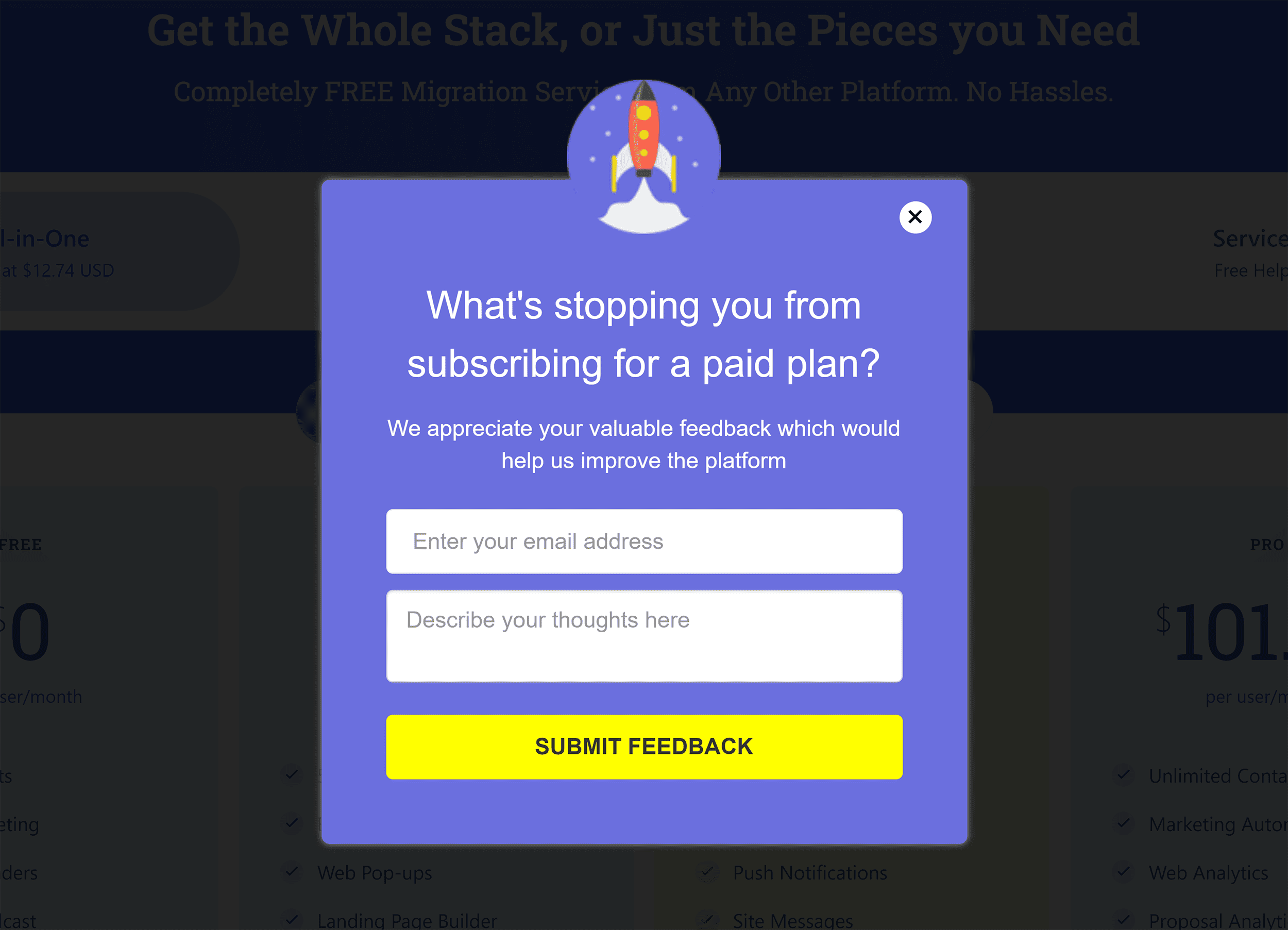
Surveys are the easiest way to get insights straight from your customers.
Use tools like Typeform to gather these insights.
Surveys can be as simple as a pop-up on your website like this one by EngageBay.
Customer Interviews
Customer interviews may sound daunting, but the insights you gain about the psychology of your buyers make interviews well worth it.
Specifically, you want to ask questions that help you figure out why people DO and DON’T convert.
For example, if you run an SEO agency, ask current clients and site visitors questions like:
- What’s the #1 reason you want to hire an SEO agency?
- What other SEO services have you considered?
- What kind of price range are you comfortable with?
- What would make you say: Yes, this agency is right for me?
Message Mining
Message mining is like eavesdropping on your audience’s unfiltered thoughts and emotions. It involves listening to your customers’ online interactions—emails, chats, social media conversations, and sales demos—to uncover hidden gems of insight.
Here’s how to do it:
- Discover online communities: Find the spaces where your users hang out
- Listen actively: Take notes of recurring topics, problems, or desires relevant to your product or service
- Refine your messaging: Use these insights to fine-tune your copy
Quantitative Research
Quantitative research forms a powerful duo when combined with qualitative insights. It provides the “what” and the “how,” offering precise metrics for analysis.
Here are two common ways to do quantitative research.
Fire up a Heatmapping and User Session Tool
Heatmaps and user session tools reveal how visitors interact with your pages.
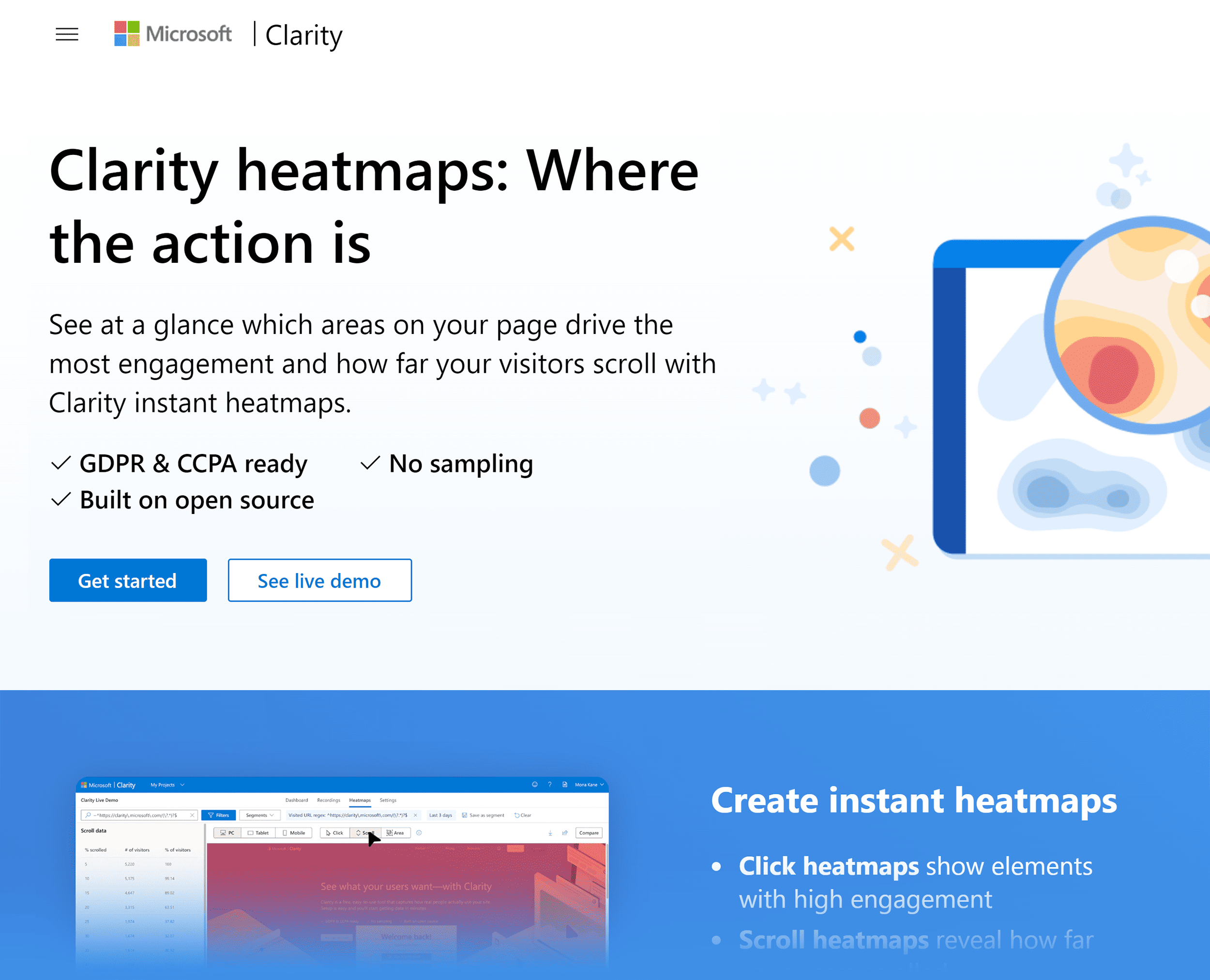
Wondering why a page isn’t converting as expected?
These tools can highlight areas where users click, how far they scroll, and where they spend most of their time on the page.
For example, on the Backlinko blog, there used to be two “helpful resources” in the sidebar. And according to the heatmap data, the vast majority of people completely ignored them.
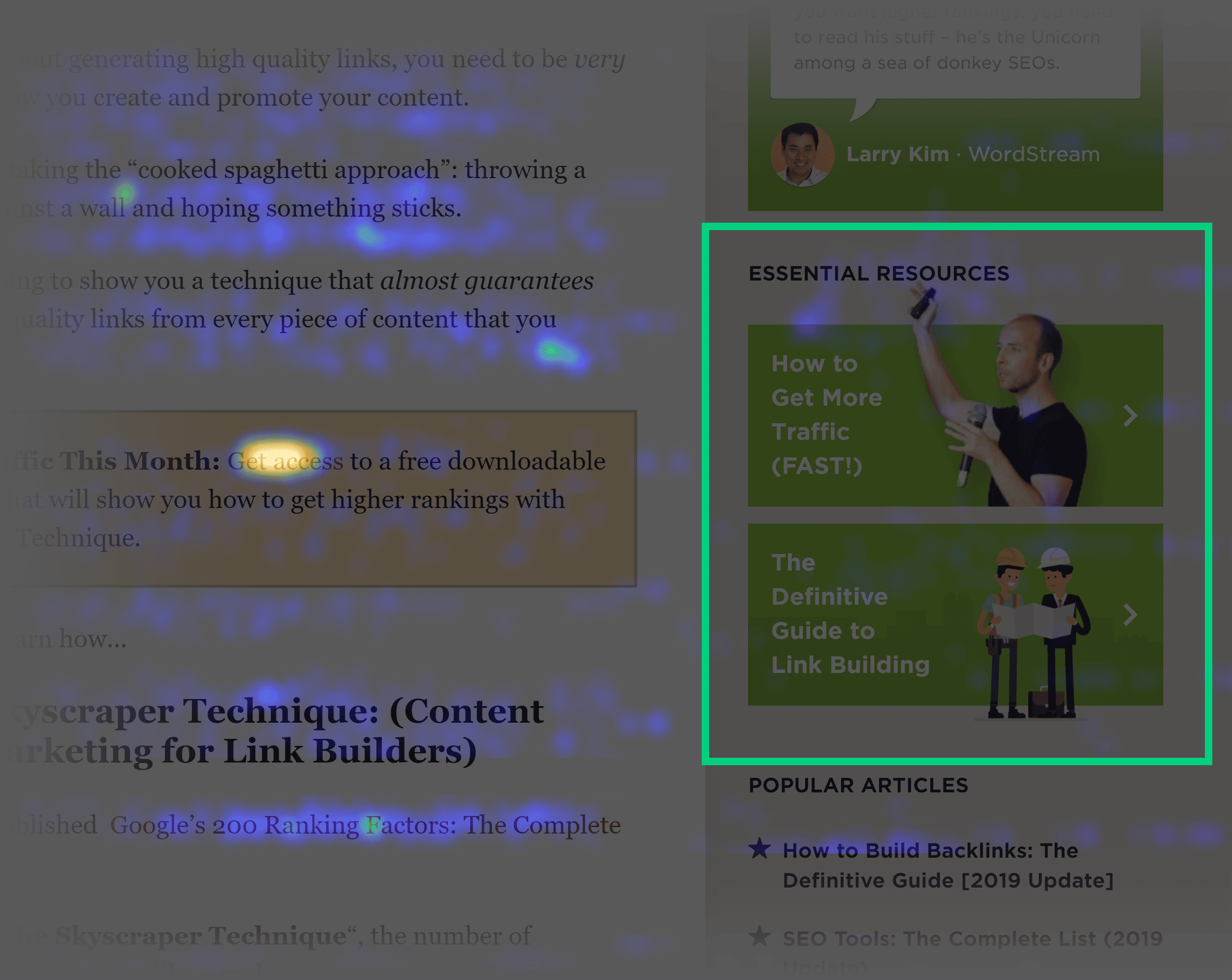
So what did we do? We got rid of it.
Dig Into Google Analytics 4 (GA4)
GA4 can help you determine the bottlenecks.
It allows you to track the entire customer journey across various devices and sessions, giving you a detailed map from the initial visit to the final purchase decision—or the point where they exit.
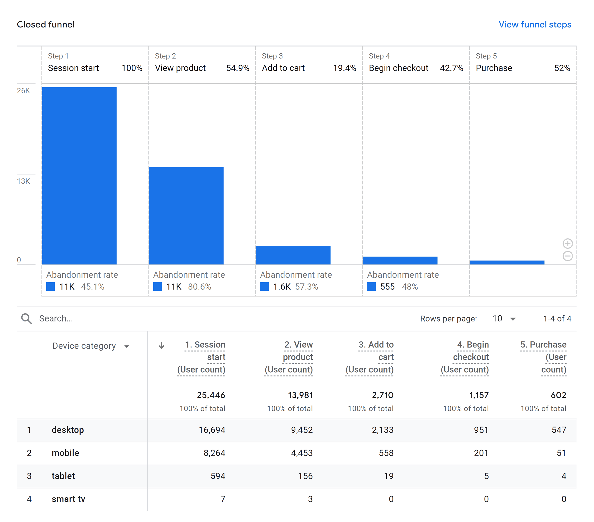
Imagine you’re managing an ecommerce site with a high abandonment rate.
GA4 can help you with that.
Ask yourself:
Where is the drop-off happening? Is it during product selection or at the checkout stage?
Pinpointing this lets you know exactly where to concentrate your optimization efforts.
Once you figure that out, you’ll know where to start optimizing.
For example, if you notice a big drop at checkout when compared to industry standards or your own historical data, that’s a clear sign to refine the checkout process.
Maybe that involves adding more payment methods, streamlining the steps involved, or improving the clarity of shipping information.
Chapter 5: Testing & Experimentation Basics
If you’ve ever asked yourself:
- “How do I get started with split testing?”
- “How do you actually perform an A/B test?”
You’ll get all that in this chapter.
Conversion Rate Optimization Steps
A data-driven approach to conversion rate optimization typically follows a set of key steps:
- Research: Start by digging into user data
- Hypothesis: Make educated guesses on improvements
- Prioritization: Choose the most promising tests
- Design and Build: Create what you’ll test
- Testing: Run your tests and gather data
- Learn and Iterate: Analyze and refine your approach
Do You Have Enough Traffic?
If your site doesn’t get much traffic, A/B testing is almost impossible.
Why?
You need enough data to hit that sweet spot of statistical significance—most optimizers aim for a confidence level of around 90-95%.
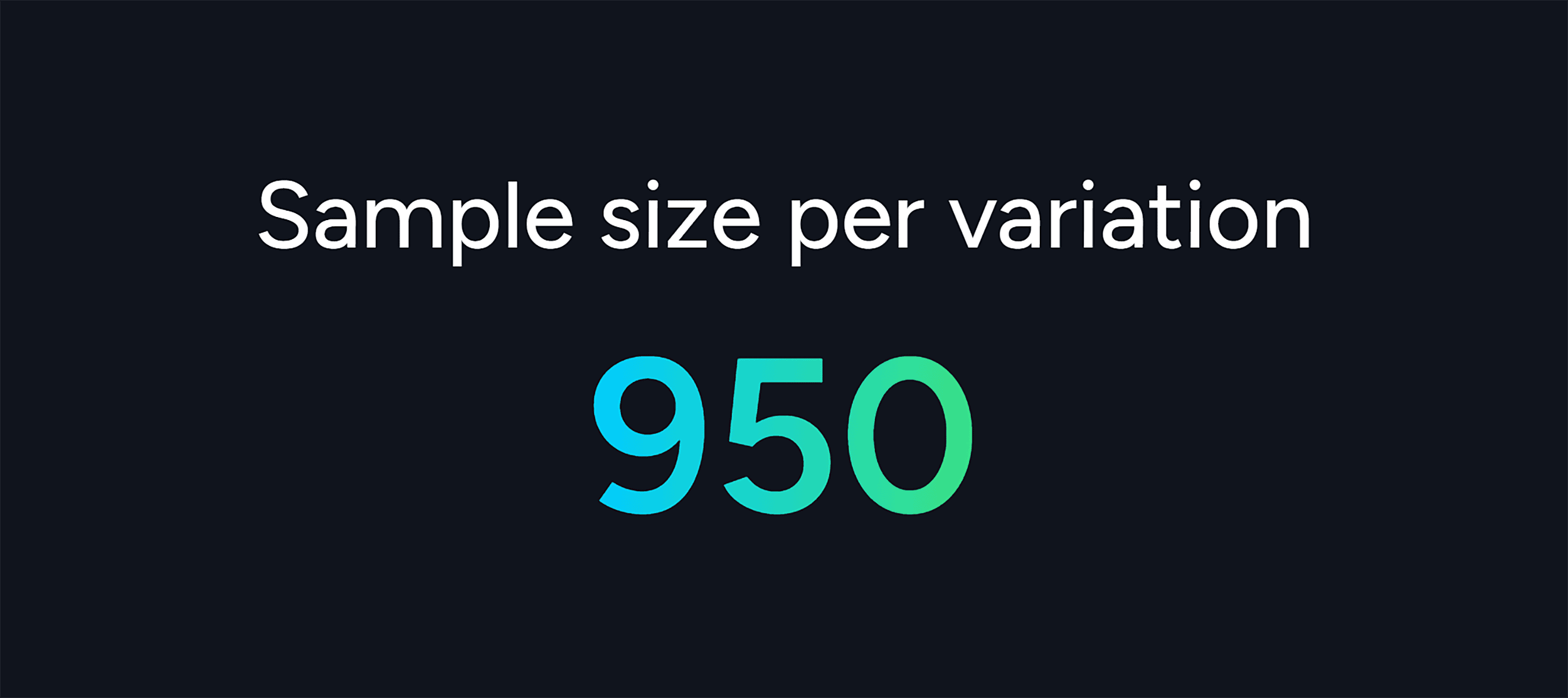
Fortunately, you can easily find out if your site has enough traffic for A/B testing with Optimizely’s Sample Size calculator.
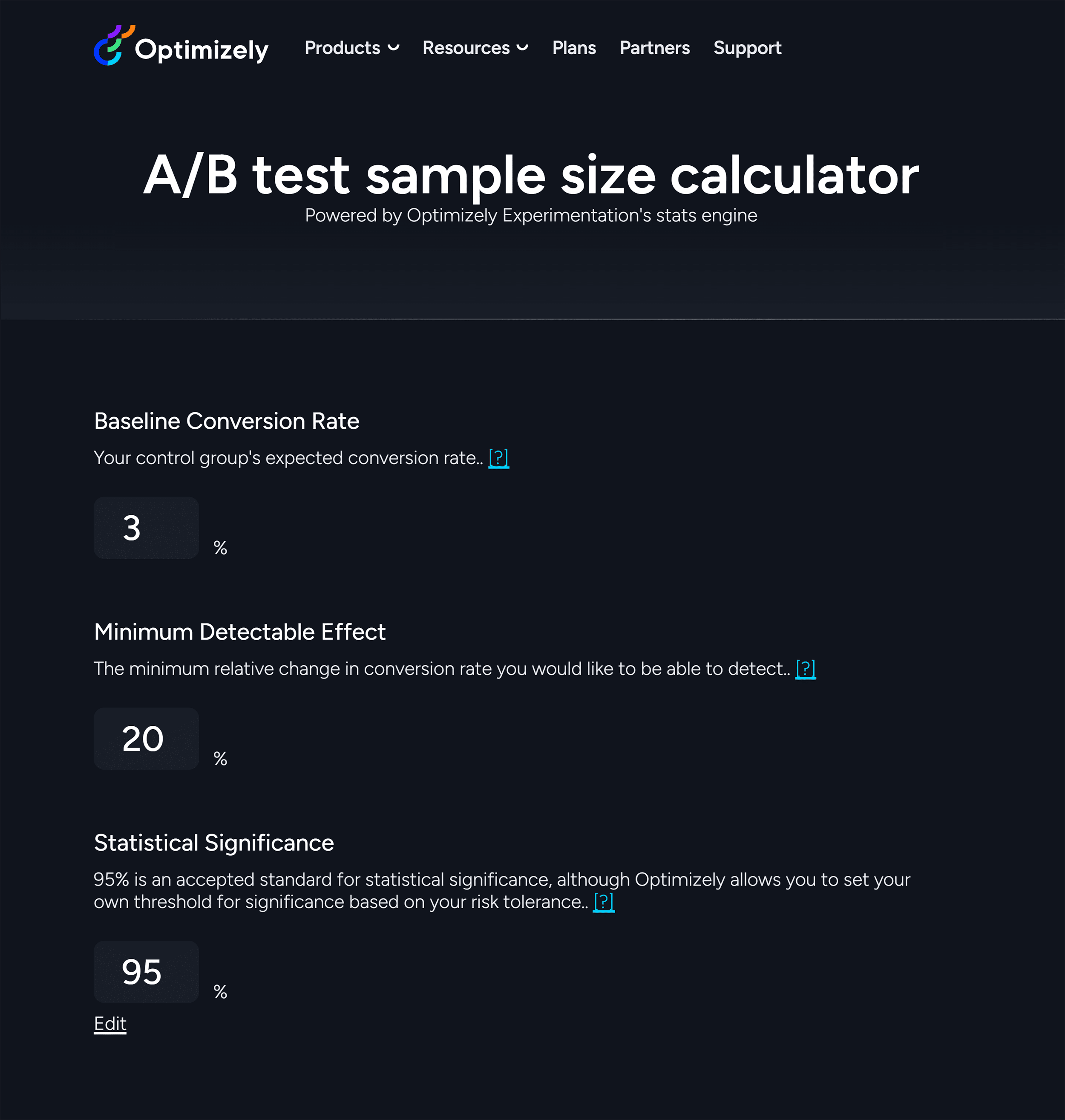
Just enter your page’s current conversion rate, the boost in conversion rate you want, and a statistical significance level.
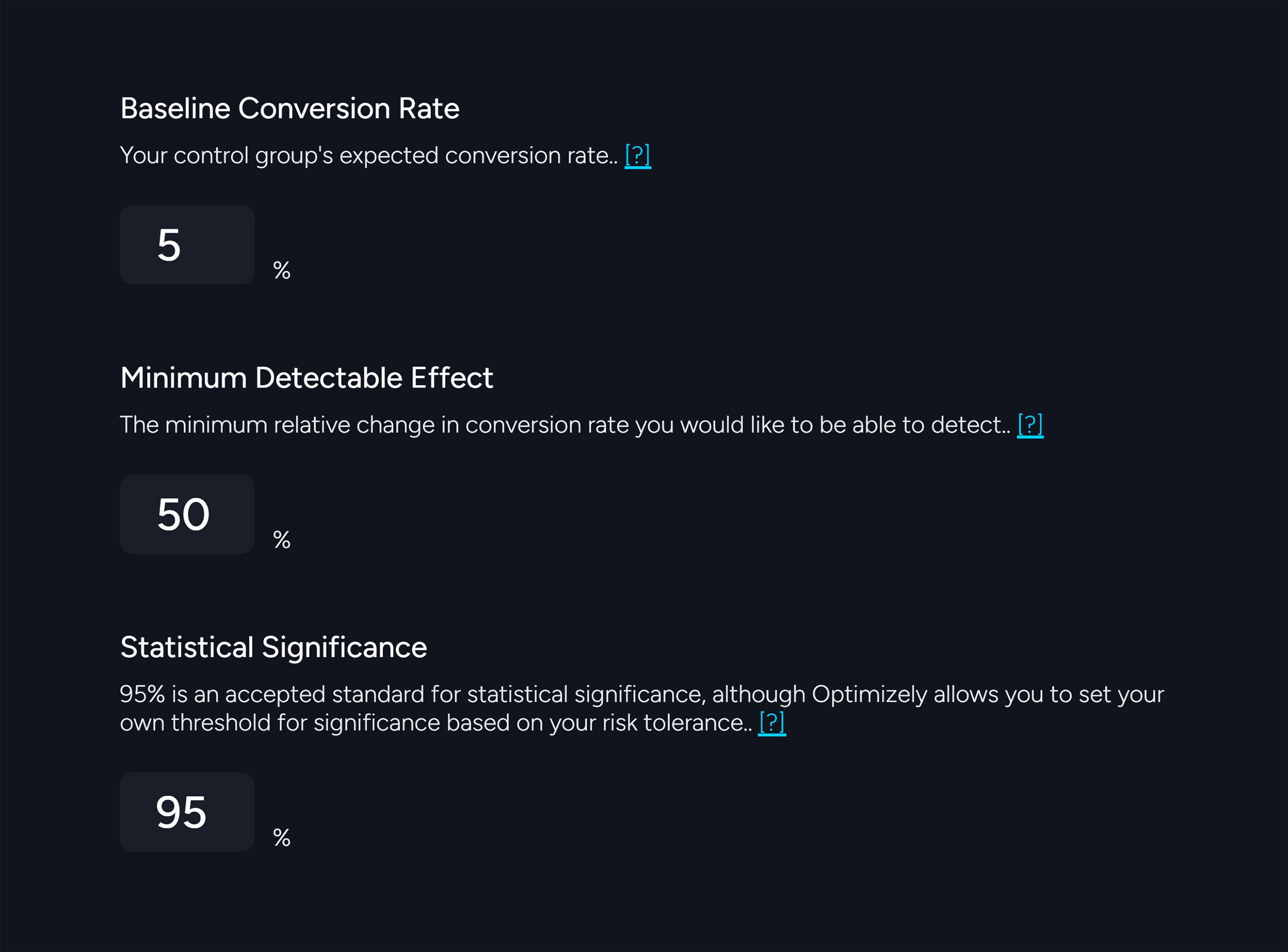
The tool calculates the visitor count you need to make your test statistically significant.
What to Split Test First
One of the biggest questions people have about split testing is:
“What do I test first?”
It’s a tough question to answer. After all, there are a million things that you can test on your site—headlines, pricing, button copy. You name it.
That said, here’s what you could try:
1. Start with High-Traffic Pages
This is simple math.
When you improve the average conversion rate on a page that gets a lot of traffic, the increase in conversions can be substantial.
2. Target Your Worst-Performing Pages
Alternatively, tackle pages with really low conversion rates.
They’ve got the most room for improvement.
Sometimes, you can see a massive leap in conversions, even with a single test.
In cases like these, consider a full overhaul rather than minor tweaks.
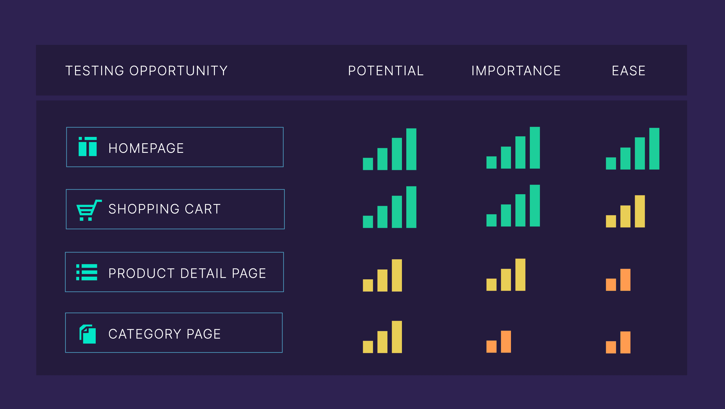
3. Let The PIE Prioritization Framework Tell You
The PIE Prioritization Framework is a widely used method for prioritizing CRO tests. It helps you pick tests based on their potential impact, importance, and how easy they are to implement.
Craft a Hypothesis for Your Tests
Once you’ve decided what to test, it’s time to create a hypothesis.
Why bother?
Well, without it, you’re just shooting in the dark, testing random elements without direction.
A well-thought-out hypothesis helps you test stuff based on logic and data—not gut feelings.
For example, in 2019, we did a scroll box at Backlinko:
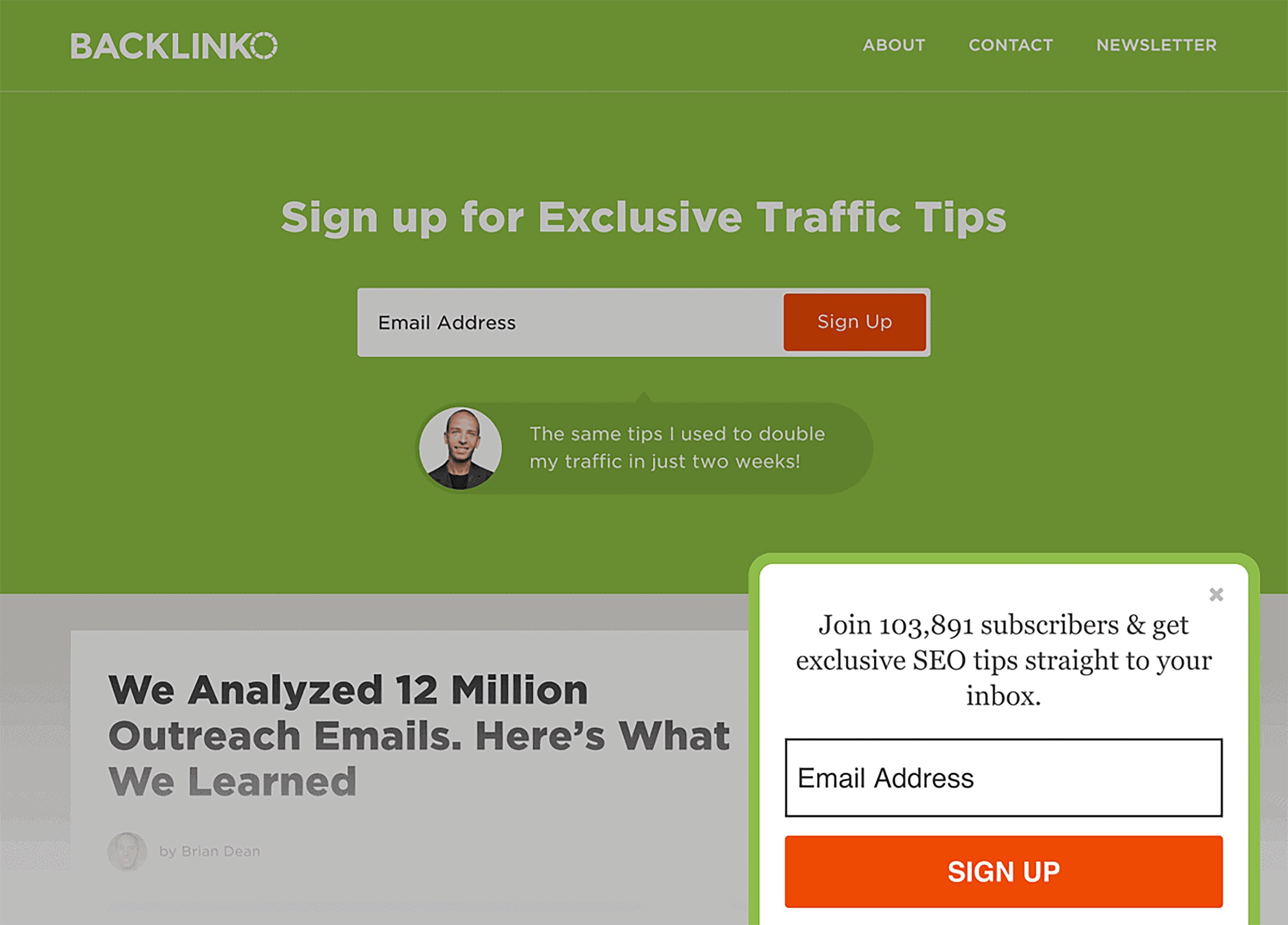
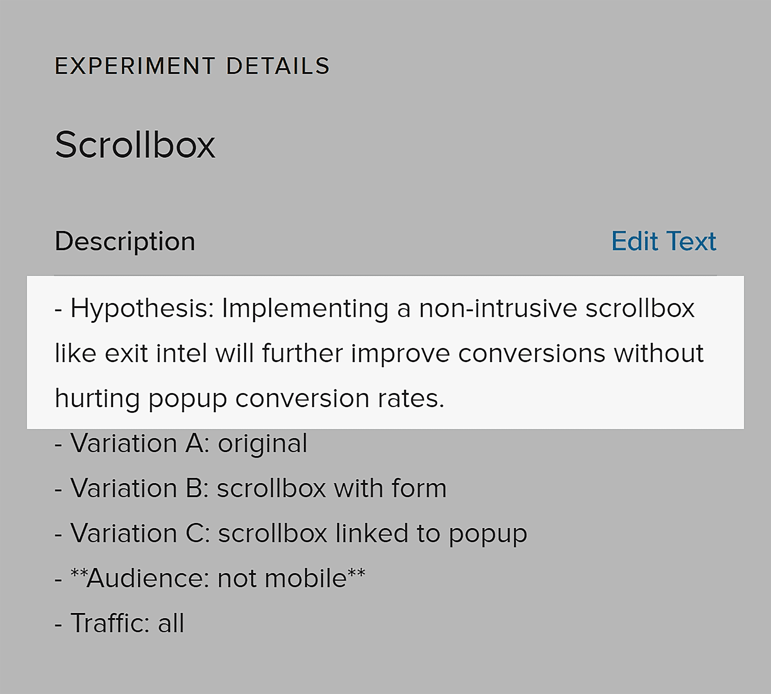
Our hypothesis was that a scroll box would improve email newsletter signups without hurting conversions in other places (like exit intent popups).
And we made sure to jot down that hypothesis before we started the test:
Run an A/B Test
Ready to run an A/B test? Here are our two cents on doing it right:
First off, go big with your tests.
A common mistake in A/B testing is to focus on the minor details, like button colors.
What you really want is to test two starkly different page versions against each other. Once you spot a winner, you can fine-tune it with smaller tweaks.
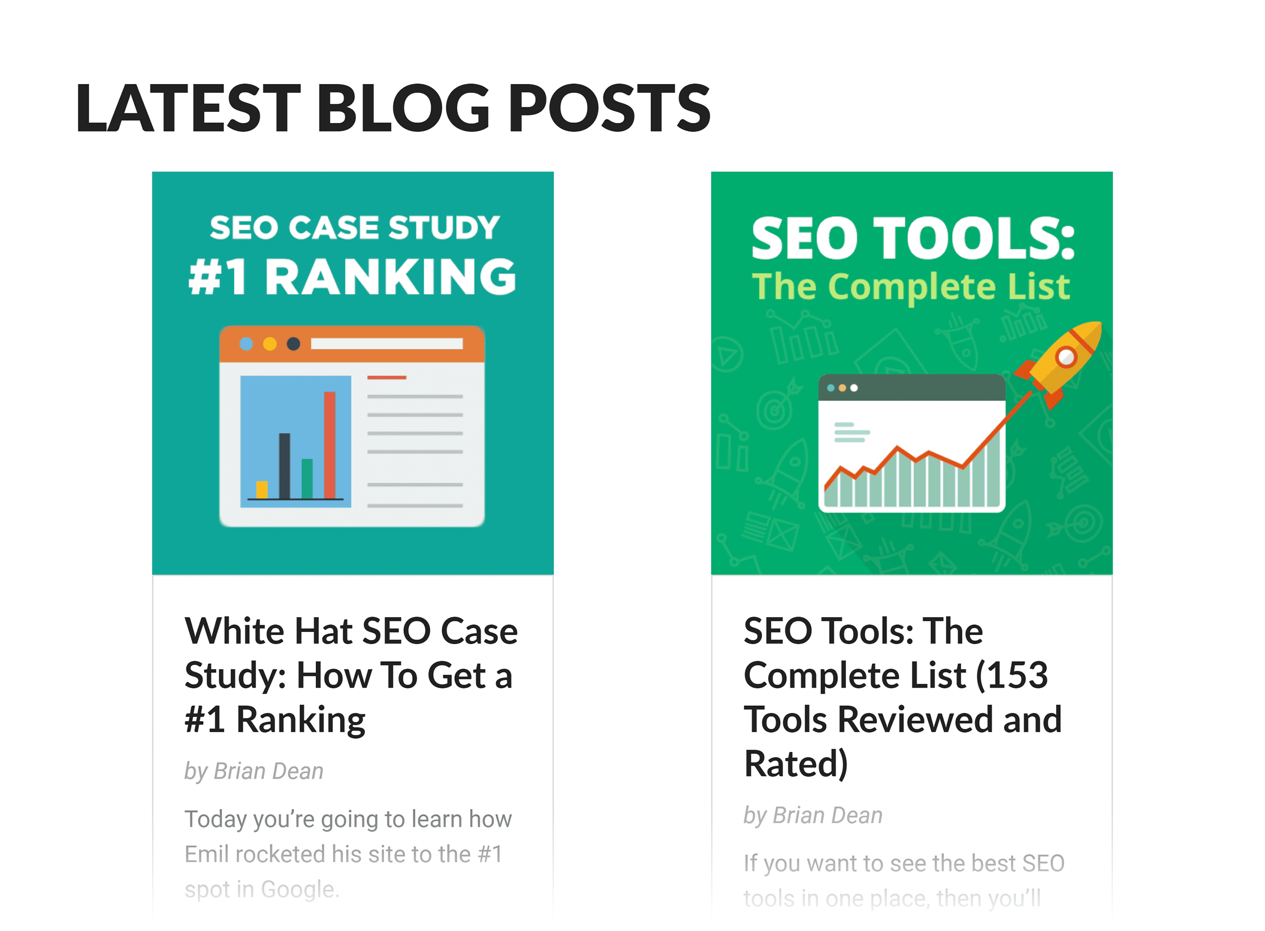
For example, when we ran a test on the Backlinko homepage, we could have tested many small things—button copy, logos, headline fonts, you name it. But instead, we went for a major overhaul.
Specifically, our old homepage linked to our recent blog posts.
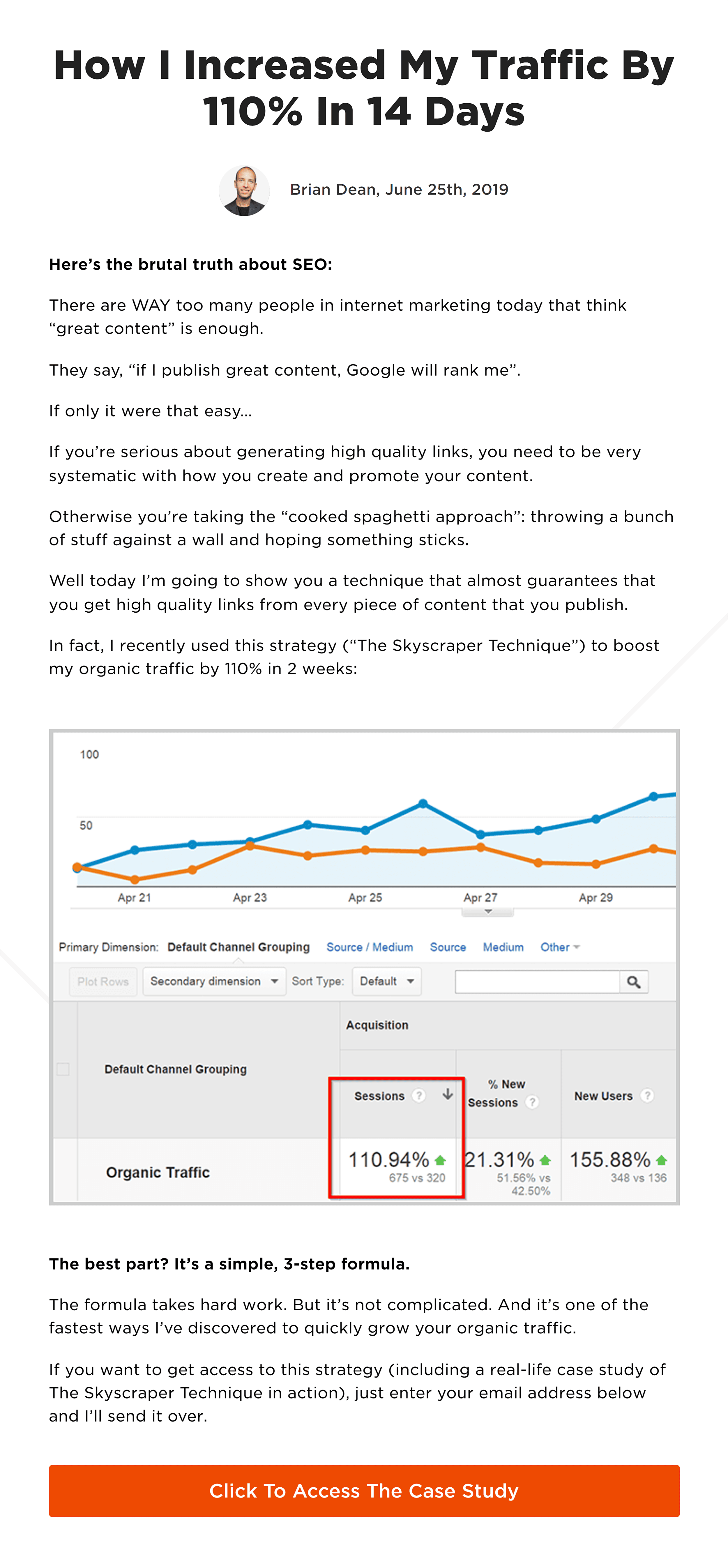
So we decided to test that original design against a version that offered a free case study in exchange for an email address.
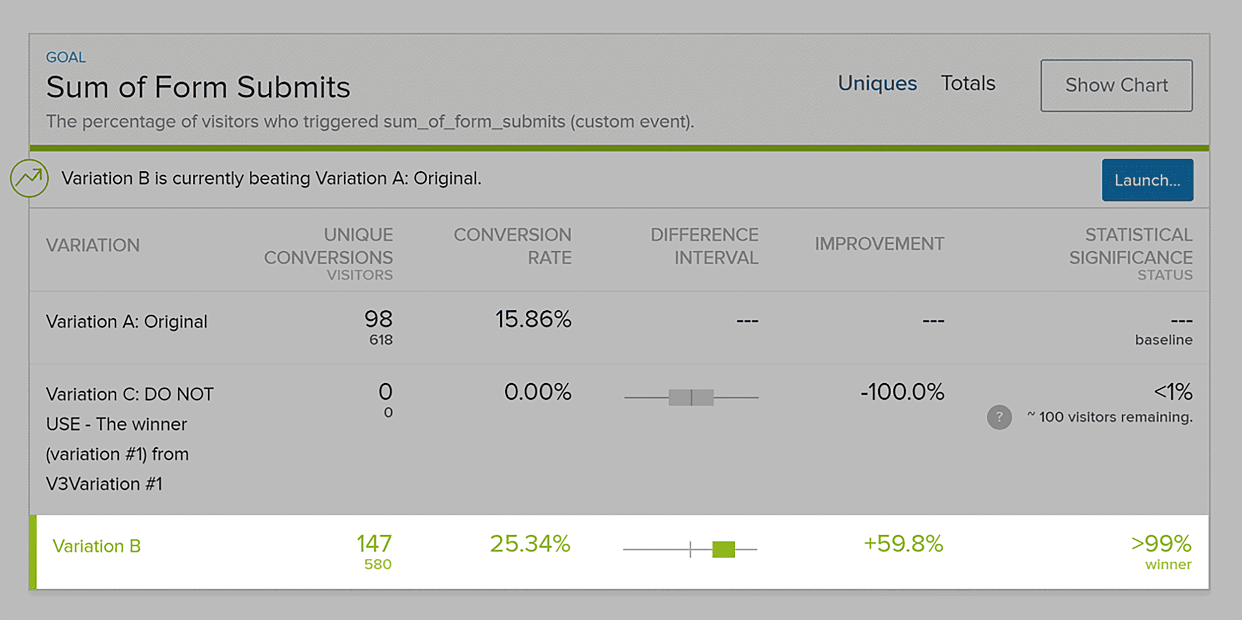
And guess what? This major change led to a major increase in signups. That’s the power of testing big differences first.
Collect Results and Scale
Alright, you’ve run your tests.
Now comes the exciting part: collecting and making sense of the results. Most A/B testing tools will flag when you’ve hit statistical significance, which is a huge help.
Once you’ve got a winning variation, take a moment to reflect.
- Was our hypothesis correct?
- What insights can we draw from this test to inform our future experiments?
- Based on what we’ve learned, what’s the next move?
Chapter 6: Optimizing Copy & Design for Conversions
Magic happens when both design and copy seamlessly complement each other.
Want this magic for your site?
Start by writing your copy first. Then create a design that enhances and supports it.
The Rule of One
A high-converting page sticks to the Rule of One.
This means the page is laser-focused: made for one reader, built around one big idea, offers one solution, and directs toward one call to action.
So, let’s say your lead magnet landing page is offering a free ebook titled “Gardening 101: A Beginner’s Guide.”
In that case, every part of the page—from the headline: “Transform Your Backyard: Learn Gardening Basics Today” to the call-to-action button saying “Download Your Free Beginner’s Guide Now”—should be explicitly tailored to appeal to gardening newbies, clearly explain the ebook’s benefits for new gardeners, and encourage them to download it.
Fine-Tune Your Offer
Before optimizing copy, first, optimize your offer.
What’s an offer?
It’s not just your product. Or its price.
It’s the whole package–everything that makes it irresistible to your buyer.
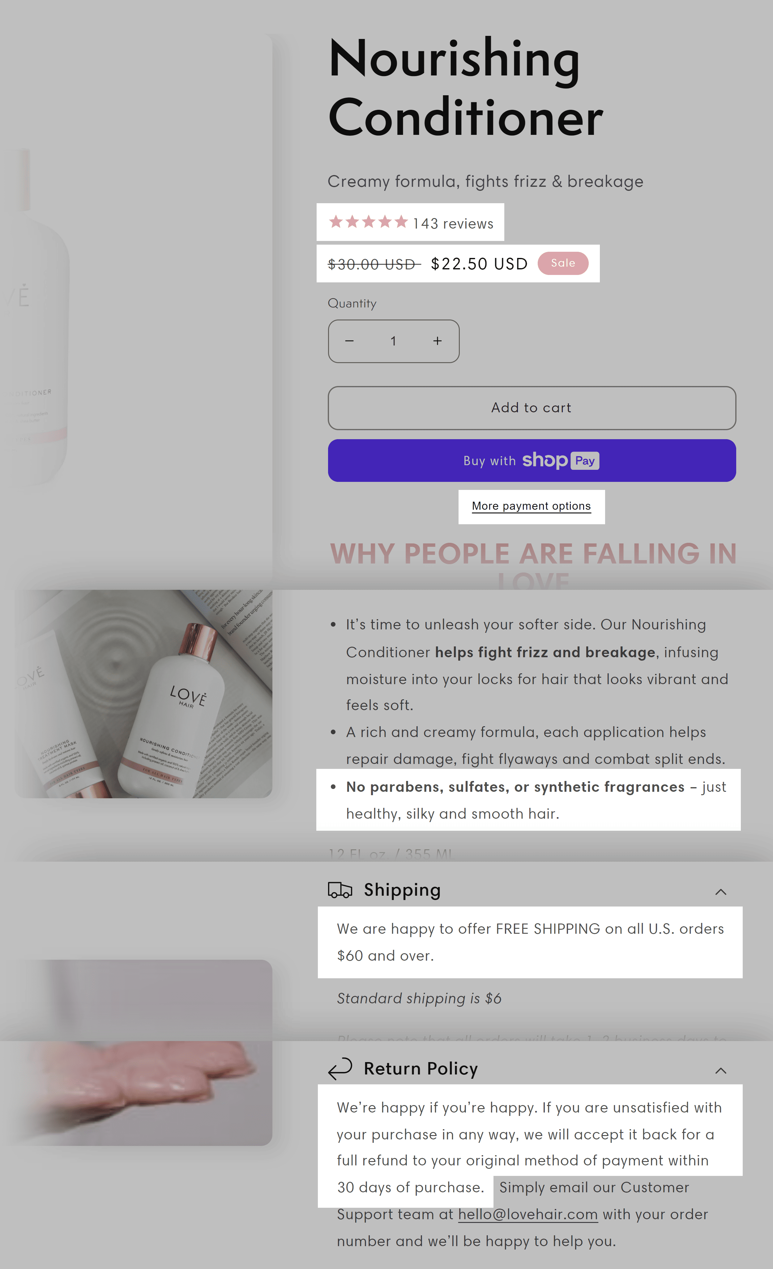
Take an ecommerce site, for example. The offer isn’t just the product but it also includes things like free shipping, a hassle-free return policy, or a bonus item.
Here’s how Love Hair incorporates the elements of its offer on one of its product pages.
For SaaS products, think beyond the software. Consider offering a free trial, extended support, or exclusive access to community resources.
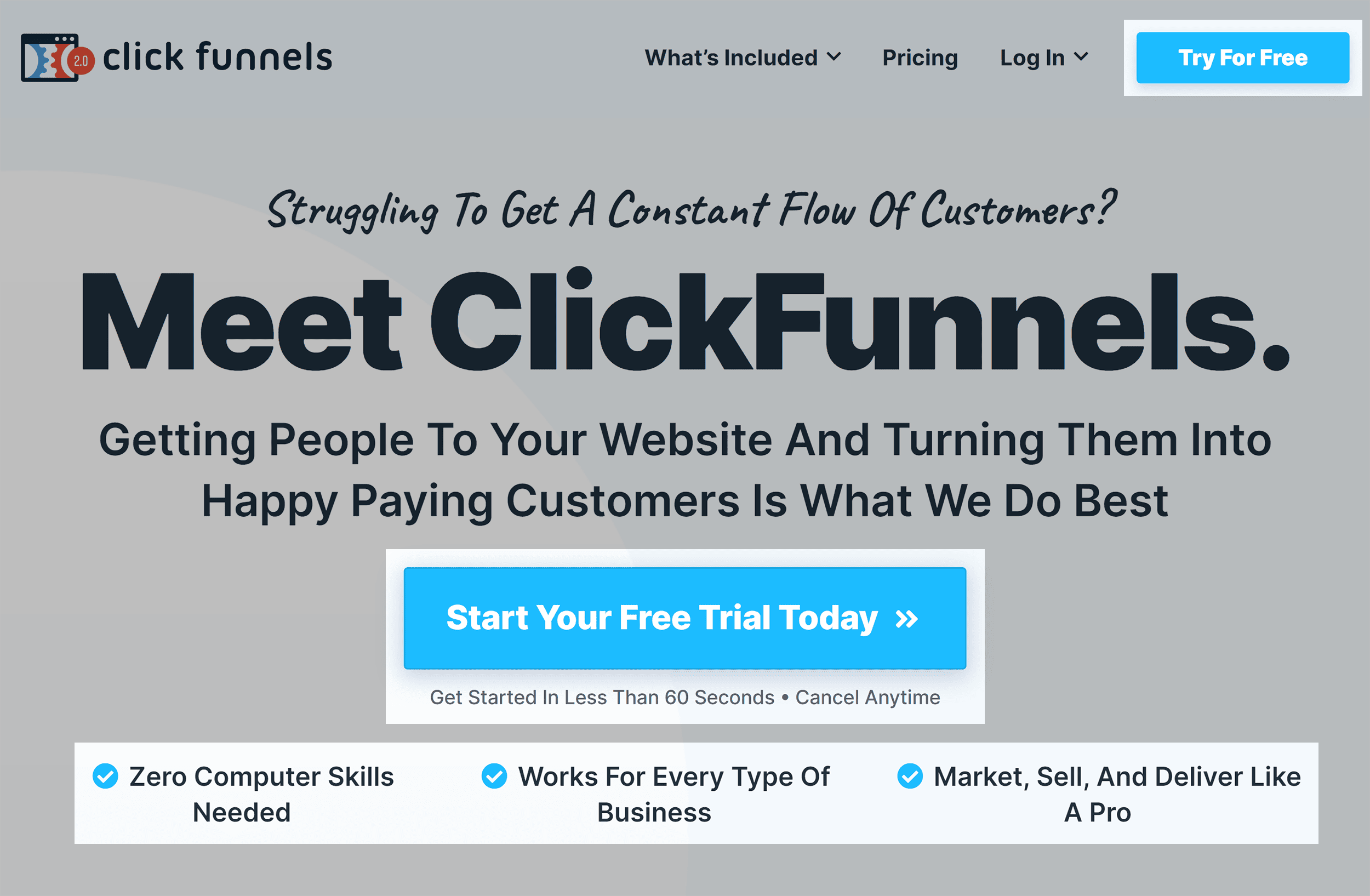
Take ClickFunnels, for example.
They pack their homepage’s hero section with enticing details about their software, effectively making their offer irresistible to the right audience.
Here’s what makes a compelling offer:
Craft them based on what you know about your customers.
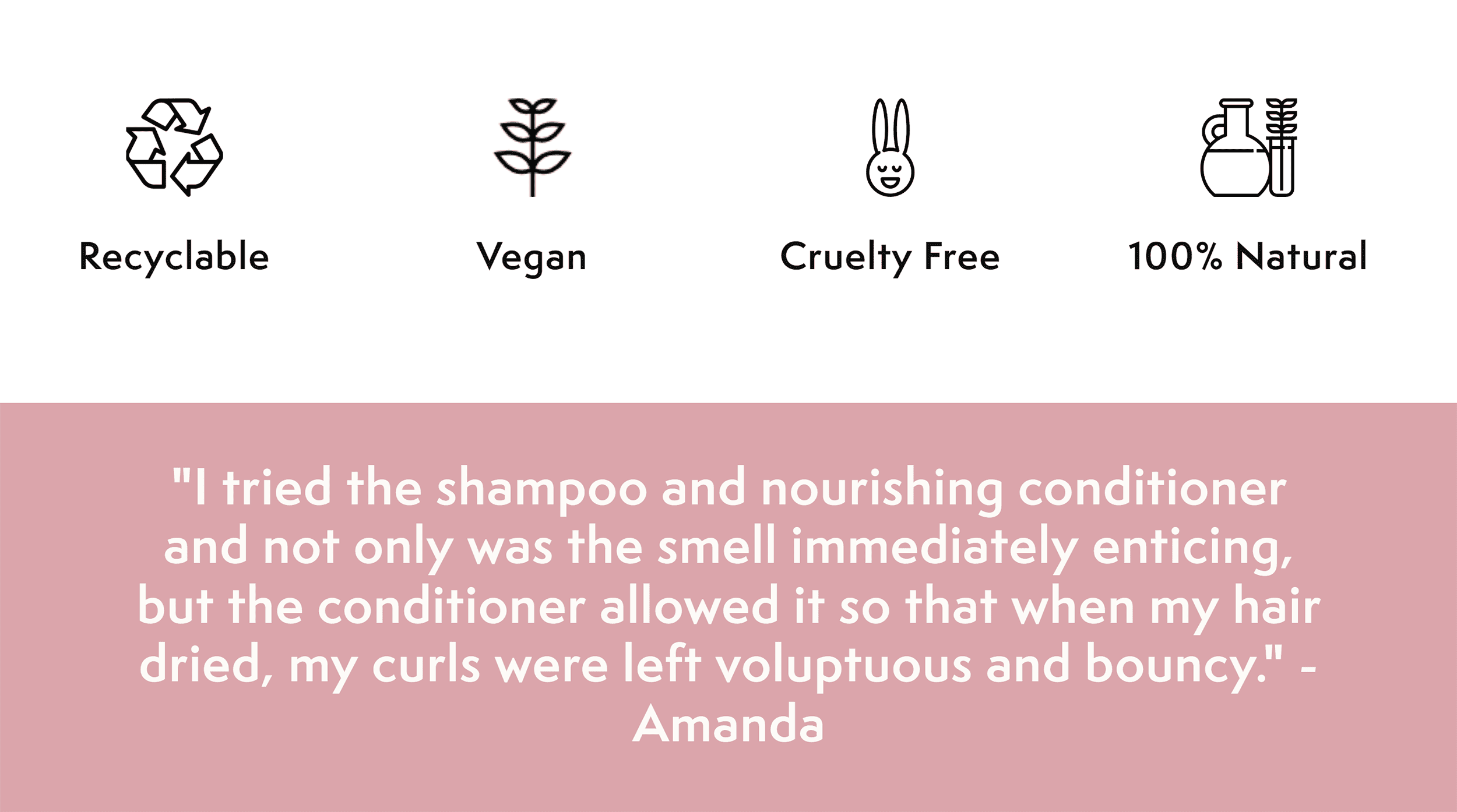
For example, if your research shows you have a very skeptical audience, bake into your offer a ton of customer reviews and real user stories. If they’re eco-conscious, showcase the sustainable features of your product all over your site.
Love Hair’s product page highlights their eco-friendly credentials—this aligns well with what their audience research likely revealed as customer priorities.
Guide Users With Directional Cues
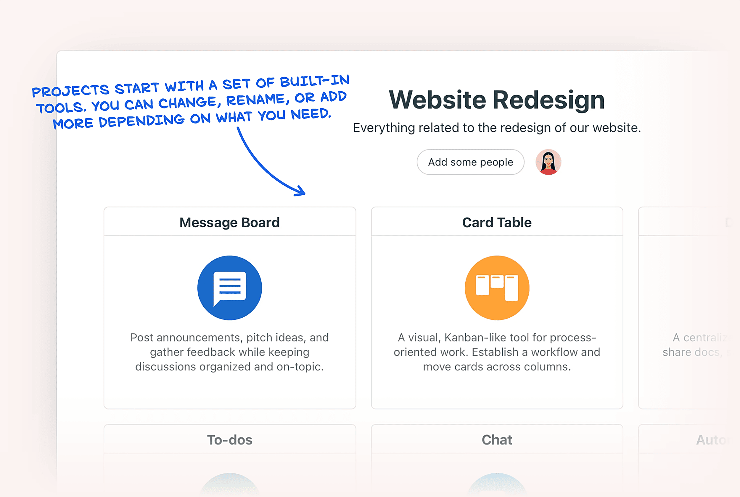
Directional cues can guide the user’s gaze to specific parts of your page.
For instance, an image of someone looking towards a CTA can naturally draw the viewer’s attention in that direction.

Or an arrow pointing toward your key content can subtly lead the user’s eyes.
Make It Scannable and Easy to Read
Most folks scan. They’re looking for quick answers or key points on the page that catch their interest.
So make your pages scannable and easy to read.
Ditch long, intimidating text blocks like this:

Use bullets. Clearly separate headlines. Use different background colors to break up sections.
You know, just like this page you’re reading.
Chapter 7: How to Create High-Converting Landing Pages
Landing pages exist for one reason: to get visitors to convert into a lead or sale.If you can increase your landing page conversion rate by 10%, that’s 10% added directly to your bottom line.
In this chapter, you’ll learn a handful of actionable techniques that you can use to boost your landing page conversion rate.
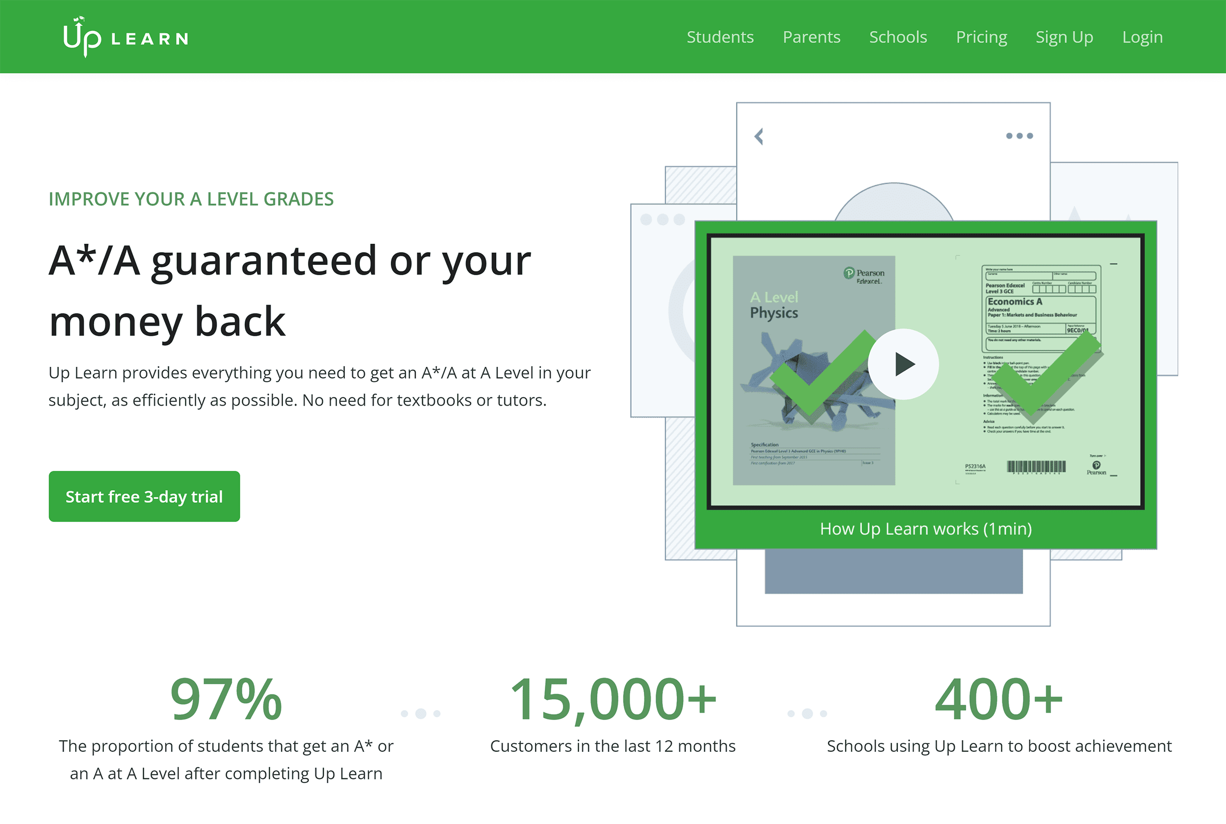
Optimize the Hero Section
Want to reduce bounce rates? Start with optimizing your hero section or above-the-fold content—the first thing visitors see on your site.
To do this, craft a hero section that directly addresses the visitor’s intent, is clear, and assures the visitor that they’re in the right place.
Up Learn’s homepage hero section is so specific and clear that it instantly hooks any student interested in getting an A*/A grade.
Optimize Your CTAs
The call to action (CTA) is the critical point where conversions happen on your page.
Optimizing it can have a significant impact on conversions.
Here’s how to do it effectively:
Firstly, choose button colors that stand out—with visual cues to signal it’s clickable.
Secondly, tailor the CTA copy to match the action or the benefits they’ll get after clicking.
For example, “Buy Now” works for product pages, while “Get Started with Expert Coaching” can work for a long-form sales page.
Pro tip: Try varying the text to ‘Purchase Now’ or ‘Add to Cart’ to see what connects best with your audience.
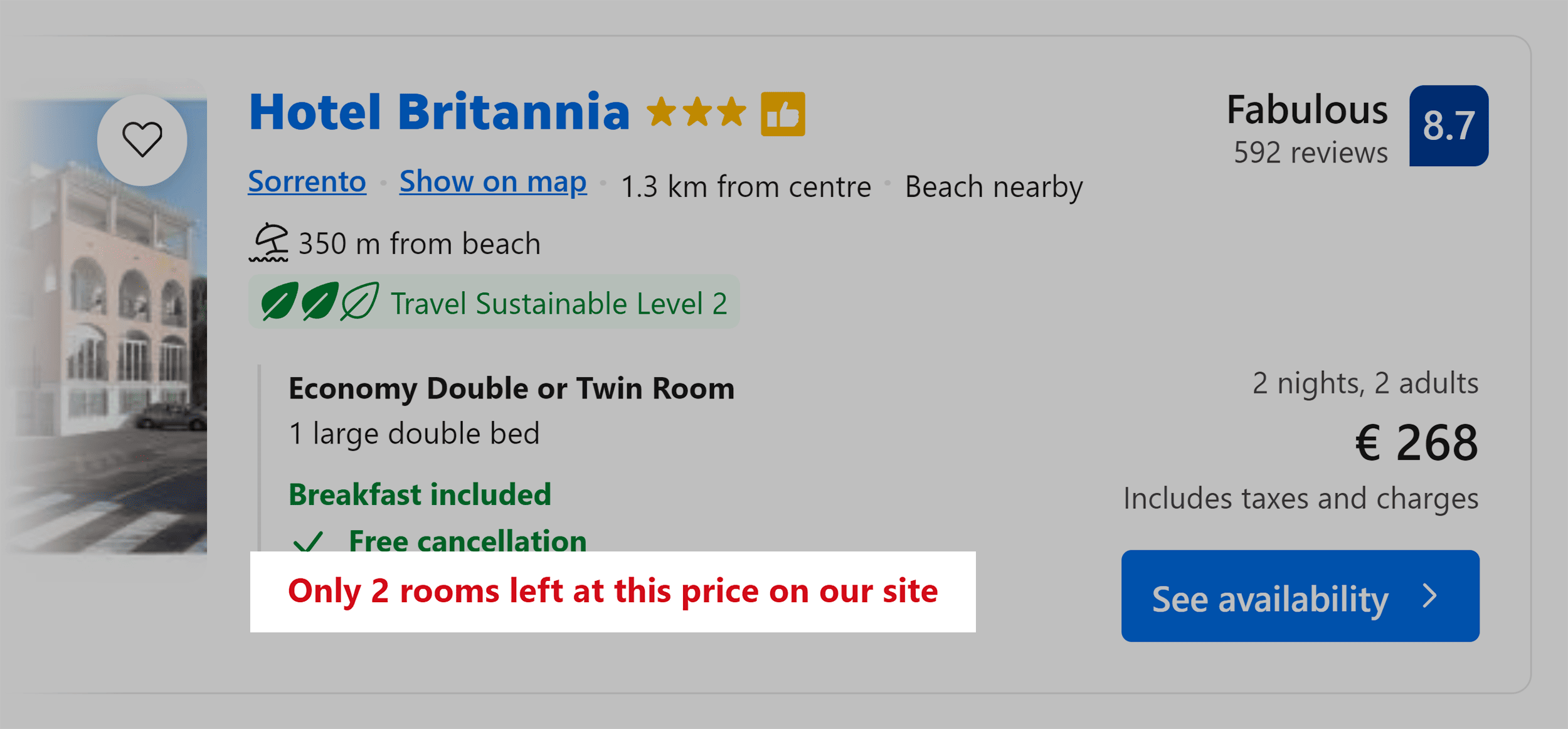
Thirdly, when appropriate, use urgency. But with caution. False urgency can damage customer trust.
Booking.com does this well on their site on various pages, from the product listing to the checkout page.
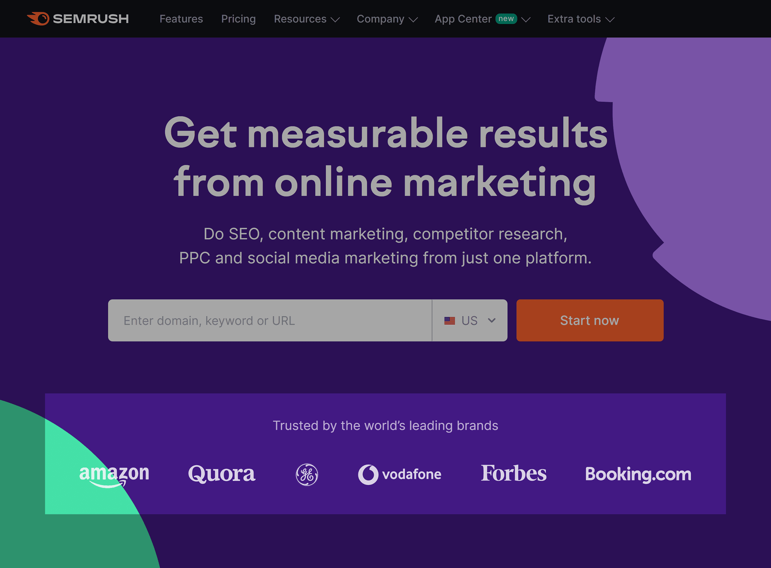
Lastly, reduce anxiety and build trust by adding social proof like testimonials or logo bars near the CTA button.
For a newsletter sign-up or ebook downloads, consider using compelling microcopy such as “Join 50,000 Accountants–Stay Ahead in Your Field” to speak directly to the audience’s professional interests.
You can also add other credibility boosters like testimonials from subscribers, highlighting awards, or displaying a counter of current subscribers.
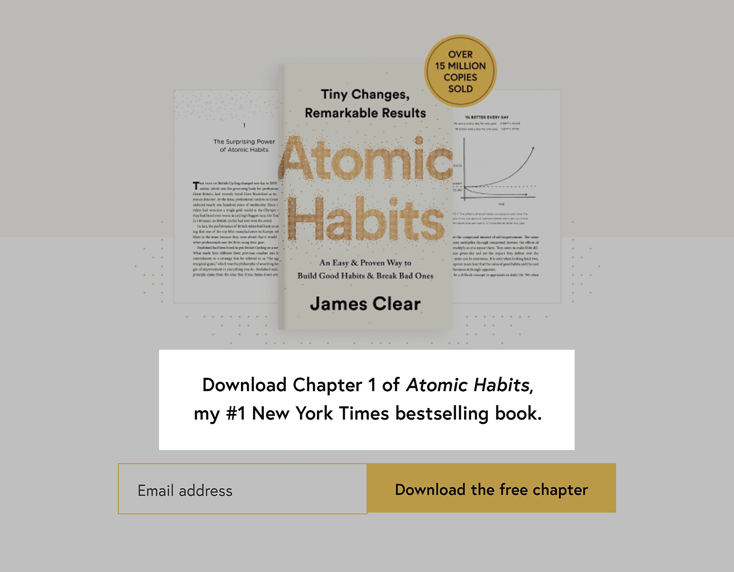
Take a look at James Clear’s homepage, for example. Just above the CTA is a notable mention that his book is a No. 1 New York Times bestseller.
Optimize Subheadings for Better Reader Engagement
Subheadings (also called crossheads) are the scanning points for website visitors.
They catch people’s eyes and help them decide if they want to keep reading.
If subheadings are catchy, people are likelier to read the rest of the content.
But if they miss the mark, people might skip the rest of the content, even if that’s where all the juicy stuff is.
So here’s a pro tip:
Use your subheadings to make visitors curious and eager to keep reading.
Here’s how you can use them to get visitors’ attention:
- Provide instant clarity by being specific.
- Create a sense of intrigue that compels readers to want to read more.
- Give a preview of the content that follows without giving away too much
Nord VPN’s subheadings, for example, all support their value prop.

Add Social Proof and Trust Signals
Website visitors often approach online content with skepticism.
To win their trust, add relevant social proof and trust signals.
Customer reviews, trust badges, and logos from known brands are great for this but think outside the box for more ways to build trust.
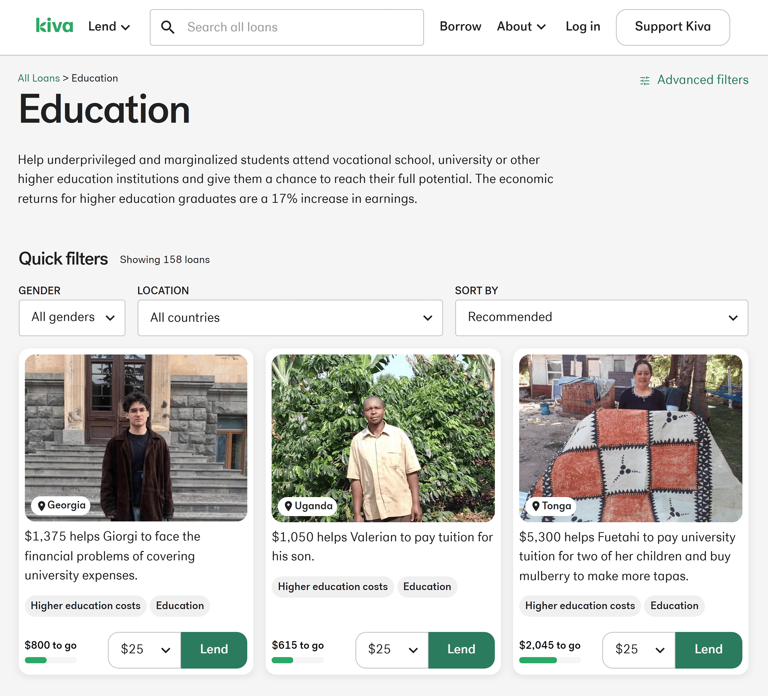
Kiva humanizes the lending experience by showing pictures of the people you’re lending money to, along with some details about what the money will be used for.
Strategically add these trust-building elements to your website. Ensure they align with the big idea you want to convey.
Use Persuasion Techniques (Without the Sleaze)
Persuasion doesn’t have to be this sleazy tactic to manipulate people into purchasing products they don’t want or need.
Instead, think of persuasion as the art of giving buyers the right information to help them make informed decisions.
Leverage Loss Aversion
Loss aversion taps into our desire to avoid losses more than to gain something.
It’s powerful.
Studies show we’re wired to strongly avoid losses.
For example, “Stop losing customers” hits harder than “Get more customers”.
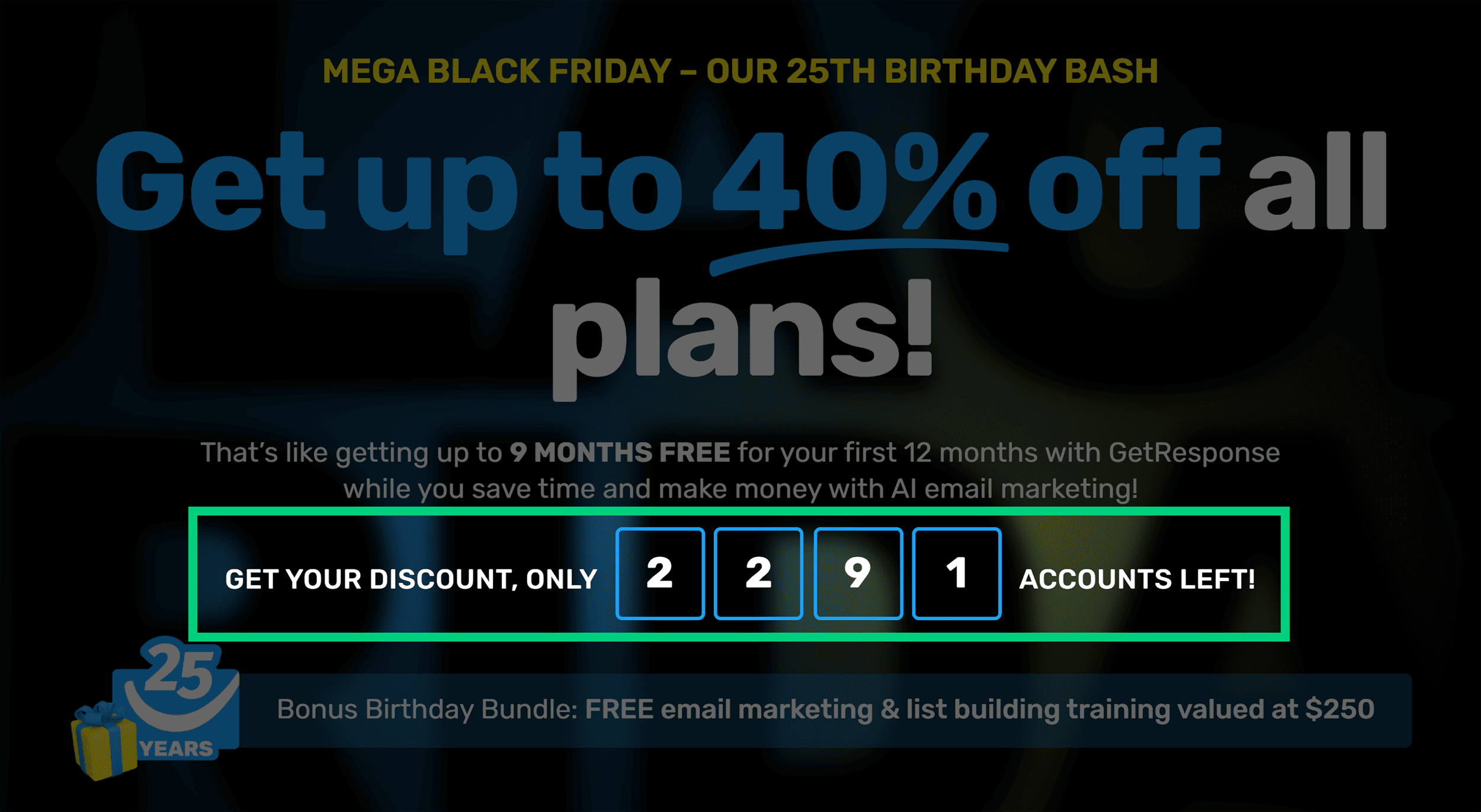
Black Friday is a great time to tap on loss aversion. Here’s GetResponse’s Black Friday deal doing exactly that.
Counter Objections Head-On
Address common concerns to show transparency and build confidence in your offer.
By proactively addressing these objections, you answer potential questions and also demonstrate that you understand and care about your customers’ concerns.
Common objections include:
- Why should I believe you?
- What if it doesn’t work for me?
- It’s not worth the money.
- How does this compare to…?
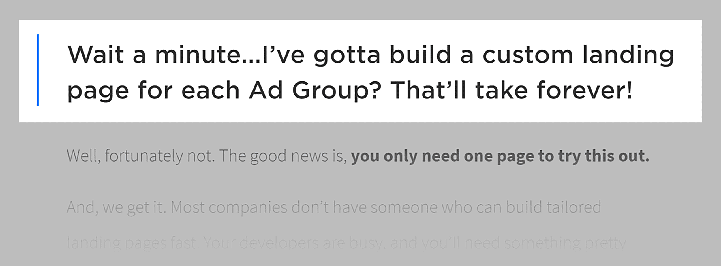
Here’s an example of this technique in action:
Chapter 8: Conversion Rate Optimization for Ecommerce Sites

If you’re specifically interested in optimizing ecommerce sites and learning CRO techniques to turn browsers into buyers, this section is tailored to help you with that.
In this chapter, we’ll look at practical strategies and techniques to improve the effectiveness of your ecommerce website, from product pages to the checkout process.
Lead with Social Proof
Here’s something not seen in a lot of online stores.
Ezra Firestone, an ecommerce marketer, is known for conducting conversion experiments. He consistently outperforms the control every time he employs this tactic.
Here it is:
On a product page, lead with a testimonial instead of leading with the product name.
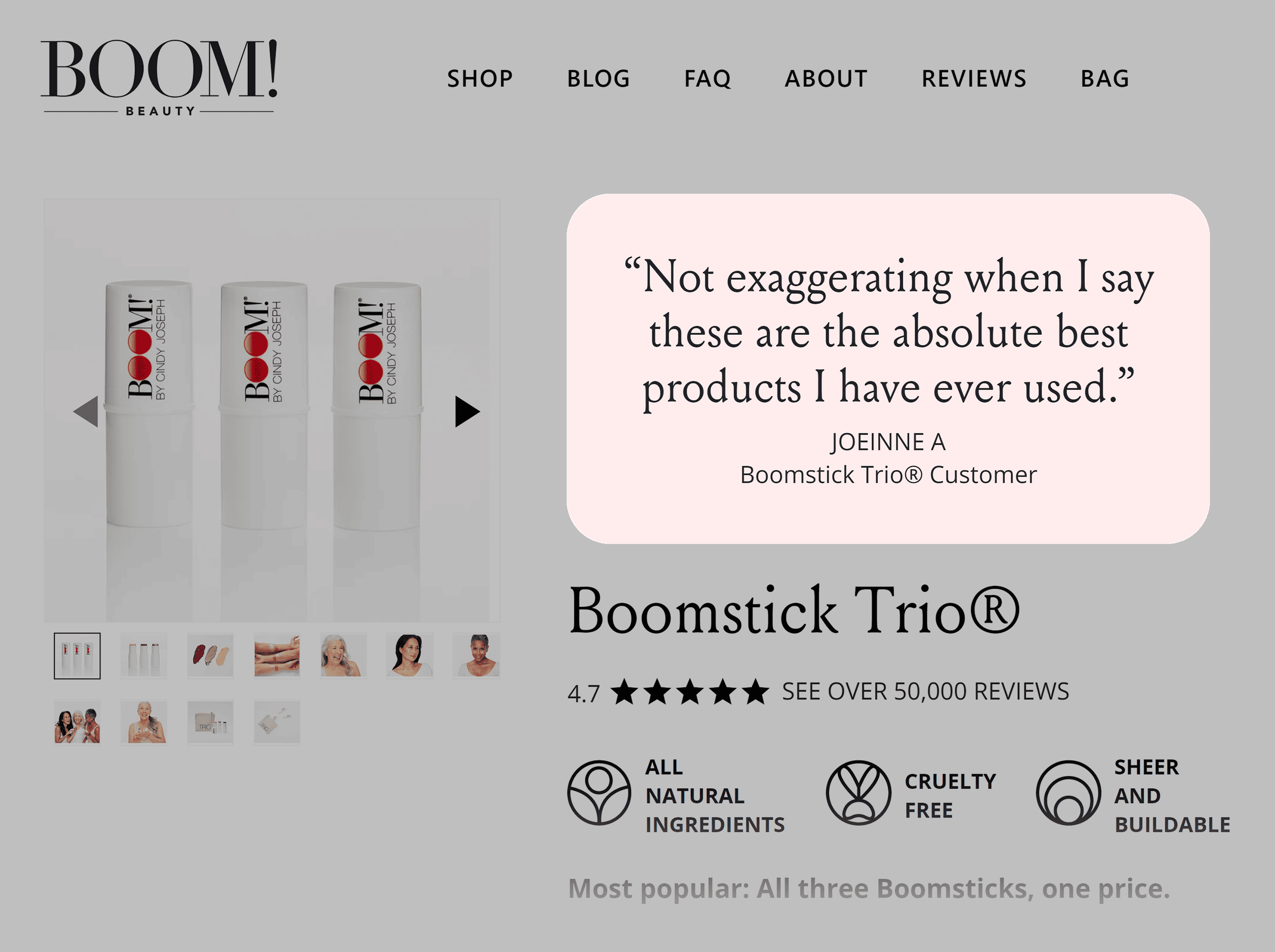
Ezra’s tests reveal that both the average revenue per user (ARPU) and the conversion rate increase whenever they use this approach.
If you’re hesitant to open with a testimonial, you can also experiment by placing it just below the product name. Like so:
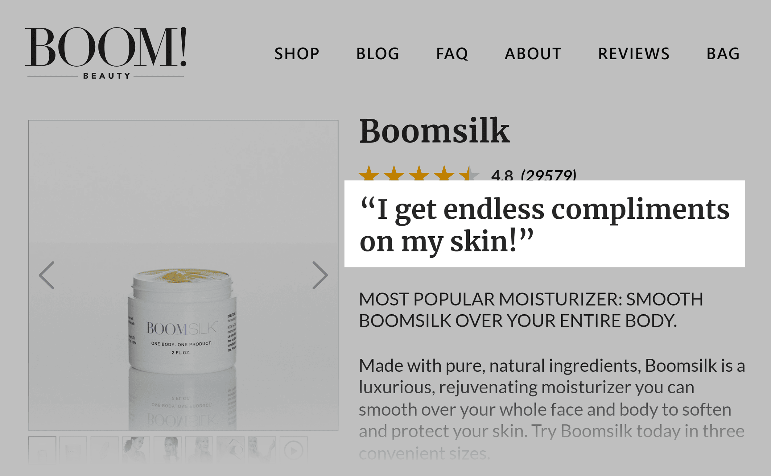
Highlight Social Proof that Best Fits Your Buyer’s Needs
Avoid burying your most compelling social proof within an overwhelming list of hundreds of reviews.
Don’t tuck away awards or any exceptional aspects of the product in the obscure corners of your About Page.
Instead, position them precisely where people make decisions.
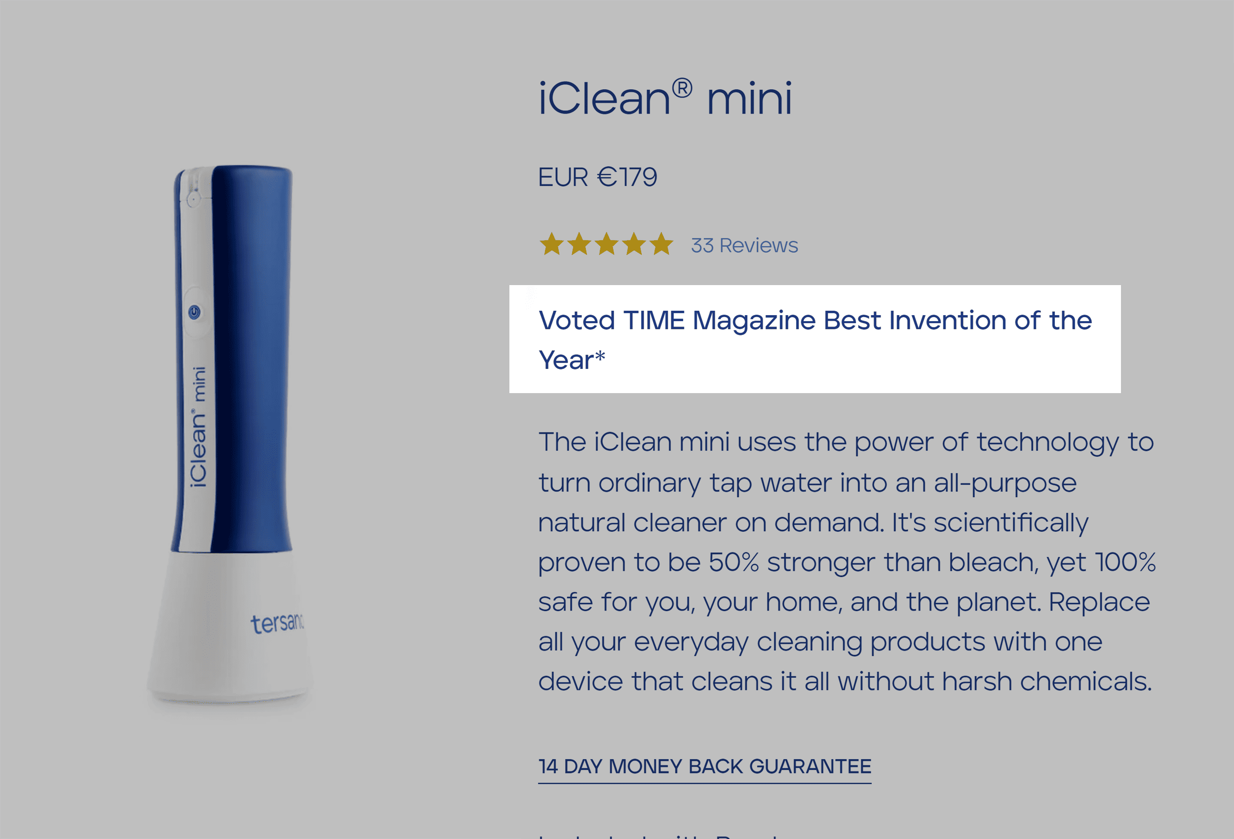
For example, in the product description for the iClean® mini, you’ll notice a small text that reads, “Voted TIME Magazine Best Invention of the Year*.”
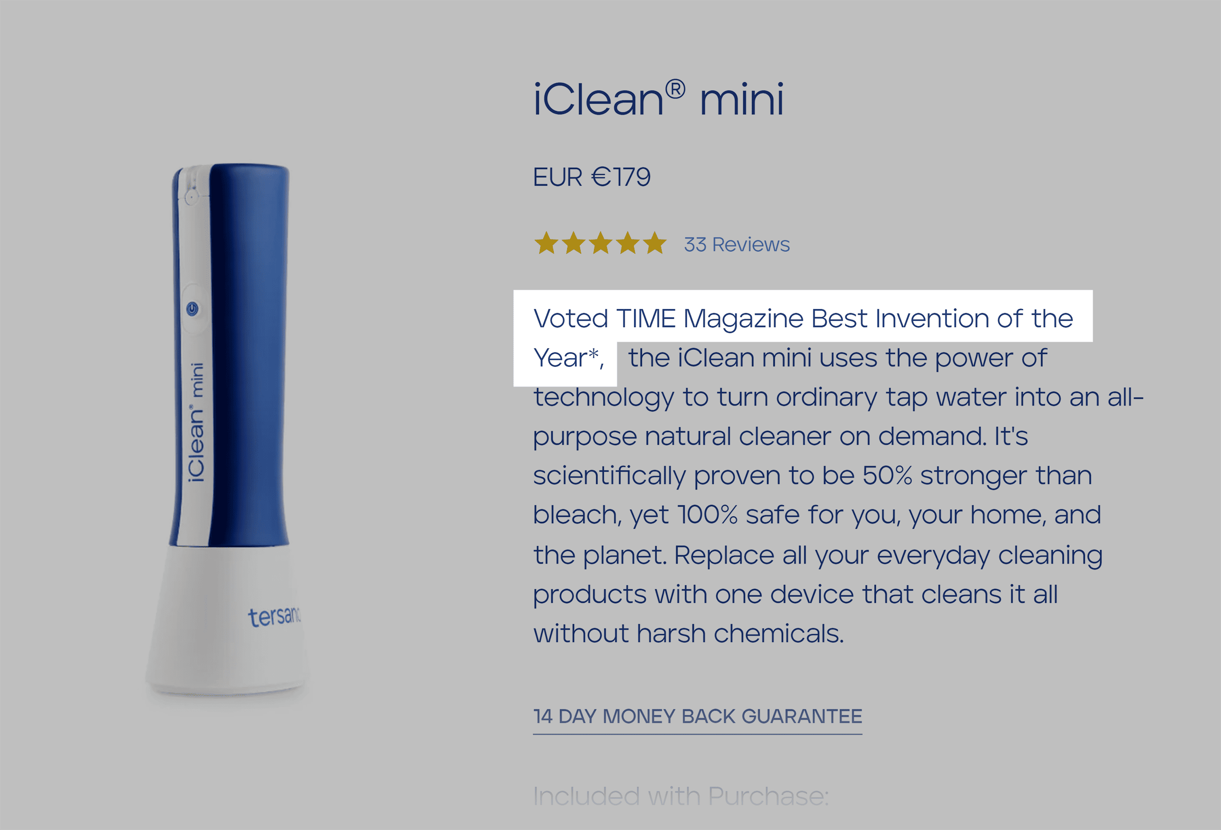
But you can easily make that social proof work harder by simply separating it from the block of text.
Like this:
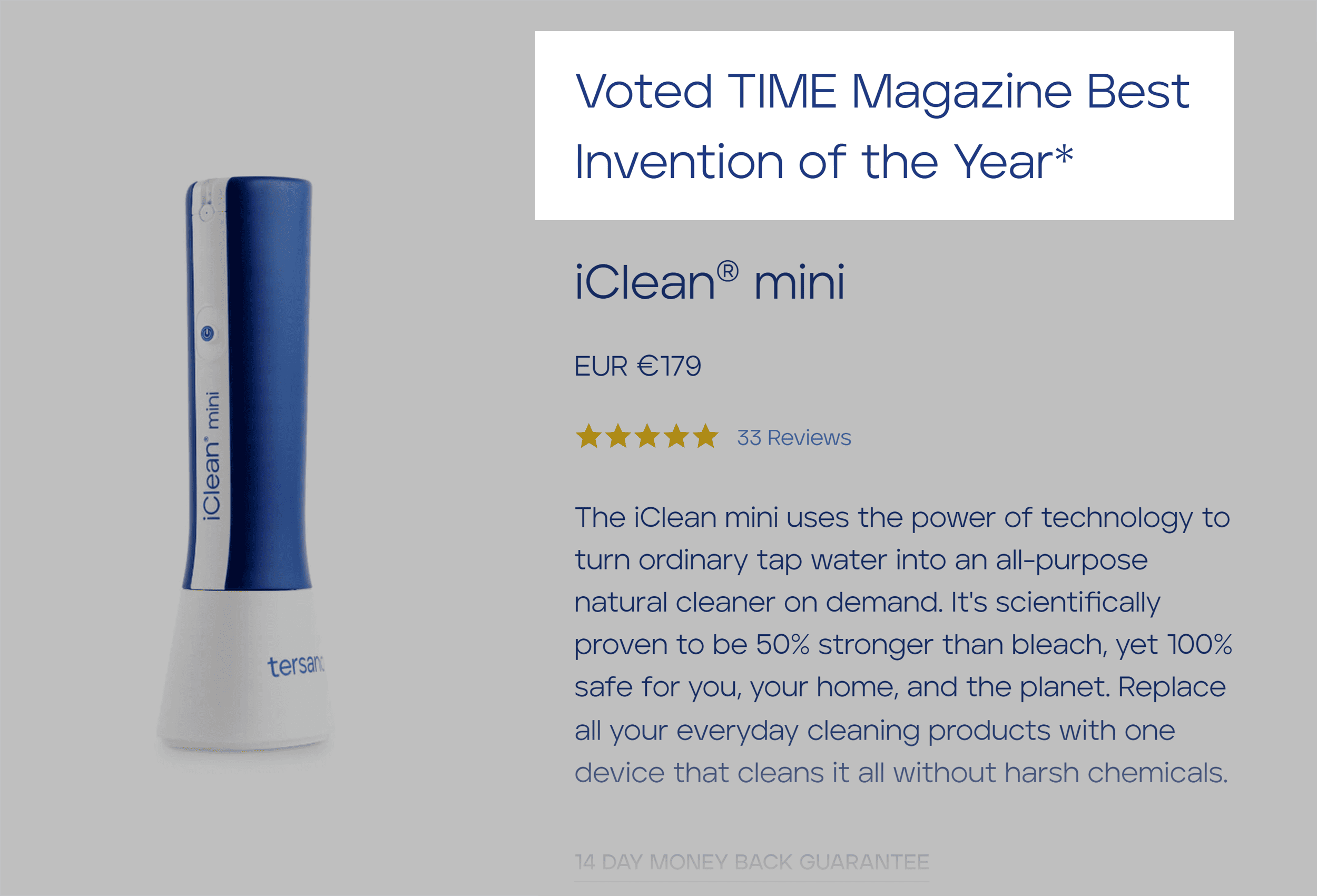
Or this:
So, anytime a customer shares a glowing review that aligns with what potential buyers are looking for, make it a focal point in your copy—especially when it resonates with your target audience’s needs.
Make Likes More Prominent for Already Popular Products
Research suggests that social media likes significantly influence the likelihood of making a purchase. This effect is particularly pronounced when consumers make decisions related to hedonistic goods—products that provide pleasure and gratification.
Use the Power of User-Generated Content (UGC)
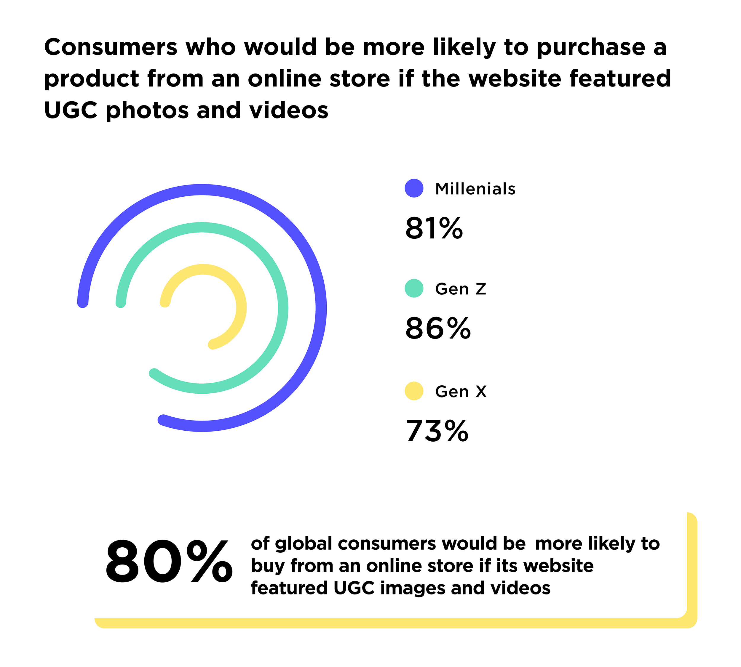
Eighty percent of people say they’re more likely to buy from an online store if it features user-generated content, a Stackla study finds.
How can you make this work for you?
Encourage customers to share video reviews on social media and use plugins like Taggbox for WordPress or UGC Shoppable Instagram Reels for Shopify to feature them on your site.
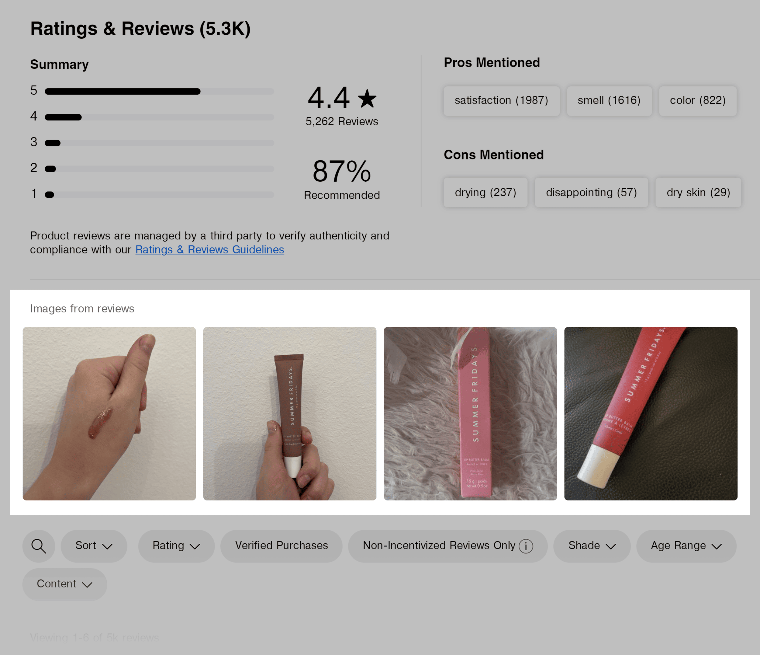
Photos and videos are ideal UGC content.
To see this in action, Sephora’s website prominently features UGC photos on the review section of its product page.
Embrace Lifestyle Shots
Give your audience the gift of imagination by helping them visualize your product as a natural part of their everyday routine.
Take a cue from Huel.
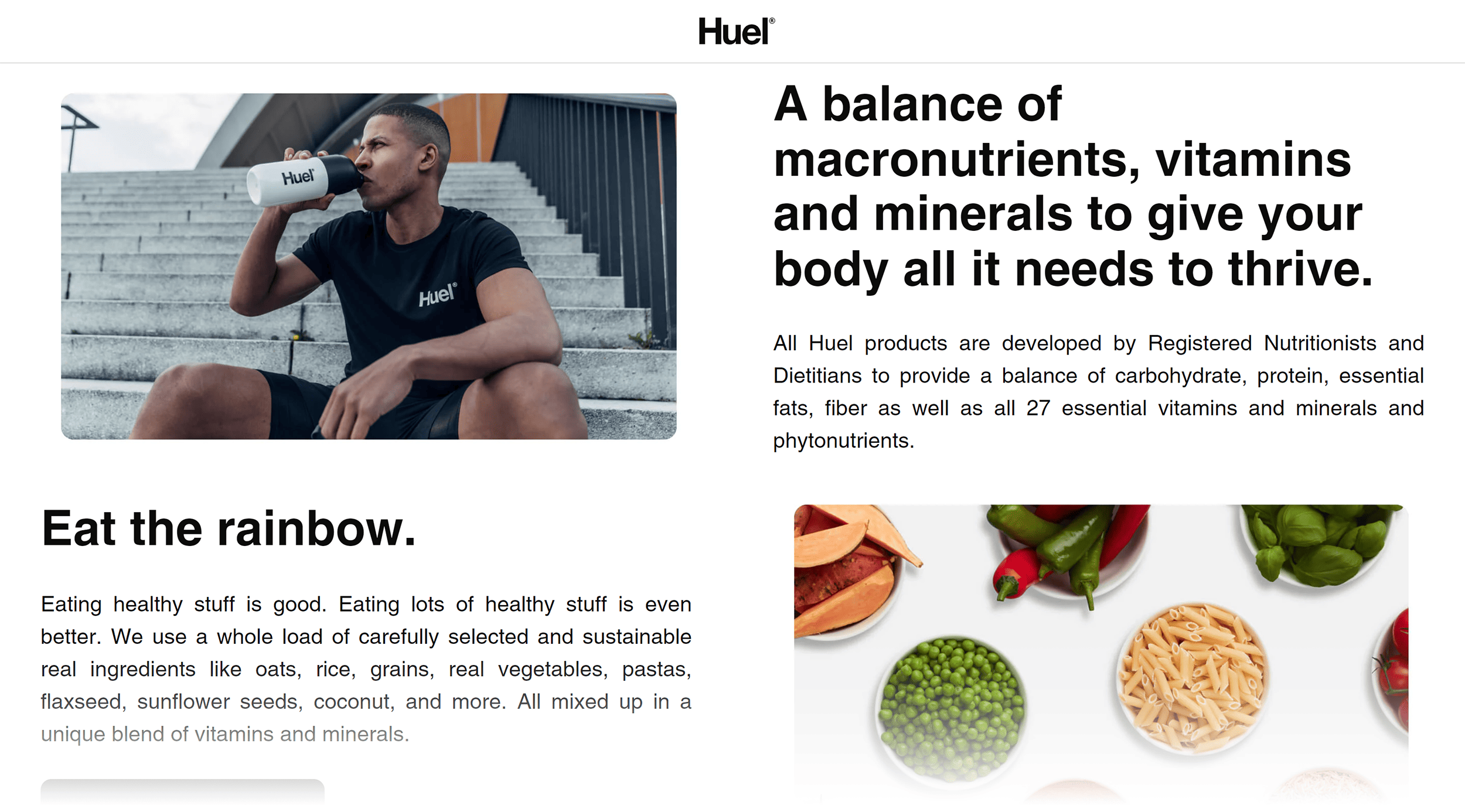
In the image above, Huel isn’t just selling instant meals. They’re selling a lifestyle.
The imagery suggests an on-the-go, health-conscious person. And Huel, as a smart, practical choice for these folks.
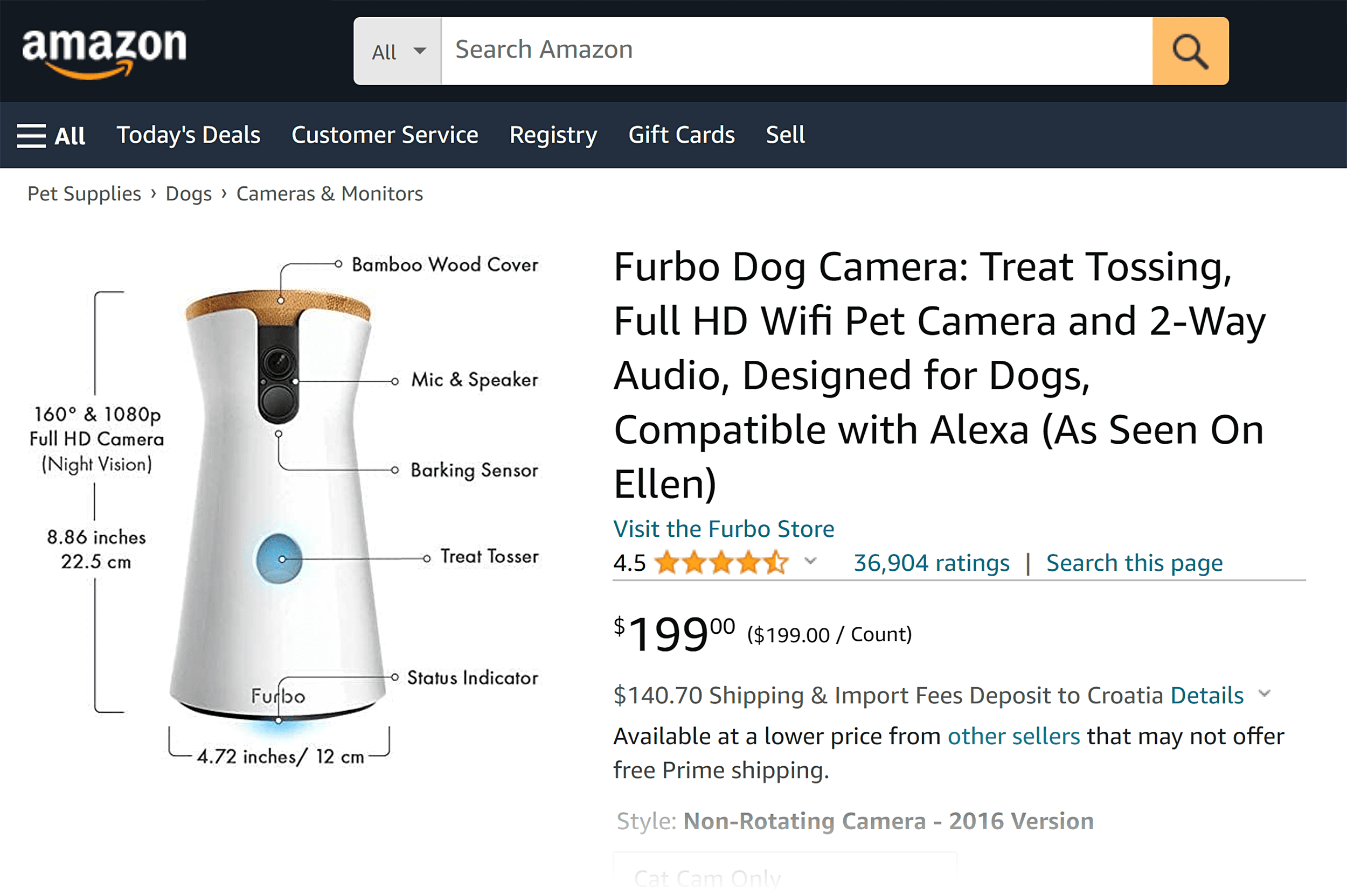
Incorporate Text in the Images
Why limit yourself to visuals when a few well-placed words can instantly convey your message, leaving no room for interpretation?
Experiment with Different Product Pricing
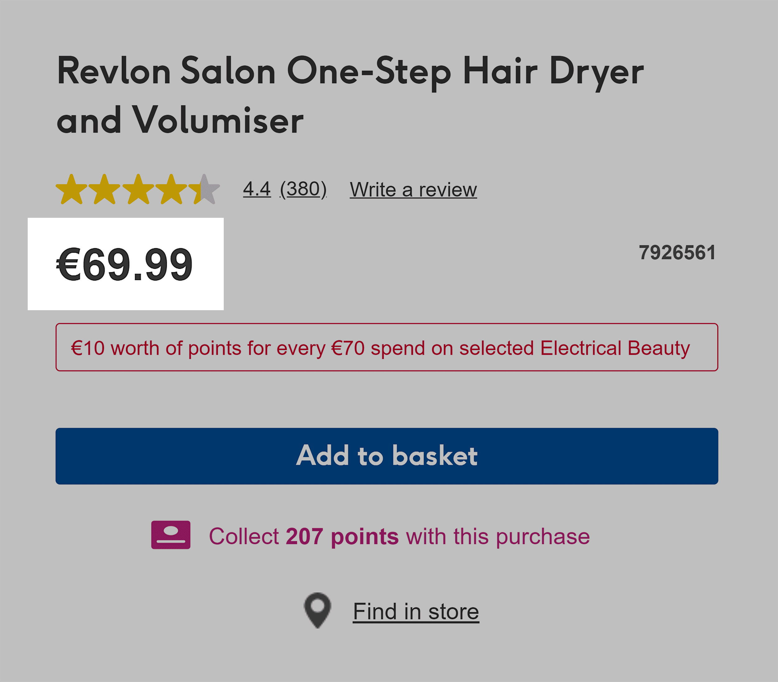
The old .99 tactic to pricing?
That still works. But not always.
If you’re selling utilitarian products, the .99 approach could still work.
But not just because it’s discounted. It’s also the pricing precision.
According to this study, pricing a product at $39.99 or even $39.70 can give the impression of careful cost calculation—which buyers might find more appealing especially for hedonistic products—than a rounded $40.
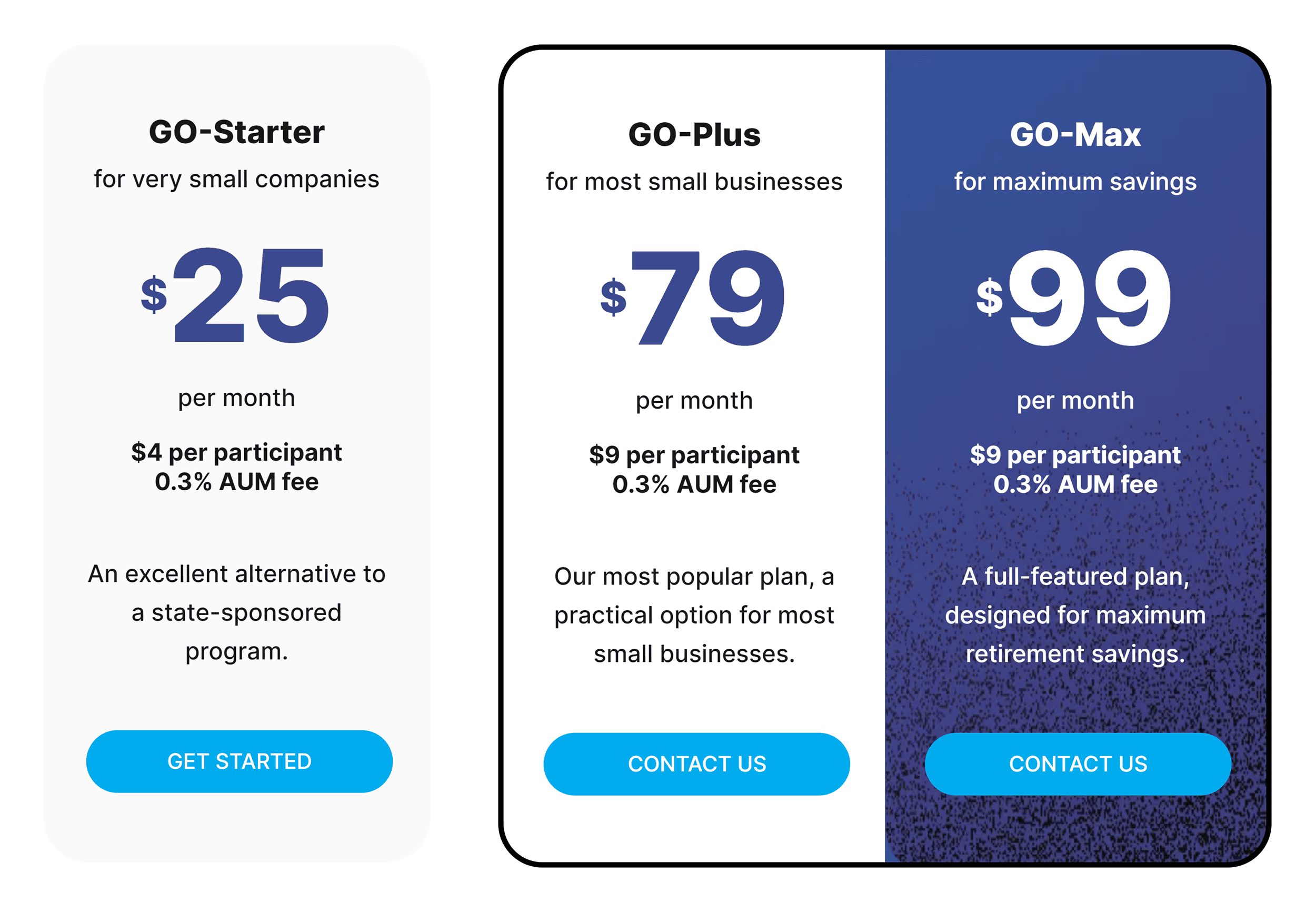
On the other hand, for products that are associated with long-term value, like retirement plans or energy-efficient windows, precise pricing may be more attractive.
Try Dynamic Pricing
Just look at Amazon for lessons on dynamic pricing. If you keep a close watch, you’ll notice that product prices regularly change.
A word of caution:
While dynamic pricing can be powerful, your regular customers might not appreciate it. Some might feel a bit miffed if they’ve recently bought a product only to find it discounted shortly after.
To lessen this feeling of frustration, offer discounts strategically, such as during holiday periods or special store days.
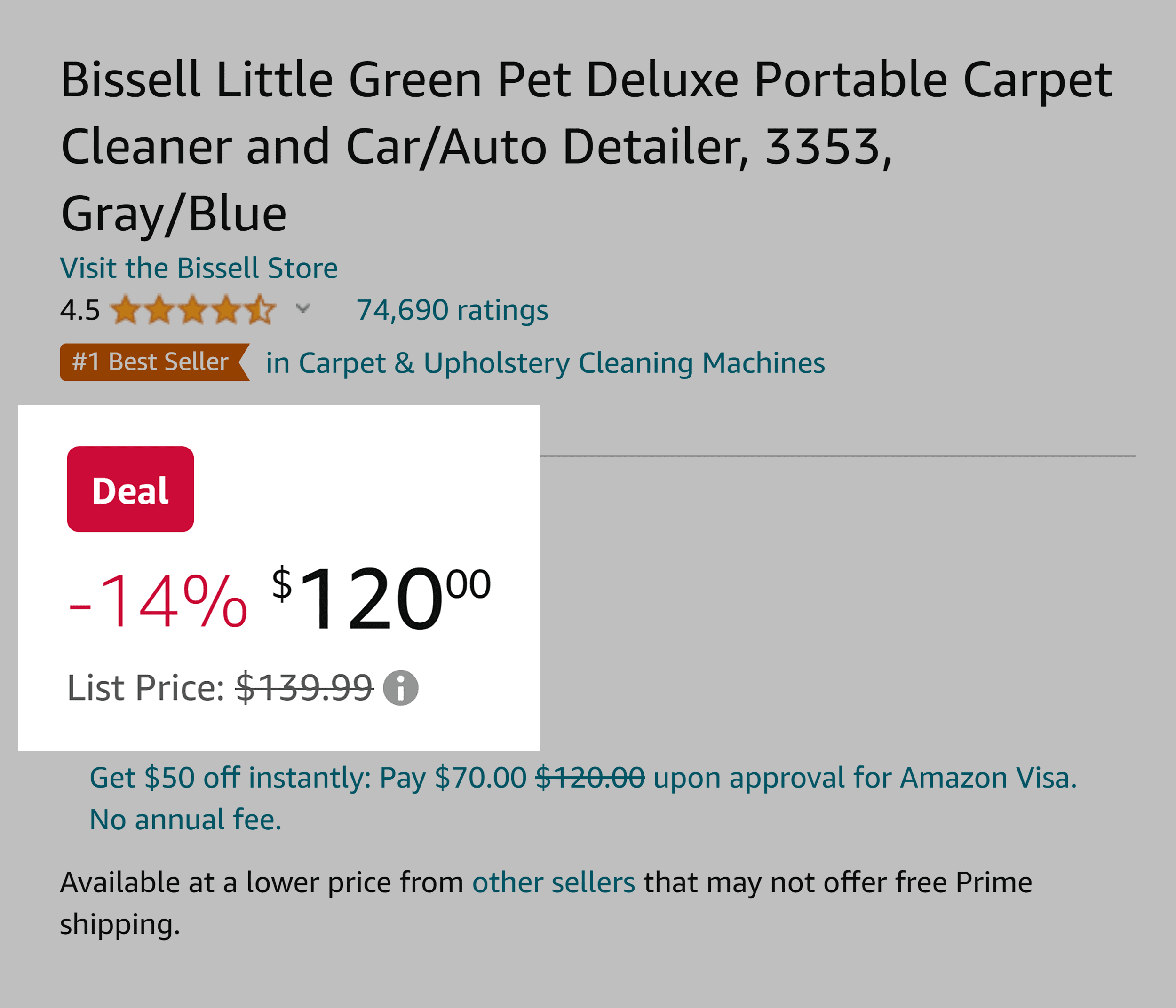
Use Price Anchoring
Want to make your products seem dirt cheap without slashing prices? Try price anchoring.
Strike-through pricing is the most common way ecommerce stores do this.
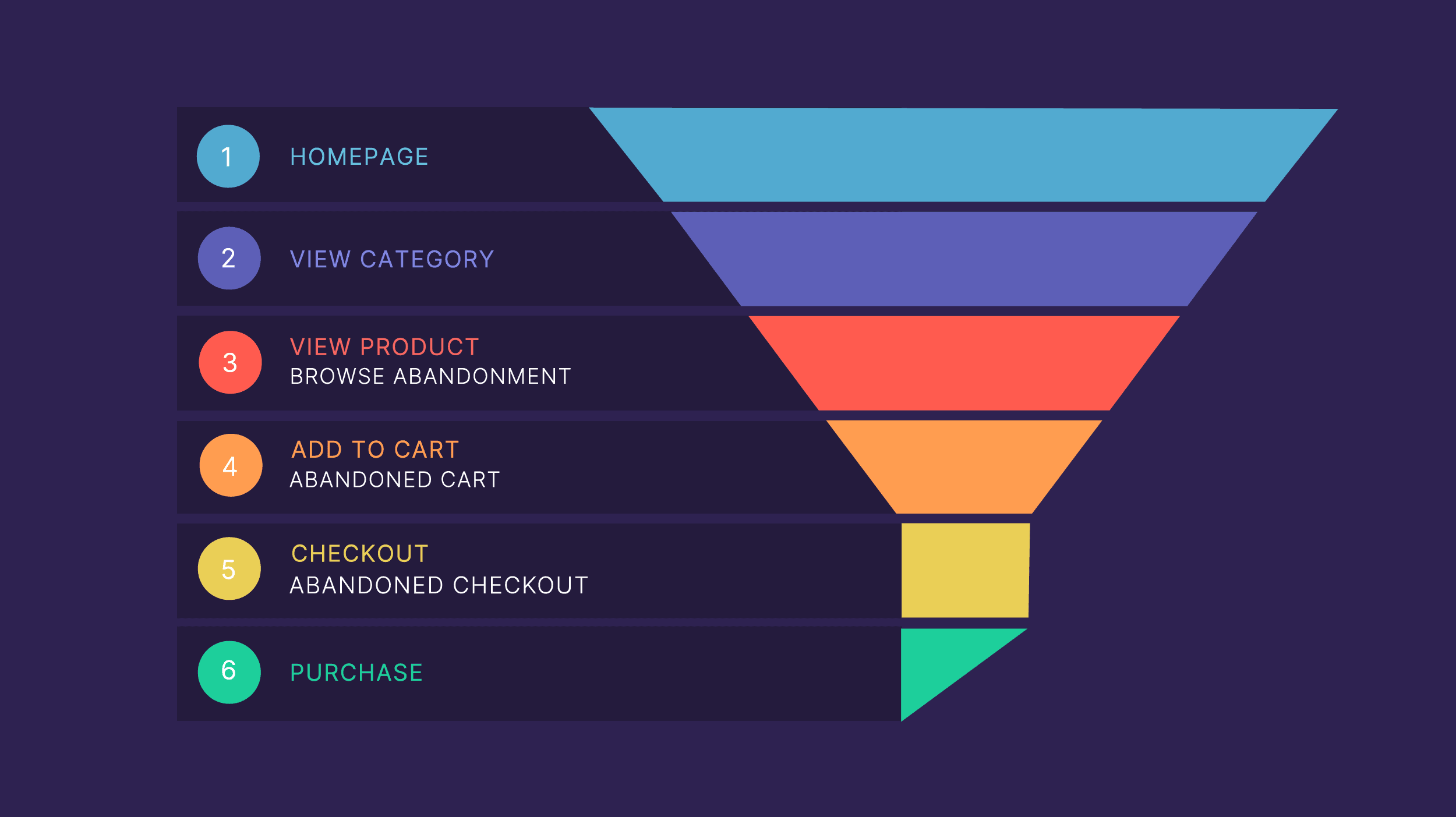
Reduce Cart Abandonment by Making Checkout a Breeze
Buyers love a smooth, hassle-free checkout experience.
Keep your checkout pages clear and user-friendly. You’re essentially rolling out the red carpet for your potential customers to finalize their purchases with ease.
Provide a Guest Checkout Option
Buyers want a fast checkout. That’s good for you.
But you have to make it smooth and easy for them.
The best way to do this? Guest checkout.
Forty-three percent of consumers in Capterra’s 2022 Online Shopping Survey agree.
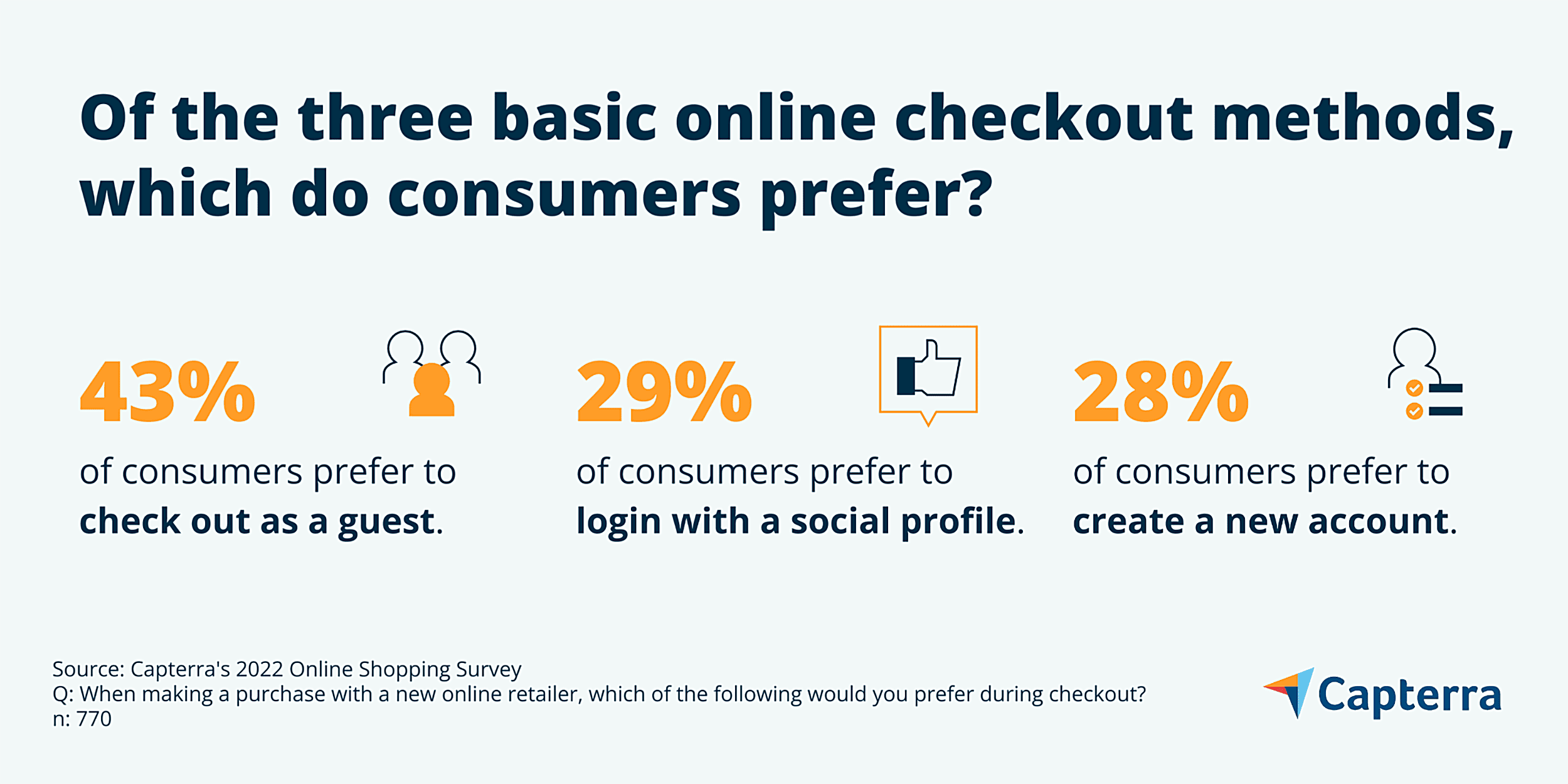
Sure, big players like Amazon can make it work, but a guest checkout option is valuable if you’re running a smaller ecommerce site.
Use Exit Pop-Ups to Reduce Cart Abandonment Rate
Sweeten the deal for customers who are about to abandon their shopping carts.
Use an exit intent pop-up to offer them a discount or incentive to finalize their order.
Pro tip: If they’re logged in and still abandon their cart, send a personalized discount to bring them back.
Word of caution: This tactic has a potential downside as you might inadvertently condition your customers to always expect discounts.
Test Live Chat Support
Zendesk reports that 92% of consumers like Live Chat support because of the swift response.
Another study by Monetate Ecommerce showed that live chat boosted average order value (AOV) by 3%.
You can try an actual live person or an AI chatbot for live chats. And compare the impact of a live person versus an AI bot on conversions.
Pro tip: Read over chat transcripts. You’ll likely find that the same 5-10 questions crop up frequently. Address those questions on your product page or add them to the FAQ section.
Simplify the Product Discovery Process
You want your customers to find the product you’re selling effortlessly, right?
But if you have a vast product catalog, it can get tricky. So how do you make it easy and enjoyable for them?
Here’s how.
Add Easy Filter Options
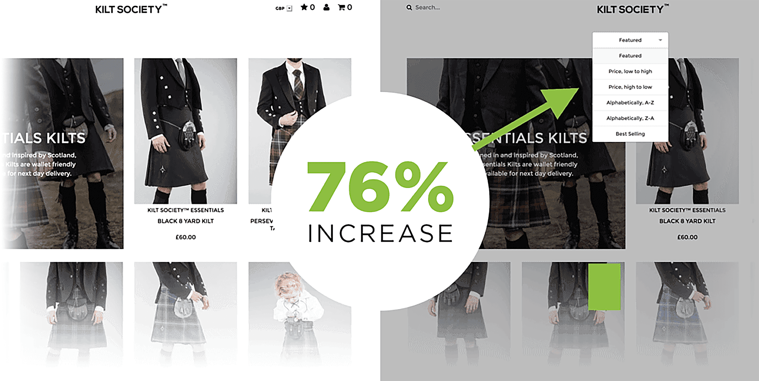
If you have a category page with 1001 products on it, add a product filter. This makes it effortless for visitors to find items that match their style, size, and budget.
Kilt Society saw a 76% increase in revenue by implementing a straightforward product filter on their category pages.
Make Site Search Intuitive
Analyze your visitors’ buying habits. This includes how they usually search for products on your site or a search engine. Use this information to make it easy for shoppers to find what they want.
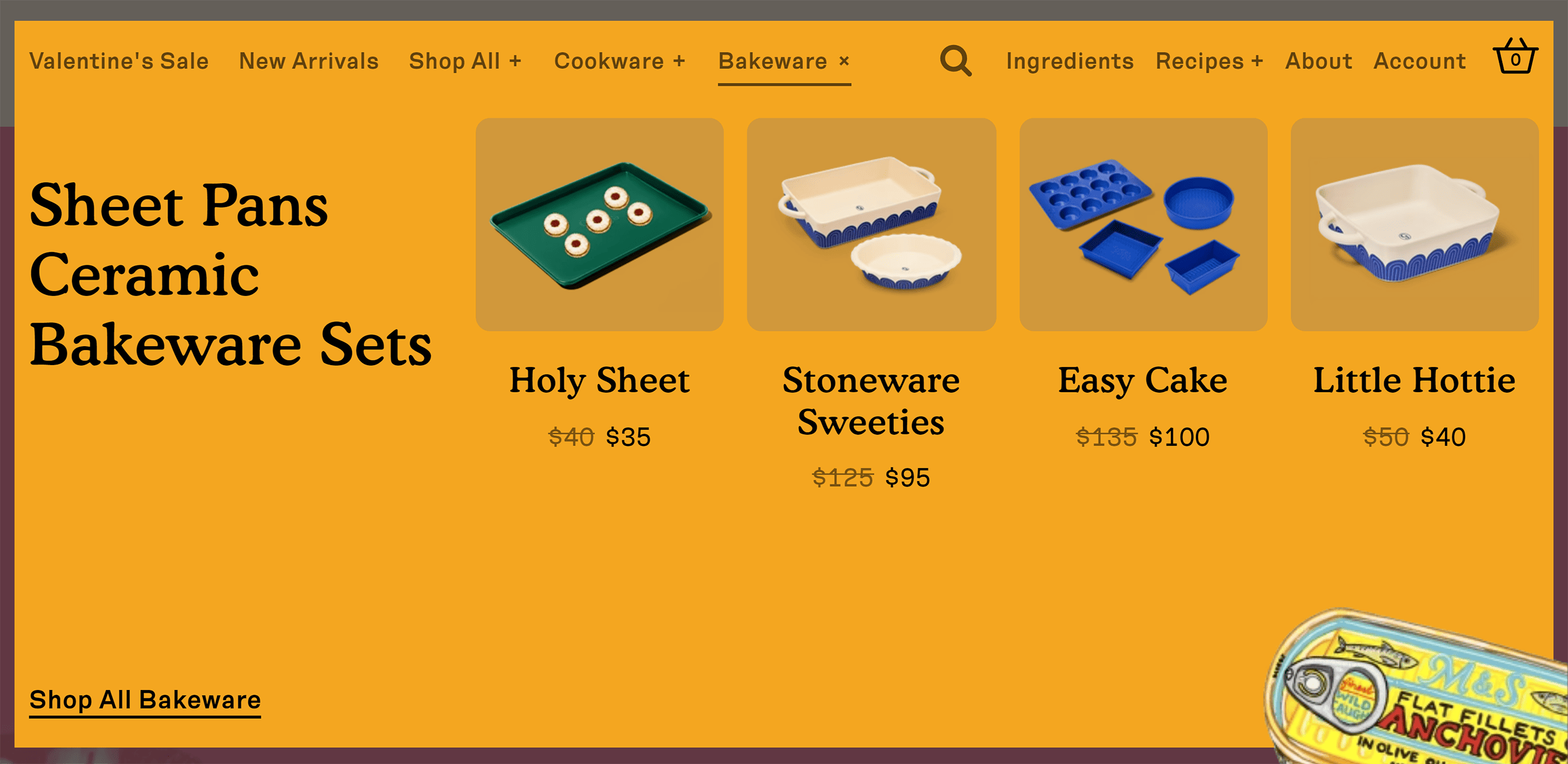
Pay attention to the products that people search for the most. And make those popular products easier to find.
For example, you can feature them on your home page or at the top of a category page.
Great Jones Goods features bestsellers on their drop-down navigation.
Optimize Website Speed
A delay of just one second can slash your conversions by up to 20%. Ouch…
This makes it clear: page speed is more than an SEO issue. It’s critical for conversions, too.
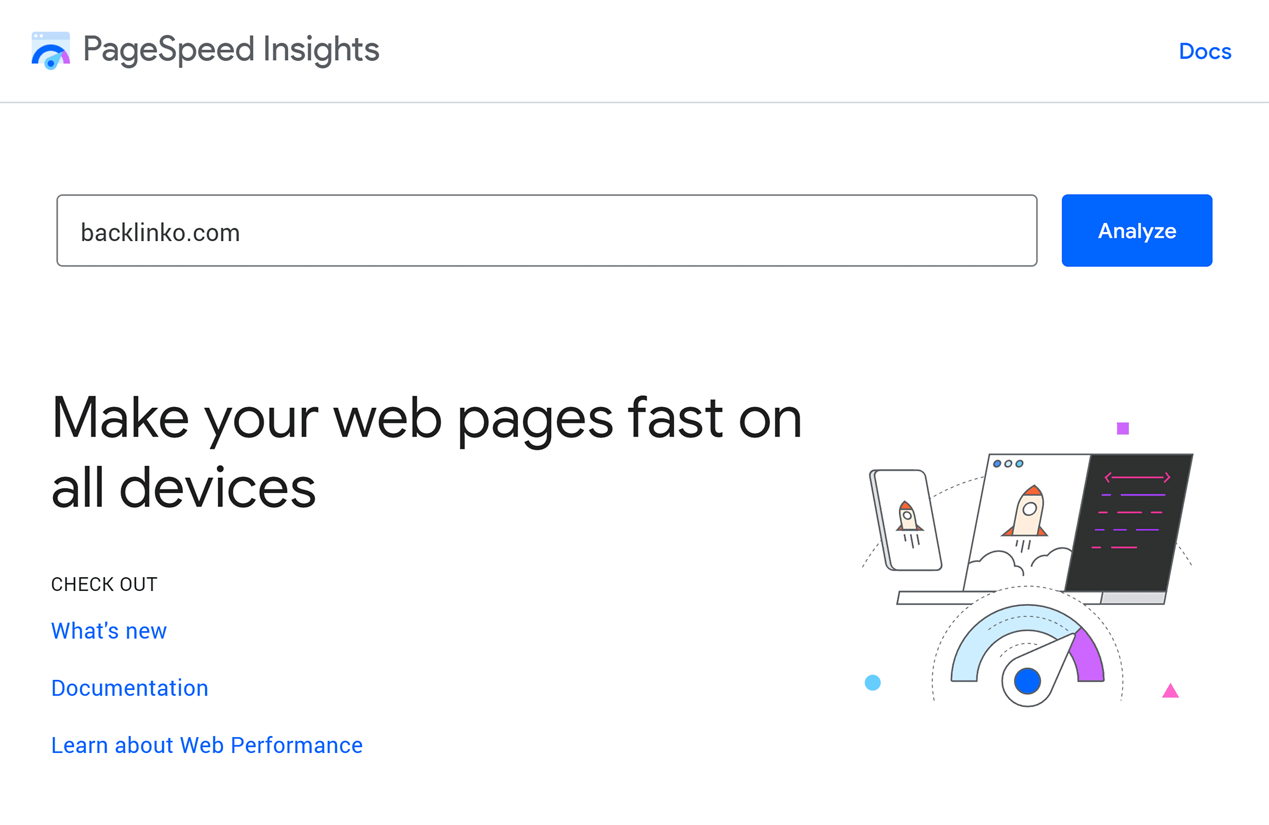
To know your site speed, head over to Page Speed Insights. Start with your most popular pages and systematically work your way through your site.
If You Offer a Money-Back Guarantee, Flaunt It
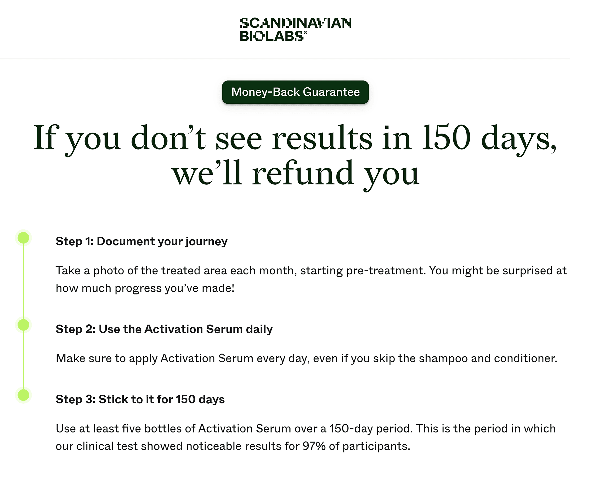
A strong money-back guarantee boosts buyer confidence. It influences how buyers perceive the risk associated with the purchase.
This tactic is especially effective for products that might initially trigger skepticism.
For example, Scandinavian Biolabs’ product page clearly outlines the guarantee—giving buyers a clear understanding of what to expect.
Add UX Copy to Product and Checkout Pages
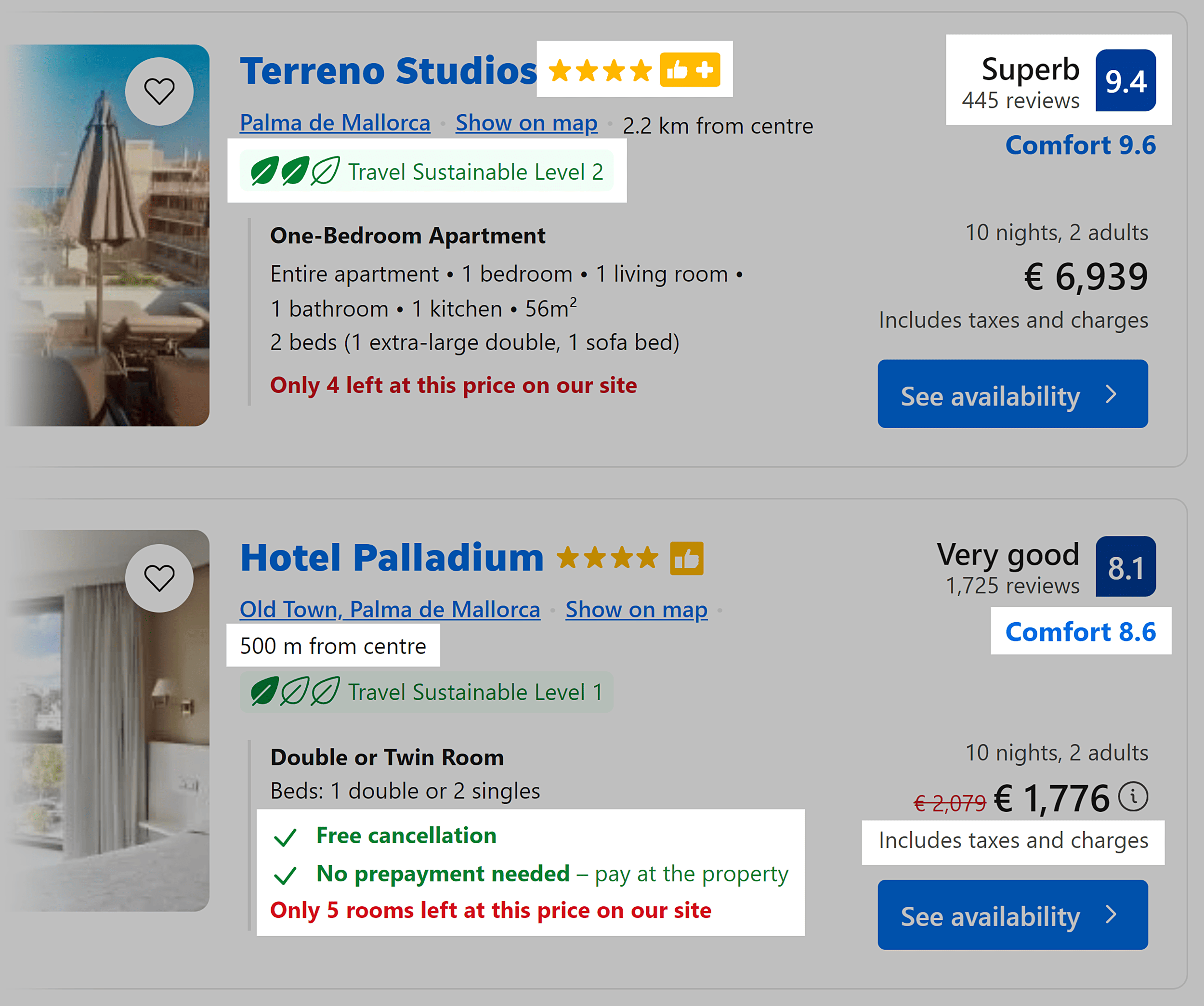
UX copy–those small yet conversion-boosting snippets on a web page–can reassure your customers as they make their purchasing decisions.
These can range from free shipping and money-back guarantees to privacy policies, social proof, or highlighting a key benefit.
Booking.com is a perfect example of a website that effectively and generously uses UX copy.
Optimize for Mobile Buyers
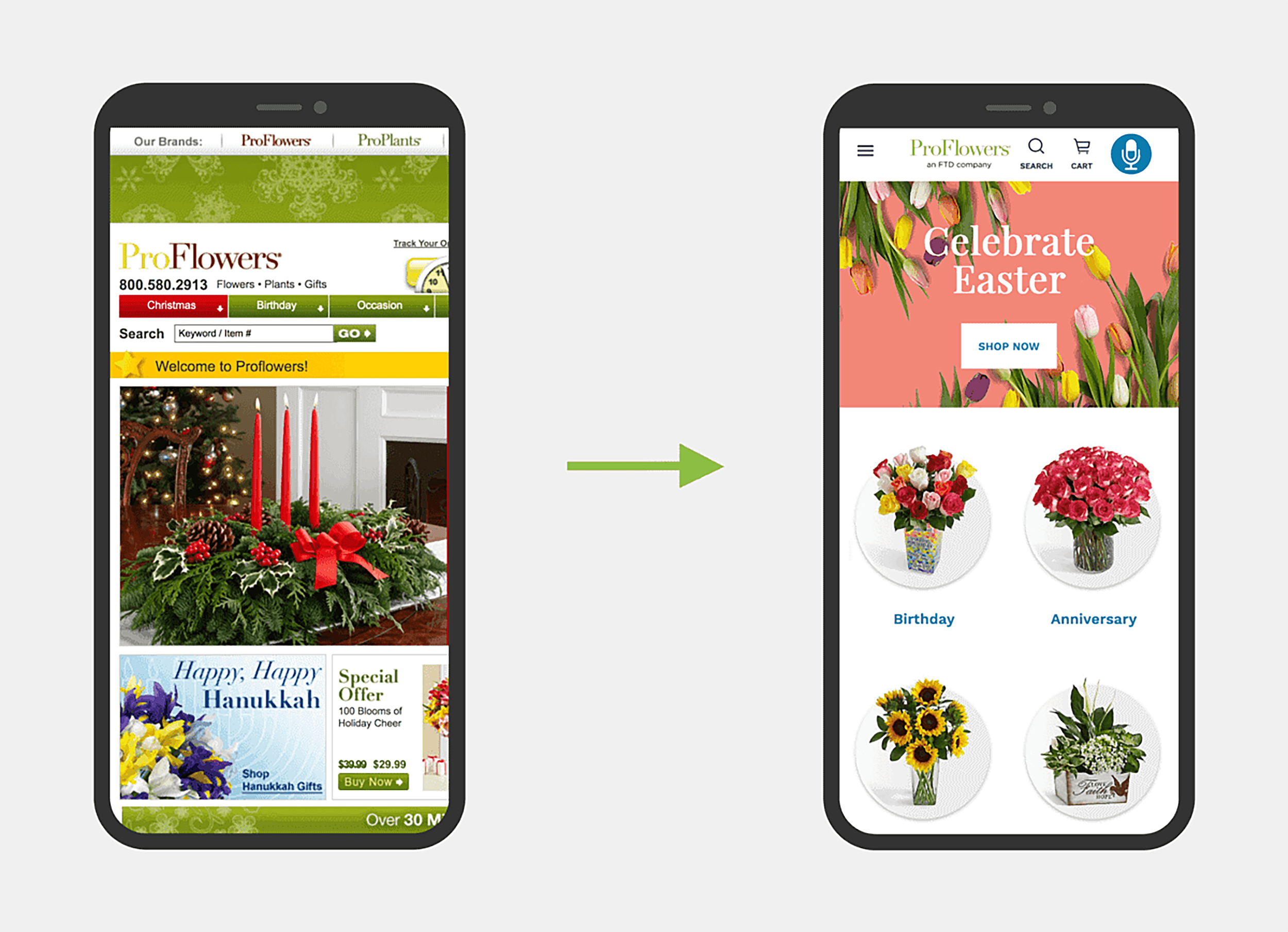
If you haven’t optimized your ecommerce site for mobile phones and tablets, you need to hop in your DeLorean and leave 1998 in a hurry.
Gone are the days when mobile optimization was just an extra feature. With over 57% of web traffic from mobile devices, you can’t afford to overlook this audience.
Ensure that the mobile shopping experience on your site is as seamless and user-friendly as it is on a desktop. This includes having a site that loads fast, features a straightforward checkout process, and is easy to navigate.
Bonus Chapter: CRO and AI - Key Strategies & Considerations

We don’t know where AI will lead conversion optimization yet. But we can already see that it’s very quickly affecting the technology that touches on CRO.
Let’s dive into what you can do to make the best of AI and machine learning.
Leverage AI-driven Insights and Predictive Analytics
Use AI to get deeper, predictive insights into your customers’ buying behavior.
Using customers’ past searches and buying patterns, you can better segment and personalize content to each shopper. Crazy, huh?
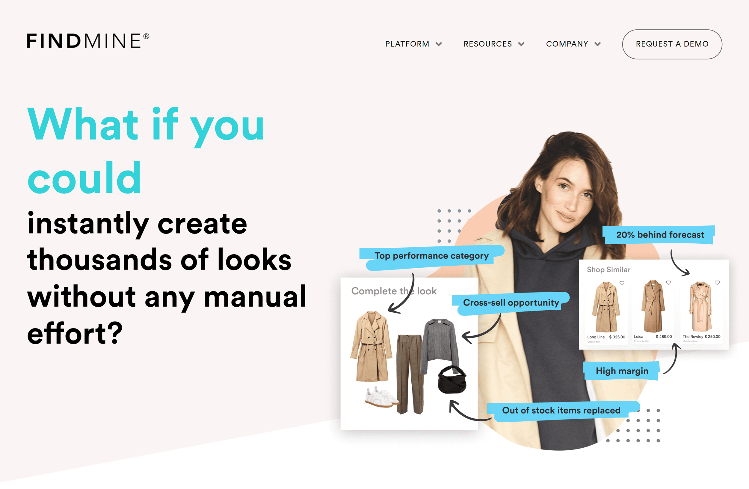
Tools like FindMine make it easy for ecommerce websites to create content using predictive analytics.
Use AI for Customer Research
AI-powered tools now help you gather in-depth customer feedback, analyze survey responses, pick out trends, and reveal customer insights quickly. Time to say goodbye to spending hours on spreadsheets.
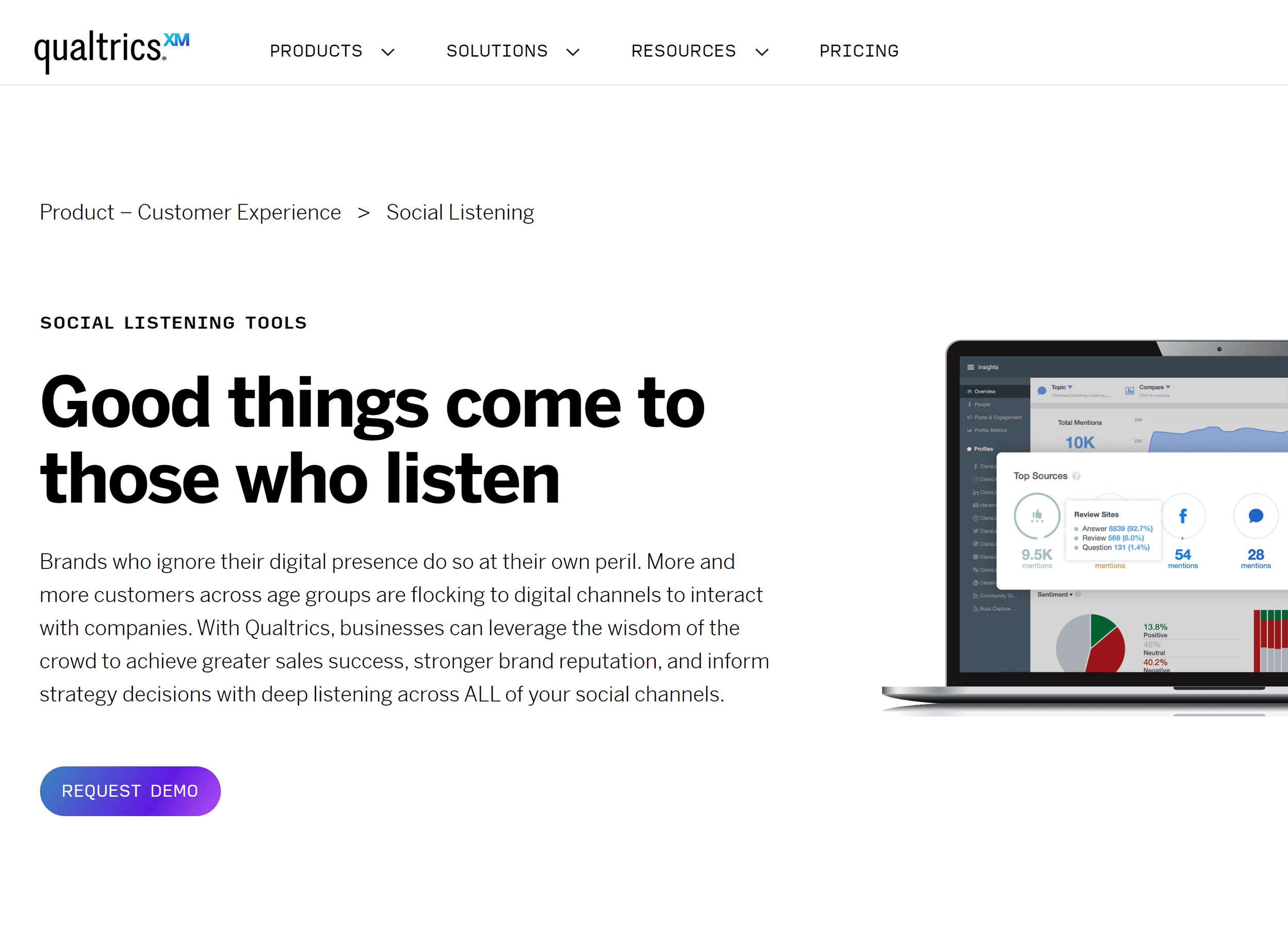
Qualtrics, for example, can tune in to what your audience is saying on social media, giving you a goldmine of insights for your strategic decisions.
Optimize CRO Processes with AI Tools
From content personalization to user journey mapping, there’s an AI tool for that.
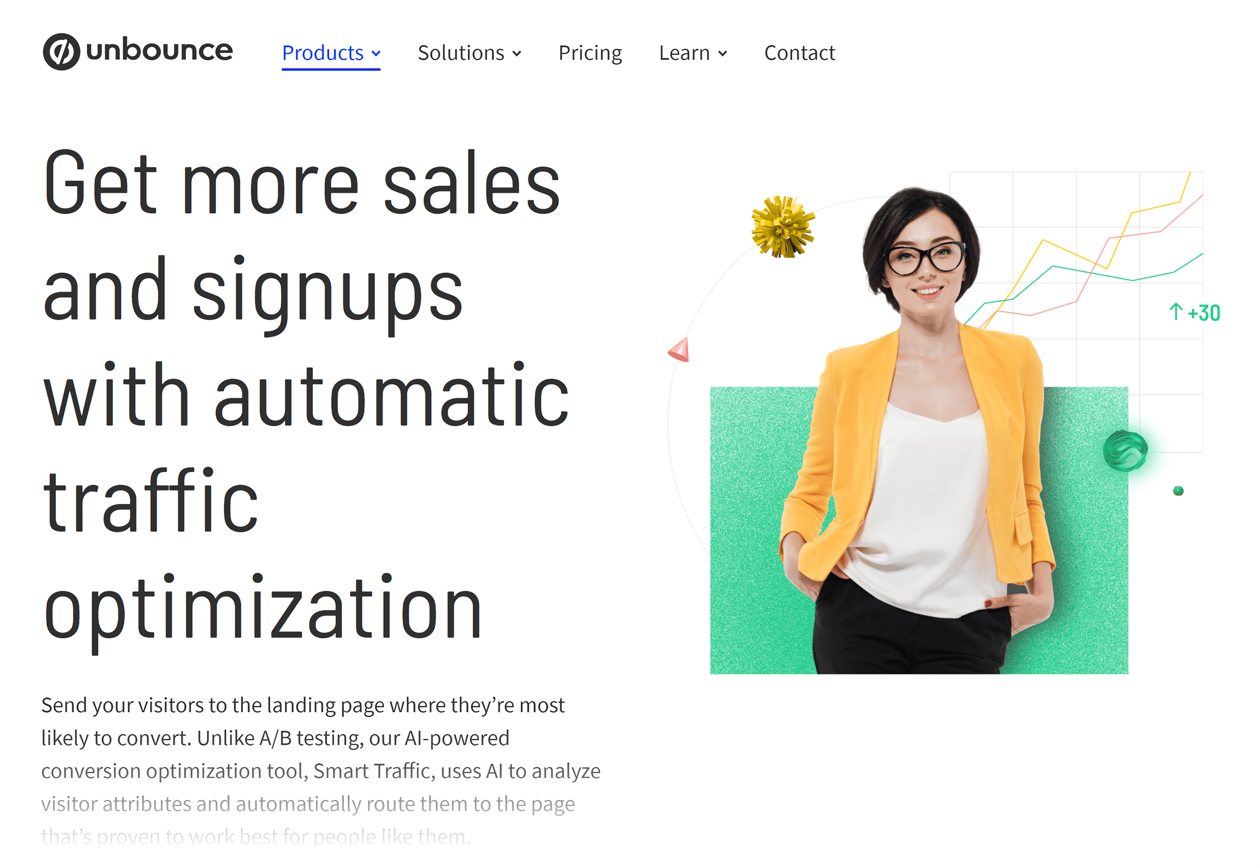
Check out Unbounce’s Smart Traffic, which analyzes live data and adjusts website elements in real time based on user interactions.
You don’t even need much traffic to test which variation converts better for your customers.
Tread Lightly When Navigating AI with CRO
Merging AI with CRO is tricky business.
It’s a fresh field, and there are plenty of challenges to iron out.
Privacy is a big one. Getting it right means handling sensitive data with care.
Then there’s the technical side, like integrating data without a hitch.
But here’s the thing:
AI is already reshaping how we do conversion optimization. It’s changing the game, and we’re just starting to see its potential.
Optimize Your Site Now. Start Here.

Ready to gain a deeper understanding of your website visitors?
It’s time to dig into the data.
Get insights into your customers’ experiences throughout their journey on your site and identify the pages that need immediate optimization.
Check out our easy-to-follow article on Google Analytics 4 (GA4) and kick off your CRO audit.
It’s packed with everything you need to know about using GA4 to understand your customers better.
